SlideMagic Blog

Frequent updates about all things presentations since 2008. Subscribe to never miss a post.

RSS
all posts

Category Data visualization

·Data visualization

Focus on the differences

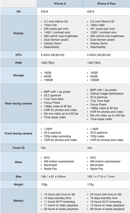
A nice side by side comparison of the new iPhone 6 and 6 Plus on the Cult of Mac. I see many of these tables in business presentations: columns with almost identical content. Why not focus on the differences instead and leave all the other clutter out?

·Data visualization

Readability

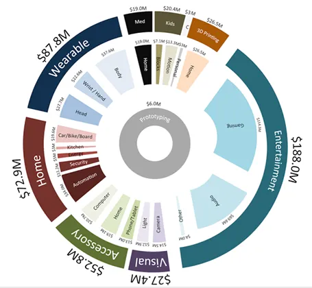
Here is a data chart that was published in TechCrunch, it shows a breakdown of crowdfunding-sourced investments in hardware.

The scattered pie chart looks nice, but is not easy to read:

  • A lot of data and many label are positioned upside down
  • The $ and M signs clutter up space
  • A lot of text is too small

Also, PowerPoint is not very well equipped to make charts like this. You see how the exploded pie points do not line up perfectly, and how the text is not curved right.

To make it readable, I would go for 2 stacked columns, one for the total categories, one for the sub categories. Put horizontal labels to the left of the totals, and to the right of the subcategory column. Use colours to link totals and subcategories together (like it is done in the above pie).

If you wanted to go fro an exploding pie as indicated above, do not explode the pieces in PowerPoint, but rather use extremely fat white lines around the elements of a regular pie to get a more organised diagram.

·Colors

What software did you use?

That question is a big compliment for your PowerPoint presentation: you have succeeded in making your PowerPoint not look like PowerPoint. Here are some simple steps that can help you:

  • No hierarchical bullet point texts (if you have to put three messages use 3 grey boxes with a short sentence)
  • Switch the standard Microsoft Office font Calibri typeface for Arial (other exotic fonts will cause issues on tablets)
  • Avoid the standard Office colours (blue, faded red, faded olive) and use your own colour palette, also in data charts
  • No dirty gradients, drop shadows
  • No heavy graphics and/or colours behind the title or at the bottom of your slides
  • Create many slides with page-filling images
  • Remove the default clutter of data charts (tick marks, etc.)

The same applies to Apple Keynote. Although a standard Keynote slides looks a bit better than a standard PowerPoint slide, Keynote also has ugly defaults (colours, texture fillings of data charts).

·Data visualization

Middle East friendships

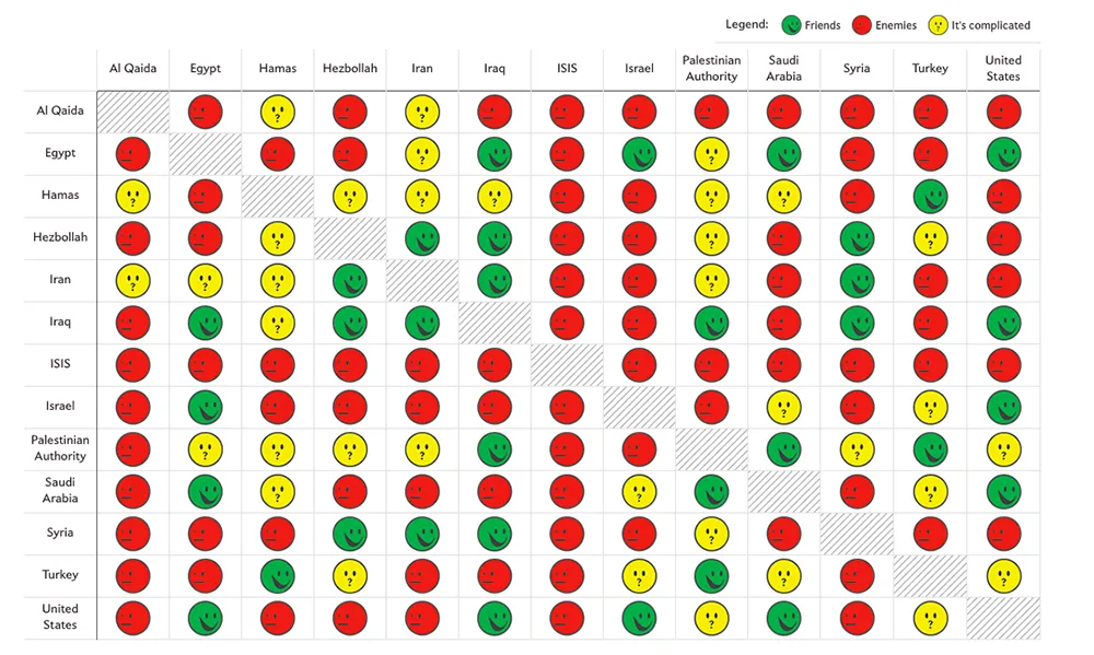
Slate created a beautiful map showing the complexities of the friendships in the Middle East:

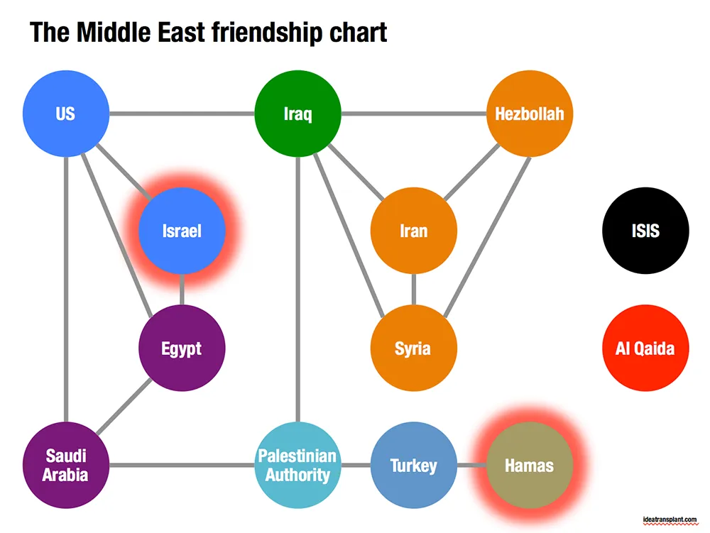
Go to the original here and click on each of the smileys for additional information. The message of this chart is clear: it is complicated. The same information can be displayed simpler by focusing on the just the green relationships. The following pattern emerges, highlighting among other things why it is so difficult to get Israel and Hamas to communicate.

·Data visualization

Data backups

A good presentation uses very simple data charts. Often, in the last minute, changes are made to the data: it is easy to change a number in PowerPoint here and there.

In most cases the first versions of these simple data charts were extracted from very complicated Excel sheets. And here is where the trouble starts. After a few PowerPoint iterations, the presentation and the backup model is no longer consistent. This is fine if the presentation was a one-off event, but most of the time, the Excel model will live on for future iterations.

The solution is to include a worksheet in your Excel model that pulls the data exactly as it goes in your charts. Put in the correct rounding, everything. Anyone who wants to change the numbers, need to make changes in the Excel model to get the numbers to change.

And yes, sometimes that might involve a goal seek.

If these charts frequently change, you might even consider designing a presentation in Excel. Excel has the same chart and shape design tools as PowerPoint, and you can create direct links between charts and work sheets without having to copy things across. See a previous post (2009) on this technique.

·Data visualization

Automated journalism

The Associated Press will start using a bot to generate verbatim on company earnings reports. The system takes as input the financial data, and then recycles that into human stories: earnings went up 3%, which is 0.5% higher than the financial services average and leads to an expected gross margin of 46% in Q3.

I never understood the point of journalists spelling out information in sentences that is much better communicated in graphs. Proof is that this translation is easily automated. The only use I can see is in translating data to audio for people who cannot take their eyes of the traffic and still want to digest data.

Instead of using the bot, AP should invest in better data visualisation.

·Data visualization

Data overload

In a recent project, I had to visualise the 5 year IT spend plan of a very large company: different business processes, different applications, different responsibilities, different timing, some were build, some were buy, different budgets.

Rather than pages of bullet point slides, I went for a simple table that showed the applications by business division, around 60 boxes. Then this - relatively complex - structure was repeated over and over again, each time with a different set of highlights and colour codings. After the first few repeats, the audience will slowly start to recognise the position of the applications on the grid, and i can introduce more complexity.

Here are some techniques to deal with complex tables and lots of different data set:

  • Colour: use similar colours to highlight similar items. Pick how you use colour: colour an entire box, add a coloured dot to a box, colour the line around a box. Use muted, calm colours for larger surfaces, use very bright, highly contrasting colours for small accent objects.
  • Semi-transparent white to cover parts of the table you do not need for a slide. Use shape booleans to cut out pieces of the cover.
  • Elimination: take the audience through a process where you throw out items bit by bit: here are the applications that we are not responsible for (out), here are the applications that we will not work on (out).
  • Re-order: Flip rows and columns until you get a layout where similar items are grouped together.
  • Shapes: squares, triangles, circles can make nice small objects to highlight different aspects.
Continue reading →
·Data visualization

Redesigning the Meeker deck

The Business Week magazine asked presentation designer Emiland de Cubber to redesign the information-loaded slides of Mary Meeker’s annual State of the Internet deck. Here is the original:

KPCB Internet Trends 2013 from Kleiner Perkins

You can see the result of the make-over here.

The Meeker presentation is a dense deck full of facts that can never be (and should never be) converted into a TED-style slide deck with a few words and some pretty pictures. And Emiland did a great job of making that information more visually powerful. Muted colours calm down the slides. The use of colours in the graphical language of KPCB eliminate the need to be reminded of KPCB by a huge logo on each page.

Here are some of my additional comments, the key point is that you can even be more radical in improving this presentation. These are all constructive ideas, Emiland did a great job!

I invite you to open the Business Week alongside this text, I am not sure whether I can copy all the slides into this post for copyright reasons.

The dark colour scheme does work better for large rooms and big projector screens. A huge wall of white light overpowers the stage presence of the presenter. However, I suspect the majority of the audience of this presentation will be sitting at a desk when watching the information, in that case sticking to the light background might keeps things more readable.

I disagree on the use of icons to simplify categories in slides. Icons simplify too much in these technical presentations. Instead, I would opt for dramatic text simplifications. Emiland did both, I would have taken the icons out, and put more emphasis on the shortened text. (The second make over example slide).


Continue reading →
·Data visualization

Boring frameworks

If your business has 15 sales channels, it makes sense to review their performance using the same framework: easy to compare, and you make sure that you are covering everything that needs to be covered.

If you work with management consultants, you will notice that they love this approach. You get presented with a framework, asked to fill it out and then - here is the mistake - the 15 analyses are put on the overhead projector for a nice morning-filling channel performance review session.

Analysis slides are not the same as presentation slides. Keep the boring, structured deck as reference material. But, when presenting: try to break the logical structure. Focus on what is different, remarkable, requires attention. And since each of the 15 channels are different, you will find that these stories do not fit into one framework.

·Data visualization

Monthly reports in PPT

Many technology providers need to write some sort of monthly report with statistics for their clients. The bare output from their applications is too rough and does not contain conclusions, insights, follow-up actions and quantified $$$ savings.

So writing this report is a manual process: data gets uploaded into Excel, analysed, put in graphs in then all of this is put into: Microsoft Word.

Microsoft Word (or any word processor) is not a good tool for creating data reports. It does not have the page layout capabilities of Adobe Illustrator (have you ever tried to move a picture or graph around and see the surrounding text move in unpredictable ways?), and it does not have the graph editing capabilities of Excel.

The solution: create you monthly reports in PowerPoint: managing images and data graphs is much easier. And now that you have left word processing territory, why not cut the amount of blah blah text and force yourself to get to the point with fewer words. If people do not feel like reading long, dense presentations, do you think they have the energy to digest dozens of monthly report prose?

First, the type writer left the enterprise world, and now it is the time to say goodbye to the word processor and leave it to authors of books.