SlideMagic Blog

Frequent updates about all things presentations since 2008. Subscribe to never miss a post.

RSS
all posts

Category Concepts

·Concepts

On the way to average

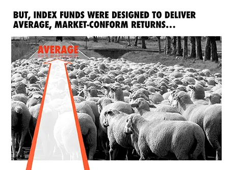
I designed the chart below for a sales presentation for an asset manager who is about to go on a roadshow to pitch a new investment fund to potential distribution partners. Yes, you saw that right, I did use a reflection effect.

·Colors

Too much color

Colours brighten up your slides and are a great way to group related items together: USA is green, Europe is blue, Asia is purple for example.

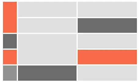
But applying bold colours to big text boxes makes your slides too busy and nervous. Instead, keep those text boxes light grey and add a very narrow colour box attached to it at the left side, almost like a fat line.

·Concepts

White on white

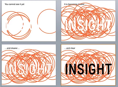
White letters on a white background enable you to make a nice slow-reveal slide. I used it for a client in BI (business intelligence) that creates insight by overlapping multiple analyses.

·Art

Table with fat lines

For boxy charts, I find it very convenient to use tables as the basic organising structure. Use big fat lines to separate the cells. In this way, it is easy to add, delete cells, combine, and split them. The Mondriaan look.

·Concepts

It is that simple

Sometimes, the story is just really simple, hence a simple chart.

·Concepts

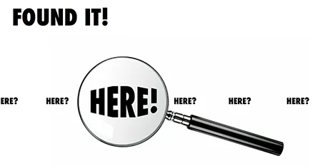
Found it!

A client spend a lot of time and effort looking for a solution to a problem, until they discovered it in an unexpected place. The chart below is simple to make: a magnifying glass and different font sizes (and a transform font effect if you want), that is all.

·Concepts

Zap!

In case you want to use laser beams in your presentation, they are easy to make: red lines, black background and a small dot with a huge red, semi-transparent glow.

·Concepts

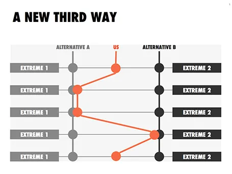
Concept: a third way

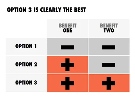
This slider chart is a great way to show a comparison between multiple concepts across multiple dimensions. I recently used it for a hedge fund with a new innovative investment process.

UPDATE: this slide concept can now be downloaded from the SlideMagic store

·Concepts

Bullet points can be OK

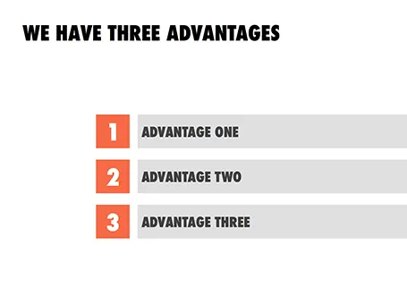
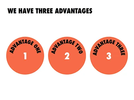
Some readers of my blog have become paranoid to use bullet points in a presentation (a good thing), but there are actually situations where putting 3 short sentences on a page is inevitable, or even a good solution for a slide.

These situations are when you want to express that something has a number of components. Breaking up those 3 advantages and give them one slide each enables you to explain them clearly individually, but the audience loses the overall perspective of how they are related.

In those cases - yes, it happens to the best - I revert to 3 short bullets.  But there are a few things you can do to keep things interesting:

  • A massive visual anchor (like a big 1, 2, and 3) to show that you are talking about an overview slide
  • Really, really short descriptions just to introduce the ideas. The full explanations come in subsequent charts
  • Also, you can deviate from the traditional list and come up with other geometrical shapes ore layouts to make your three (short) points.
·Concepts

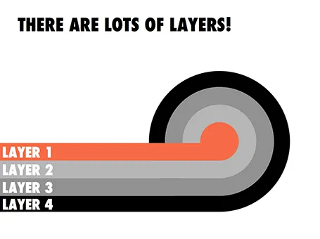
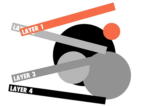
Lots of layers

Here is a concept to label lots of layers in a circle without bending text, the second image shows with which components the first chart was created.