Torn
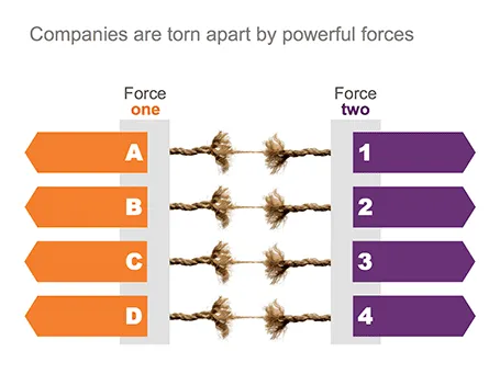
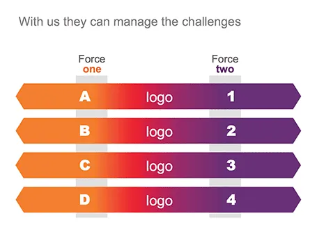
One of my clients is saving companies that are caught between two opposing forces. Here is the visual concept I used that explained the 4 contradictions.


Frequent updates about all things presentations since 2008. Subscribe to never miss a post.
One of my clients is saving companies that are caught between two opposing forces. Here is the visual concept I used that explained the 4 contradictions.
Here is a simple concept to visualize a problem that the cable television industry has: replacement cycles of hardware sitting in the people’s homes is really loooooong, especially compared to how often we upgrade our mobile devices. In this slide I used repetition plus cropped the years on both sides of the page to create that sense of continuity.

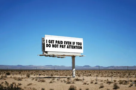
Online, advertisers pay by the click. In the offline world, not yet. This slide was made using Photoshop’s vanishing point filter and some fat Futura Condensed Extra Bold
Spirals are a great way to visualize an endless repeating of something. Stock image sites are full of images of real staircases, rendered ones, or other images that have a spiral structure. You can use the visual as-is, or add text (maybe in circles that get smaller and smaller) to shows that something is going on forever, that something is repeatable.

Some people associate a diagram like this with a downward spiral. I do not see it that way, you?
Almost every pitch presentation talks about something that is missing. A simple image of a paper hole is a great way to visualize it. You can have one, you can have fifteen, you can cut out the white background and put the whole into something else. You can find hundreds of paper holes on stock image sites.

Using a visual cliché can happen to the best of us… I recently was guilty of this one. “We are scalable!”

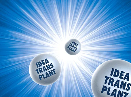
The star burst is often used in retro advertising. You can pick one up from any stock image site to create a background for a composition with a lot of depth.
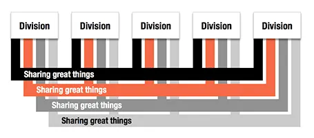
Here is an alternative to a circle-like composition of a holding company and its subsidiaries.
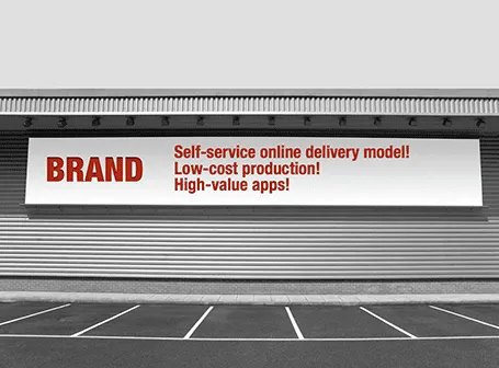
Maybe a bit overused, I still applied the billboard concept in a number of presentations recently.


Photographs with a strong perspective are always the most interesting ones to use in a presentation. See the example below. Strong lines leading to a bright spot that almost makes you squint. When adding PowerPoint objects make sure to align them properly with the flow of the image.