SlideMagic Blog

Frequent updates about all things presentations since 2008. Subscribe to never miss a post.

RSS
all posts

Category Colors

·Colors

Google image search narrowed down by image color

An interesting find by the Google Operating System blog: using Google image search to find pictures with a certain color. It is not an official search option (yet), you need to adjust the Google URL manually:

Finding red birds:

  • Enter “bird” in Google image search
  • Add “&imgcolor=red” to the Google URL so it looks like this: http://images.google.com/images?q=bird&imgcolor=red,
  • Replace “red” with “blue”, “green”, “teal”, “purple”, “yellow”, “orange”, “pink”, “white”, “gray”, “black” and “brown” to get other colors

Still, watch out for possible copy right violations or poor image quality when using pictures taken from Google in your PowerPoint presentations.

Thank you Ashish for pointing this out to me.

·Colors

New startup - do you still need to bother with a logo?

I encounter this situation often when designing fund raising presentations for new startups pitching to VCs. “Oops, what about our logo?”. My answer is usually don’t bother, instead invest time to find a suitable color scheme.

  • Getting a good logo designed is expensive

  • It takes time for logos to become brand icons. First you need a brand story/experience, only then can customers connect it with your symbol. Read Seth Godin’s post (great quote “the iPod didn’t need a logo”).

  • Logos are not important for the look and feel of a presentation, colors are. If a client insist, I will put them in 8pt at the right bottom of the page. Think about what drove logo design in the last century: they needed to fit on a building, a letter head, a form, a black and white fax. Because the user could not manipulate colors, fonts, images like we can today, it was the only “interesting” graphic on an otherwise boring piece of paper without an identity. These times are over.

Forget about logos if you are short of time, or short of cash. Pick some nice colors instead. Worry about your logo later.

·Colors

Need your help: colors in data charts PPT 2003 versus 2007

Colors in data charts. This 2003-2007 compatibility issue drives me crazy. Many of my clients still use Office 2003. Does anyone have a solution?

  • PPT 2003 uses Microsoft Graph for data charts, PPT 2007 Excel
  • I create a chart in 2007
  • I save the 2007 PPTX in 2003 PPT format
  • I (or my client) opens the 2003 PPT file and
  • right-clicks the chart to open it: all the colors are off…

I have to change every color manually using RGB codes to set them permanently to the correct value in 2003.

There must be a better way to do this! Let me know if you know.

·Colors

PowerPoint template colors and color blindness

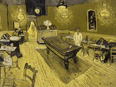
My Vincent van Gogh color set from a few days ago is not very good for people suffering from red-green color blindness.

Use Vischeck to test your own templates. To do so, you need to “save as” a PowerPoint page as “PNG”.

A side-benefit of this test is that you get sense of what happens if someone prints your presentation on a black & white printer. (But hey, the B&W white test is the easiest of all: print preview)

Somewhat related: an earlier post about designing presentations with people suffering from dyslexia in mind.

Via Richard Garber. A more elaborate post on Vischeck and PowerPoint in this post on the Indezine blog.

·Colors

"Color me creative"

People have been talking a lot about how colors influence behavior. A study published in Science Magazine today added one more entry to the list.

  • Red: improves performance on detail-oriented tasks
  • Blue: stimulates creativy

The article goes on to discuss underlying causes. Stressful colors like red might enhance effectiveness of getting things done. Blue “calm” colors are better for coming up with that brilliant idea.

Regardless of whether these type of studies are right or not: picking a color scheme for your company look and feel (and/or your PowerPoint presentation) is a far more important decision than deciding the graphics of your logo.

·Art

Using historical paintings as an inspiration for color schemes

Great painters use colors to set the emotion of a painting. An example is Van Gogh’s “Le Cafe de Nuit”. He talks about this painting in one of his letters to his brother Theo:

I have tried to express the terrible passions of humanity by means of red and green. The room is blood red and dark yellow with a green billiard table in the middle; there are four lemon-yellow lamps with a glow of orange and green. Everywhere there is a clash and contrast of the most alien reds and greens, in the figures of little sleeping hooligans, in the empty dreary room, in violet and blue. The blood-red and the yellow-green of the billiard table, for instance, contrast with the soft tender Louis XV green of the counter, on which there is a rose nosegay. The white clothes of the landlord, watchful in a corner of that furnace, turn lemon-yellow, or pale luminous green.
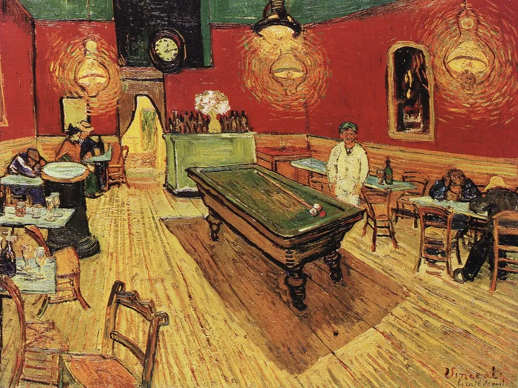
It is interesting that Van Gogh talks about clashing colors, but the end result is in fact a very harmonious ensemble of colors.

Painters use intuition and a sharp eye for real-life images to create a suitable color scheme. You can “borrow” a bit of their genius by using painting as an input source for tools such as kuler to create your own color combinations. In fact, paintings might be a better source than images for this purpose.

The result is good, but not as perfect as the original. I miss the digital equivalent of the artist color pallete to mix and match colors as you go. I am starting to experiment though with going “off color scheme”, injecting here and there colors in slides that do not fit 100% with the defined presentation colors.


·Books

Great book "Tasteful Color Combinations" - not even available on Amazon

Found hidden away on a shelf in the book shop of the Tel Aviv Museum: “Tasteful Color Combinations” by Naomi Kuno. It is not even available on Amazon, that’s why I have trouble finding a good web link to it.

The book contains 455 color schemes (with detailed RGB  and CMYK codes), organized in 14 chapters each with a different mood. (“Nostalgic and melanchology”, “humanistic and natural” to name two). The first edition was published in Japan in 2004, and the English translation is not always perfect, adding to the charm of the book.

Some examples of colors schemes available (exact quotations from the book):

  • 241, Formal Kimono: the color of a patterned formal kimono for a married woman
  • 255, Homely: the cozy warm color of home where a cheerful laugh is always heard
  • 359, Glory and fame: glory and fame never fades away when quality is accompanied. The blue is for glory and the red and gold are for fame.
  • 370, Rococo -1: the elegant rococo period colors of Fragonard’s paintings and dresses
  • 111, Ryugu castle: the color of a town of Ryugu castle in a deep sea, where princess Otohime and beautiful fish are said to inhabit, in a legend story of Japanese fantasy.

The colors of 111 below as an example:

I have used this book a number of times as a source of inspiration for finding color schemes for seed-level technology startups that need help developing their very first fund raising presentation. (Other techinques to find a good color scheme can be found here).

Continue reading →
·Colors

Color mismatches in corporate PowerPoint templates ("Skype" example)

Skype has a beautiful and very strong visual identity. Things start OK on the first page of this presentation by its COO at CES 2009. Then the color coordination gets weaker. Off blue. Pink’s too bright. No greens (Skype’s green “call” button is very strong visual icon returning in the monochrone rainbow).

PowerPoint templates go beyond page 1.

I am sure Skype’s template is OK, the default colors are probably not set in such a way that they are easy to use for people without a degree (or passion) in graphics design. Like in almost all corporate PowerPoint templates, too much screen real estate is devoted to the brand/logo. With its strong blue colors Skype could actually afford not having a logo at all on its presentation pages. People will recognize the company regardless.

Skype COO Scott Durchslag at CES 2009

·Colors

How to set a non-standard color in PowerPoint - HSL codes

You can fill books about color theory, here I will take things one step at a time. How to set a non-standard color in PowerPoint?

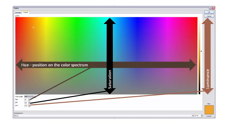
First of all to enter the right menu: hit any fill, outline or font color drop-down and select “more colors”. A big rainbow-like display will open. (Click the image above for a larger picture.) You have 3 options:

  1. Manually move the mouse in the color grid and click a color: this is never accurate enough. (Tip, you can actually stretch the window to make your selection more precise)
  2. Use RGB codes: a value of 0-255 for ®ed, (G)reen, and (B)lue: it is impossible to predict what the resulting color of an RGB-combination is
  3. Use HSL codes, my favorite. Let’s elaborate.

In the “color model” box at the bottom left of the matrix, change “RGB” to “HSL”.

You can define a color exactly by changing the 3 variables, each ranging from 0 to 255:

  • (H)ue is the position of the color on the spectrum, going from red all the way to purple
  • (S)aturation determines how bold are faded your color will be. Fluorescent colors go for the full 255, pastel colors for a low value, if you make the value really low, all colors turn more or less into grey
  • (L)umenance sets the shade of the color, from light to dark

In practice I hardly ever use this technique to set my PowerPoint presentation color scheme (see a previous post on how I do this). There are situations though you might have to use the HSL color model:

Continue reading →
·Colors

There are more font colors than black

When working on a white background:

Using very dark shadings of one of your color scheme colors as the standard font color, can give your slides a much nicer feel than using high contrast but boring black. 

Especially true for title lines.