SlideMagic Blog

Frequent updates about all things presentations since 2008. Subscribe to never miss a post.

RSS
all posts

Category Colors

·Colors

iOS7 and PowerPoint templates

Most PowerPoint template designers think that what you put on the empty template page sets the look and feel of the presentation. Gradients, watermarks, logos, color bands. I have long been arguing that the template can just be a blank white page, what sets the look and feel is your approach to how your design the slides: what shapes, what colors.

The new iOS7 is a good example. Icons that looked great in iOS6 now look dated instantly in iOS7. The design philosophy has changed, without new logos, or repeated graphical elements on the page. It is the combined power of the new iOS7-ready icons that together create that new fresh layout.

So in PowerPoint, pick your colors, your fonts, your approach to shadows and gradients and you can use a simple blank page as your PowerPoint template.

·Colors

Useful colors

If you have the freedom to pick the colours of your presentation yourself, try if you can find ones that have enough contrast both with black and white. The Idea Transplant orange for example can be a background for both white and black text. Skype blue also works. Design is always a combination of aesthetics and practicality.

·Colors

Color hierarchy

Over the past few years, more and more people started to understand that as a presentation designer, it is important to have a look at the style, brand, color guide of the organisation you are working for. Program the prescribed colours into your PowerPoint or Keynote template, and your slides are instantly recognisable with the right look and feel, without having to remind the audience by putting a big logo on every slide.

But these brand guidelines often contain more than just the RGB codes for the corporate color. Color hierarchy is as important. Which color should you be using more often than others? Which color is background, which color is accent?

Randomly applying (the allowed) colours to slide objects can create clutter, especially for large shapes on your slides. Think about color hierarchy when designing your next presentation.

·Colors

On gradients

In the spirit of flat design, I am not a big user of gradients in my presentations. It is one of those features: the fact that PowerPoint/Keynote supports them, does not mean you have to use them. Some observations.

Not all gradients work. A background gradient that goes from white to a touch of grey as your PowerPoint canvas often looks “dirty” on the presentation screen. Especially on antique VGA meeting room projectors. The inverse (pitch black to a dark grey) can actually look good. There is another challenge though with a gradient slide background: it is harder to work with shapes and images that have a non-gradient background that is close to the canvas color.

Watch out with gradients that run between clashing colours. If the colours do not go well together (for example green and red) then the resulting gradient is probably not going to be good either. Complex gradients can work though, have a look at the book cover of “Pitch it!” on the blog cover page. You could construct a nice gradient with reds, oranges, blues, and purples.

There is one area where I often use gradients: visualising transitions from one state to another. Even if the colour clash, I would still add that colour transition on a big horizontal arrow.

But still, we have to admit modern display technology falls short in places where ancient artists thrived…

·Colors

B&W images

Converting all your images in a presentation to black and white can help even out the colours in the document. What is left is a series of slides in subtle shades of grey with your corporate color popping out to make a strong accent. I use that look a lot recently.

·Colors

Too cute for investors

Unfortunately, in 2013 most investors are still male. Coming in with a cute deck (curly flower background, pastel colours, retro-chique font, etc.) is not going to get you points. Even if your product itself has to be cute (a cosmetics line for teenage girls for example) you can still separate things in your investor deck. Use more macho graphics for the serious business stuff, leaving the cute graphics for the product show case pages.

·Colors

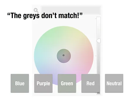
The greys do not match!

A few days ago, a friend posted a “complaint” on her facebook timeline that her husband always failed to spot fashion imperfections, in this case grey tints that did not match.

Grey colours sit in the center of the color wheel with equal balance of Red, Green, and Blue. But tipping the balance of the color mix a little bit instantly makes your grey look different. Use it as a design option to create a matching set of colours, watch out if it is not what you intended to do.

The same is true in black and white images, not every BW image is really pure grey, but it is easy to correct it, just have PowerPoint or Keynote turn it into a proper black and white image.

·Colors

Creative commons Flickr search

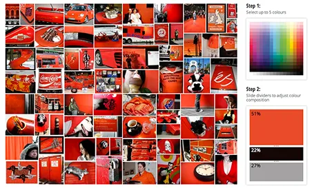
TinEye Labs has developed a cool image search engine. Select multiple colors (unlike Google image search), and the tool will mine 10 million Flickr images with a creative commons license (unlike Google image search).

Image by Mitali Mokerjee

·Colors

Hey, where is the colour?

A recent client was wondering why I turned all images in his presentation to B&W.

The answer: because I matched the colours of the presentation to the colours of his brand; shades of grey plus a strong blue as accent color. These type of colour schemes are actually my favourite ones. They look elegant, are recognisable, and it is very easy to create a harmonious, consistent set of slides through the deck with out the distraction of clashing colours. Definitely not a presentation with a 1980s, pre-colour monitor, look and feel.

·Colors

Which color schemes work?

You cannot argue about taste, and there are no rules about what color combinations work or not. But somehow there are color schemes that come out great in a presentation, and with certain ones I have a very hard time making a deck look good. Here are my random experiences:

  • Colour schemes with fewer contrasting colours in it tend to work better. You can create beautiful minimalist shades with grey shades and black, with a dash of a bright accent color here and there. In case of three (or more) contrasting colours, I tend to pick one of the three as my main accent color, and reduce the prominence of the other 2
  • Deep colours work better than faded pastel ones. What looks great in print, might not work on a screen. Especially when you make the backgrounds of your slides white. Contradicting my first point, a series of deep colours can look great of they are related, and not contrasting. I have designed great looking decks with 5 to 7 related colours.

So, whenever you are thinking about new colours for your company, create a few presentation slides to evaluate options rather than deciding on the look of a logo. Logo colours can look great, but seeing them used in a business presentation is another challenge.

If you are going to work mainly with dark backgrounds, use that as your color testing ground. And vice-versa, if you find that your colours simply do not look good on white, switch to dark background presentations. I have applied this rescue trick a few times with clients.