SlideMagic Blog

Frequent updates about all things presentations since 2008. Subscribe to never miss a post.

RSS
all posts

Category Colors

·Colors

Ugly colors

When your company has an ugly corporate color scheme it can be hard to make good looking charts. Here is one solution: go mainly for shades and grey and use one or two of the corporate colors as an accent color to highlight things. In 99% of cases this will look very elegant and nobody can accuse you of deviating from the prescribed colors.

·Colors

PowerPoint for Mac color rendering

If you cannot get excited about color rendering in software, please skip this post.

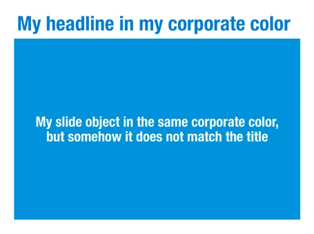
There is something weird in the color rendering of Microsoft PowerPoint 2011 for Mac. First, text and shapes get treated differently. If you make the text and the background the same color, the text will appear different. At first it looks like to be designed on purpose. But the adjusted color is actually a bit off on the hue spectrum, creating color clashes. See the example below.

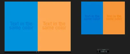
Maybe there is a problem inside the software though. Look at the screen shot below of a presentation in presenter mode. I copied 2 exactly the same slides and you can see that the preview of the second (identical) slide pulls the blue into same purple direction as the text in the previous example. There must be more than one color rendering engine inside PowerPoint.

PowerPoint 2010 for Windows does not suffer from this, and I hope that Microsoft will fix it in a subsequent update (even it was done on purpose). If I want my text to stand out on a background, I want to freedom to decide myself what colors to pick.

·Art

Screaming colors

I just re-designed my Twitter avatar with a dash of fluorescent paint to stand out in the noise of social media. It is interesting how computer screens work. A really bright color is not yellow or orange, but rather the ones that sit on the edges between 2 colors. Mine is in between yellow and green. It is as if our eyes are being teased by interfering light waves that are just a bit off in terms of wave length.

Other examples of interfering colors are on the border of pink and blue, or green and blue. I blogged earlier about how great classical painters manage to create rich colors through a combination of color mixing, patterns, texture.

·Colors

Make the small print really small

On the first day of my career at McKinsey we were told to put the sources of our analysis really prominently at the bottom of each chart. Even if the source of the data was yourself, simply put “Team analysis”.

Still, many presentation slides have very conspicous sources and foot notes at the bottom. It is a typographical eye sore. When you are standing up to present your slides, people are not interested in reading the small print.

I am not advocating to take the foot notes of all together. Readers who go through the deck afterwards might be interested in them. It is also very hard to keep a good book keeping of data sources, better to have them handy all the time (I do not have the discipline to keep on updating that page with all the sources in the back of the document). And finally, taking of the reference to a photographer in an image with a creative commons license is not good practice.

So instead, do the obvious. Make the font really small (you can overwrite the “8” as smallest font size in the PowerPoint drop-down menu and make it a 6). And give the font a color with low contrast with the background. In that way, you get the best of both worlds.

This might also be the way to handle your lawyer who insists to put “confidential” and other disclaimers on every slide of the deck. Page numbers can be treated the same way. Sometimes they need to be there, but only for people who stand with their nose against the screen.


·Colors

Color theory can be boring

Nature or artists usually do not stick to color theory to create an interesting color scheme. Jazz bands really start to swing when the drummer goes slightly off beat. If you restrict yourself to complementary colors, your choices are limited and the look of your presentation resembles those of many others who use the same approach.

Instead, get inspired by art (try Art Authority) or a or a colorful sea creature, or a photograph (check out Steve McCurry’s blog) and upload the image to a color extraction tool such as Adobe Kuler. It will make you work more original, plus it adds a little personal secret to your presentation, your favorite painter or that memorable place that is hidden in the slides somewhere.

·Colors

Dark or light slide background?

A dark or light background for your presentation slides? Dark backgrounds work better for very large stages, where a big bright screen takes away the attention from the speaker. In smaller meeting rooms, a light background work better.

It is very inconvenient to edit and work with 2 masters of the same presentation, it is a lot of work and you always end up with inconsistencies. Presentations with a dark background give less flexibility to work with colors, and are harder to print (there are still audiences that do this, especially when presenting to institutional investors).

So as a result, I recommend sticking to a light background for most business presentations, unless you have a very specific, high-profile event that merits the design of a custom slide deck.

·Art

Monet, poppies, and color rhythm

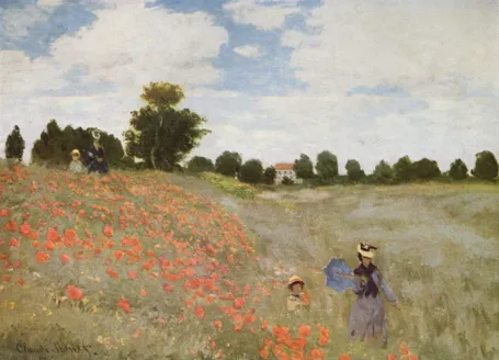
Nature and artists are still better at producing certain colors than computers. Look at the famous painting Poppies at Argenteuil by Monet. If you were the pick the blue green color and copy the RGB values into your PowerPoint presentation, the result would be dull. The rhythm of the brush strokes adds something.

In spring, there are many flower fields like these in Israel. The green blue color is created by the contrast between the top and the bottom of the leaves: grey green and yellow green. The wind moving the leaves creates the color effect. In an earlier post I discussed a painting by Jan van Eyck with a similar effect of alternating and interacting colors.

This painting is also a great example of how to create movement in a static image. The horizon and the diagonal line between the two ladies set the composition. Look how the red flowers are blurry dots of paint without much detail, and how they get incredibly big close to the front. Flowers in the wind never sit still, but rather we watch them go round, leaving a much bigger impression than the space they actually occupy.

This painting has multiple levels of experience, an almost impossible feature to recreate in a PowerPoint slide, but a reminder about what visuals ultimately are: pieces of emotional input. First you see a landscape, then you see things moving in the wind, hear the wind whistling, feel that spring sensation when you venture out of your cold house into the sun and sense your skin warming up from the outside. The bright red, blue green contrast, plus the movements of the children running down the hill might just remind you that life is all about those simple pleasures and moments of beauty.

·Colors

Color management in PowerPoint 2011 for Mac

Slowly I am working around some of the shortcomings that PowerPoint 2011 for Mac has in comparison to PowerPoint 2010 for Windows, and get to enjoy some of the advantages of the Mac platform. One of them is color management.

Built-in to a Mac is a powerful color management picker:

  • With a magnifying glass, you can copy the color of any element on screen and add it as a color to your palette. For example, you can take the colors from your corporate logo to create a matching PowerPoint color scheme. In Windows, I had to rely on other applications (Photoshop, Paint) to do this.
  • Your color palettes are stored across applications, so you set them in PowerPoint, they are available in Photoshop, Keynote, and any other applications you are using.

See this extensive post on robinwood.com on how to use the Mac color picking tool. Thank you Andrew Marritt for pointing me to this.

·Colors

What really matters in PowerPoint template design

The design of the template should be simple: minimal graphics and logos, maximum screen space (see a previous post here). My favorite is really simple: a nicely designed title page followed by a completely white page for the rest of the deck.

So what does matter? The technical PowerPoint stuff that helps thousands of employees with only a very basic understanding of PowerPoint do the right thing. Before letting the genie out of the bottle and releasing a new template to the whole organization check the following:

  • Are the RGB codes of the color scheme coded correctly as standard colors? In 99% of all templates I see, PowerPoint offers the default blue, green, red color options when drawing a shape in a template. Easy to fix.
  • Are the drawing guides set up correctly so that people align objects correctly on the page? There should be guides that align with screen graphics, and guides that help users position objects on the screen. (Earlier post here)
  • Does the standard blank page pop up correctly when hitting “insert new slide”? Most templates are a bunch of example charts that people can use for inspiration. Nobody uses them, every one clicks “insert new slide” and - if not corrected - gets served the standard Microsoft chart with a big title and a hierarchy of bullets in Calibri font. To fix this, go into view slide master, delete most of the template charts on the left side of the screen and carefully re-design the key blank slide with the correct graphics, colors, and fonts. If you have courage, delete the standard bullet page.
  • Are the standard shapes set correctly? Draw a text box, set the font, right click it and set as default shape. Repeat for a shape (rectangle, anything) and focus on the color, the font, the outline, the shadow, etc. Right click and set as standard shape.
  • Are custom fonts embedded in the file? (PowerPoint Ninja post)
  • Are the page-filling images in title pages and separator pages compressed? If not, a presentation of 2 pages can already take up 5MB in hard disk space. Go into the slide master, select the image, and compress image sizes.
  • Are the data charts formats set up correctly? This is a bit more advanced but should really pay off. See an earlier post on fixing issues.
Continue reading →
·Colors

Setting the colors for Excel 2003 users

Increasingly, I use color schemes in Excel models as well. While I am about to switch to Microsoft Office 2010, I find that the majority of my clients (especially the large corporate ones) are still on Office 2003. Buried down in the Excel menus is a feature to set the colors that Excel 2003 users will see when they open files created in Excel 2007.

  1. Click the office button
  2. Go to the bottom and select “Excel options”
  3. Select “save”
  4. Click the “colors” button under “preserve visual appearance of the workbook”