SlideMagic Blog

Frequent updates about all things presentations since 2008. Subscribe to never miss a post.

RSS
all posts

Category Colors

·Colors

Some thoughts about colour

If you use colours correctly, there is actually no need to put your corporate logo very prominently on each page to remind the audience what company they are listening to. Colours will give the page the recognisable look & feel instantly.

Make sure you use the correct colours instead of PowerPoint’s default colour scheme. Your marketing department should have the brand guidelines with RGB codes, and if not, you can “steal” them from a logo image using a colour picker. Try saving them as a template in PowerPoint so you don’t have to go through this exercise for every presentation you start.

You actually do not need many colours for a page to look great. (My presentation design app SlideMagic only allows you to use one). It is important to think about the relative importance of colours. Which colours can you use often, or for large surfaces, and which ones are meant as accent colour only.

Throughout the presentation, try to use the same colour for the same concept. Everything to do with competitor A is always green. The results for the drug are blue, the control group is orange.

Colour can be a powerful tool to group things together on a slide. Especially if objects are far away from each other, using colour is a much better tool than trying to draw connecting lines.

Watch out with the colour red in financial results. Even a huge profit will look like a massive loss when set in bright red.

A light colour is a much better way to give a box contrast than drawing a dark line around it. I hardly ever use lines around shapes.

Continue reading →
·Colors

Colour schemes that work in PowerPoint

I am still breaking my head on this, but some colour schemes look great when you see them presented in a brand guideline, but look dull/boring in PowerPoint. More and more I think that this is because what PowerPoint is: basic slide compositions and boring/neutral Arial/Calibri fonts (especially to keep things readable on mobile devices).

  • Colours that come out poorly: earthy tones: brown, olive, curry, faded red, faded blue
  • Colours that come out great: bright and fresh purple/red, pink/blue, mint green, used as accent colours in compositions that are dominated by grey shades and big black contrasting typography.

One of the nice things about design is that you cannot always explain/rationalise why something “just is not right”.

Art: Peter Paul Rubens, Rainbow Landscape, 1636

·Colors

What software did you use?

That question is a big compliment for your PowerPoint presentation: you have succeeded in making your PowerPoint not look like PowerPoint. Here are some simple steps that can help you:

  • No hierarchical bullet point texts (if you have to put three messages use 3 grey boxes with a short sentence)
  • Switch the standard Microsoft Office font Calibri typeface for Arial (other exotic fonts will cause issues on tablets)
  • Avoid the standard Office colours (blue, faded red, faded olive) and use your own colour palette, also in data charts
  • No dirty gradients, drop shadows
  • No heavy graphics and/or colours behind the title or at the bottom of your slides
  • Create many slides with page-filling images
  • Remove the default clutter of data charts (tick marks, etc.)

The same applies to Apple Keynote. Although a standard Keynote slides looks a bit better than a standard PowerPoint slide, Keynote also has ugly defaults (colours, texture fillings of data charts).

·Colors

Fix the PPT for Mac colour bug

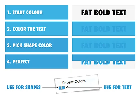
The colour rendering bug in Microsoft PowerPoint 2011 for Mac is highly annoying. Here is fiddly a trick to get around it. You basically need to goal-seek the text colour into something you like.

  1. Pick a colour you like, draw a shape and fill it with the colour
  2. Write some text in a big bold font and set it to the same colour: PowerPoint will render it incorrectly
  3. Here is the fiddly part: repeat steps 1-3 until you are happy with the TEXT COLOUR.
  4. Now, use the Apple colour picker to strip the colour of the text

Save your colour template with 1 accent colour for text, and one accent colour for shapes. In your drop down menu they will look different, on screen they will look the same.

Note 1: I tested the PowerPoint RGB colours as well in Photoshop and Illustrator, and it turns out that PowerPoint renders the shape colours incorrectly, the text is correct.

Note 2: There is a more analytical way to get your desired colour than simply trial and error. You can analyse the RGB codes of the background colour and the text colour. So, set the shape colour to something that you would like. Write down the RGB codes. Colour the text with that colour, and pick its colour with the colour picker. Write down the text RGB codes. Analyse the difference between the two colours and create a third colour by adding/subtracting the R, G, and B differences between the colours. This will be your text colour that renders the same as the desired shape colour. It all sounds more complicated than it is.

Continue reading →
·Colors

PPT 2011 for Mac color bug

Microsoft PowerPoint 2011 for Mac has an annoying bug: when you apply a colour to a font, it comes out slightly differently than when you apply the exact same colour to a shape. One: it looks bad on slides, two: it gives surprises when you open a PowerPoint file created on a Mac on a Windows machine (which does not have the same issue).

When I posted about this somewhere on a Microsoft forum I got the response that this was done on purpose; to make text readable against a coloured background. This does not make sense, if I want to make the text readable, I will put in a different colour myself, and definitely not the one that Microsoft is using. See below, the letter colour is a completely different type of blue than the background.

(Geek alert). There is a complicated way to get around it. Type some text, change it to the desired colour. Now select the desired text (not the entire sentence) and bold it: the right colour appears… But, as soon as you do anything else to your text box, the wrong colour gets put in. Annoying…

·Colors

Lighten up

It can be tempting to splash on the colours in a slide design, especially if you have a colour palette with 3 or more colours. The result: highly colourful slides that still look very “PowerPoint”.  Why does the work of a professional designer not look like PowerPoint?

The secret: only use colour or highly contrasting greys (dark on a white background, light on a dark background) when you want an object to pop out. Use one base colour frequently, and reserve all the others for accents. Use light shades of grey, rather than filling a big slide object with a very dark grey. Consider using dark grey for your font colour instead of pitch black.

·Colors

Too much colour (2)

Following frequent requests after my previous post, I have included a picture here that shows the concept of the narrow coloured bar replacing a fully coloured slide object.

·Colors

Too much color

Colours brighten up your slides and are a great way to group related items together: USA is green, Europe is blue, Asia is purple for example.

But applying bold colours to big text boxes makes your slides too busy and nervous. Instead, keep those text boxes light grey and add a very narrow colour box attached to it at the left side, almost like a fat line.

·Colors

PowerPoint template mix up

Copying PowerPoint slides from one presentation to another can have disastrous format implications. Some survival advice.

  • When saving/defining a new PowerPoint theme, stick to the suggested colour uses that PowerPoint suggests, i.e., text/background dark should be a dark colour for example. If you move slides across between templates in properly defined colour schemes, the damage will not be that big
  • Make sure you copy slides into the file with the desired template and not the other way around. Sometimes this might require you to create a 1-slide presentation in your preferred template, and then copy the 35 other slides into it.
  • There is a way to merge PowerPoint slides and keep their original formatting, see an old blog post on the subject.
  • At the top left corner of the ribbon is a layout button that opens a drop down menu of slide formats that are present in the master. Use to to correct disasters.

Good luck!

·Colors

Presentation template recipe

Here is an almost sure recipe to get a good look and feel for a presentation template, even with an Arial font:

  • One nice accent colour, but used sparsely for only that: provide an accent
  • The other objects in shades of grey, using relatively more light ones than dark ones
  • Text in dark grey, not black
  • No lines around shapes, let the color (i.e., grey) do the work
  • Everything flat: no shadows, no gradients, no reflections
  • Black & white images only