SlideMagic Blog

Frequent updates about all things presentations since 2008. Subscribe to never miss a post.

RSS
all posts

Category Books

·Books

Book review - "Just my type"

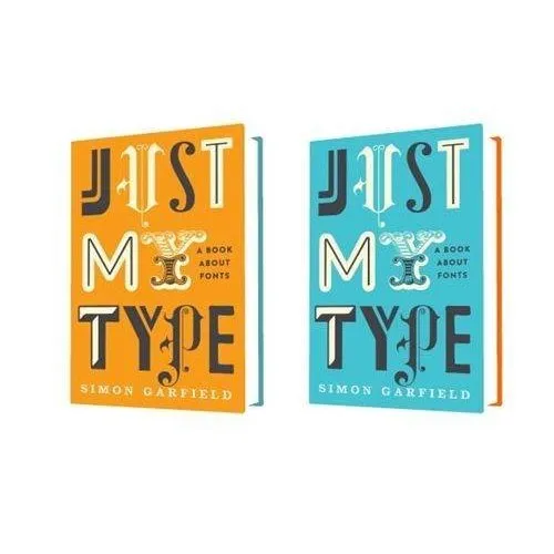
Most books about typography and graphics design are nicely illustrated reference books full of theory. Just My Type: A Book About Fonts (affiliate link) by Simon Garfield is different; through a number of stories and anecdotes you a get a wonderful introduction to the history of typography.

It is a great read: both informative and entertaining. A more extensive review of the book in the New York Times. I purchased the book for my Kindle/iPad to save delivery time and charges to Israel. If you live closer to Seattle, I would suggest you buy a paper version to get a better view of the font examples inside the book.

·Books

Book review: 20th-Century Type

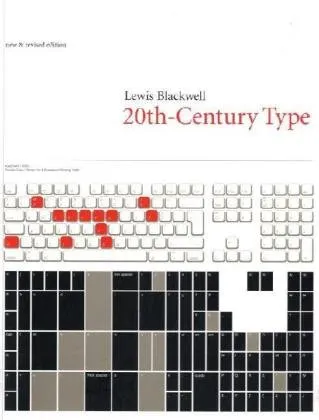
The book Twentieth-Century Type (affiliate link) by Lewis Blackwell gives a history of type fonts developed in the last century. I found it useful because it puts all the names of the fonts that sit on your computer into a historical time line:

  • Books copied by hand in the middle ages
  • Metal setting: serif fonts
  • Bauhaus aesthetic and sans serif type
  • Photo setting, advertising, display fonts and using fonts as elements in abstract compositions
  • Desktop publishing

Professional graphics design has made quantum leaps because of technology. I find a mirror of this in my own personal development in design from starting to experiment with typography in the time of WordPerfect to 2011 where I am getting interest in applying poster design concepts into PowerPoint.

·Books

U-turning on custom fonts

I used to recommend to stick to standard Windows fonts in order to avoid compatibility issues when presenting on other computers than your own. I am changing my mind, the risk of technical issues is still there, but the benefits of custom fonts is much greater.

Standard PC fonts (Times roman, Calibri, Arial, etc.) just do not look good. In dense body text, this is not such a big deal. But as PowerPoint slides get fewer and fewer text, their design start to look more like a poster with big headlines. And in posters, typography is a huge deal.

This post on the PowerPoint Ninja blog explains how to overcome compatibility issues by embedding your custom font inside the presentation. When you send it to someone else, she will see the correct font.

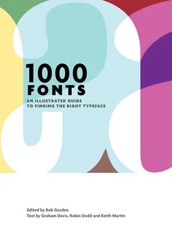
You can find your inspiration for fonts on one of the many fonts web sites, paying close attention to the small prints in books (they often mention which font was used) or through books like this one that I picked up in a Tel Aviv book store: 1000 Fonts (affiliate link).

·Books

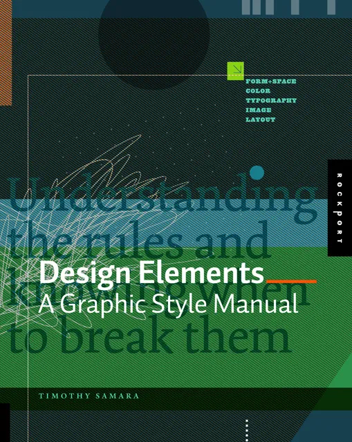
Book review - Design Elements

Recently, I have picked up a lot of books about graphics design and typography. Design Elements: A Graphic Style Manual (affiliate link) is a book that takes all the basic principles of graphics design one by one. It is built around 20 reminders for designers. Reminders and not rules, because designers have the opportunity to break them (see the cover of the book with 2 paragraphs of text put on top of each other).

Most books about graphics design use an incredibly complex language to describe visual concepts. This books is no exception. Rather than try to translate the text into concepts, I skimmed the prose and focused on the many beautiful illustrations, images, examples, and their explanations.

Things that I was reminded of (not as a graphics designer, but as a designer of business presentations in PowerPoint):

  • Think of which fonts you use (I am u-turning on earlier assertions that you should only use standard fonts in PowerPoint to avoid technology issues)
  • Pay attention to the style consistency across pages in a presentation beyond just colors. Other things to watch are placement of objects, style of images, the way images are displayed, etc.
  • Make sure your slide looks elegant, maybe even by reducing the font size somewhat and creating more white space around the slide. Margins do not have to be set at 0.4 inch all the time.
  • Use color carefully, instead of “which color of the scheme have I not yet used on this slide”-type thinking, think about the distribution of light and dark, ask yourself where color is needed, and then pick the one that supports the slide message best.
  • Try to incorporate rhythm in the design of a slide.
Continue reading →
·Books

Book review - "Resonate"

Anyone interested in presentation design will have heard about or bought Nancy Duarte’s latest book: Resonate. I managed to read it over the weekend, here are my impressions.

While her previous book slide:ology was mostly about slide design, Resonate is about stories, stories that get your audience to change their perspective, and take action, do something, change something. It is actually the right order of learning how to become a good presentation designer: first acquire the skills to visualize a single concept in a chart, then focus on weaving those charts together to build a powerful story.

This is what I see happening around me. The current Slideshare presentation of the year competition shows that thousands of people have acquired the skill to make “stunning visuals” using images. But most story lines are still relatively simple: sequences of chars showing how big something is, or sequences of images that show emotions/feelings that we all recognize. Great movie directors or authors posses the art to take you along a more complex path  that will change you and the perspectives you have of the world. This is what Resonate is trying to get to.

Slide:ology is a reference book that I still use when designing slides, Resonate is different. It is a book with an idea, looking at the cover on the book shelf will remind you to check whether this is the best story line you could come up with

Large parts of the book are written using reverse engineering, analyzing great presentation and speeches and see why they had so much impact on their audiences. But on top of that, Nancy threw in her own presentation design experience, and embarked on a significant research effort in areas such as movie scrip writing and classic rhetoric. A few of the interesting points that were highlighted in the book (just random examples, not a MECE (what’s this?) summary of the book’s contents):

Continue reading →
·Books

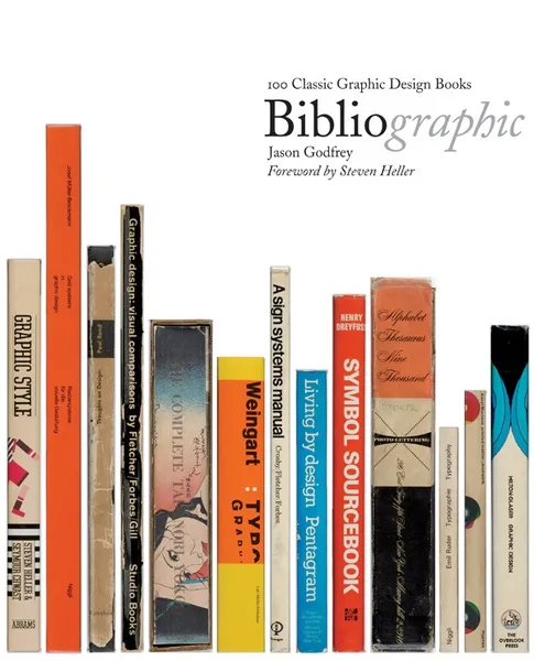
Book review - "Bibliographic"

I stumbled on this book: Bibliographic: 100 Classic Graphic Design Books in a Tel Aviv book store the other day. The vast majority of recent books on graphics design are meant to be “eye candy”, sitting on coffee tables without being read in detail. What a joy it is therefore to go back to older titles.

This book lists 100 important books on graphics design and typography. Each book is discussed, put in its historical context, and highlighted with an image of the cover and  a few page spreads.

It is striking to see how only a few decades ago, graphics and type still looked so basic. But equally important is the realization how the current overdose of computer-generated images and decorations detracts from the basic purpose of a poster or a slide: convey a message. When people just had type and basic shapes as design tool, it forced them to make the most of them. I find myself in a similar situation, armed with PowerPoint, fonts, images but without the graphic artillery of sophisticated Adobe Illustrator designs. Looking some of the designs from the 30s or 60s convinces me that I can do without this back up.

Some books discussed in the book are still in print, and I have added a few to my wishlist:

Continue reading →
·Books

Learning from ancient folk stories

I was just reading some stories from Nelson Mandela’s Favorite African Folktales(affiliate link) to my kids and realized how much you can learn from them to create short anecdotes that fit inside your bigger presentation:

  • Very short
  • One to three simple (almost stereotypical) characters
  • Something happens at turn 3. “On the 3rd day…”
  • An unexpected twist at the end: “and this is why monkeys became so good at climbing trees”

These tales were designed to be remembered and passed on for generations. How long does your slide deck stick?

·Books

Where good ideas come from

I am joining in the viral marketing campaign of the new book Where good ideas come from by Steven Johnson (affiliate link)

Video of his TED talk published today:

Shorter video highlighting the idea in his book with a good use of cartoon-style drawing:

·Art

Christoph Niemann and LEGO presentations

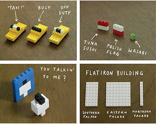
Christoph Niemann (web site) is a highly talented artist whose illustrations have appeared on magazine covers ranging from the New Yorker to Wired. He posts on a regular basis on his blog in the New York Times, where this set of cartoons based on Google maps caught my attention.

He recently published a new (board) book with snap shots of New York modeled in Lego bricks: I LEGO N.Y. (affiliate link). A sample image below.

Now here is a presentation challenge: construct your entire presentation in tiny Lego scenes, photograph them and paste them into PowerPoint. Not as crazy as it might sound.

UPDATE. One of my readers, Daniel Cabrera, used LEGO images to construct a presentation for a university project. In this case, the images were sourced from the web.

391 city workforce

·Books

Browsing for books about design

The Internet and the place I live (Israel) have cut me off of those great large book stores where you can browse endlessly for books you did not know you missed.

Presentation blogs (this one included) often talk about the same limited set of books about public speaking and presentation design. Here is a list of design books compiled by graphic designer Jason Santa Maria full of titles that look really interesting.

Found via SwissMiss. Image credit Google LIFE, an excellent source of images for non-commercial use.