SlideMagic Blog

Frequent updates about all things presentations since 2008. Subscribe to never miss a post.

RSS
all posts

Category Books

·Books

Most of your slides are a grid

In some presentation slides, the grid is obvious: a data table is an example. But also without the explicit lines of a table structure, you can recognize a grid in almost any composition you make. A diagram, the positioning of boxes on a slide, even a big picture with a few words of text. Recognize the grid structure, imagine the hidden lines and make sure everything lines up and is spaced out nicely. It will make for a much better slide composition.

If you are ready to dive in to hard core literature on the use of grids in graphics design, I can recommend the 1981 book Grid Systems (affiliate link) by Swiss graphics design master Josef Mueller-Brockmann(some of his poster design are in this Flickr set). The big issue for print designers is to juggle around text columns and images. Presentation slides are a bit different, but still the conceptual approach applies to them as well.

·Books

Visual memory

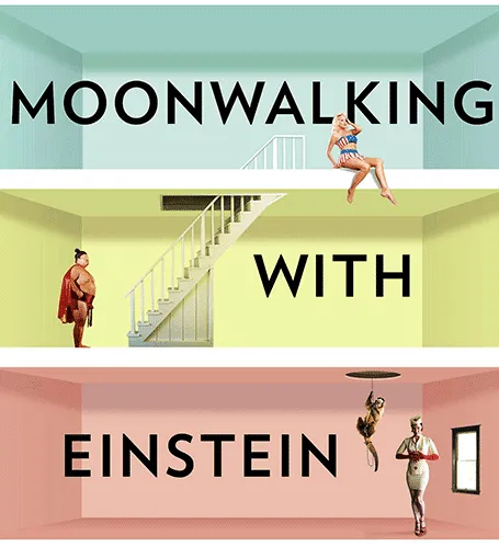
A year after discovering it, I finally got around to reading Moonwalking with Einstein(affiliate link), by Joshua Foer. A journalist gets fascinated by memory championships, and takes on the challenge to participate himself. On the way he explains how to train your memory, and puts memory in a historical context.

Why am I interested in these types of books? Presentations are all about helping people remember your story. We all know that forcing people to remember bullet points be repeating and repeating and repeating them does not work. The brain needs a visual story around which to store your message.

And it turns out that is exactly what memory champions do. They commit random numbers, names, facts, to rooms in virtual memory palaces in their brain. These palaces are often based on places the contestants know very well: a home, a school, a library. In these rooms, the objects are placed in the most outrageous (memorable) ways possible, including smells and sounds. After you put everything there, you can simply take a walk in your virtual memory palace and see all objects in front of you.

Scientists now think that the brain actually never forgets anything (capacity: 10-100TB). The problem is accessing the information. The brain needs an emotional stimulus (smell, visual) to unlock its memory. Slightly different than a indexed memory access of a computer. People think that we are so good at remembering places, locations, stories is survival: how to find a place with food, and then more importantly, how to find the way back home was a more useful skill in the stone age than remembering phone numbers.

Continue reading →
·Books

Apple iBooks and presentations

Two main take-aways from the announcement by Apple yesterday about the new platform to design and publish interactive books for the iPad:

  1. It removes the excuse that the lizard brain inside me used so far to stop me from writing a book: the thousands of dollars and months in training I would have to invest to port an InDesign document to a working iPad app. Here you go, I committed publicly.
  2. This platform can be fantastic to write investor and sales pitch documents for one-on-one meetings or sending to a prospect before you meet face-to-face. The standard for the boring text “Executive Summary” just got raised in such a way that people might actually start to read them.

·Books

Book: The a-z of visual ideas

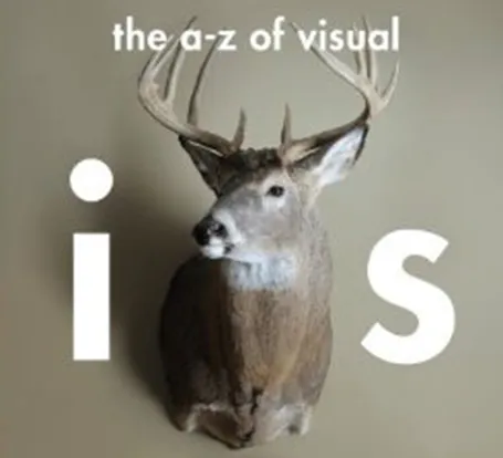
An A-Z of Visual Ideas: How to Solve Any Creative Brief (affiliate link) by John Ingledew, aims to help you solve visual creative deadlock. Organized in 26 sections following the letters of the alphabet, it introduces a number of concepts that you can use as the basis of your design. Examples: counter-intuition, eyes, juxtaposition, and zeitgeist.

It is written more with advertising or poster design in mind, but still it can help you broaden your creative mind with the concepts provided in the book, or by encouraging to think out of the (visual) box yourself.

·Art

Lessons from Vidal Sassoon

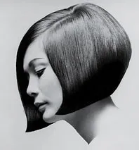
I am continuing my quest through the long tail of Netflix design movies and stumbled on this one: Vidal Sassoon the Movie (affiliate link) about the famous hairdresser. In itself, his story is very interesting, growing up poor in an orphanage, and becoming a global celebrity.

For me, there were two things that I found especially interesting.

  1. It took him 9 years to find his signature style that would change the way women looked (and thought of themselves) in the 60s. Design is hard work, even for the best and most talented among us.
  2. He says that it is easy to see when something is wrong, but very hard to come up with something that is right.

This is exactly the case in slide design as well (at least for me). Learning to design is going through lots of your own failures, eliminating stuff that is not right, leaving you with the things that do. One way to accelerate the process is to plough through design books and absorb anything design around you. It increases the odds that you will bump into something that works.

·Books

Book review - The visual dictionary of typography

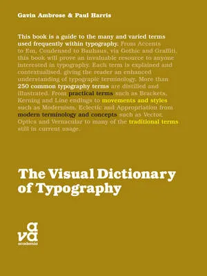
The Visual Dictionary of Typography (affiliate link) is a nice little book that explains 250 concepts in typography, each using a visual example. Dictionary is the wrong title, this is not a reference book, but rather something to browse through and explore. I stumbled on many terms that I have never heard of before. On the other hand, the book also contains some entries that are a bit forced: music for example.

Here are the entries for the letter V to give you an example of the contents:

  • Vector
  • Vernacular
  • Vertical alignment
  • Virgule

All in all a nice little book, I would get it in print rather than as an eBook.

·Books

New French presentation Bible

Recently, I received a review copy of  L’art des présentations Powerpoint, by Bernard Lebelle, a frequent commenter here on the blog. A very interesting book (obviously for those who can read French).

L’art des presentations PowerPoint

My first impressions:

  • Besides the big presentation and speaking insights (often covered in many other books on the subject), this book is a treasure of smaller insights, many of them illustrated with a little diagram or a quick scribble. Almost like reading a constant flow of interesting blog posts. My French is probably not good enough to read this book from page 1 to 386, but the layout with the bite-size illustrated tips and tricks enables me to digest much of the content.
  • It covers a broad range of subjects, all the way from speaking suggestions down to the basics of typography and detailed suggestions on how to use the PowerPoint software
  • Bernard integrates concepts and ideas from many sources (books, web sites) with clear references to them for further reading.

Congratulations Bernard.

·Books

Book review - "Thinking with type"

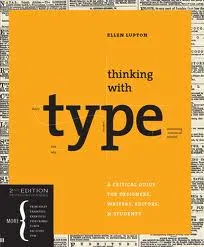
Regular readers will have noticed that I am reading up on typography lately. Some basic understanding of typography can improve the quality of your presentation designs dramatically. The book Thinking with Type (affiliate link) by Ellen Lupton is one of the most useful ones I read so far. Clear explanations of all the basic concepts with great examples. It comes with great online resources on the Thinking with Type website, covering a lot of material of the book. (See the type crime section, and how I use the wrong quotation marks all the time on this blog).

Earlier reviews of typography books:

  • Just my type, stories about the most important fonts and their designers, useful information, entertaining reading (and great dinner party stories).
  • 20th century type, a more scientific overview of fonts and designers of the past century.
  • 1000 fonts, just what the title says
  • Design elements, a broader review of graphic design concepts
  • Bibliographic, an overview of classic graphic design books
·Books

Recommended presentation design books

What are the best books about presentation design and public speaking

Some good books about presentation design, public speaking, graphics design, and art. If you click on an image, you will be linked through to Amazon where you can buy the book. We use affiliate links and receive a small commission when you purchase a book through this site.

You can find reviews of presentation design books that I posted on the blog here.

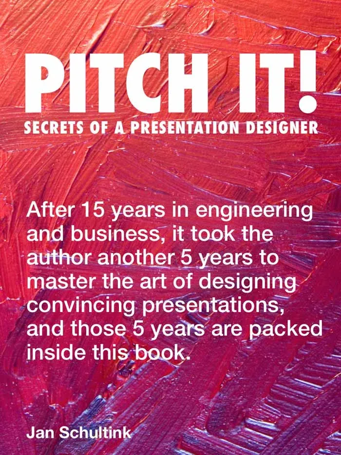
Pitch It! by Jan Schultink, my own book about all things presentation design. The book can be accessed free online here.

Presentation Zen by Garr Reynolds started the revolution in presentation design, transforming bullet point slides into visuals with images. Read my review here (2008).

Design Elements by Timothy Samara takes you through the basics of layout and typography. Read my review here (2010).

Resonate by Nancy Duarte has good instructions on how to design a captivating story that gets your audience to do something, take action after they walk out of the auditorium. The iPad version is free. Read my review here (2010).

Slide:ology by Nancy Duarte is a good general introduction to presentation design and delivery. Read my review here (2008).

Continue reading →
·Art

Going beyond the presentation screen borders

A long introduction to the post today. You can skip the plot sideline and go straight to the end if you want.

It seems that many visual artists that somehow documented the thoughts behind their work reach higher levels of fame. One example is Vincent van Gogh, who through the letters to his brother Theo gave us a lot of background on his art. Vincent van Gogh spent some time in this white house in the same street I grew up in the Dutch town of Hoogeveen, and it is striking to see how his descriptions of the place, the features and character of the people still applies today (except for that people there have moved on from living in huts). His subsequent transition from the cold/dark Netherlands to the bright Mediterranean is another interesting parallel I share with the painter.

Vincent Van Gogh, farm house in Hoogeveen

Recently, I have been reading a biography about Robert Irwin, an American artist starting off with expressionist paintings to move on to minimalist, large art installations. The book Seeing Is Forgetting the Name of the Thing One Sees (affiliate link) provides lots of his personal perspectives behind his own work, but more importantly about art in general. I have changed the way I like at art after reading it.

Irwin wonders why art ends with the frame of the painting. He wonders why art ends with the room the painting/installation is exhibited. Art and beauty is all around us, we just need to be able to perceive it.

“But paintings are like what you can barely make out through a keyhole compared with the richness of perception that’s just waiting there in the world to be experienced all the time. […] It’s strange. With food, for instance, people seem to understand what’s involved: you savor the taste rather than just feed the body. But people have a hard time understanding that it should be the same way with visual experience.”

Continue reading →