SlideMagic Blog

Frequent updates about all things presentations since 2008. Subscribe to never miss a post.

RSS
all posts

Category Art

·Art

Lessons from Vidal Sassoon
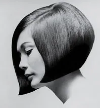
I am continuing my quest through the long tail of Netflix design movies and stumbled on this one: Vidal Sassoon the Movie (affiliate link) about the famous hairdresser. In itself, his story is very interesting, growing up poor in an orphanage, and becoming a global celebrity.

For me, there were two things that I found especially interesting.

  1. It took him 9 years to find his signature style that would change the way women looked (and thought of themselves) in the 60s. Design is hard work, even for the best and most talented among us.
  2. He says that it is easy to see when something is wrong, but very hard to come up with something that is right.

This is exactly the case in slide design as well (at least for me). Learning to design is going through lots of your own failures, eliminating stuff that is not right, leaving you with the things that do. One way to accelerate the process is to plough through design books and absorb anything design around you. It increases the odds that you will bump into something that works.

·Art

Every sentence should matter

I recently made the switch back to literary fiction after it took me around 25 years to overcome the bad memories of high school teachers forcing me to read this genre against my will.

Reading these books showed me just how empty corporate language is. Over the years I have developed a pretty high speed-read rate. Non-fiction books, annual reports, PowerPoint bullets can all be digested in very limited time without missing a beat of the content.

So, when I tried to apply this to literary fiction I was forced to back up. Every sentence actually matters. The world would be a much better place if corporate language stuck to this principle.

·Art

Monet, poppies, and color rhythm

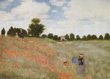
Nature and artists are still better at producing certain colors than computers. Look at the famous painting Poppies at Argenteuil by Monet. If you were the pick the blue green color and copy the RGB values into your PowerPoint presentation, the result would be dull. The rhythm of the brush strokes adds something.

In spring, there are many flower fields like these in Israel. The green blue color is created by the contrast between the top and the bottom of the leaves: grey green and yellow green. The wind moving the leaves creates the color effect. In an earlier post I discussed a painting by Jan van Eyck with a similar effect of alternating and interacting colors.

This painting is also a great example of how to create movement in a static image. The horizon and the diagonal line between the two ladies set the composition. Look how the red flowers are blurry dots of paint without much detail, and how they get incredibly big close to the front. Flowers in the wind never sit still, but rather we watch them go round, leaving a much bigger impression than the space they actually occupy.

This painting has multiple levels of experience, an almost impossible feature to recreate in a PowerPoint slide, but a reminder about what visuals ultimately are: pieces of emotional input. First you see a landscape, then you see things moving in the wind, hear the wind whistling, feel that spring sensation when you venture out of your cold house into the sun and sense your skin warming up from the outside. The bright red, blue green contrast, plus the movements of the children running down the hill might just remind you that life is all about those simple pleasures and moments of beauty.

·Art

Art Authority for Mac

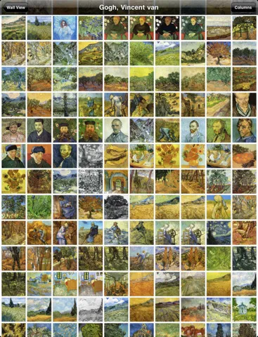
I reviewed Art Authority, this great art catalogue for iPad earlier, and I just bought the same application for the Mac.

The bad news, the user interface is a lot worse than the iPad. You browse art in finder windows, sometimes via HTML pages.

The good news, working with the images is a lot easier. Since a good keyword search mechanism is still missing, a very large monitor makes it easier to browse icons of paintings. You can have multiple thumbnail windows open, and leave them open for a long time.

Ten dollars well spent. Twenty dollars well spent if you buy the iPad app as well.

·Art

Going beyond the presentation screen borders

A long introduction to the post today. You can skip the plot sideline and go straight to the end if you want.

It seems that many visual artists that somehow documented the thoughts behind their work reach higher levels of fame. One example is Vincent van Gogh, who through the letters to his brother Theo gave us a lot of background on his art. Vincent van Gogh spent some time in this white house in the same street I grew up in the Dutch town of Hoogeveen, and it is striking to see how his descriptions of the place, the features and character of the people still applies today (except for that people there have moved on from living in huts). His subsequent transition from the cold/dark Netherlands to the bright Mediterranean is another interesting parallel I share with the painter.

Vincent Van Gogh, farm house in Hoogeveen

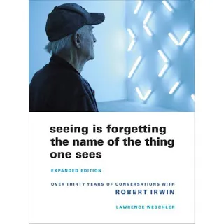
Recently, I have been reading a biography about Robert Irwin, an American artist starting off with expressionist paintings to move on to minimalist, large art installations. The book Seeing Is Forgetting the Name of the Thing One Sees (affiliate link) provides lots of his personal perspectives behind his own work, but more importantly about art in general. I have changed the way I like at art after reading it.

Irwin wonders why art ends with the frame of the painting. He wonders why art ends with the room the painting/installation is exhibited. Art and beauty is all around us, we just need to be able to perceive it.

“But paintings are like what you can barely make out through a keyhole compared with the richness of perception that’s just waiting there in the world to be experienced all the time. […] It’s strange. With food, for instance, people seem to understand what’s involved: you savor the taste rather than just feed the body. But people have a hard time understanding that it should be the same way with visual experience.”

Continue reading →
·Art

Review: Art Authority for iPad

I often use paintings as an inspiration for slide design. Sometimes you can actually use the actual painting itself, but more often, I use a painting to borrow a color scheme (earlier post).

There is  a big problem with art books: it is hard to browse vast quantities of images quickly, slice and dice art works by artist, time, genre. A good painting requires time to appreciate, once you found it. However, the finding is the difficult bit.

The iPad is a wonderful device to navigate huge image data bases (earlier post). I am a bit late to discover Art Authority for iPad, an application that make this a reality for art. Over 1,000 (Western) artists, with each painting properly documented plus links to Wikipedia for more information.

Most art books show the same “greatest hits” paintings, not spending paper on less well-known works by artists, paper publications cut off the long tail. Not with Art Authority that shows works beyond the beaten path.

$10 well-spent.

·Advertising

Portraits that do not really look you in the eye

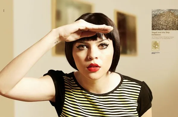
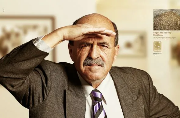
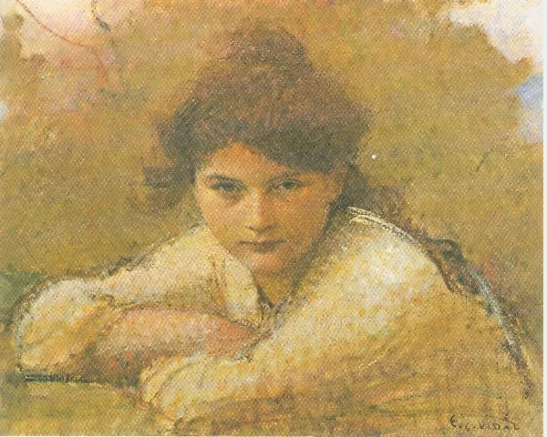
Stock images libraries are full of pictures of models that look towards the lens, but are not really look at you. The man in these ads does better than the woman (maybe the squinting, or his age), but it is hard to beat a painter’s ability to get those penetrating eyes.

The ads were taken from Ads of the World. The painting is “Girl resting on her arms” by Eugene Vidal (1847-1907), Oil on canvas, 47 x 59 cm.

·Art

The secret to great presentation design is...

The bar has been put higher and higher over the past years:

  • Everyone is now able to put text and charts in PowerPoint and project them on a screen
  • (Almost) everyone has discovered where to get beautiful page-filling images
  • Many people have figured out how to clean up a messy data chart
  • More and more people are learning to apply professional typography (PowerPoint gets a bit closer to Illustrator with every release) and coherent color schemes

What is left that is hard to do is the “art part”. It can never be automated. Sequencing the right story, knowing what to cut, what to keep in, picking the right analogies, selecting the right images, picking the exact right data visualization option…

·Art

The real photographer and the stock photographer

Clicking through some of the black and white images on this incredible page on Smashing Magazine shows you once more the difference between an average stock image and a photograph taken by an artist.

This image is by Andrzej Laskowski

·Art

Every slide starts with a sketch

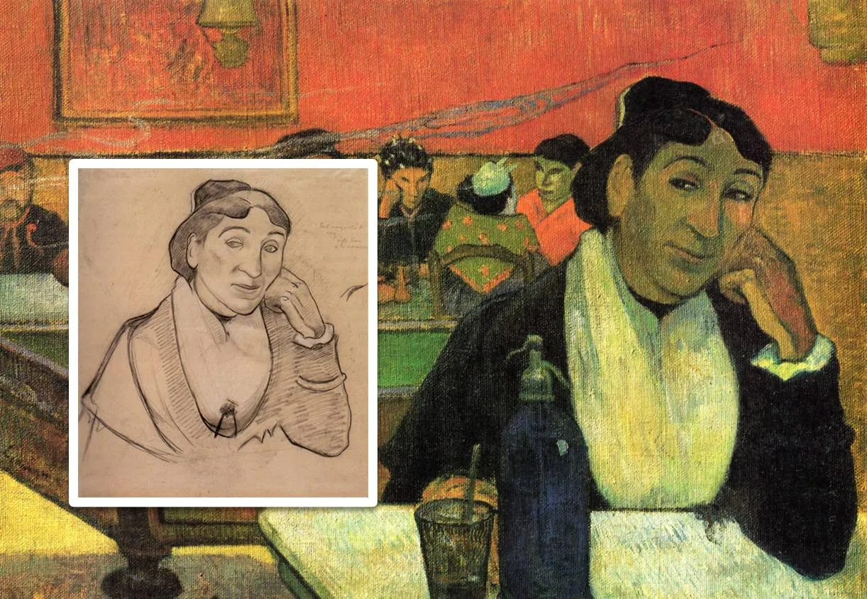
Painters first make a sketch before starting the final painting. Presentation designers should do the same. I have a big pile of old print outs that is my unlimited source of scrap paper. An important slide can take 5-10 page-filling rough sketches before turning to the PowerPoint editing screen.

I always carry one of these beautiful notebooks (affiliate link) with me to capture an idea that pops up in my head. Yes, a notebook and not an application such as Evernote on my iPhone because the idea is most of the time a sketch or a scribble. Hard to do in digital format.

The end of my most productive/creative days are always marked with a full paper trash can next to my desk.

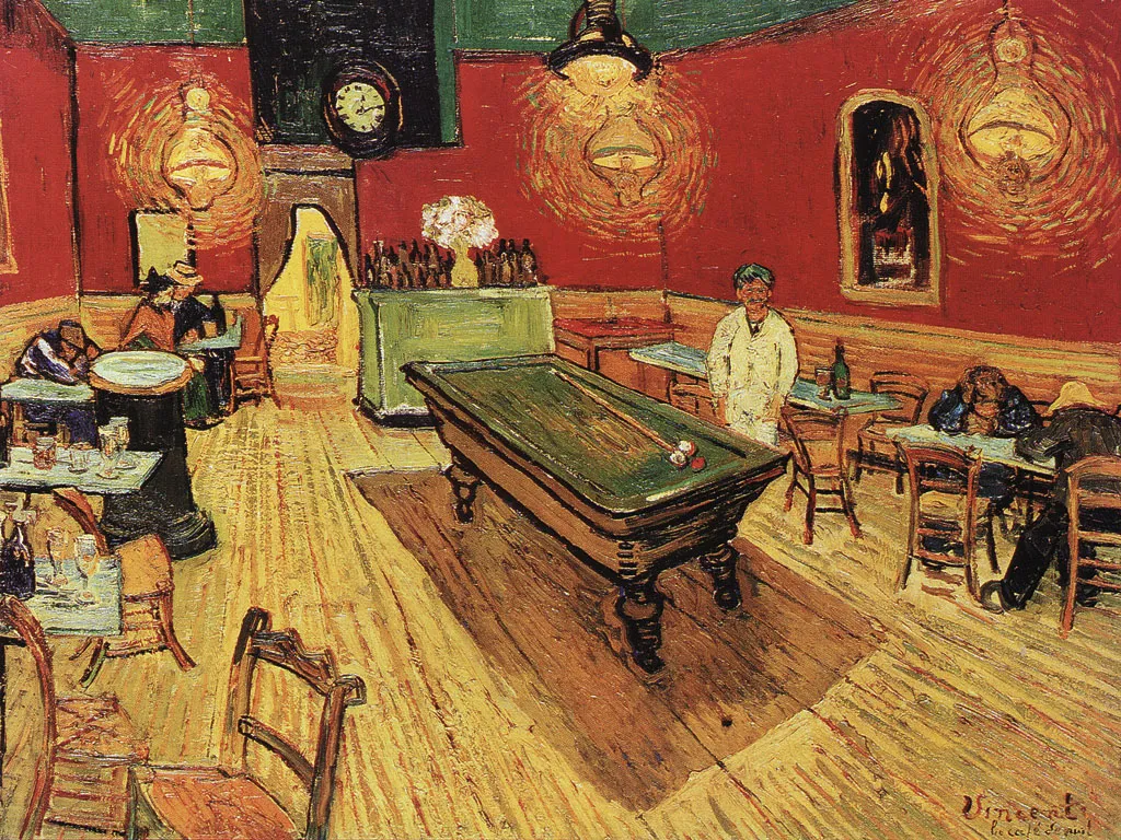
The painting is Gauguin’s night cafe, info about him and Van Gogh painting at this location here and here.