

I am more and more fascinated by design lessons from consumer advertising billboards. Take this ad for Tango (a UK soft drink):
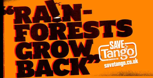
First of all the message. Confident, huge font, but the reader will discount the message completely “yeah right”. But it makes you think.
Then the typography. It almost hurts. Like watching a broken television screen. The onset of a migraine aura. Looking through the corner of your glasses and see how the lenses distort colors because of light refraction.
I argued before that slightly irritating the senses of your audience can help get your message across.
How did the typographer (Chris Chapman) do it? Clashing colors. Full orange background. Bright red shading. Colors that are very close on the color spectrum, but not similar. Like hitting 2 adjacent keys on a piano (harmonic dissonance). Grunch letter fill (hard to imitate in PowerPoint).
More on working with color wheels in a later post.
Via Ads of the world.
UPDATE after a comment. People should not misunderstand me. Any dissonance effect should serve a purpose. Simply screaming out a message does not make it stick. However, certain “painful” situations can be supported by a (one) “painful” chart.
2 comments
Yes I think that these techniques should be used sparingly not to give your audience a headache.
Your basic color scheme that you use for every slide should be elegant, calm and pleasing.
I am just encouraging people to step out of the mental box in PowerPoint. Using quality images is one. Using simple typography effects is another (huge font, red shading, rotate 15 degrees and you're done).
Any dissonance effect should serve a purpose. Simply screaming out a message does not make it stick. However, certain "painful" situations can be supported by a (one) "painful" chart.
I am not sure I would want to do the same to my PPT audience. I have more time and opportunities to convince them of my message. If I give them a headache are they still willing to receive my message?