Infrequent postings...
I will be spending time away from my desk over the next few weeks, posts will be less frequent than usual. I hope all of you are having a great summer as well.
Cover image by Maxwell Gifted on Unsplash


Frequent updates about all things presentations since 2008. Subscribe to never miss a post.
I will be spending time away from my desk over the next few weeks, posts will be less frequent than usual. I hope all of you are having a great summer as well.
Cover image by Maxwell Gifted on Unsplash
This was the title of a recent article in the Economist. (The link is behind a paywall*). The general idea is that corporate mission statements are all the same, and are totally not credible. A company’s mission and values is communicated by how it behaves, not what it says on the web site.
What does it mean for presentations? Putting your company’s mission statement on page 1 is unlikely to get your audience to move to the edges of their seats.
Cover image by Marc-Olivier Jodoin on Unsplash
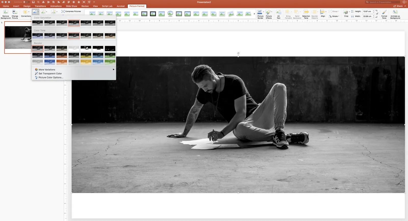
Design mistakes happen to the best of us. See this screen shot of a blog post from a few days ago. The image the looks black and white, is actually not black and white. It is always good to remove all colour from all images, even when they appear to be black and white already.
In PowerPoint you do this in picture format - colour, see the screen shot below.
Cover image by Oleg Laptev on Unsplash
I thought this comment exchange on a post of a few days ago is worth sharing with all of you:
Disqus embedding is not perfect, here is the discussion:
Question: My presentation looks very formal for a first-level discussions. I need a way to turn presentation to rough sketches. Is there an app or an easy way to transform my formal presentation slides into paper napkin sketches?
**My reply:**I am not sure you need paper sketch-style slides to make your presentation look less formal. I would loosen up the existing design, cutting words, changing language, etc. One way to do this is to find another presentation somewhere with an informal style you like, now copy the style of the template and re-create your existing presentation so that it exactly fits this model. I am pretty confident that in the end, you will discard your “formal” presentation all together and run with your new deck in all meetings (both formal and informal).
If you insist on making “sketchy” presentations, here are two approaches:
Business plans are usually “mechanical” documents: systematic analysis of markets, competitors, economics, milestones, etc… It is the document trail of a strategy consulting project. Hard work, systematic, rigorous (hopefully).
For investors, it can be comforting that you can rest your hand on a beefy pile of paper, she will be confident that you have thought things through as best as you could, and that there is some direction and a sense of budget in that early stage company.
But, business plans make long and boring reads. They are structured as, well, a business plan, not an exciting story. Text is usually written in one go, as information is captured: creating duplications, side tangents, and an excess of buzzwords that were not zapped by an editor. Also, they are often written by more than one person, adding inconsistent styles on top of the duplications.
A good investor presentation (or even a good “business plan edited for investors”), is more like a “voice over” (lots of quotation marks in this post), of they dry exhaustive, duplicate, raw, business plan. Let’s pause on this diagram that shows you exactly what we are doing, now look at this market in a new way, see this picture that shows why all existing solutions are so poor, in this long list of competitors there is this guy we should be worried about, look the CVs of our team, we all have a Phd in [x], yes I know, the obvious, elephant in the room question is [y], the answer is on page 35, etc. etc.
There are 2 types of software approaches for writing add-ins for Microsoft Office applications: so called VSTOs, and web applications. VSTO is the older technology. It integrates deeply into Office and the Windows operating system, code is written in C#. This restriction to Windows is the reason that all PowerPoint plug ins and extensions run on Windows at the moment. The web application API is the newer approach, allowing you to code applications with standard Javascript/HTML.
This has huge advantages:
I have a lot of ideas to extend PowerPoint beyond the current plugins that offer in-app access to stock photo sites but… PowerPoint is at the bottom of the priority list when it comes to API development at Microsoft. Excel, Outlook, and to a certain extend Word, get priority. Specifically, the ability to manipulate slide content is very limited (put text in the currently selected text block, or place an image somewhere on the page).
PowerPoint is the key communication tool that is used in corporates (not Word). PowerPoint is tricky to master (50% to blame on software, 50% to blame on the “eye for design” that not everyone has). Combine these 2 and it is the biggest opportunity for 3rd party developers to make a change to business communication, make a financial return for both developers and Microsoft, and make PowerPoint stand out over Apple Keynote.
The pitch deck is usually the first piece of marketing material a startup needs (“Oh no, we need a logo as well”), next up: the web site.
If your company has not launched yet, and/or your company is not about being a highly interactive game (i.e., the web site is not the product), seed company web sites can be very simple (and easy/cheap) to make.
The objective is to create a credible business card for your company that supports your pitch to investors and/or partners and/or potential customers
A check list:
I am starting to get my head around building applications for Microsoft Office / PowerPoint, and this can be done easier on a Windows machine, so I am now pretty much all day working in a Microsoft environment on Apple hardware. (Don’t worry, the result of the effort will run on Windows and Mac).
The whole Windows experience is fantastic and completely at par with a Mac. As I said in a post before, I now consider PowerPoint to be a better presentation program than Keynote, and PowerPoint for Windows is better than PowerPoint for Mac.
The only issue for me is to get the Apple keyboard and mouse properly integrated with the workflow (scroll directions, knowing where certain keys are, and getting used to the difference between CMD and CTRL). (And… the Logic Pro X music software does not run on Windows).
Cover image by Timothy Eberly on Unsplash
I think the success rate of convincing people in political rants/debates is exactly 0%, and this tweet reminds me of that:
Some things to remember when convincing people:
(* End of rant *)
Cover image by Clem Onojeghuo on Unsplash
I am currently reading the book “How Music Works” by David Byrne (Talking Heads). Off topic: it is a fascinating study about creating and perceiving music, highly recommended.
In the book, he talks about how music software is influencing music creation and draws parallels with what PowerPoint is doing to presentations:
“With the Microsoft presentation software PowerPoint , for example , you have to simplify your presentations so much that subtle nuances in the subjects being discussed often get edited out . These nuances are not forbidden , they’re not blocked , but including them tends to make for a less successful presentation . Likewise , that which is easy to bullet - point and simply visualize works better . That doesn’t mean it actually is better ; it means working in certain ways is simply easier than working in others .”
Byrne, David. How Music Works (p. 132). Crown/Archetype. Kindle Edition.
I agree that a good presentation irons out subtleties and nuances, but I would not call this dumbing down. A 10 minute presentation needs to get the investment pitch done with a very pragmatic objective of getting to the next stage of due diligence. In a sense you can compare it to the hit single with the simple hook that can create interest for the broader work of the artist.
Image via WikiPedia