SlideMagic Blog

Frequent updates about all things presentations since 2008. Subscribe to never miss a post.

RSS

Writing cold VC emails that work

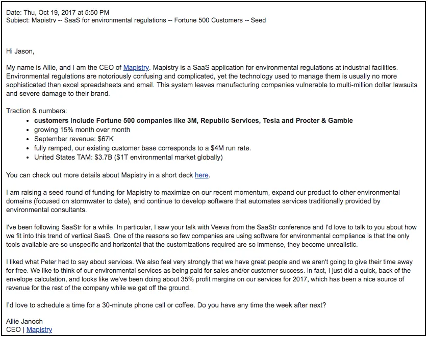
Here is a very good blog post by Allie Janoch about 2 cold emails she sent: the first one got ignored, the second one led to the funding of her startup.

The second email explains what the company is about (surprisingly not all emails do), a tangible description of the problem it solves, meaningful metrics, an explanation why this is a fit for this VC, links for more detailed info, the right length of text, not too generic, not too much, good typography and paragraph spacing.

Cover image by Marius Christensen on Unsplash

"Please pause this video here"

I am watching a lot of tutorial and training videos at the moment, and many of them make the same mistake as the presenter who reads out bullet points.

Usually the introduction of a 10 minute video is an overview slide with 4 lines explaining what the course is going to cover. You read it in exactly 5 seconds, but the video narrator talks and talks and talks around the bullets for ever. Usually somewhere in the comments below is someone who posts a link with a time stamp and says “the real stuff starts here”, followed by lots of thank you’s from other viewers.

Videos are usually not very well scripted, an instructor just talks around the subject (in my case computer code that is edited “live” on the screen). But sometimes, some visual structure can be useful. For example, discussing pros and cons of multiple approaches to a problem, different software solutions, etc. These subjects are usually discussed in a conversational style where the viewer is losing the overall picture at some stage. It is better in this case to put in a very clear overview table where all the options are compared side by side.

For both these scenarios, you could ask your video audience to simply pause the video, asking them to read what is on the screen and press play again when they are done. Now, you can go through this video slide more as a voice over, providing additional comments, rather than feeling the need to read out the content.

Continue reading →
·Investor presentation

4 types of VC meetings

Why did the VC take your meeting after reading the pitch deck that you emailed?

  1. She pretty much understood what you are trying to do from the slides you sent, and is now moving to the next stage of due diligence: figuring out you as a potential new colleague to work with in her portfolio.
  2. She pretty much understood what you are trying to do from the slides you sent, already knows it does not fit her investment strategy, but takes the meeting anyway because of external pressure (someone who referred you for example)
  3. She pretty much understood what you are trying to do from the slides you sent, already knows it does not fit her investment strategy, but gives in to a relentless pressure from you insisting that she is wrong and you have answers for all her questions and doubts.
  4. She did not fully understand what you are trying to do from the slides you sent, and is really looking forward to sit down for an hour to clarity what’s in the deck.

Think about which of these scenarios you are in. Think about which of these scenarios are most likely to happen. Think about what your chances are in scenarios 2, 3, and 4.

Cover image by rawpixel on Unsplash

Updated market numbers

Most companies have them: a slide deck with market size data by geography, segment, etc. Every quarter, half year, year, the source data gets updated. How to present it?

Maybe first: how not to present it. Create a slide for every breakdown in the report before thinking what the data means or is telling you. Then read out the percentages and growth rates page by page to the bored audience.

A better approach. Build an appendix that contains a good overview of all the data in the report. These charts are meant for reading, reference material to look up a number. Because the breakdowns and set up of the data is unlikely to change from quarter to quarter, people will get used to your chart layouts and can find their way quickly in the report.

Now drop the report all together and write down the key market trends you have experienced yourself. Open up your appendix charts and look whether these trends are reflected in the numbers. Adjust your list. Now, and only now, start making charts that back up the key trends you identified. The charts should only present the relevant data, a chart with just 3 numbers could do the trick. For broader context, people can open the appendix.

Cover image by Ricardo Gomez Angel on Unsplash

Back...

I just returned from a most wonderful holiday in Sri Lanka and the Maldives.

Obviously these 2 countries are great holiday destinations with beautiful nature, interesting cultural heritage sites, and great food, but this trip also reminds me once again how the whole world, and especially Asia, is developing and changing rapidly. The more countries I had a chance to visit, the more I see that economic development does not really happen at a country, but at a city/metropolis level. Driving through Colombo, the capital of Sri Lanka, you see development and energy all around you.

Fifteen years ago, I was one of the pioneers to deliver high end design services from a relatively “remote” location (guy in Tel Aviv making presentation decks for New York and SV clients), but as people now get used to this model of working, there is great opportunity for young people with a laptop and an internet connection to do this kind of work also from the more remote villages in countries such as Sri Lanka, not just in the main capital cities. I receive more and more emails from people offering to help me with my work from smaller towns across Asia.

I will pick up my regular posting schedule again and I hope that you also had a great summer break.

Cover image via WikiPedia

Infrequent postings...

I will be spending time away from my desk over the next few weeks, posts will be less frequent than usual. I hope all of you are having a great summer as well.

Cover image by Maxwell Gifted on Unsplash

Mission implausible

This was the title of a recent article in the Economist. (The link is behind a paywall*). The general idea is that corporate mission statements are all the same, and are totally not credible. A company’s mission and values is communicated by how it behaves, not what it says on the web site.

What does it mean for presentations? Putting your company’s mission statement on page 1 is unlikely to get your audience to move to the edges of their seats.

  • I actually tried licensing the content, which took me through an interesting process. “Do you want print as well?”. “Please list all the countries where you want to use it” (Worldwide was not an option in the drop down). “How many months?”. And in the dropdown menu of “who are you?”, the blogger did not show up. In the end The Economist suggested GBP 500 for linking to an article for just one month that might have gotten them more subscribers.

Cover image by Marc-Olivier Jodoin on Unsplash

Not all grey is grey

Design mistakes happen to the best of us. See this screen shot of a blog post from a few days ago. The image the looks black and white, is actually not black and white. It is always good to remove all colour from all images, even when they appear to be black and white already.

In PowerPoint you do this in picture format - colour, see the screen shot below.

Cover image by Oleg Laptev on Unsplash

How to make your presentation less formal

I thought this comment exchange on a post of a few days ago is worth sharing with all of you:

Disqus embedding is not perfect, here is the discussion:

Question: My presentation looks very formal for a first-level discussions. I need a way to turn presentation to rough sketches. Is there an app or an easy way to transform my formal presentation slides into paper napkin sketches?

**My reply:**I am not sure you need paper sketch-style slides to make your presentation look less formal. I would loosen up the existing design, cutting words, changing language, etc. One way to do this is to find another presentation somewhere with an informal style you like, now copy the style of the template and re-create your existing presentation so that it exactly fits this model. I am pretty confident that in the end, you will discard your “formal” presentation all together and run with your new deck in all meetings (both formal and informal).

If you insist on making “sketchy” presentations, here are two approaches:

  1. Apple Keynote has rougher border styles. combine this with a custom hand-writing-style font
  2. The manual way: recreate your presentation but leave selected bits out (boxes, maybe certain charts, arrows), print it, take a big marker, draw in the elements, scan the thing to PDF. It will look really good, but is hard to edit.
  3. A variant on this: take a print out of the half-finished deck to your meeting, and complete the charts on the spot, “live”. This could work in a meeting setting.
Continue reading →

The business plan "voice over"

Business plans are usually “mechanical” documents: systematic analysis of markets, competitors, economics, milestones, etc… It is the document trail of a strategy consulting project. Hard work, systematic, rigorous (hopefully).

For investors, it can be comforting that you can rest your hand on a beefy pile of paper, she will be confident that you have thought things through as best as you could, and that there is some direction and a sense of budget in that early stage company.

But, business plans make long and boring reads. They are structured as, well, a business plan, not an exciting story. Text is usually written in one go, as information is captured: creating duplications, side tangents, and an excess of buzzwords that were not zapped by an editor. Also, they are often written by more than one person, adding inconsistent styles on top of the duplications.

A good investor presentation (or even a good “business plan edited for investors”), is more like a “voice over” (lots of quotation marks in this post), of they dry exhaustive, duplicate, raw, business plan. Let’s pause on this diagram that shows you exactly what we are doing, now look at this market in a new way, see this picture that shows why all existing solutions are so poor, in this long list of competitors there is this guy we should be worried about, look the CVs of our team, we all have a Phd in [x], yes I know, the obvious, elephant in the room question is [y], the answer is on page 35, etc. etc.

Continue reading →