SlideMagic Blog

Frequent updates about all things presentations since 2008. Subscribe to never miss a post.

RSS
·PowerPoint

Qwerty in software design

For a number of reasons, keyboards do not follow an alphabetical layout, including increasing typing speed by promoting the use of alternating hands, and/or preventing jams of hammers in mechanical type writers.

I feel that many of today’s presentation (and all other productivity) software is still in the ABC phase. Functions are grouped logically so you can more easily find them the first time around. Instead, they should be grouped in the way you actually use them:

  • How often are they required?
  • What features are typically used together?

The resulting user interface might not be logical, but will be very useful. Work in progress.

Photo by rawpixel on Unsplash

Linchpin jobs - chart makeover

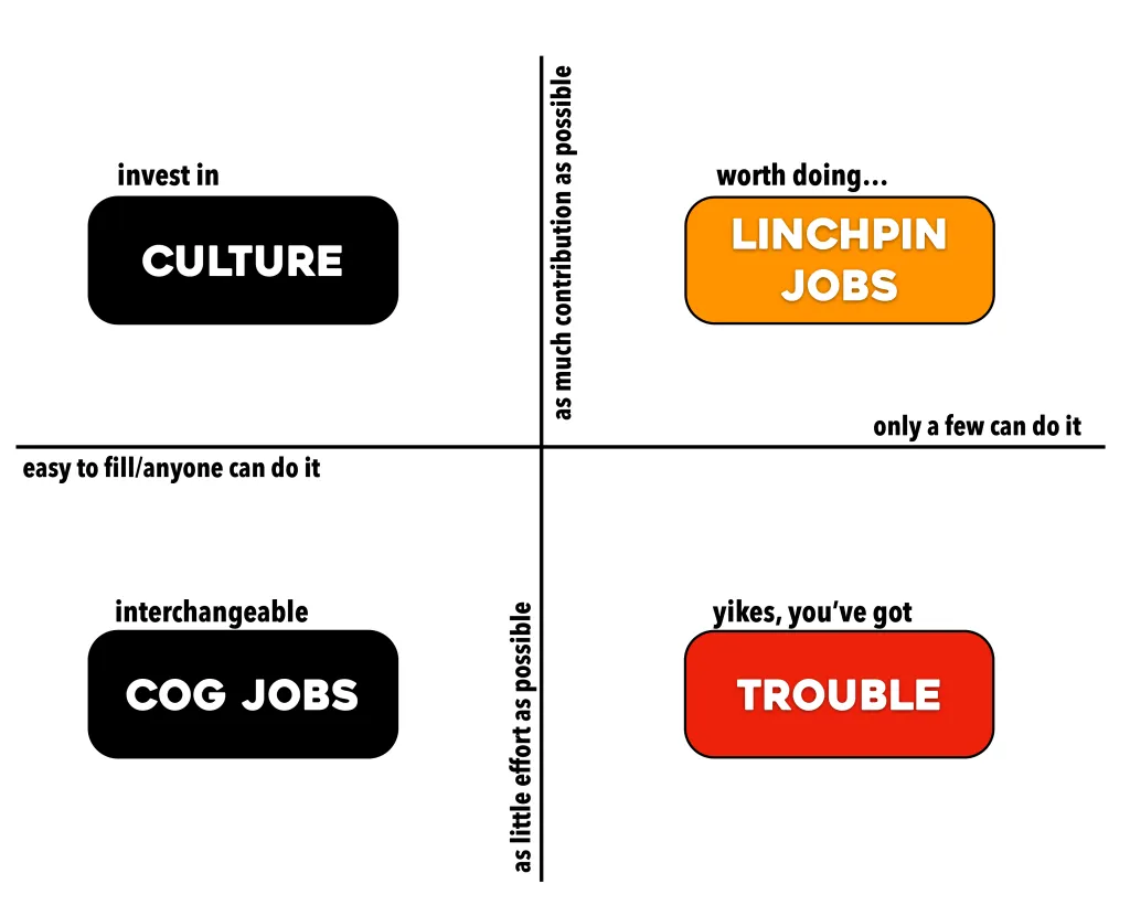
Seth Godin designed this framework to explain what Linchpin Jobs are:

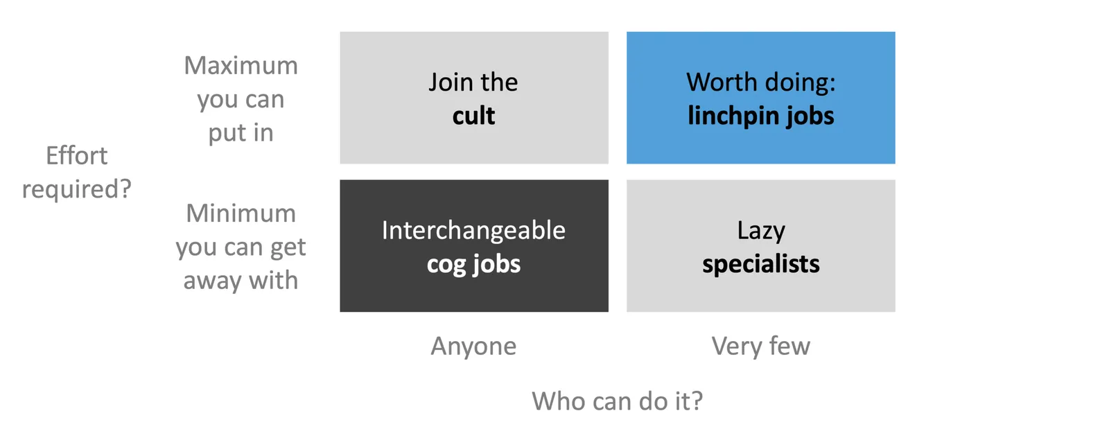
I did a quick makeover of the diagram, keeping the design super simple (life is too short to be spending designing charts at your desk):

  • Move from an XY to a 2x2 layout to make it easer to read the axis
  • Changing the labels of the boxes, axes to get rid of excess text, make them more consistent
  • Change the colours so that the cog jobs stand out (I think they are worse than what I call “lazy specialist” roles

Cover image credit: Jared Goralnick

Debating

By coincidence I watched part of the live coverage of a political debate in the Dutch parliament yesterday (after reading a newspaper that provided a link). Here are some of the things I noticed:

  • Most of them are debating to each other, technocrats, rather than the general public and looking to score quick points on technical details. The audience for the live debate is probably pretty small, but news outlets tend to pick sound bites in their coverage later on.
  • All of the politicians want to have the last word: they quickly make an additional point, leaving no time to let the answer sink in, and move on to a completely different subject not to give the opportunity for additional intervention
  • The whole format of an open political debate about a very complex treaty without a clear agenda does not really work, people jump back and forth between totally different topics: fundamentals, practicality, interpretations of words, etc. etc.
  • Politicians like to stick to their hobby horses. Finally, someone makes a point that could be considered reasonable by the opposing party, open the way for a compromise or agreement, and boom, it is followed by the usual dogmas that will block any further changes of mind.

Maybe a good slide deck that breaks down the discussion in 2-3 tangible options what can be done next, with clearly grouped pros and cons can help structure this debate a bit :-).

Photo by Giovanni Gras on Unsplash

PowerPoint at Amazon

I met someone at Amazon the other day, explaining how they deal with communication (spoiler: no PowerPoint):

  • For a decision, you have to write a memo (2 pages max), no slides / PowerPoint
  • The memo gets handed out in the meeting (no pre-reading), and people have 30 minutes to read it in silence
  • Then, the discussion follows, going straight to Q&A, no presenting

There are obviously some good things about this approach:

  • No time wasted on designing 100+ page PowerPoint decks
  • No time wasted in sitting through presentations where people are reading slides from the screen
  • Less risk that people will jump in the conversation without having done their homework
  • No pre-reading late at night after the kids are asleep

But…

  • Writing a good memo might be more time consuming/difficult then creating a quick presentation
  • Some information on which you want to base a decision is better presented visually than in paragraphs (pros/cons, graphs with trends, tables with financial data)
  • Sometimes, you actually need some time to ponder things over before making a big decision.

On balance, it is probably the right thing to do because it creates a strong cultural statement.

(BTW, I am going to experiment with uploading the cover images in colour, a nice change for 2019, what do you think?)

Photo by Luca Micheli on Unsplash

Way back

I was looking back at my old site on the Wayback Machine the other day and noticed how my approach to presentation design has changed. Back then, I would put huge efforts in finding unusual images, study advertising design, push PowerPoint to its limits. The result: some pretty unusual presentations.

Today, I have become much more pragmatic: presentations should be easy to understand (which might mean cutting that exotic visual metaphor), have a pro/no-nonsense look, and very easy/quick to put together, there are more important things to do than battling presentation design software.

Have I become lazy? I don’t think so. Just a more realistic and practical approach to presentation design.

·Hardware

Set up stress

This post on AVC describes a common situation: technical problems when setting up a presentation. Different computers and different screens (dimensions, operating systems, resolutions, cables, plugs) make it unpredictable what happens when you connect the 2.

This a particular problem in marathon meetings, where a large number of presenters show up one after the other. It is a time waste for the audience and a concentration breaker for the presenter.

The solution in the post was an interesting one: use Zoom (or another web conferencing service) locally (i.e., standing in the same room). This eliminates the need for hardware connections and allows presenters to line up, solve any technical issues before they are due on stage.

In the absence of such a solution, my recommendation would be to always carry a USB stick with your deck around (in PowerPoint and PDF), just in case. Ultimately portable projectors will be compact and capable enough that everyone who has a high-stakes presentation to pitch will carry one around.

Photo by Jeremy Yap on Unsplash

Looking for 2-5 beta testers

My first software product that I coded myself seems to be working and I need a handful of beta testers to work with. I want to see if there are unexpected bugs still hiding in the product, and what happens if people start installing things on a machine other than my own (full of developer privileges when it comes to accessing hard disks, etc.)

What is this product? A plug in for PowerPoint that converts SlideMagic presentations to 100% perfect PowerPoint. Extra bonus: automatic translation to and from a dark background, and flipping between 4:3 and 16:9 aspect ratio in a second without distortions. Users get sent a “.MAGIC” file that the tool can interpret.

It runs on Windows only, since I had to dive pretty deep into the Microsoft .NET libraries to get all this to work. (At the moment, I deal with Mac-originated conversion requests partly manually, you get the same quality conversion sent to you with a time zone delay, but this will not be sustainable if request volume goes up).

This product is not the final stage of SlideMagic, more a first step for me to test whether I can ship useful software. I am catching up with technology since my 1992 graduation from engineering school, now I have moved on from PowerPoint plugins to writing Windows desktop applications from scratch for a next product release. Desktop apps are a bit “1995”, but for B2B design work, “cloud” might not always be the best solution. In any way, I have to pass this station before being able to move on to web and possibly mobile app technologies. It is fascinating to see that you can basically do anything in software if you are not intimidated by technology and have the courage to leave the traditional boxes/application models and user interface approaches.

Continue reading →

Artificial voices

Computers and software have become powerful enough that it is now possible to have them sing a song on a melody and lyrics you write. (Vocaloid by Yamaha). The quality is not yet that of a diva, but the result is acceptable enough for trying out songwriting ideas.

This “text to speech” technology could be interesting for presentation design as well. If a computer voice can read out your pitch with a convincing intonation, you could test out your ideas without having to contract a voice actor (which you would never do for an everyday business presentation).

When you glance over a sentence in a document for the 100th time, you are not really reading it anymore, you just check the latest edit you made. Hearing the whole thing out loud, can wake you up to the fact that it has become bloated, fluffy, loaded with jargon, buzzwords, and boring.

Photo by Maaria Lohiya on Unsplash

Switching to the new PowerPoint conversion

In the coming days, I will switch SlideMagic PowerPoint conversions to the new software that I have written: no more imperfect renderings but a perfect 1-to-1 translation. The conversion still involves processing centrally, but ultimately, I will release a DIY plugin for Windows users, I am still stress testing it.

In the future, this feature might become the premium offering of SlideMagic, the ability to save “.magic” files to your computer, translate them to PowerPoint freely to collaborate with your colleagues, and present decks offline.

Cover image by rawpixel on Unsplash

·Typography

Font sizing

When people submit their SlideMagic documents for conversion to PowerPoint, I still have to peek inside for a second for a quick manual operation. Here is the most common design mistake I see: different font sizes in boxes that are part of the same list or grouping.*

Yes, bigger fonts are better, but in case of lists, it is the lowest common denominator that determines their size. Slide design is like formatting headlines in a print newspaper: you need to edit text to make the message clear, but also to fit things in the typographical constraints.

  • Users in te app are warned beforehand about this.

Cover image by Andre Benz on Unsplash