Moving house - going offline
Hope to see you all back on the other side of the tunnel in a few days.


Frequent updates about all things presentations since 2008. Subscribe to never miss a post.
Hope to see you all back on the other side of the tunnel in a few days.
Thank you TED for reminding us of this great speech. It is worth watching again to see someone touching everyone without slide or media support. Even now, decades later on a small YouTube screen, far away from the event itself.
I am anticipating the inauguration speech. Obama’s victory speech in November was phenomenal. I remember what I was doing when I watched it. I still remember story lines of it. Evidence that it stuck. Can he raise the bar even more?
Skype has a beautiful and very strong visual identity. Things start OK on the first page of this presentation by its COO at CES 2009. Then the color coordination gets weaker. Off blue. Pink’s too bright. No greens (Skype’s green “call” button is very strong visual icon returning in the monochrone rainbow).
PowerPoint templates go beyond page 1.
I am sure Skype’s template is OK, the default colors are probably not set in such a way that they are easy to use for people without a degree (or passion) in graphics design. Like in almost all corporate PowerPoint templates, too much screen real estate is devoted to the brand/logo. With its strong blue colors Skype could actually afford not having a logo at all on its presentation pages. People will recognize the company regardless.
I have seen too many of these:
Delete them both.
The first slide should just cover what you are about to say, but not say it. The last slide should be an uplifting graphic reminding people about your key messages. Repeating these messages will just bore your audience.
The Obama poster by Shepard Fairey is the icon of 2008.
Here is a tool to make your own. You see, there is still some work to do before I can make it as a presidential candidate.
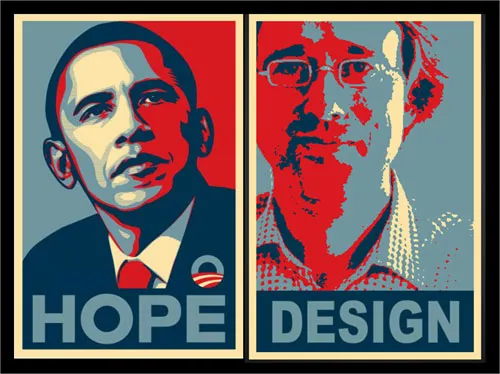
Jokes aside. Icons can be powerful visual tools to use in presentations. Famous historical moments, famous historical pictures, famous historical posters.
An earlier post about real historical images from LIFE magazine available on Google.
Unusual. An well-designed ad for a more or less local hairdresser/spa. Like a good slide:
I like the small light-source-behind-the-model effect, I will experiment with it in my next presentation using a radial-gradient with very close color shadings.

Still, there is something “criminal” associated with a finger print (as people suggest in the comments of Ads of the World, where I found this image).
During a meeting today: “You make presentations? Can you believe that my children are actually producing PowerPoint in school at the moment?”
It made me look back at my own time in school. There was virtually zero training in visual communication. And now that I think of it, this is actually not solely because of a lack of technology (I got my first home computer at around 1986).
I hope things are better now. My kids are a bit too young still for me to get first-hand experience.
Making things more difficult, visual communication would probably involve the combination of a number of subjects. In high school: economics, mathematics/logic, language, arts, etc.
Does the availability of PowerPoint in the highschool class room today actually help to make kids better at communicating? Or is it counter productive?
An interesting and entertaining way to spend 17 minutes. Comics evangelist (and author of the comic book that explains the technology behind Google Chrome) Scott McCloud on comics and visual presentation in general. More details on the TED talk page, and the TED Scott McCloud profile.
Olivia Mitchell is the person behind the Speaking about Presenting blog. She is one of the true leaders in the global presentation design community and collected and synthesized input from 40 presentation experts, bloggers, and other enthusiasts into one blog post: PowerPoint design in 2009: does design matter?.
Well done Olivia.
And well done presentation design community. Over the past few months a group of people around the globe really started to work together, comment on each others perspectives, exchange ideas. There are not that many blog subject areas in which this happens. Great. Join in if you want. See my improvised blog roll (I forgot many names there, or go to Alltop Speaking to get a flavor of who is out there).
“Everyone can paint” used to be the name of a Dutch toy set when I was a child.
With really basic drawing skills it is possible to make useful “iconic” charts. The umbrella below was used to highlight how a strategy has shielded one of my clients from the full effect of the 2008 economic meltdown.
Image no longer availableLook at shapes and see how they are decomposed in very simple elements: a few ellipses and some rectangles. On the right I gave them a different color to make them visible. Make sure that everything is neatly spaced out and symmetrical. The background image was purchased on iStockPhoto.
The key lesson: simple drawings do not have to look simplistic.