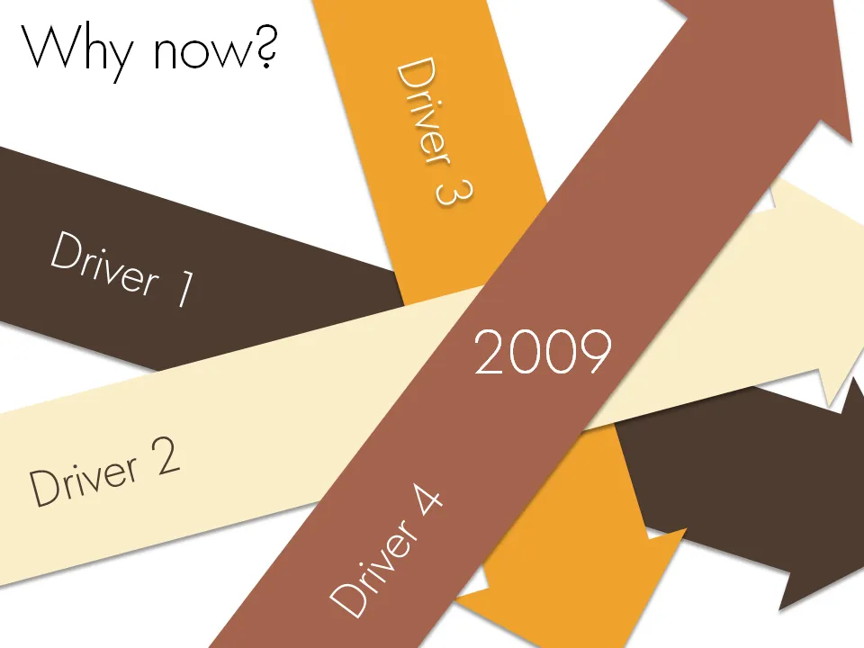
Chart concept - why now?
Sometimes it just comes all together, right now. Everything falls in place. And investors better move fast to benefit from the opportunity before it’s gone. A set of big simple arrows can visualize this.


Frequent updates about all things presentations since 2008. Subscribe to never miss a post.
Sometimes it just comes all together, right now. Everything falls in place. And investors better move fast to benefit from the opportunity before it’s gone. A set of big simple arrows can visualize this.
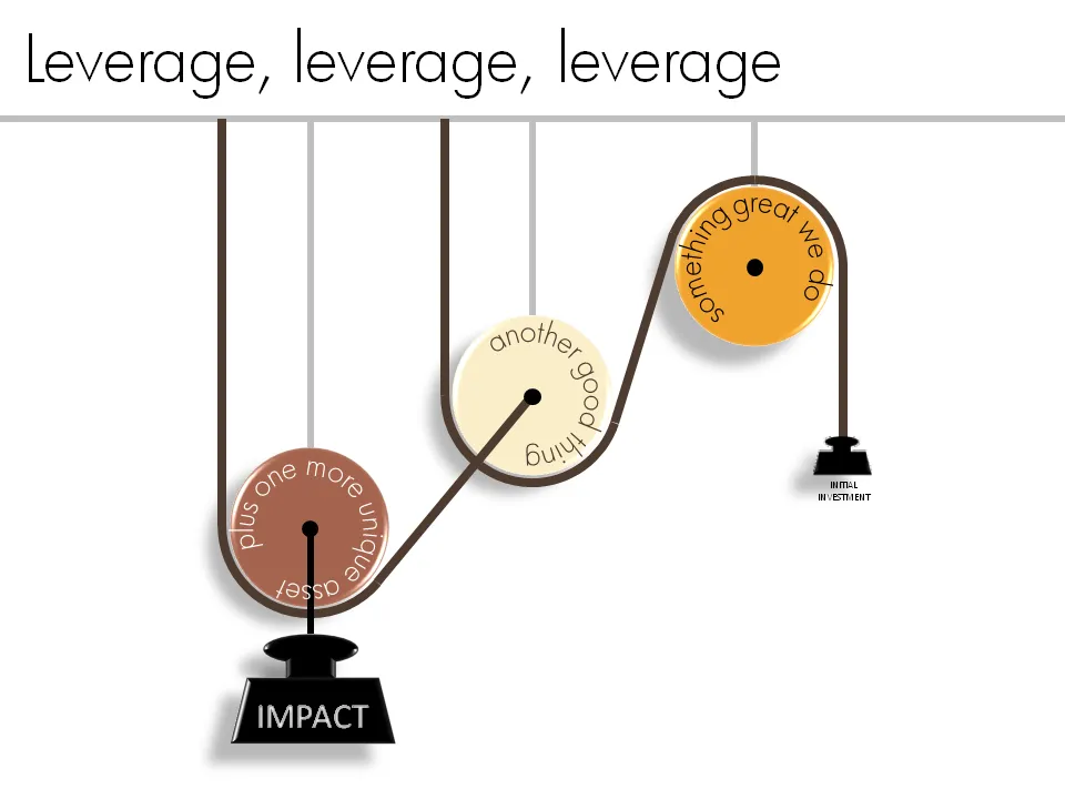
Smart companies leverage money and man power invested in them to do great things. How to visualize this?
One option is to go back to high school physics class and use a good old pulley system.
See a previous post about how to get circular text in PowerPoint.
The book Influence: The Psychology of Persuasion by Robert Cialdini was added to my Squidoo lens with presentation resources (thank you anonymous reader!). I finally managed to read it. The book aims to teach anyone who needs to influence other people (that includes presentation designers like me) to leverage learnings from the field of psychology.
Like most business classics, the real-life case examples are really valuable; the attempts to draw generic conclusions and insights from them somehow make less interesting reading (although they still are valuable). Just a few examples:
The six principles discussed in the book (where possible I added lessons specifically for presentation design)
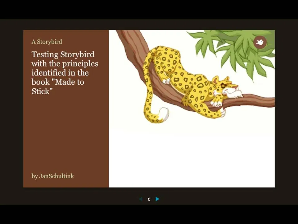
More and more online presentation tools are popping up. A recent one is Story Bird. You select artwork from an artist and are offered a simple interface to weave images of your choice together into a story.
The service is targeted at family/children and works well. Narrowing down the degrees of freedom (artwork in a consistent style, simple page layout [image + big font text]) makes it easy to create and share professional looking stories. You can invite others to collaborate with you as well.
Maybe the biggest application of this service is in education? There is a business presentation version of this application possible as well. Replace the image bank with non-cheesy useful presentation images (you only need a few hundred to cover most business presentations) and you have an alternative template to the PowerPoint bullet points. “Ayne can make Presentation Zen-style presentations”). Cutting the available slideware tools to the minimum helps focus the presentation design amateur on the story.
My first creation can be found here.
Via Orli
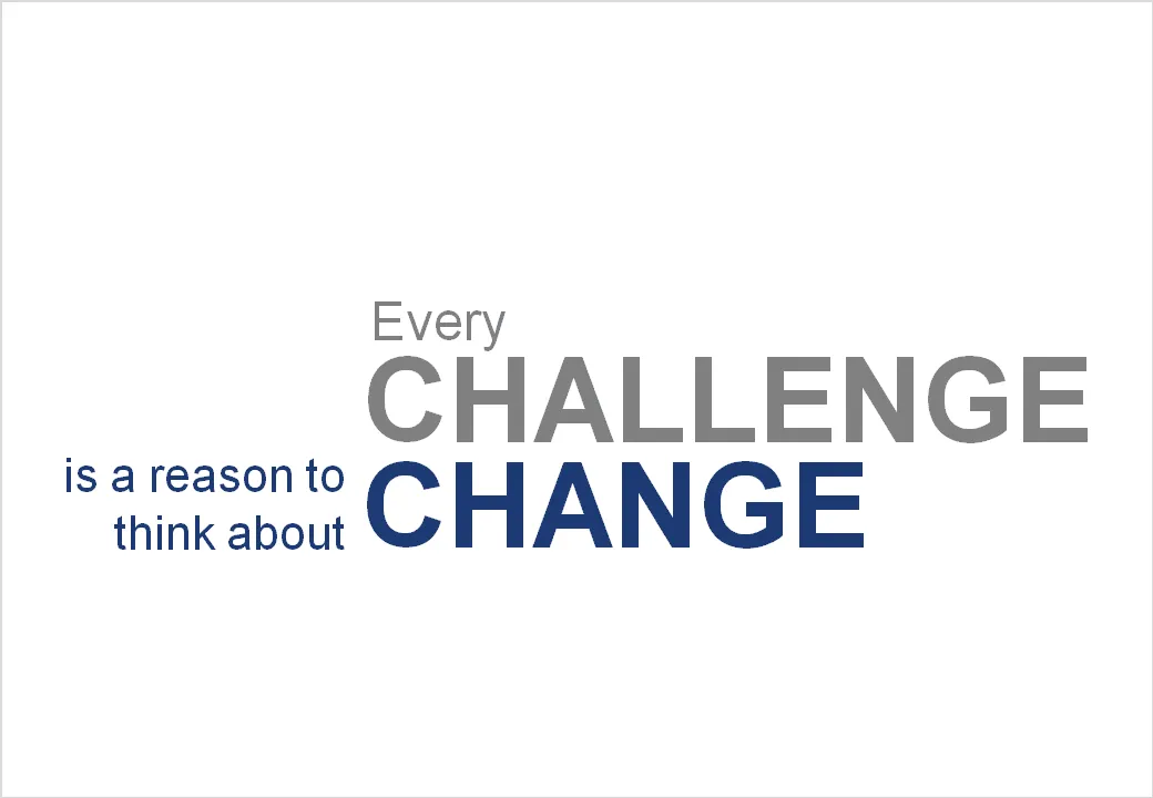
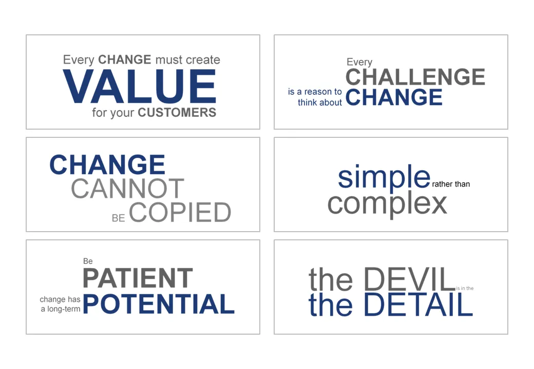
Sometimes a presentation is just a discussion of a series of beliefs or points. Each section of the presentation is devoted to one statement. Big-font section separators are followed with a few more charts adding detail and explanations. Why not play around with fonts a bit on these separators? A summary page could consist of PNG captures of the all the tracker pages in the presentation. In this way, it looks a bit more interesting than six bullet points.
This ad uses a concept that can easily be replicated in presentation slides. Find a silhouette of let’s say a shark, and fill it with small gold fish shapes and you’re done.
I used something like this once to show how small individual components of an information security architecture can create a formidable defense against cyber crime if they coordinate their activities well.
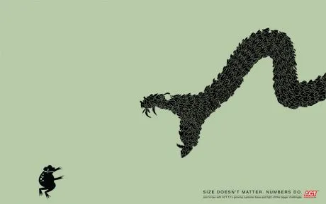
A larger image can be found on Ads of the World.
Seth Godin nailed the perfect format for a one-on-one presentation in a recent blog post.
This type of presentation is ideal for short 15 minute coffee chats with venture capitalists where you try to pitch for a more in-depth meeting.
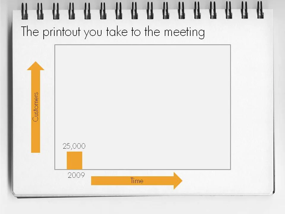
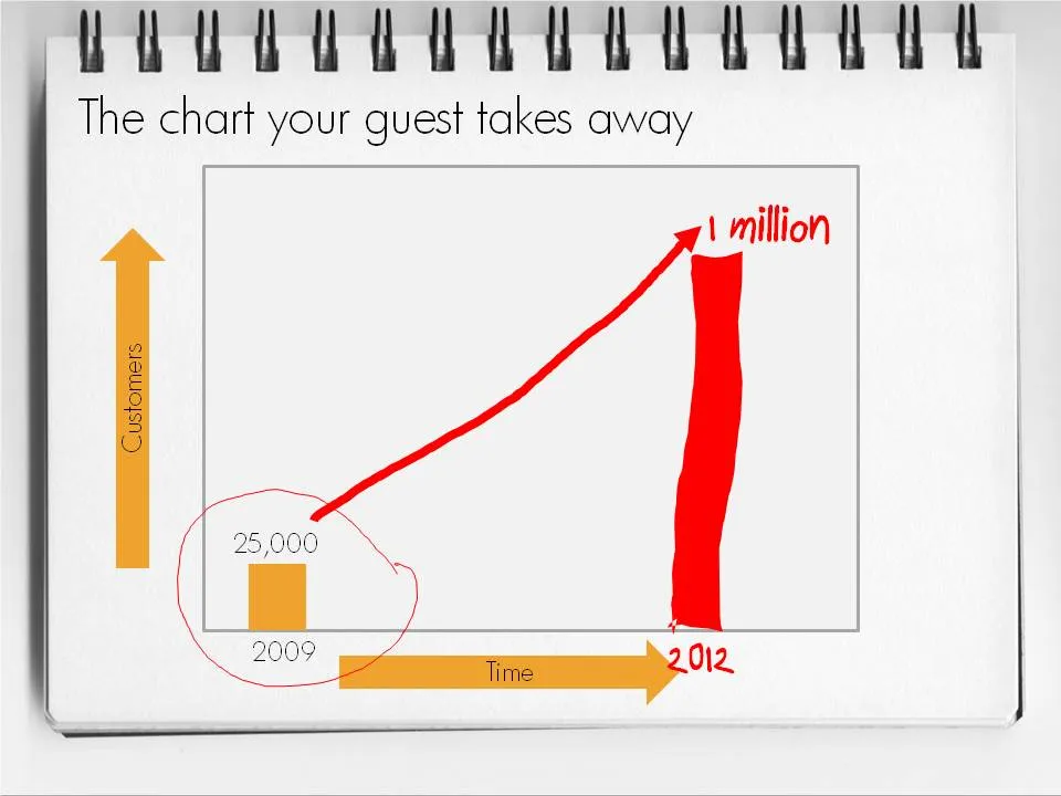
To make a hybrid napkin presentation, I suggest that you actually design all the slides, including the version with the comments and drawings put on them electronically so that the story flows logically and it is easy to prepare for the meeting. Just before your presentation, you decide which slides to print or not.
Slowly, I am catching up on reading presentation-related classics. This holiday I read through Daniel Pink’s A Whole New Mind.
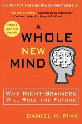
The subtitle of the book: “why right-brainers will rule the future” is an overly simplistic summary of the main idea. The book’s content is more nuanced. In the “conceptual age” 2 skills are essential:
Why? In current society, supply of goods and ideas is overwhelming. In order to stand out you need to develop a unique edge. The only way to get this edge is through developing “right-brain” skills such as desgn and story telling. “Left-brain” skills such as accounting, diagnosing a patient, applying legal rules are repitive and can increasingly be automated or outsourced to countries with much lower labor cost. A whole new mind is a mind that has a combination of left-brain and right-brain skills.
Some additional thoughts:
I just returned from a beautiful and relaxing family holiday in western France (apologies for limited posting and replies to comments). My 2 year old son’s fondness of cars required us to venture to the car museum in Chatellerault. (About the only thing to see in this town).
Lunch was in a local brasserie (not recommended). The placemat (click on the scan below for a larger image) reminded me of the slide sort sorter view of many poor PowerPoint presentations. Ads screaming for attention by using big, colorful and different fonts. With as much information crammed into it as possible.
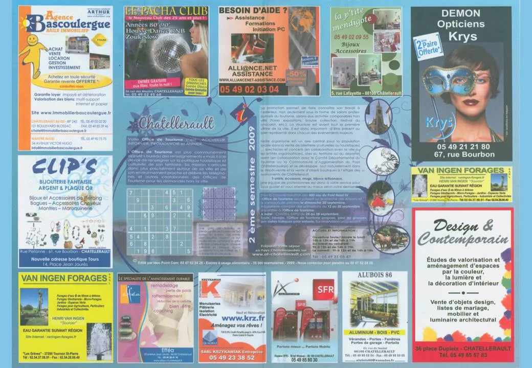
Few got it right with some exceptions. The power of pictures does work in France as well. Many men will be drawn to the Le Pacha Club, fashion-conscious women might check out the Krys optician. I was disappointed with the interior design study institutue though (bottom right).
More light summer posting. My Squidoo lens is filled with useful resources for presenters (blogs, books, presentater tools, videos). Have a look. Add more content. Vote existing content up or down. You can even buy some useful things, affiliate link proceeds are donated to charity.