SlideMagic Blog

Frequent updates about all things presentations since 2008. Subscribe to never miss a post.

RSS
·Investor presentation

Smarter questions -> better stories

If you are writing an investor presentation you can Google what questions should be covered:

  • What is the market?
  • What is the competition?
  • What is the business model?
  • Who is in the team?

Or, you can take it one step further and already anticipate the most obvious questions an investor might have:

  • I am doing something similar to Google, is that smart?
  • I look like I am 21, isn’t that a bit young to run a startup?
  • We have been working for 18 months and still there is no prototype, will it ever arrive?

Smarter questions lead to smarter investor presentations.

·Creativity

Being sick and designing

Back in my days as a management consultant, I would surrender to an illness only when I had a really big fever and stay in bed. Now, as a designer it is different.

My work no longer involves in running around, chasing things, sitting through meetings. And even the slightest disruption of your health has a direct impact on your design work and creativity. I often sense the onset of a cold before the first real symptoms such as a soar throat: not being able to focus, a simple chart that I simply cannot get right.

Well in these cases, there is always the end of the month accounting to do…

·Keynote

In NYC at the end of April

I will be in New York at the end of April. Let me know if you would like to connect in person.

Full "Pitch It!" PDF available

I just uploaded the PDF version of “Pitch It!” which can now be purchased and downloaded. You can view it on any device that can display PDFs.

When compared to the iPad version, 99% of the interactive functionality is preserved, I replaced touch objects with static image galleries.

Distribution of this book is not restricted by Apple’s policies, and is available anywhere in the world.

I am looking forward to your feedback (content, and - hopefully minimal - technical glitches).

Pressing the button below will take you to the PayPal check out page:

Buy Now

·Design

New look? Don't forget PPT...

When I get the brand guidelines from a client (explanations about logos, colors, fonts), the PowerPoint section is usually at the back, put there as an afterthought after brochures, business cards, and letterheads are being discussed.

Designers usually do not pay much attention to PowerPoint (PPT is uncool for serious designers) and you end up with fonts, shapes, and concepts that are 1) hard to incorporate in presentation design software (no, most people do not have Frutiger installed on their machines) and 2) - more importantly - are very hard to understand for the layman designer.

The face of a company used to be the letterhead, but today it is the website, and yes, the PowerPoint presentations that are cobbled together by the amateur designers and shown to customers everywhere, all the time.

So, when designing a new corporate look, think about those amateur designers, and the best way to do that is to design your look for PowerPoint, then adjust it to other canvases. Sorry.

·Keynote

The consulting presentation

As a former management consultant, I can say it: consultants make very poor presentations. But what about these fancy looking documents full of graphs (exhibits as they are called)? Well, they are decks meant for reading, not for presenting to a live audience.

And as documents intended for reading, they are pretty good. Consultants have replaced a word processor with a slide design program, which adds more writing freedom:

  • It is easier to add data charts and data tables
  • It is easier to add structure to a text (frameworks in consulting speak)
  • It is easier to group edit a document that consists of 1-page-1-topic that can be shuffled

Still, consulting reports meant for reading can be designed better: cutting jargon and using simpler language (synchronising key performance indicators across behaviour segments takes up a lot of space and does not mean much to the layman), and think better when to use data charts (often one single data point gets put down in one single column chart with one single column).

Now, this document is great for people who have been deeply involved in the project (consultants on the team, team members from the client). To win over the hearts of people who will see the recommendations for the first time, a whole new presentation needs to be designed from scratch. And unfortunately, most consulting firms do not make this final step.

·Keynote

Why do Keynote slides look better?

I was asked to answer this question on Quora the other day. My hypothesis that it does not have anything to do with the preinstalled templates or the software’s underlying capabilities.

I think that on average the population of Keynote users are better designers. If you invested the effort to get to grips with a new presentation design tool, you are probably likely to be able to design better slides.

Testing - Pitch It in PDF

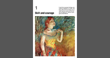
I am preparing the conversion of my book Pitch It into PDF based on the comments I received yesterday. In the process, I am becoming an expert in Adobe InDesign as well. The challenge will be to translate the interactive iPad content into static sequential images.

Here is a trial of the first chapter, which is available for download for $0.01 (PayPal obviously does not allow $0 transactions). If you want, you can check it out and let me know whether the format works and how you liked the shopping experience. But I understand it if you save the $0.01 for the full version (chapter 1 is an introduction and does not contain any of the core content of the book).

You can download the first chapter by clicking the button below for a $0.01 charge:

Buy Now

·Art

Table with fat lines

For boxy charts, I find it very convenient to use tables as the basic organising structure. Use big fat lines to separate the cells. In this way, it is easy to add, delete cells, combine, and split them. The Mondriaan look.

A non-iPad version of my book

A question for people who do not have an iPad and want to purchase my book about presentation design. Would you prefer a highly illustrated PDF file that can only be read on high-end Kindles or computers, or a mainly text-based document that will render nicely on all Kindle devices (but lacks the illustrations)?