SlideMagic Blog

Frequent updates about all things presentations since 2008. Subscribe to never miss a post.

RSS
·Investor presentation

Fitting the trend

The world of Internet startups is filled with buzzwords: SoLoMo (social, local, mobile), freemium, wearable computing, big data, social sharing, sticky eyeballs (2000), monetization, consumerization to name just a few.

I see many startups trying to force-fit themselves into one of these trend boxes. You start with the buzzwords, then steal charts about the buzzwords from analyst reports (“online video will be huge in 2017”), and then present a diluted story about your company, showing how it fits in.

A better alternative is to explain how your company solves a big problem in a unique way and worry about the buzzwords later.

·Investor presentation

Investor infographic

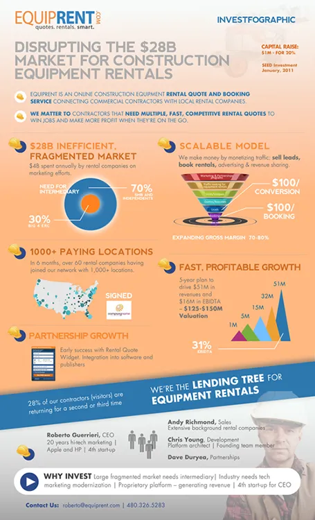
Equiprent is raising money, and put together an infographic to attract the attention of investors (found it on the Cool Infographics blog).

What I like about it:

  • One page Executive Summaries are boring and yes, this is a much better way to grab attention. Equiprent is realistic and does not think that this graphic is landing them the investment. Its sole purpose is to get a 5 minute phone call to discuss the next steps in the fund raising process
  • The company is not afraid to get the fact that they are fund raising out in the open: it says so, it shares their suggested valuation, and it states how much they are raising in return for what % of the company. I feel that the benefits of publicity and reaching more investors outweigh the drawbacks (putting some of your company secrets out in the open). The fund raising process can be much more open than hush hush discussions in small venture capital meeting rooms.
  • The infographic itself catches the basic points of an investment pitch, if an investor is convinced that all the claims are true, she will for sure invest in the venture.

Some feedback on where it can be improved:

  • From a design perspective: some objectives on the page can be aligned better
  • Content-wise: maybe the fragmentation point can be beefed up more. It is the core argument of the pitch. I have no immediate suggestion how to do it better though
  • Financial projects look impressive, but have little credibility without the accompanying assumptions
Continue reading →
·Keynote

The 2-line slide heading

In some presentations, I use a template with a 2-line slide title, giving me more screen real estate to spell the key message of a chart. The format is very similar to exhibits I drew at McKinsey, where the message of the slide was written in a paragraph that could span 2-3 lines of text in point 12 font above the chart headline.

When to experiment with this format? Smaller audiences, lots of complicated data charts, chart messages with nuances that are hard to capture in a newspaper-style article heading.

Oh, and when you use the longer headlines, there is not reason to re-write that same sentence in a big bubble or box on the right of the chart.

·Keynote

Difficult strategy meetings

A story works great in a TED talk, but a cute personal anecdote might be less effective in a highly charged and political Board room meeting where a strategy decision has to be made. What can you do when you are in the hot seat? Some thoughts.

Cut to the chase. In a typical Board meeting, most attendants are probably familiar with the basics of what is being discussed. Leave out the descriptive intro, send big data fact packs before the meeting as background reading.

Create some sort of pro and con chart that summarises your logic for picking a certain option. Group the no-brainers on both side of the argument to avoid losing a lot of presentation time on issues that everyone agrees on. Single out the more contentious issues that should be debated. Keep coming back to this chart if someone brings up a point that has already been discussed, or that is a no brainer.

Push the rational argument with quantification and analysis all the way to the end. Not just the inputs (market share, customer satisfaction) but take things right down to a metric that matters (profit in scenario A, profit in scenario B).

Think about how to push the emotional side of the argument. Focus group quotes by customers look like just another text slide, adding a picture of the participant makes it a real person, putting a video snippet makes it even more credible.

Good luck!

·Colors

Color hierarchy

Over the past few years, more and more people started to understand that as a presentation designer, it is important to have a look at the style, brand, color guide of the organisation you are working for. Program the prescribed colours into your PowerPoint or Keynote template, and your slides are instantly recognisable with the right look and feel, without having to remind the audience by putting a big logo on every slide.

But these brand guidelines often contain more than just the RGB codes for the corporate color. Color hierarchy is as important. Which color should you be using more often than others? Which color is background, which color is accent?

Randomly applying (the allowed) colours to slide objects can create clutter, especially for large shapes on your slides. Think about color hierarchy when designing your next presentation.

·Creativity

High-Low-High

This describes my usual creative process. You start off with digesting a story at a high level, and things seem clear - although most of the times presented wrong. Then you dig in, start asking questions, go all the way to the very bottom of detail, and things are confusing, ambiguous and not clear. After this stage it is time to rise up again to come to a new high level story. And that high level story is most of the times a completely different one from the first version that we started off with.

A parallel can be drawn to financial analysis: you start with a napkin, build a very detailed spreadsheet, and end with an extremely simplified chart (that looks different from the napkin you started off with).

·Keynote

Unraveling

Technical (process flow) diagrams can be mess with intersecting and overlapping arrows. The challenge of the presentation designer is to unravel them. I usually decide between 2 possible solutions:

  1. Minimal clutter. Like unraveling physical wires, I re-draw and re-draw the diagram again until I have it in such a configuration that none of the connectors overlap (or with the minimal overlap). Then I resize boxes to the same size, align and distribute so that the whole thing lines up nicely in a grid. The result is pleasing for the eye.
  2. Maximum logic. I take the big steps in the process and line them up in the logical sequence. Other intermediary steps get organised around this. Use differentiating color for the main big steps in the diagram. The result is pleasing for the brain.

Then decide whether to please the eye or the brain.

·Keynote

The print out

Some executives still have their assistants print out emails and/or presentations. Recently, I saw a proposal for a major project sitting on a desk for review, printed in black and white. Colours that looked bright on screen were translated into depressing dark grey and black shades. Big captions in light colours were faded and hardly readable. Photos enhanced with artistic filters looked distorted.

Lesson: try out how your document looks when printed. You can even do that using a print preview, no need to waste trees here. This is especially important if your document contains a lot of text, the temptation to print it is bigger.

·Data visualization

Just make me a set up

“Oh, just make a set up, and I will fill stuff in later.” This approach does rarely work for presentation design. A framework is good to guide data collection, but when it comes to creating a slide to communicate your data and conclusions, you need the actual data.

·Creativity

I did not do anything today...

I sometimes have these days where I sit at my desk thinking, sketching, being distracted, and some more pondering. It feels like nothing happened that day, until I sit down the next morning after a good night sleep I crank out the entire slide deck in under 2 hours…