SlideMagic Blog

Frequent updates about all things presentations since 2008. Subscribe to never miss a post.

RSS
·Investor presentation

Executive Summary?

Back in the 1990s, “Executive Summary” pages were summaries that you put in front of a strategy consulting document. They were meant for senior management / decision makers. There was almost something offensive about them, reminding you of your junior position in the hierarchy. Senior managers can skip the detail that you have been sweating on for months and get straight to the point.

The good thing about these summaries was that you actually had to think what it is you wanted the senior management to do, and you had to frame your argument in the best possible way. Writing these summaries often caused major shifts in the recommendations of the project.

Clients ask me frequently about an Executive Summary of a presentation. This time, it is about a summary document that they can email to someone ahead of a presentation, or in most cases, a document that should convince the recipient to agree to a presentation.

I think the classic Executive Summary memo is not the most engaging way to get people excited about your project. There are a number of differences between your need for a summary, and the Executive Summary of the strategy review that is addressed to the CEO of your company.

The CEO is probably very interested in the recommendations (what price should I pay for the acquisition target), and is fully aware of the broad context of the project. She just needs the underlying logic to complete her own understanding of the situation. And, she probably knows you, and can pick up the phone quickly to clarify something that is not clear.
Continue reading →

Experimenting with Medium

I started to experiment with Medium as a now host for my blog. What do you people think, should I move? It is easer to write posts and get people to discover them, integration with my overall side is less strong. And Squarespace has become a bit buggy for some reason when formatting text and inserting links. Check it out here: www.medium.com/slidemagic.

Bad 1990s design habits

Below a repost from 3 years ago, an blog post I put out on a Medium publication that I am taking down. Putting it out here to preserve it.

You can design better presentation slides by getting rid of engrained habits that can go back decades.

Sometimes I work with teenagers to teach them about presentation design. To my surprise, they often are much better students than “grown ups” who are supposed to benefit from decades of business experience. Here is a theory why.

Transparencies for overhead projectors encouraged you to copy pages out of a book and uncovering paragraphs or key points bullet by bullet. Moving to PowerPoint, people just kept writing these bullets.

The first visuals that you felt compelled to project to an audience were data charts: lines, bars, columns. These type of graphs needed to have a title in the top left and a source at the bottom. Most slide designs today use a big title at the top left, other typography on the page is almost never bigger than the title. Very rarely, people leave the title out all together.

Pictures are low resolution and take a lot of memory, hence you can only put in small images in a presentation document that you need to email someone.

PowerPoint was created as a mouse-based drawing software, rising alongside Microsoft Windows. Everything could be dragged, and resized easily to fit. Cropping an image was tricky. The first plasma TV screens confirmed to us that it was OK to stretch an image out of proportion, as long as it fitted whatever you needed to fill easily.

Continue reading →

Simple or pretty?

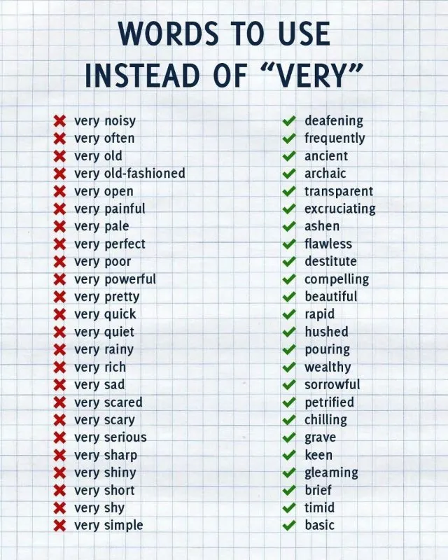
This is probably one of these images that has been going around on LinkedIn for the past 5 years, somehow I did not pick it up:

Yes, the right column is better English. But:

  • Some of these words actually take more copy space
  • Some of these words are long, and hard to break to the next line
  • Some of these words might not be understood by non-native English speakers (“destitute”?)

At school, you are writing to learn the most beautiful English possible, in real life you might be pitching a Chinese investor with a complicated startup idea.

·Investor presentation

We need to get everything ready

When I meet with a startup for an investor presentation, I am usually the first external “marketing person” they meet with. (Understandable, no investors, no money, no marketing budget). Some CEOs are nervous about the daunting task (and cash expense) of getting all those marketing materials ready as the company expands beyond product development. Sales presentation, investor presentation, one pager, leaflets, website, introduction video, etc. etc. (“Do you do those as well?”)

My advice: take things one step at a time. An investor presentation is a good place to start, since any investor presentation needs to include some sort of customer sales presentation as well. (Investors need to be sold of the product).

The company/product story is often not completely set in early stage startups. So, freezing the spec and commission a lot of money to all kinds of designers might cause problems down the road. A presentation is actually a useful format to play around with visual concepts. Graphical execution might not be the best, but things can look decent enough and are easy to change.

After you feel that the presentation starts to work, you can consider upping the investment in the design of other marketing material. But here, I would do things gradually as well.

When working with video and video producers/designers, make sure you have a version of the footage that does not include text (in a specific font, containing a positioning that could go out of date) and logos (that could be changed later on). Video footage can be useful for a long time.

Continue reading →

Office cleanup

I went through a big cleanup of my office the other day and encountered many of the gadgets I have reviewed on this blog over the past years. Unfortunately, they did not become regular productivity tools (at least most of them). Wacom tablets, Wacom Inkling, lots of different iPad styli. Now looking back at these. Part of the problem is the hardware, but the other part might just be that free hand drawing is not the most convenient interface to design presentations.

An update on the Apple Pencil. I think the pencil hardware is sorted, but there is still a software issue. My note taking app needs to be open in a meeting all the time, with the screen on, it does not survive a long meeting.

Maybe 2017 will be the solution.

Image by Creative Tools on Flickr.

Most presentations are training decks

In the beginning, you know you have your killer slides to get you through the meeting. The more you give the pitch, the more confident you get with delivering your story and the slides actually become less important.

A special case of this is salesforces. When you design a sales deck for a large group of people who will deliver the pitch without you being present, your presentation is actually a sales training deck.

Image via WikiPedia

·Software

One software, many uses

PowerPoint is used for many things in today’s corporations:

  • Quickly write documents for internal use
  • Maintain the competitor intelligence database
  • A tool to draw the system architecture diagram
  • Organize your thoughts, make a work plan
  • Brainstorm ideas live in a group
  • Logo / design concept prototype
  • A UI spec (that’s how I used for SlideMagic)
  • Big stand up presentation to outsiders - big audience
  • Big stand up presentation to insiders - big audience
  • Big stand up presentation to outsiders - conference room
  • Big stand up presentation to insiders - conference room
  • One-on-one “coffee chat”
  • Document for reading for outsiders
  • Document for reading for insider

To name a few. We get problems when we confuse the application and the target audience. A project status update on the overhead of the big annual industry conference, pretty pictures without explanations when you want your budget approved by the CEO.

·Investor presentation

Deep dive

Three ways to show understanding of an industry in 10 minutes:

  1. Construct a 90 minute lecture trying to cover everything, and squeeze it into 10 minutes
  2. A very detailed deep dive in one aspect of the industry, showing an insight that nobody has ever heard anywhere else
  3. Do this deep dive on a random subject that is brought up by your potential investor or client.

1 won’t work, 2 is better, 3 is best

·Story

"They are not interested in this"

Or maybe: “they understood it”. When you don’t get questions about a certain issue in your presentation does not mean that you should pull that part of the story. It is most likely that the audience understands your point and is ready to move on.

If it works, then there is no reason to spend a lot of time/slides on something. But leaving that part of the story out, creates a deck with only your contentious issues left without the glue that stitches everything together.

Image via WikiPedia