SlideMagic Blog

Frequent updates about all things presentations since 2008. Subscribe to never miss a post.

RSS
·Delivery

Slides in a foreign language?

Should slides and your talk be in the same language? Ideally, yes. Visuals and the audio track are in perfect sync.

But I think for most audiences in Western economies, “business English” slides that support a talk delivered in a local language work perfectly OK. “Business English” is what I call the English that is spoken by most non-native English speakers. A very narrow vocabulary of English that enables you to express most common business concepts.

For some audiences having your slides might give you that added international appeal (a startup raising money across Europe for example, or here in Israel, where high tech slides designed in Hebrew would look really weird).

Slides in English raise the challenge for the presenter though. If you were planning on reading bullet points of the slides, it sounds boring in English, it sounds really awkward when you are live translating from English into your native language. Either things go really slow, or the translation sounds really funny, or - most likely - both.

As always, there are exceptions. Some highly conservative financial institutions have complicated investment approval processes where decks get forwarded/discussed without you being there. If your deck is primary for reading, then consider translating the whole thing.

Be aware that languages can create technical challenges as well if people do not have the right fonts installed on their computers, and mobile devices create additional problems. Always send PDFs.

I have done many of these types of projects for presentations aimed at local Israeli institutional investors. I would start with an English design (but laid out right-centered, graphs flow from right to left), the client would translate (challenge 1: Hebrew, challenge 2: business/science-specific jargon in Hebrew), and would clean up afterwards with a 50% understanding of what’s inside the text boxes.


Frankensteining market background charts

Google for “market developments” in a specific industry, and your search engine will serve you thousands of consulting charts that fit the bill. It is tempting to “Frankenstein” a deck together with 25 of these and call yourself an industry expert and/or convince investors that you are one.

Here are some health warnings.

  • Frankensteining a deck (stealing charts from different presentations and stapling them together to form a new slide deck), will never give the most coherent story. Start with the points you want to make, and decide in what order they come, then create visuals
  • Google has a long memory and most of the consulting charts out there are dated: old data, expired insights and stale, overused case examples
  • Most charts designed by consulting companies are written for their core customer base: large corporates who are trying to catch up with smaller, leaner, more innovative startups around them. If you are a startup yourself, you are a different audience.
  • Many of these charts are complex frameworks that aim to visualize some micro-economic concept. These frameworks are great for solving a problem, they are less suited to communicate the conclusions. If your message is “it is complex”, use a consulting framework as a chart, if it is something else, try a different one.
  • Every consulting project covers the basics: figuring out market sizes, growth rates, segments, shares. All the results of this analysis gets put in charts that shows the homework that has been done, but they are unlikely to be the key insight from the work. Presenting slide-after-slide with growth rates by subcontinent is not going to excite your audience.
  • Long-winded recommendations out of a consulting project specific context or quotes from experts people have never heard of never make for the most appealing or convincing charts in a presentation.
Continue reading →
·Story

Usually one thing is special

Back in the 1990s at McKinsey, a very senior Director told me that while the Firm does high quality work across the board, in ever project there is usually one insight, one piece of analysis, one original idea, just one, that stands out and makes all the difference. And that one insight is enough to break a deadlock where the client or other consulting firms could not solve the problem.

In sales and investor pitches that is pretty much the same. Yes, smart phone use is growing, yes the team consists of a bunch of very smart people, yes security is a major concern of enterprises. People have seen it before. But that one unusual combination of technologies, or that completely new approach to a problem that is interesting.

Show why it is so tricky to solve. Show the solution. Show why it is so clever.

Image from WikiPedia

·Creativity

Working with background music

Sometimes it works, sometimes it doesn’t. When I have to write something (this blog post for example) or need to come up with a visualization for a tricky concept, background music disturbs me. It like the melody of the music highjacks my brain and takes things in a different direction than the storyline in front of me.

Cleaning up charts (make-over work), or building financial/economical models works great with music in the background though.

That’s maybe why many people end up writing things late at night: finally it is quiet.

Image from WikiPedia

·Creativity

Uncovering cosmic patterns

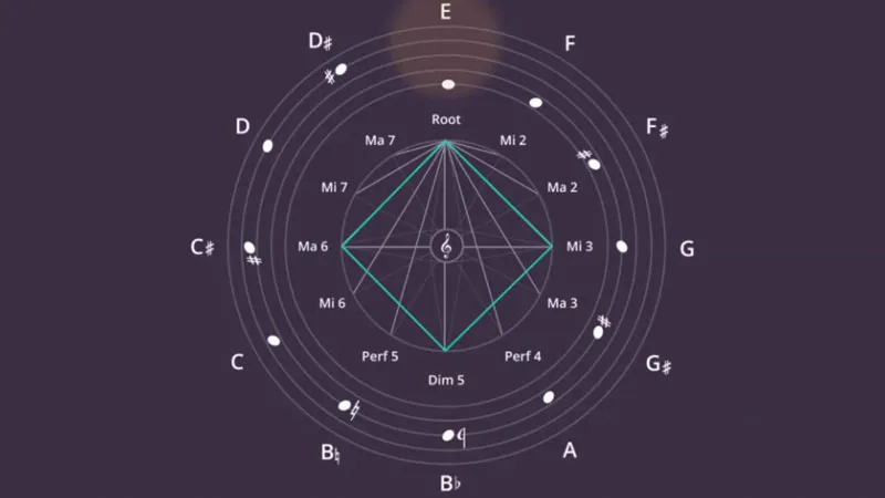
Design is all about uncovering patterns and proportions that are somehow hidden in the cosmos. Architects, music composers, graphics designers, chefs, film directors, painters, authors, each is hoping to uncover a genius composition that has been hiding in plain sight for a few billion years.

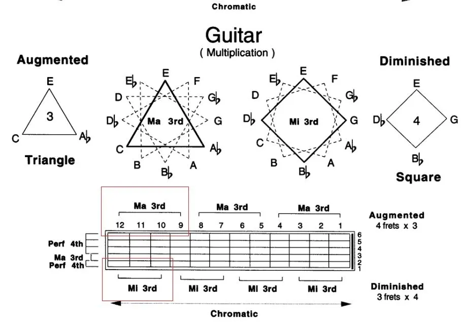
Recently, I was introduced to the patterns that jazz guitarist Pat Martino is using to teach chord shapes on the guitar. The diagram in the video (if you are interested) shows how he uses turning triangles and squares (visual objects) to construct chords (audio).

In other videos, Pat explains how he uses words as musical inspiration. For example, he assigns a note to each of the 26 letters of the alphabet, and then creates words (“beautiful” for example) to see what they sound like.

·Layout

Logo cropping

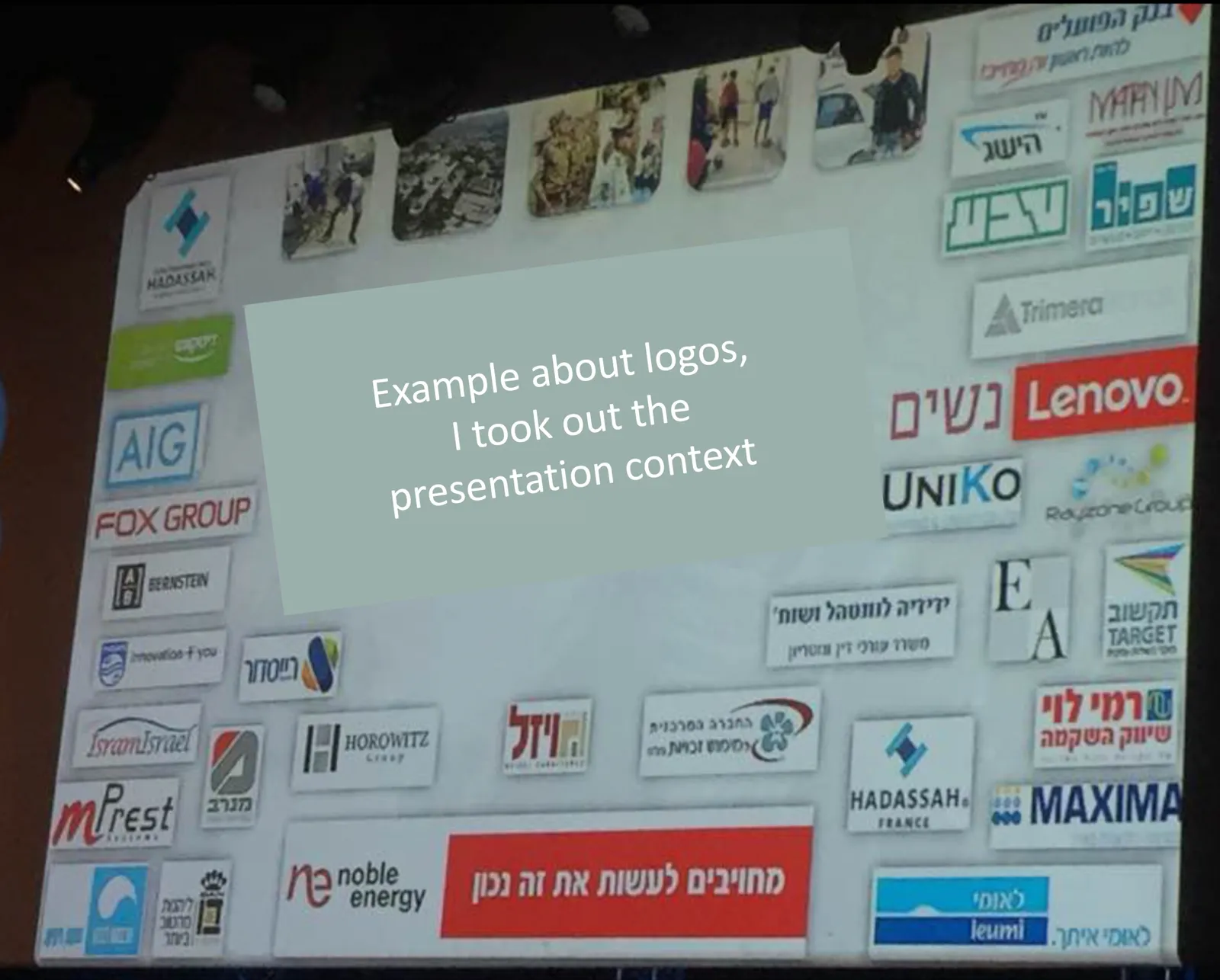
This screen shot is typical for many logo pages in presentations:

Images files are copied into the slide after which a background shading is added. The shadow creates an instant frame around the logo which is too tight, definitely not the framing the logo designer intended. Now that all logos have a box around them, the eye immediately wants everything to be distributed and aligned properly in a grid, which is impossible to do given the different sizes of the boxes. Finally, the drop shadows actually do not look good.

My approach to logo pages is to adhere to a strict grid and keep everything on a white background to give the logos space to breathe. In PowerPoint or Keynote it is a bit fiddly to line up all the logos, I usually put in a temporary table to make sure everything is lined up in rows and columns. When every logo is in its place, I delete the table.

My presentation app SlideMagic makes it easy, it is impossible not to align images in a proper grid.

Sign language

I was invited to give a guest lecture on “sound” at my daughter’s (12 years old) school the other day. I created a small presentation to back up the main elements of the talk: an analogue synthesizer connected to an oscilloscope.

The interesting bit: 12 years old + Hebrew, a language I only master passively (I understand, I can speak a few words, I totally cannot write anything). So my daughter did some translating, and for the slides I relied heavily on icons.

Yes, icons. I made fun of icon slides many times in this blog, but I must say, when used the correct way they can make great slides. I think the key to icons is to pick really original and good ones, use them in very big sizes, use flat designs without colors/shadings/gradients, use icons in a consistent style, and use the same ones repeatedly as a memory shortcut to the same concept.

To find icons, I used the noun project, a much better source for icons than stock image sites.

Presentation design secrets

If you are a layman designer, here is how your guide to an effective presentation:

  1. Put your entire existing slide deck with all your backup slides and analysis in an appendix
  2. Think what you want the audience to do, and write down a simple story of the points you want to make to get them to do it (no, don’t peek back into the appendix, it is all in your head already)
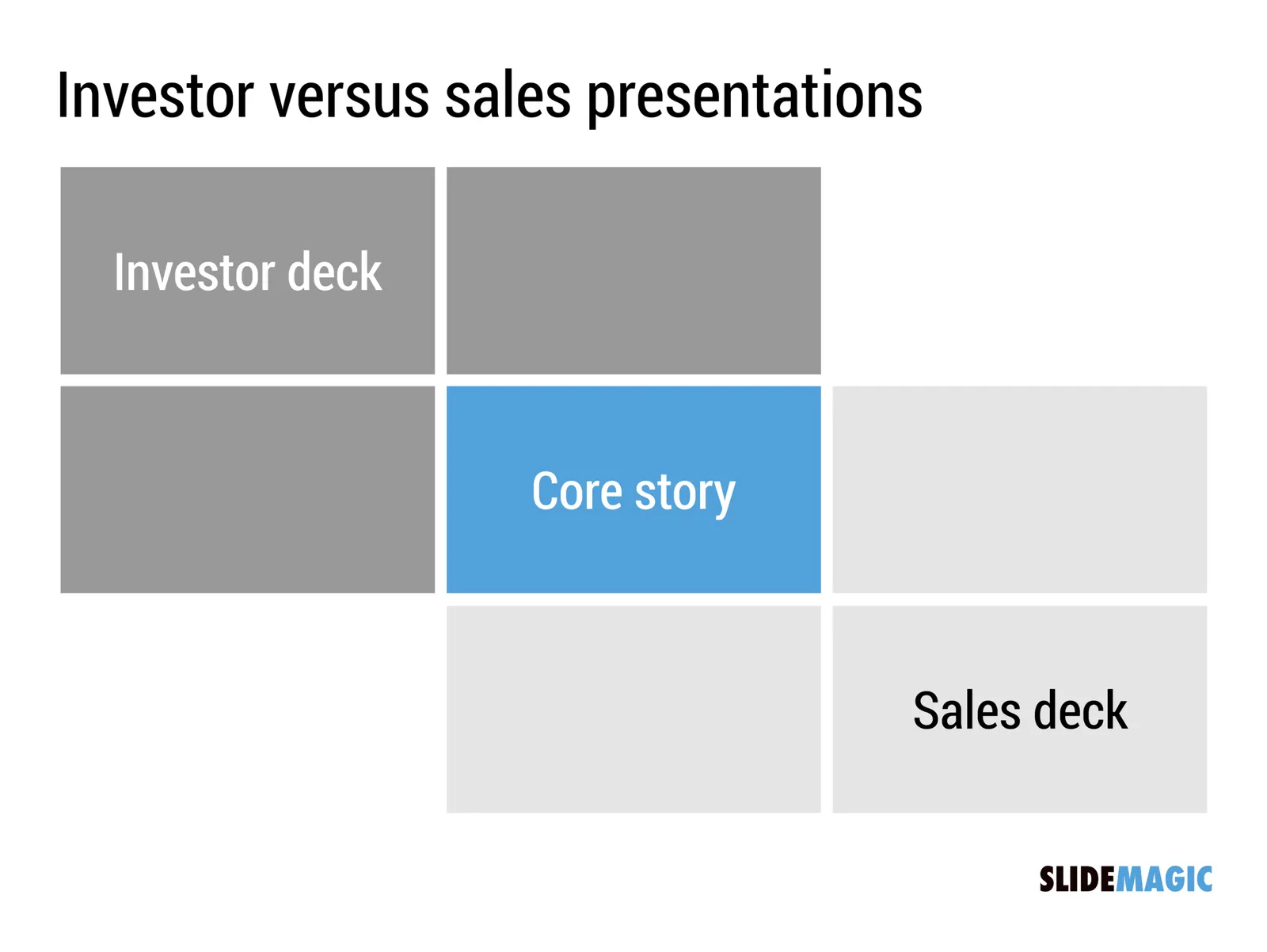
  3. Create a very simple slide template with just one accent color, and put all your text in light grey boxes to line up in a grid. Add a drop of accent color here and there.
  4. Create ridiculously simple charts using that grid that just, and I mean just, make the points you wrote down in 2. If you come up with a concept that requires more than a few text boxes, rethink the design and try again using your boxes.
  5. Run your presentation for real (speak out loud) and fix the flow where it does not work.

Here is how this approach prevents the layman designer from creating ugly and boring charts:

  • Separate the “analysis phase” from the “communication phase” of your project
  • Design a flowing, natural dialogue rather than a structured book with the full fact set
  • Cut your visual vocabulary down until you have an arsenal of basic visual elements (boxes in a grid) that you can morph into slides that pretty much always look good

Believe me, this will save you and the audience a lot of time. You can use my presentation app SlideMagic to do it, or in PowerPoint/Keynote. The latter option makes it a bit harder to align your boxes, but in the end will give the same result.

Continue reading →
·Layout

Writing text on charts

Most charts consists of 2 - 4 “boxes” with some text inside them. Text in boxes is different from text in sentences and/or paragraphs. When writing an article, you don’t have to worry about how long a line is, and/or whether it fits exactly in a certain amount of space.

Some guidelines about writing text in boxes:

  • Make sure the point in each of the boxes has more or less equal weight in terms of content. You don’t want box 1 to cover the entire presentation message, and box 2 to be a footnote detail.
  • Think of text on slides as headlines. Strip out all unnecessary filler words (i.e., make it as short as possible), but add enough words to keep it specific (i.e., no generic buzzwords).
  • Make sure that each box has roughly the same amount of text, covers the same number of lines. Yes, that means being a bit more verbose if one box is particularly short.
  • Adjust line breaks to avoid orphan words on the next line, or line breaks that cut the words of a key concept in two (cognitive [break] dissonance).

When “writing” a chart: the content should be clear but the text should be balanced as well.

Image from WikiPedia

The audience who knows

The feedback on most presentations is usually that it could have been shorter, more to the point. So, if you can pretty much say anything in 10 minutes, why do people study for years to get an academic degree in something?

The answer: most business presentations are conducted in front of an audience which is pretty familiar with the subject. The venture capitalist has seen thousands of startup pitch presentations, the retired angel investor has interviewed and met thousands of candidates for specific positions, the strategic acquirer knows the limitations of a certain technology, the CEO has a pretty decent understanding of the market she is operating in.

So all these presentations can skip all the background and dive straight into the one thing that is new, that is different.

Image via WikiPedia