

SlideMagic Blog

Frequent updates about all things presentations since 2008. Subscribe to never miss a post.

RSS
all posts

Search results for “windows”

·Gadgets

PPT Roomba

SlideProof is a neat PowerPoint plug in that cleans your presentation of common small mistakes - automatically. Misaligned boxes, titles, wrong page numbers, you name it.  A bit like the Roomba vacuum clean robot, a spell checker on steroids. You have complete control over the changes though, so nothing unexpected will happen to your slides, which is crucial since my guess is that most of the vacuum cleaning of presentations will happen just before the live presentation.

Fixing small mistakes might not be crucial to get your message across, but it does make a huge difference in the overall impression you leave behind. A bit like polishing your shoes.

SlideProof only runs Windows so I did not have a chance to test drive it myself (I work on the Mac platform). Please share your experiences in the comments if you managed to check it out.

·Keynote

Mixing and matching

Before starting a presentation design project, I need some basic guidance from my clients: dark or light background, custom fonts or not, Mac or Windows. Useful information.

A few times, I made the mistake of asking design (not content) input on specific slide elements: this way of putting pictures or that way, this type of titles or that, black & white or colour. It somehow did not work. As a designer you need to select the entire design approach in a consistent way.

I sometimes see something similar in interior designs of houses: individual elements look OK, but the whole composition together does not make sense.

Mixing and matching gives mediocre results.

·Keynote

PowerPoint for iPad review

Yesterday, Microsoft finally released a full version of Office for iPad, including PowerPoint. Unlike a previous release for iPhone, this version allows you to create and edit documents.

I blogged before about the strategic mistake of Microsoft restricting its Office products for its own operating systems, and I think the recent change in CEO might have something to do with the sudden release of the iPad app which was rumoured to have been ready for a long time.

So what do I think? First of all, the design looks great. It is a good blend of the iOS environment with Microsoft-specific UI elements (ribbon). The app works fast/snappy and is intuitive to use.

The best thing is that finally PowerPoint will look normal when opening them on an iPad. Fonts work, no need for PDF-ing, or using specific apps such as SlideShark. This takes an important uncertainty out of business meetings. I had many instances where I needed to pull out a deck quickly and unexpectedly, and if an iPad is the only devices you have on you, you keep on apologising for the horrible look of your slides.

And I think this will be the main use of PowerPoint for iPad: showing presentations plus the occasional last minute text edit, or slide show re-order. Serious slide design work is not possible, first of all due to the small screen that is not comfortable to work on for a long time, and secondly because critical functions are missing when compared to the desktop app.

Continue reading →
·Colors

Fix the PPT for Mac colour bug

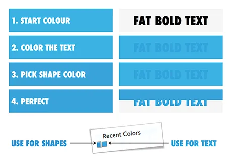
The colour rendering bug in Microsoft PowerPoint 2011 for Mac is highly annoying. Here is fiddly a trick to get around it. You basically need to goal-seek the text colour into something you like.

  1. Pick a colour you like, draw a shape and fill it with the colour
  2. Write some text in a big bold font and set it to the same colour: PowerPoint will render it incorrectly
  3. Here is the fiddly part: repeat steps 1-3 until you are happy with the TEXT COLOUR.
  4. Now, use the Apple colour picker to strip the colour of the text

Save your colour template with 1 accent colour for text, and one accent colour for shapes. In your drop down menu they will look different, on screen they will look the same.

Note 1: I tested the PowerPoint RGB colours as well in Photoshop and Illustrator, and it turns out that PowerPoint renders the shape colours incorrectly, the text is correct.

Note 2: There is a more analytical way to get your desired colour than simply trial and error. You can analyse the RGB codes of the background colour and the text colour. So, set the shape colour to something that you would like. Write down the RGB codes. Colour the text with that colour, and pick its colour with the colour picker. Write down the text RGB codes. Analyse the difference between the two colours and create a third colour by adding/subtracting the R, G, and B differences between the colours. This will be your text colour that renders the same as the desired shape colour. It all sounds more complicated than it is.

Continue reading →
·Colors

PPT 2011 for Mac color bug

Microsoft PowerPoint 2011 for Mac has an annoying bug: when you apply a colour to a font, it comes out slightly differently than when you apply the exact same colour to a shape. One: it looks bad on slides, two: it gives surprises when you open a PowerPoint file created on a Mac on a Windows machine (which does not have the same issue).

When I posted about this somewhere on a Microsoft forum I got the response that this was done on purpose; to make text readable against a coloured background. This does not make sense, if I want to make the text readable, I will put in a different colour myself, and definitely not the one that Microsoft is using. See below, the letter colour is a completely different type of blue than the background.

(Geek alert). There is a complicated way to get around it. Type some text, change it to the desired colour. Now select the desired text (not the entire sentence) and bold it: the right colour appears… But, as soon as you do anything else to your text box, the wrong colour gets put in. Annoying…

·Investor presentation

Twitter IPO presentation review

The Twitter IPO presentation is posted online. Overall it looks good and very professional, here are my thoughts on how it could have been even better (comments in random order):

UPDATE: The official presentation has been taken down, it is still out there on YouTube:

  • The whole story is structured around a description of Twitter, what do we do, how do we make money, how are we going to grow. It could have been pitched more to the point: why is Twitter such a great company to invest in. This would have changed the flow of the story significantly
  • For knowledgeable investors, there are a number of huge elephant-in-the-room questions about Twitter: the biggest one being, how are you going to make money? The presentation should have included hints to the answer to that question upfront in the presentation, and elaborate on it more during the presentation (the CFO only gets to the meat around 27 minutes into the talk, many potential investors might have tuned out by then).
  • The presentation is full of social media speak: engagement, driving conversation, rich media experiences, content, etc. To an industry insider, the sentences make the exact point, but to an audience who might be tuning in and out (watching the presentation online, while now and then checking the email inbox in another tab), this creates too much white noise to which the brain pays limited attention.
  • The look and feel. Twitter has an incredibly powerful branding (colour blue and the bird). It could have been used more prominently in the slides. Not by increasing the side of the logo, but by using the graphical language in the actual content of the presentation.
  • Using the actual embedded Tweets in the presentation is good, but the small print makes them hard to read for the audience. Also complicated conversations (a celebrity chefs replying to a person preparing for a dinner party for example) do not really come across, or worse, the audience is trying to read all the stuff that is going on on the screen (windows, tweets, hashtags) and loses the audio narrative that drivers the big point home. A better solution would have been a tiny representation of the actual Tweet with an extreme close up of the content that actually matters.
  • The 16:9 aspect ratio leaves some canvas blank on the tiny 4:3 screen of this 1990s video delivery platform of the Retail Roadshow service. For an IPO this size, they should have resized the slides.
  • The energy of the presenters (CEO, CFO) is held back a bit sometimes. In some sections, it flares up. For example: the interesting statistics about Tweets during TV shows, or the CEO closing remarks about the importance of the platform that can give everyone a voice.
  • Some very interesting messages are not reinforced by explicit slides. I found interesting for example that on Twitter, advertisers can target people by their actual interests in life, while traditional advertisers have to derive/guess these interests from demographics information. A big point, it deserves a slide. Another example: the majority of Twitter users are outside the US, while international ad revenue is a fraction of the US one, again a point that can be made in a slide, ideally with some growth curve that shows that it is not unreasonable to assume that international ad revenue is catching up to US levels fast.
  • Video is used only in the beginning of the presentation (mainly portraying the founders), it could have been used throughout the presentation.  Interviews with people, or snap shots of important live events that were broken on Twitter. The video animation of the spread of the Obama-4-more-years Tweet was amazing to watch, and only popped up in a small window.
Continue reading →
·Delivery

Crappy screen, crappy impression

When you invite people over in your office and you run a pitch presentation on a 10 year old screen with a stretched aspect ratio, pixelated images, and burned in colours you are not leaving a very good impression.

LCD screens are not very expensive today, and the right cables plus a bit of tweaking with screen and laptop settings will give a razor sharp picture. Maybe it is time for a meeting room upgrade.

Other quick wins: removing used coffee cups, empty cookie boxes, de-greasing the screen remote, eliminating chewed-on pens and used stationary, open the windows.

First impressions count.

·Keynote

New Keynote - first impressions

Together with a whole range of other product updates, Apple released a new version of iWorks (including Keynote) last night. I installed the Mac OS X Mavericks (warning, this will take your computer down for an hour) and played around with the new software. Observations in random order.

All iWorks apps are now free for people buying new Macs. iWorks was already a lot cheaper than Microsoft Office, but now the economic argument against enterprise adoption has been removed completely. Still, the huge installed base of both Windows hardware and PowerPoint with its familiar user interface will make it hard for Apple to make an inroad here.

What could help them is the cross platform compatibility. As of today, there is one file format both for desktop and mobile versions of keynote. I still do not fully understand iCloud, where my files are, where things get saved or not, but the duplication of a file when opening it on your mobile phone is gone. A step in the right direction, but not all the confusion has been removed.

Apple has also launched their suite of iWorks web apps. You can now edit and present Keynote presentations right from your browser. You can simply share a link to the presentation with your co-workers, rather than sharing heavy email attachments. More than one person can edit the live presentation. Many other services offer this feature, but personally I find it a bit scary when I loose control of how makes what edits (including deletions) in the master document. Anyway, that the feature is available does not mean that you have to use it.

Continue reading →
·Keynote

A hard drive crash in 2013

I had to swap my hard drive a few days ago and the experience was quite a different one from similar accidents that happened to me in the 1990s. What is different?

First of all, the total lack of panic. After I diagnosed the problem, I did not have to think long about hitting the delete hard drive button. All my data is in Dropbox.

A hard drive crash would have been an excuse to splurge on a new machine a decade ago. Then, there were dramatic performance degradations in just a few years as PC software become more powerful, especially because of the improved graphics. No such thing in 2013, software does not get more complicated, often the opposite is true as PC software is replaced by web applications.

I decided to rebuild my computer from scratch rather than recreating it from a Time Capsule backup. The machine got a little slow and cluttered full of applications that I tried once but never used again afterwards.

One decision: I did decide not to re-install my virtual Windows machine that I put on my machine the first day I bought my Mac to calm down my fears that the whole transition just might not work. PowerPoint 2013 for Windows is better than PowerPoint 2011 for Mac, but not enough to justify breaking my Mac file system workflow and colour picker, and to sacrifice disk and CPU performance to a huge virtual machine (Parallels).

Some things to remember with Dropbox. Move the default photo directory of your Mac inside Dropbox so you have your personal pictures backed up. (But then again, 99% of my personal pictures are actually sitting on my cell phone now, and the reason that it is very important to back up your phone, personal photos on your phone are more important than PowerPoint files on your PC). And secondly, move your Mac download folder into your Dropbox. Some software that you bought online do not allow for re-downloading the installation file (stupid).

Continue reading →
·Keynote

First impression of iOS7 (design)

As I am making steady progress with the design of my PowerPoint killer app, I have become very interested in user interface design for mobile and big screen applications. Apple showed its new iOS7 design yesterday. (iOS7 is the operating system that runs iPhones and iPads). Some observations.

I love the flattening of the design, out with excessive shadows and fake textures. The use of transparency is clever, to get a sense of layers throughout any app you use on the phone.

But there are things that I think are less good. The color palette is very bright, almost screaming, and the home screen looks like a sparkling X-mas tree. The use of gradients is inconsistent, with different directions of light sources. Some icons have gradients, some have not. I am also no fan of the more pronounced rounded edges. Grids on some screens are not completely consistent. The thin font looks classy, but might be hard to read in glaring sun light. And finally, the look and feel is not consistent either across all applications (some apps look great, others less so).

In short, a big improvement over iOS6, but iOS8 might just iron out the current imperfections. Weirdly, I actually still think the minimalist design of Microsoft’s mobile platforms looks great in terms of use of grids, simple colours, and sharp edges.

But then, people say never to argue about taste…

The look and feel of PCs running Windows software has greatly influenced the design of PowerPoint slides. In the future, I expect the same influence from mobile platforms on the way the average amateur design will create presentation slides. Helvetica Neue Light will become a popular font.