SlideMagic Blog

Frequent updates about all things presentations since 2008. Subscribe to never miss a post.

RSS
all posts

Search results for “web design”

Slide makeover example

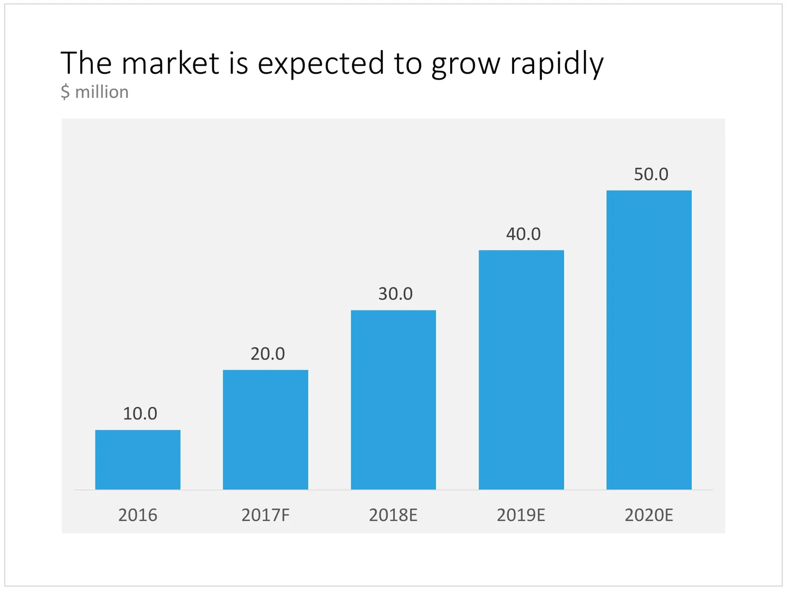
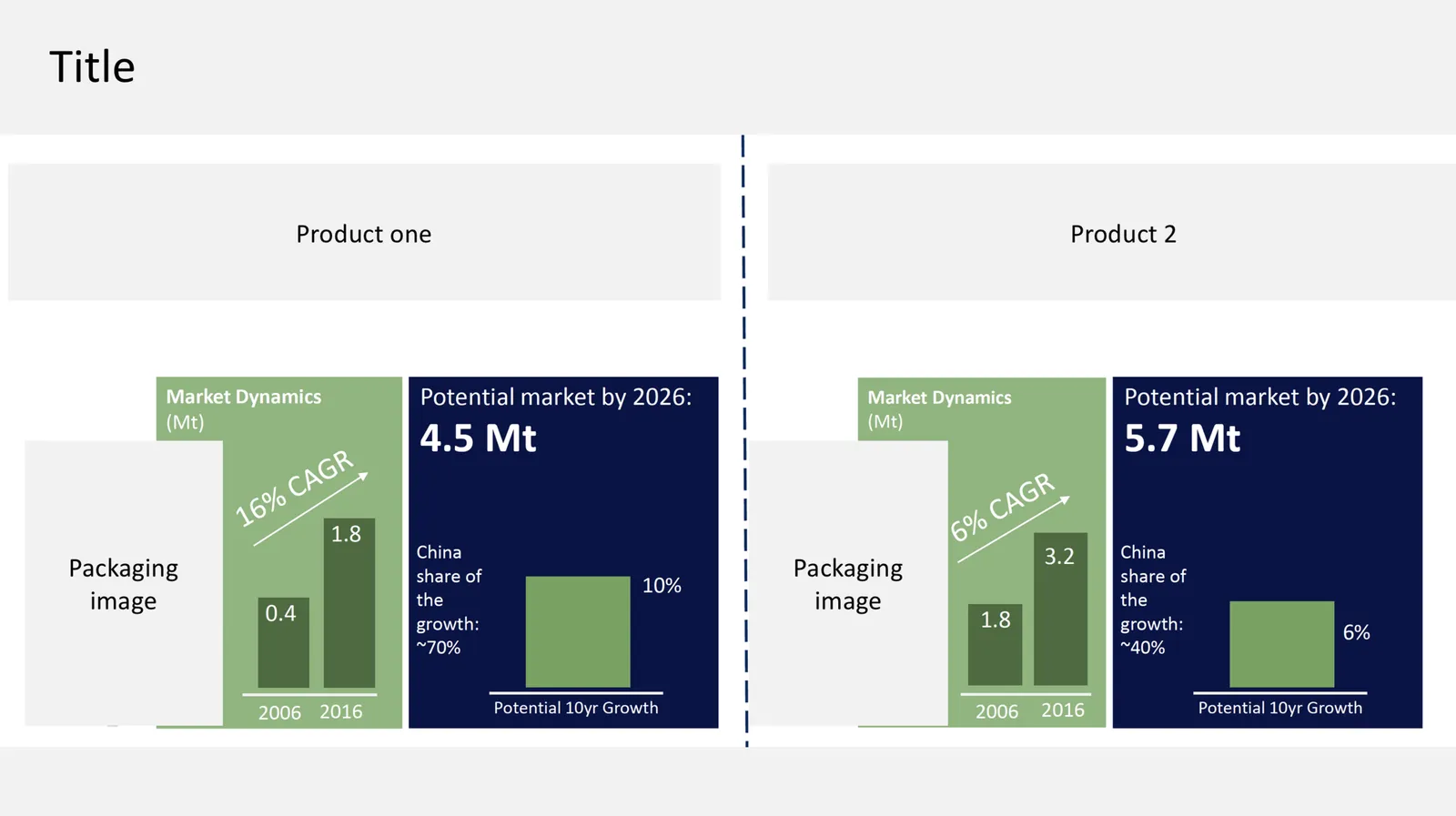
I came across this slide in an investor presentation of a public company the other day. The slide is in the public domain, but still I disguised the branding in order not to “picking” on a specific company. It is an example of a slide that is probably a leftover of an internal consulting project that evaluated different market segments. In that context, it was probably useful, in this context (the investor who was never part of the consulting project team), it is hard to grasp what is going on in five seconds.
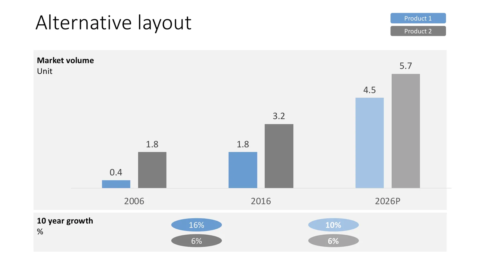
Below you can see my makeover.

  • On purpose, I stuck to a simple, no-nonsense, everyday, “anyone-can-do” presentation style. Managers should be spending their time on running a company, not experimenting with fancy graphics in presentations
  • I changed the design to a simple column chart that ties everything together. The original slide had market sizes, growth, potential, history, all in different places.
  • I removed that 1 data point column chart that never makes sense
  • I took out the packaging images with labels that were hard to read
Writing macros in PowerPoint

The last time I used macros in PowerPoint was probably back in the 1990s during my time as an analyst at McKinsey. Yesterday, I picked things up again where I left them of.

To my surprise, the record function is no longer available (at least on a Mac). This used to be my secret weapon: record something very roughly, analyse the automatically generated code, and re-write that in a better way. The fastest way to learn the macro language.

Now you have to go through the process of learning VBA via the MSDN website. For someone with a Computer Science degree (i.e., me), this is doable, but I am afraid, anyone else will get lost.

Macros are still very hard to make idiot proof. Giving non-technical users access to a neat button in their ribbon that does magic probably works 70%, but in 30% of the cases, it will either not work, or worse: do damage to their work.

I need macros to speed up my production time of slides for the template store. Highly repetitive work is the bottleneck: creating thumbnail images, creating the individual PowerPoint and Keynote slides, in different aspect ratios, and creating the product pages on the store.

I toyed briefly with the idea of outsourcing this to other designers, but after a few days of study, I might have found a way to automate the bulk of the work, which will save me a tremendous amount of time and reduce errors, and free up my hands to increase the speed at which I can add slides to the store dramatically.

Continue reading →

Survey results in PowerPoint

Survey data can be tricky to present. So much data, so many breakdowns, where to start? Here is my take.

First, let Excel make “dumb” data visualisations, simply use the automated tools of the spreadsheet to visualise the results somehow. Use this data to analyse / what is actually going on. While a chart for a live audience should be clear in 5 seconds, these charts are for you, and it might take you a couple of hours before you have figured out what the most important trends in the data are. When finished, all these charts go in an appendix of the document.

Now write down what the key messages of the survey are, and find the data that specifically support that message. One message per slide! Next, find the most appropriate data chart that can present that data. I often see people mix up columns (time series), pies (harder to read than stacked columns), and bar charts (rankings).
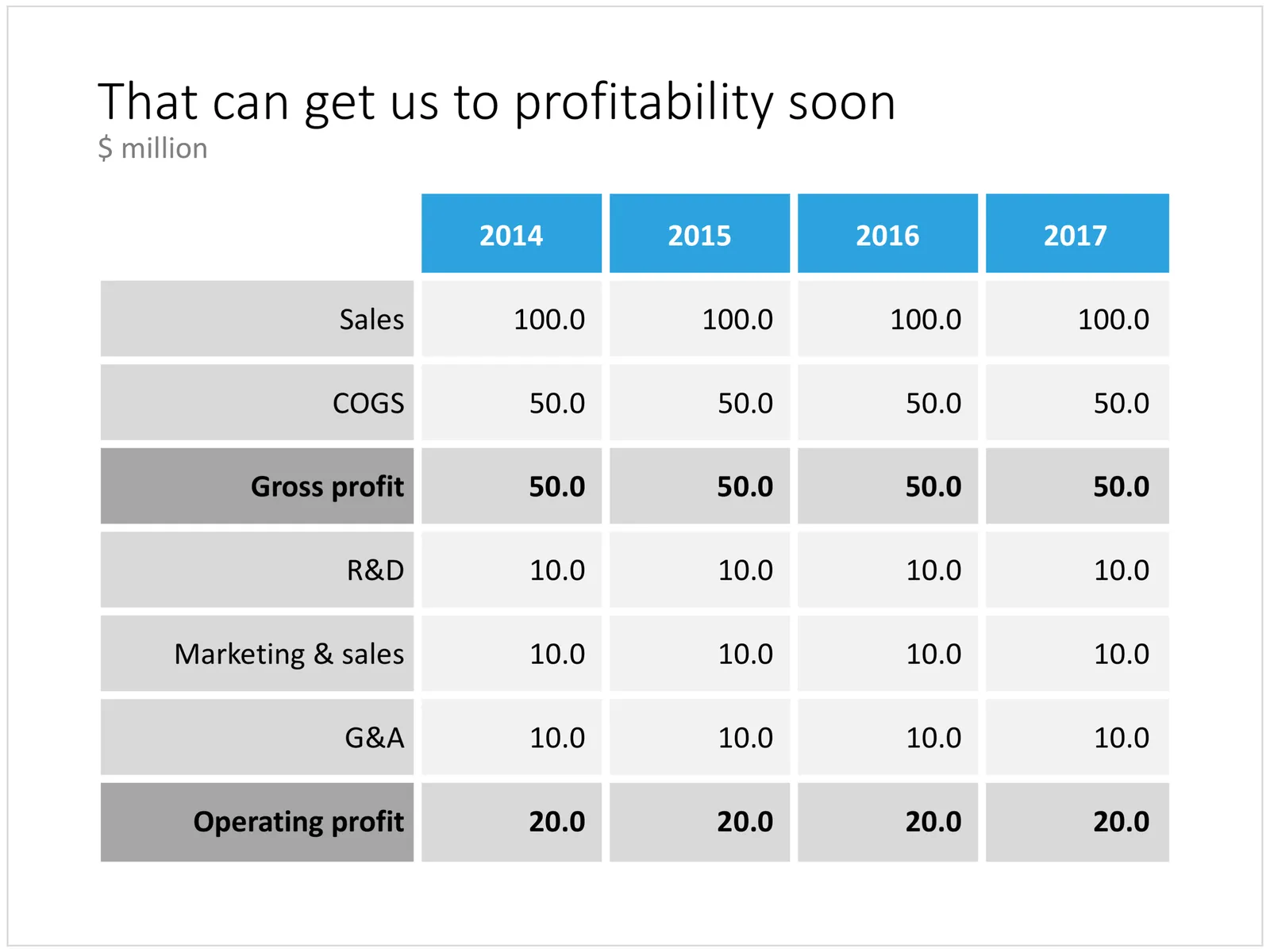
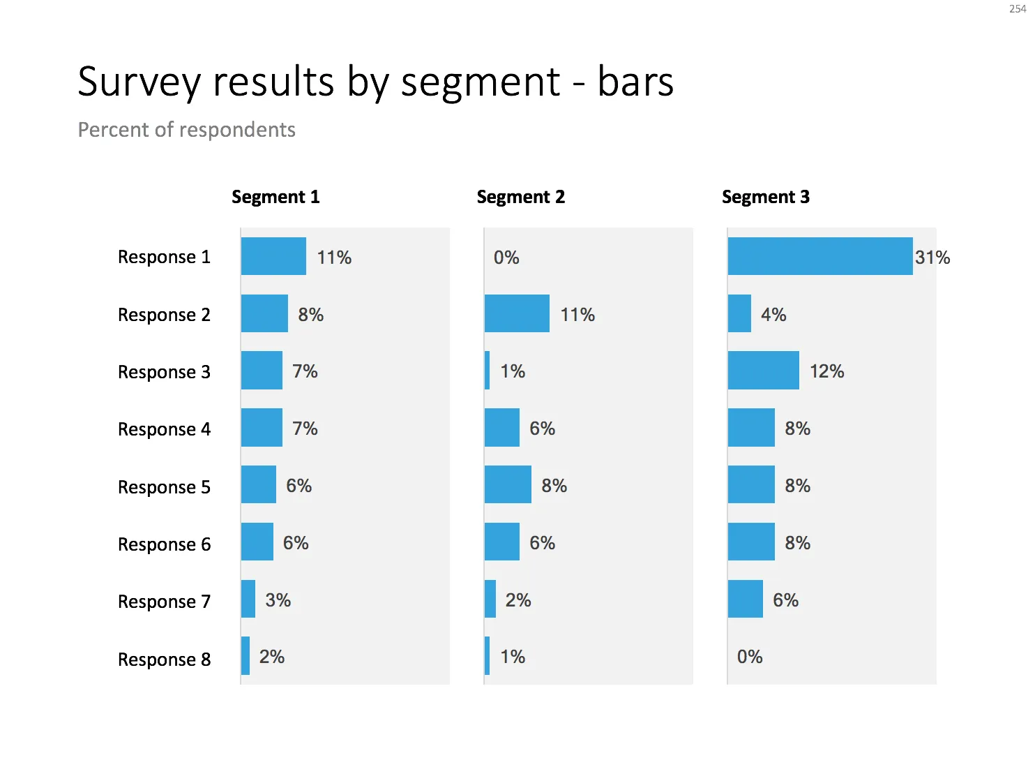
Below are 2 designs that can be useful for survey data that cut across different segments. The first is the classical approach: a series of column charts. The first one shows the entire population, the second and third give a breakdown for specific segments.

Here is a slightly unusual variation for this chart. I went back to table and duplicated the axis labels for each segment. This table highlights the order/ranking stronger than the value of the actual data point. To add more clarity, I colour-coded the ranked data for one sub segment (not the total!). This brings out the contrast between the segments better.

Continue reading →

Two types of PowerPoint templates

The Internet is littered with PowerPoint templates that fall roughly in 2 categories, I would classify them as follows:

  1. “Potpourri”-style
  2. “Adobe InDesign”-style

Potpourri. These are the slide templates that have been around since the mid 1990s.

  • Not very pretty: a very “PowerPoint” design with gradients, bevels, shadows that is often trying too hard
  • Hard, if not impossible, to integrate with prescribed corporate template files
  • Filled with cliche icons and stock photos
  • Sites offer “tens of thousands” of slides, but they are highly inconsistent across designers

Adobe Indesign. Recently, print/web designers have been branching out into the world of PowerPoint: creating very pretty designs that look a lot like the finished product that is created in Adobe InDesign. But there is a reason that InDesign-style presentations do not work very well for everyday business presentations:

  • They tend to ignore the way PowerPoint works with template slides: instead “hard coding” text boxes, shapes, and images on a blank page. This is very hard to customise as a non-designer, and it is impossible to fit into a corporate PowerPoint layout
  • They mostly are designed around paragraphs of text. Headlines are big and bold, but text is incredibly small. From a distance the grid of images and paragraph text looks pretty, but it is impossible to read.
  • The compositions are dependent on exactly the amount of words, pictures, paragraphs that are presented in the template slide. Have more text, one more option, less text, and you have to redesign an entirely new grid layout.
  • Custom fonts make porting the source files between devices hard (most people don’t even bother and in no time the presentation will end up in Arial).
  • The layouts are all about presenting lists, or blocks, there is no visual movement that is important in business presentations: cause-effect, pros and cons, trends, sequences.
Continue reading →
·Concepts

Risk matrix in PowerPoint

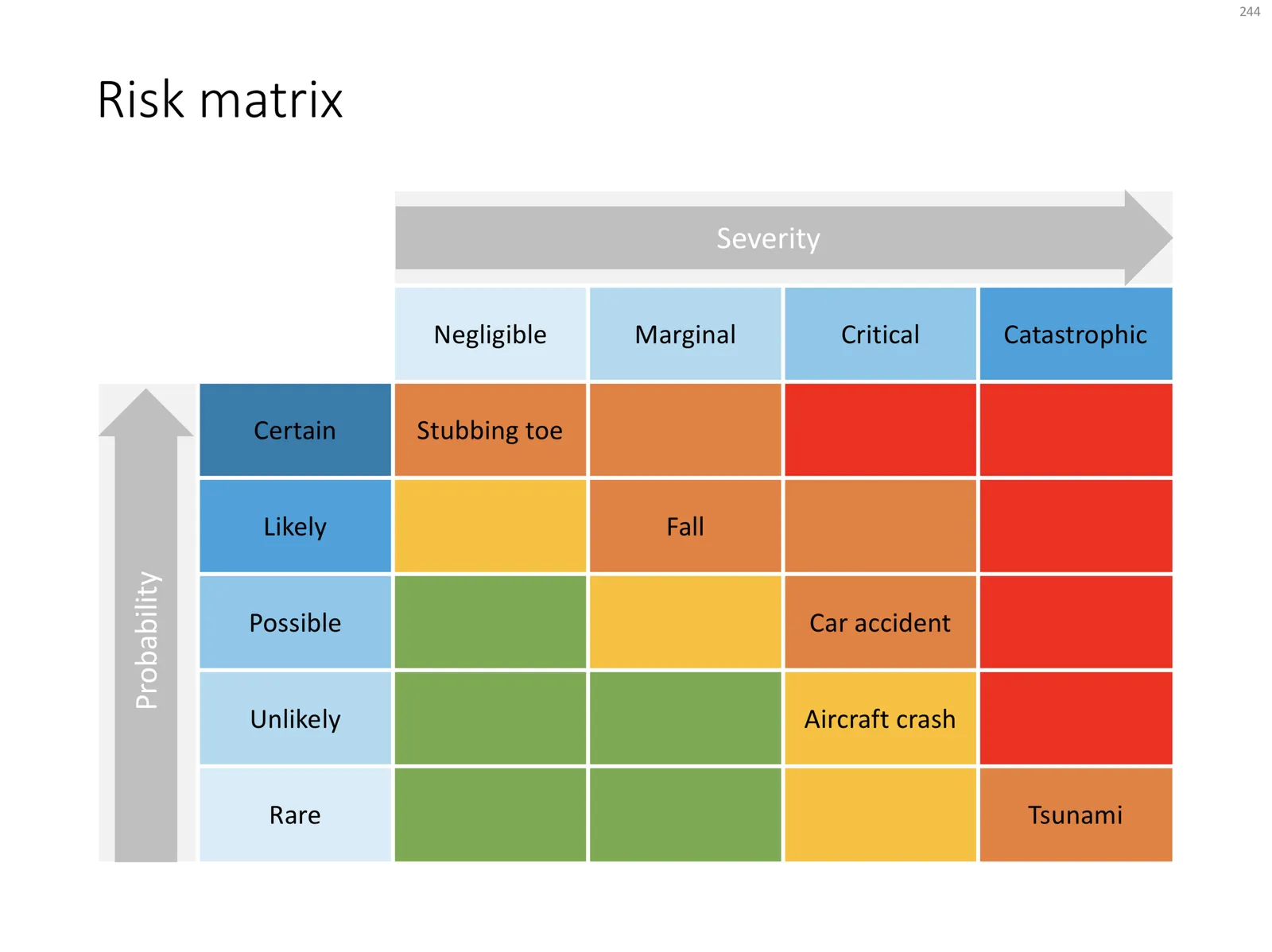
I am continuing to tick off the standard presentation frameworks in the store, yesterday I added a PowerPoint template for a risk matrix. The matrix has 2 axes: one for the probability that a disaster happens, the other one how severe it would be if it were to happen.

The matrix is designed in true SlideMagic style: not very fancy, but highly symmetrical, usable, and adaptable to your everyday presentations. You can download the slide here, subscribers can do so free of charge. Feel free to adjust the axis titles, labels, or dim the bright traffic light style colours to your taste and needs.
Cover image by JC Dela Cuesta on Unsplash

Almost there

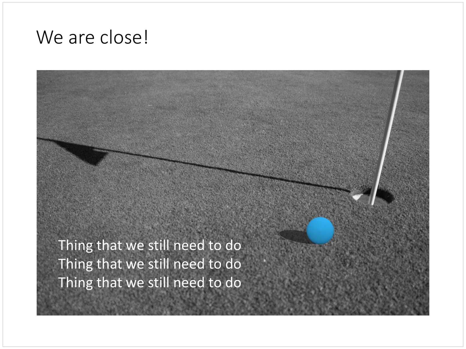
I love to use this golf-related concept to visualise a situation where something is almost done, it just needs a little push.

Visually, the image is highly recognisable. Similar to resolution in music (the listener is just craving the moment when the unstable note resolves into a stable / root one), here the eye can already mentally see the ball disappearing in the hole. There is tension, anticipation of movement in the chart without any video or animation effects.

The second advantage of this composition is that golf courts by design provide an abundant amount of white space (the grass) on which to put your text.

In my slide, I reconstructed the golf ball using a PowerPoint shape, a circle with a touch of gradient and a shadow constructed from an oval shape. As a result, you can control the size, position, and colour of the ball precisely. Feel free to borrow the design or download the ready slide here. Subscribers can do this free of charge.

Cover image by Andrew Rice on Unsplash

·Investor presentation

First attempt at a generic startup pitch flow

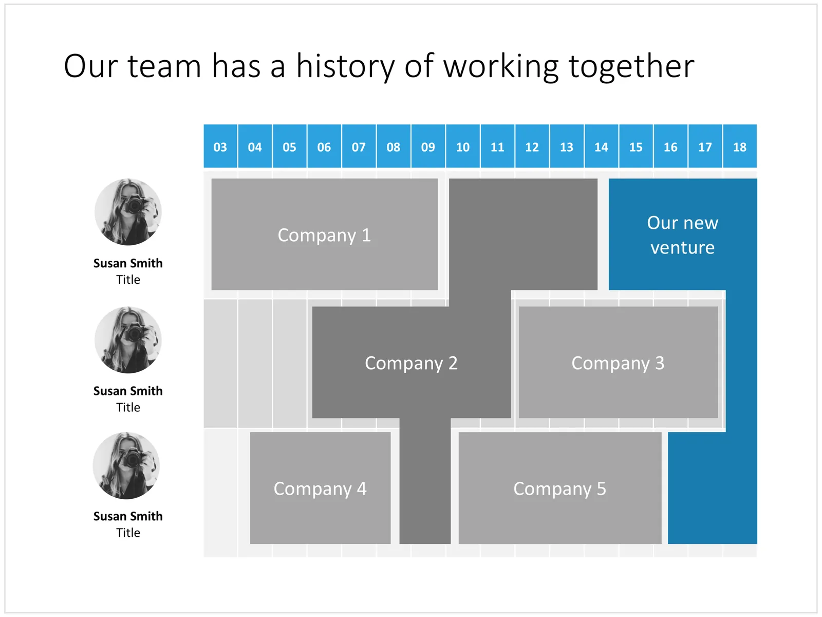
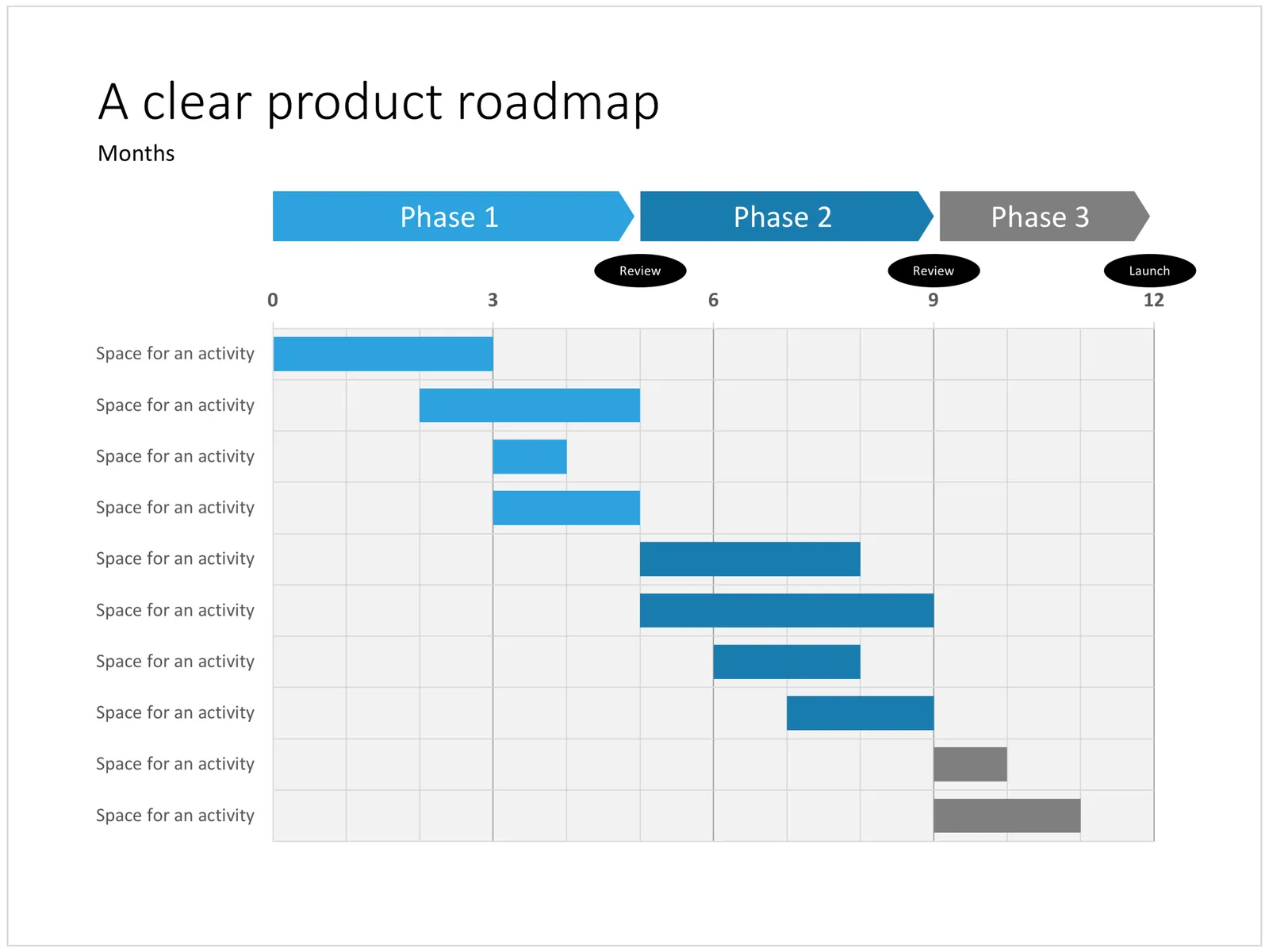
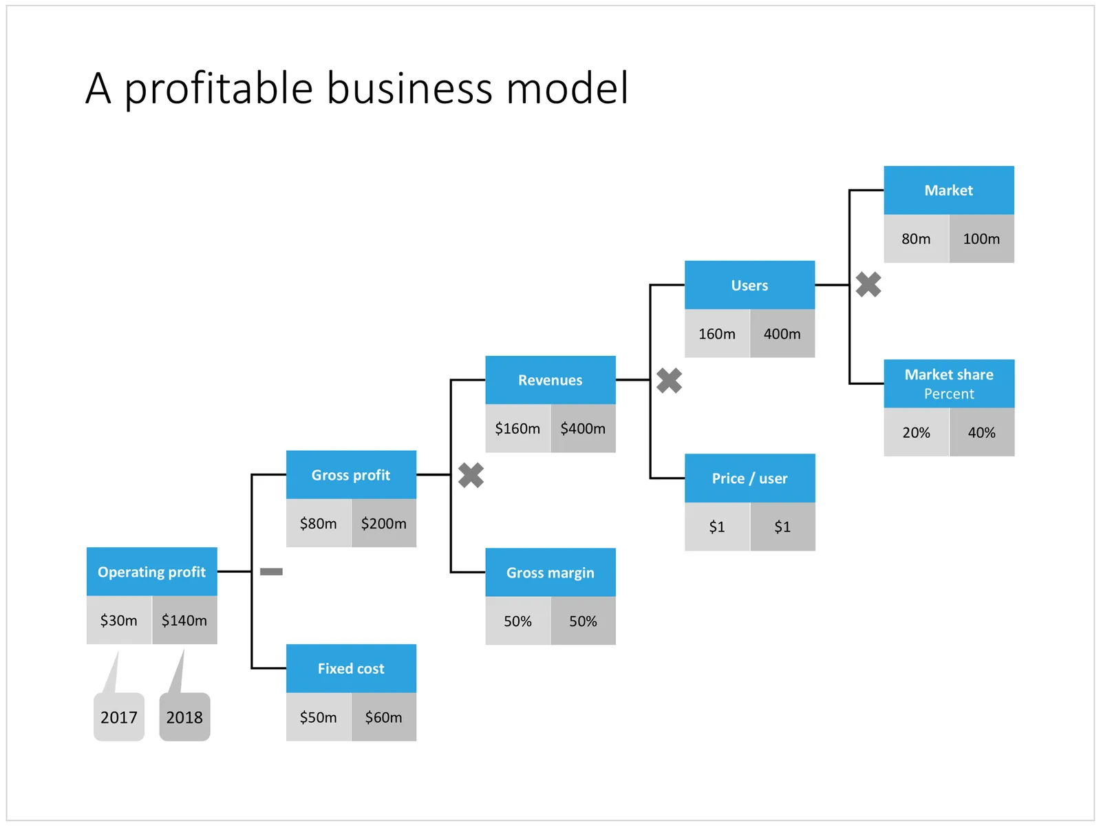
Below is an example of how you could stitch (I don’t want to call it “Frankenstein”) a startup pitch deck together using the slides that are available in the template store. It is tricky to design a generic startup up, the upfront bit of these decks is highly specific to the company and the marketing it is operating in. Towards the back, things get more generic (team, financials, pipeline, roadmap, etc.).

I will give this template a bit more thought, and I will also turn my attention to other standard presentations such as quarterly results presentations, kick off documents, Board meetings, etc.

The deck above can be pieced together from individual slides in the template store, or downloaded in one go here (4:3 PowerPoint only for the bundle). Have a close look before you do to make sure this is the flow that fits your company. Subscribers can download at no extra cost and experiment freely.

Cover image by Jomjakkapat Parrueng on Unsplash

·PowerPoint

Improved search

Slowly, slowly, I am moving closer to the goal of creating a searchable slide bank bank that is actually useful. Here are the various steps that I have gone through:

  • Designing a slide template that looks good/professional AND blends in easily with existing corporate PowerPoint templates
  • Creating a “boxy” design language that is easy to manipulate and edit, even for non-designers
  • Cutting down the universe of slides to come to a collection of basic slides that can cover almost every possible common business concept that is out there
  • Anticipate the majority of possible search queries to find layouts for every possible angle
  • And now: find a smart grouping slides that creates a really smart way of suggesting related/similar slides

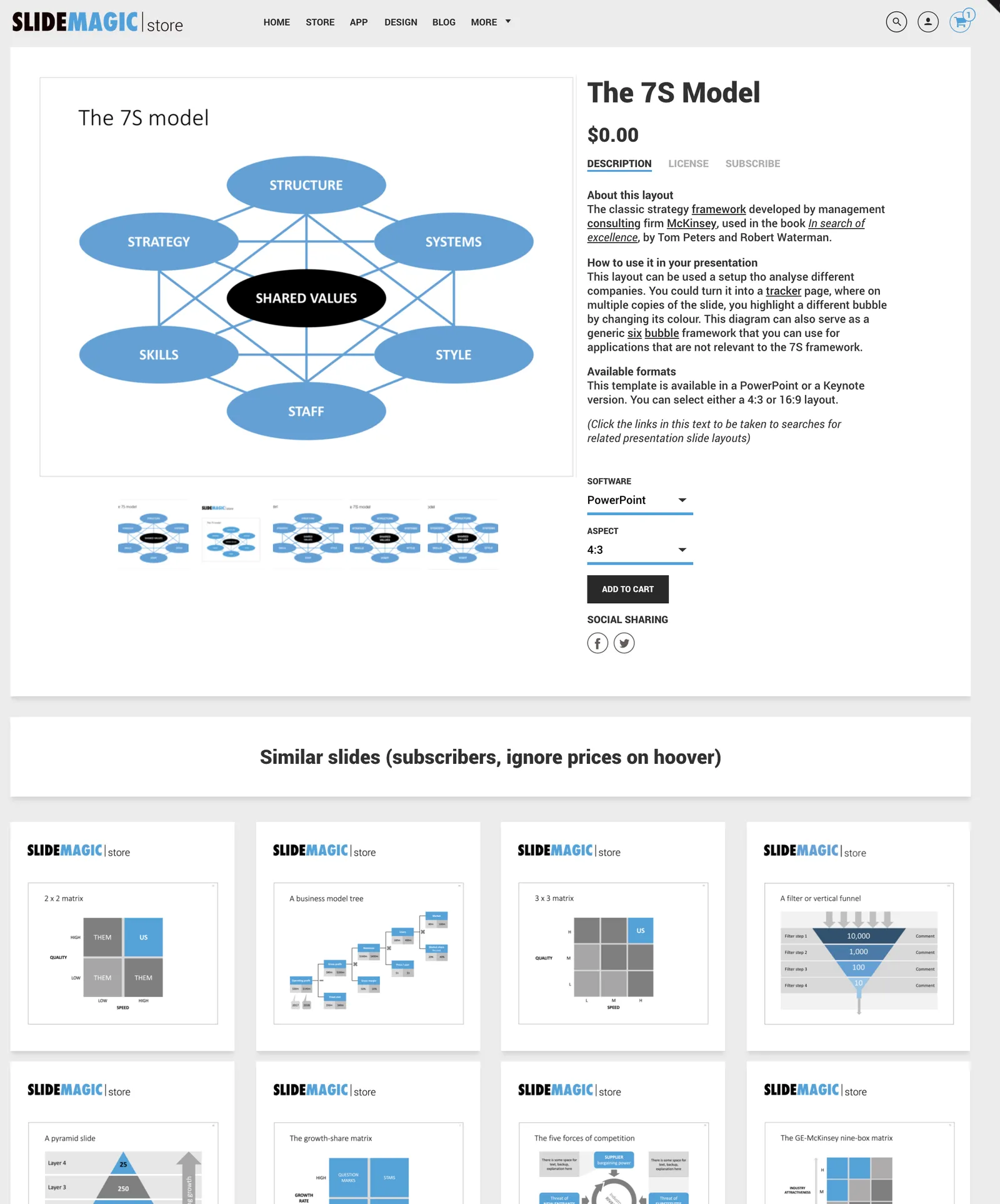
Below is an example of a product page in the store now:

Now that I have automated subscriptions, plus sorted out the search algorithms it is time to clear the last automation hurdle: VAT management globally for both consumer and enterprise customers (the EU has created a nightmare for small digital content stores as it is going after tech giants such as Apple). After that, all attention will be focussed on adding more slide content.

Cover image by Anthony Martino on Unsplash

Between a rock and a hard place

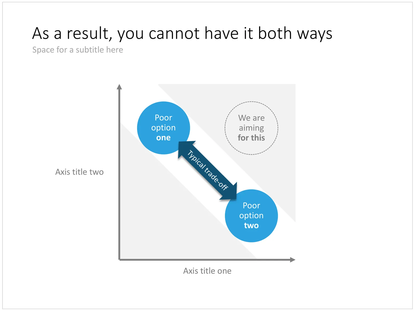
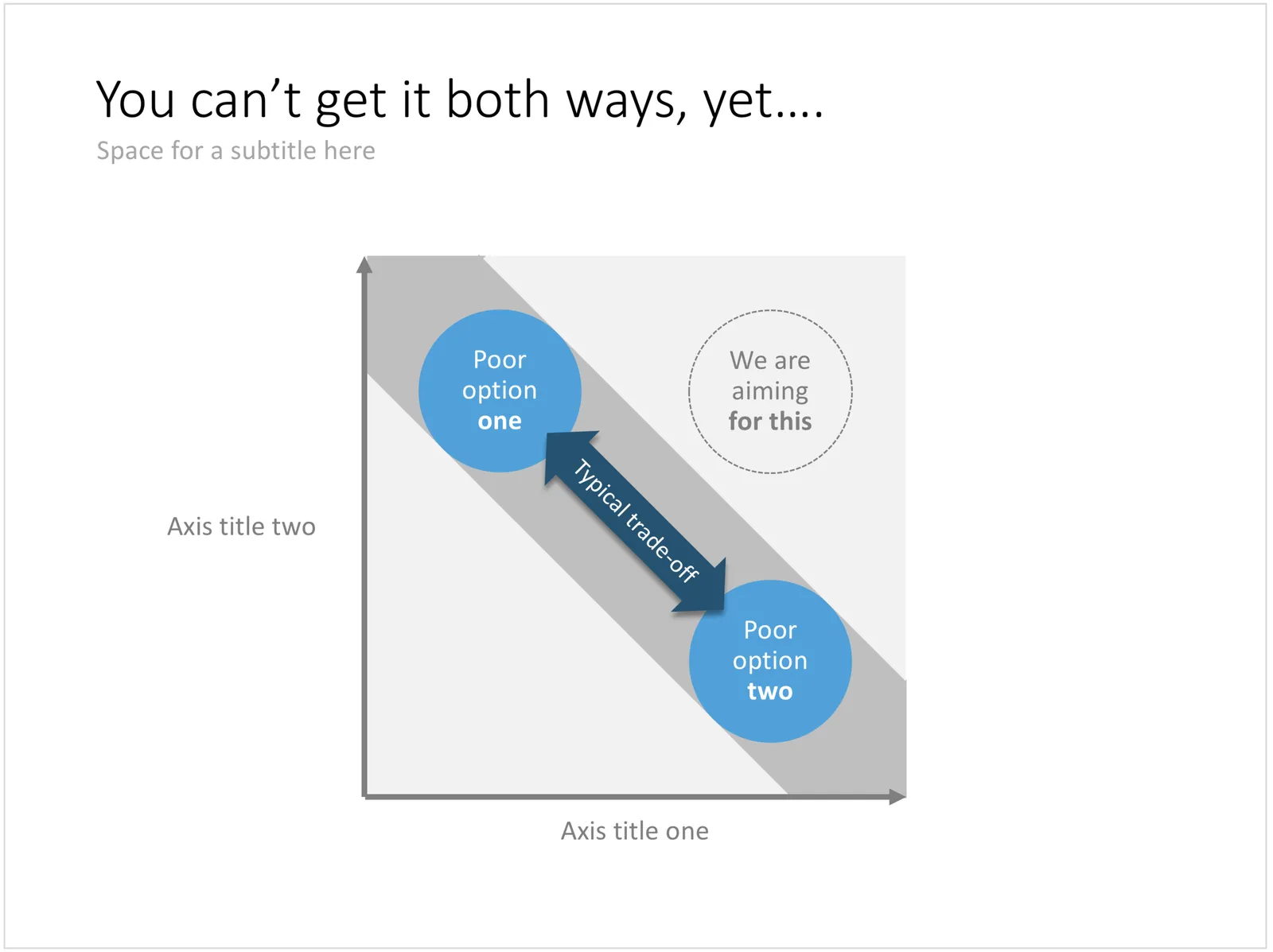
This variation on a 2x2 matrix slide can be a good way to visualise being stuck in a choice between two poor alternatives. Two balls move in a corridor and are trapped so they cannot reach that ultimate, best of both world position which sits at the top right of the chart.

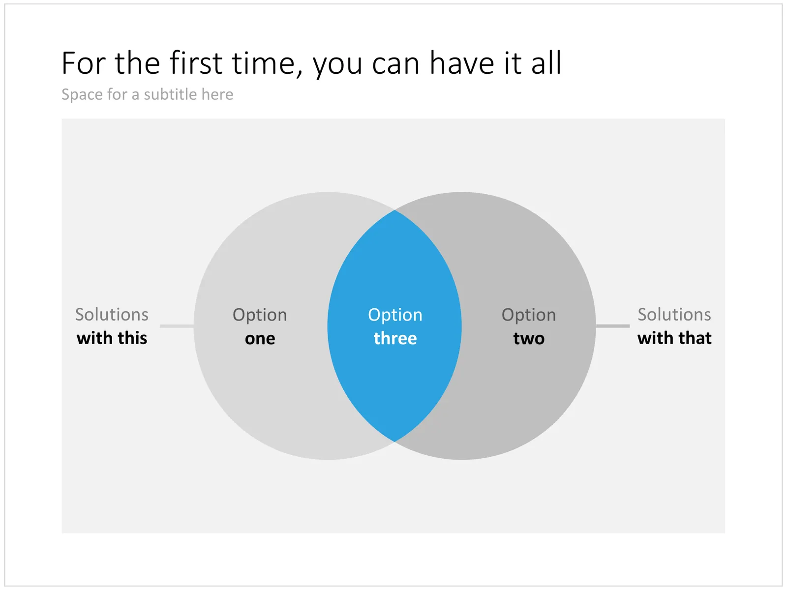
In a follow-up chart you could use the exact same design as a basis, but have the corridor break open as you introduce your solution. Other layouts to show a best-of-both worlds situation are Venn diagrams or 2x2 matrices. You can download this trade off chart here, subscribers can do so free of charge.

Cover image by Martin Reisch on Unsplash

Good slideocuments versus bad bullet point slides

PowerPoint (and Keynote) can be very useful alternatives to word processors:

  • It is easy to set up a document quickly, using empty pages with headers to organise your ideas
  • It is easy to move things around
  • It is easy to combine text, graphs, images, and data
  • It is easy to collaborate with others in this well-known user interface

As a result, many of my clients use “slideocuments”, presentations that are meant for reading, discussing, and decision making, rather than being the backdrop of a stand-up presentation in front of an audience.

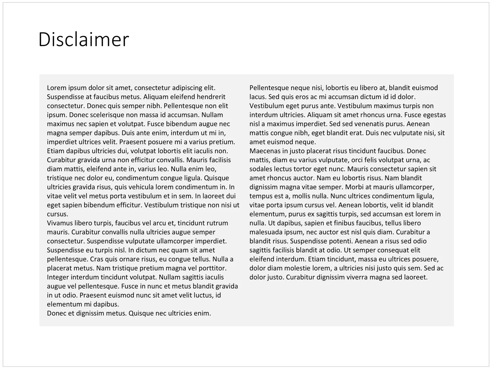
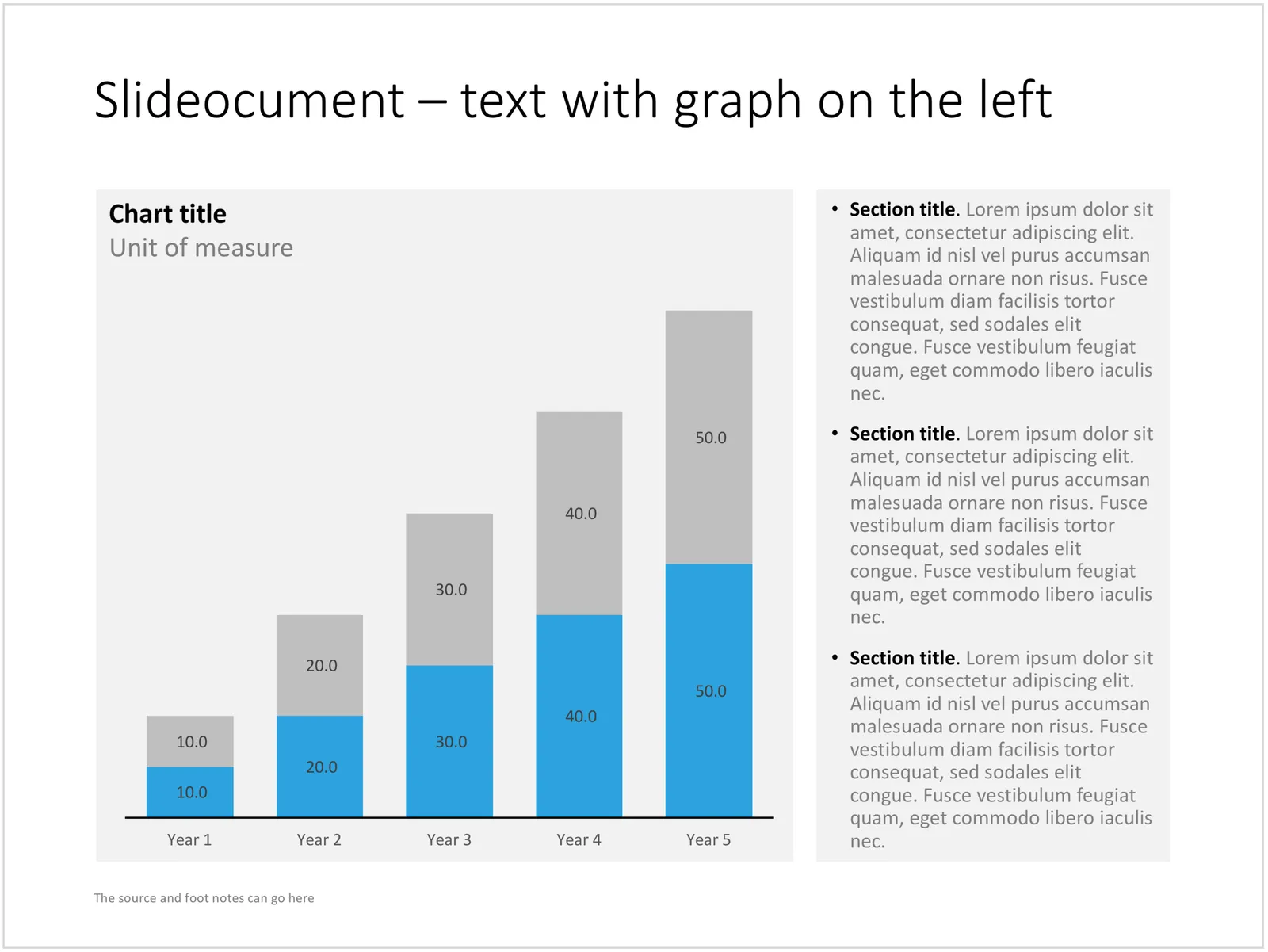
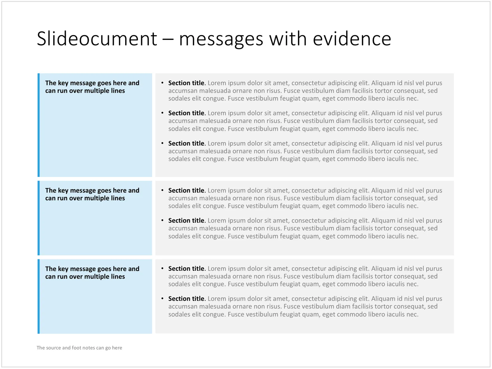
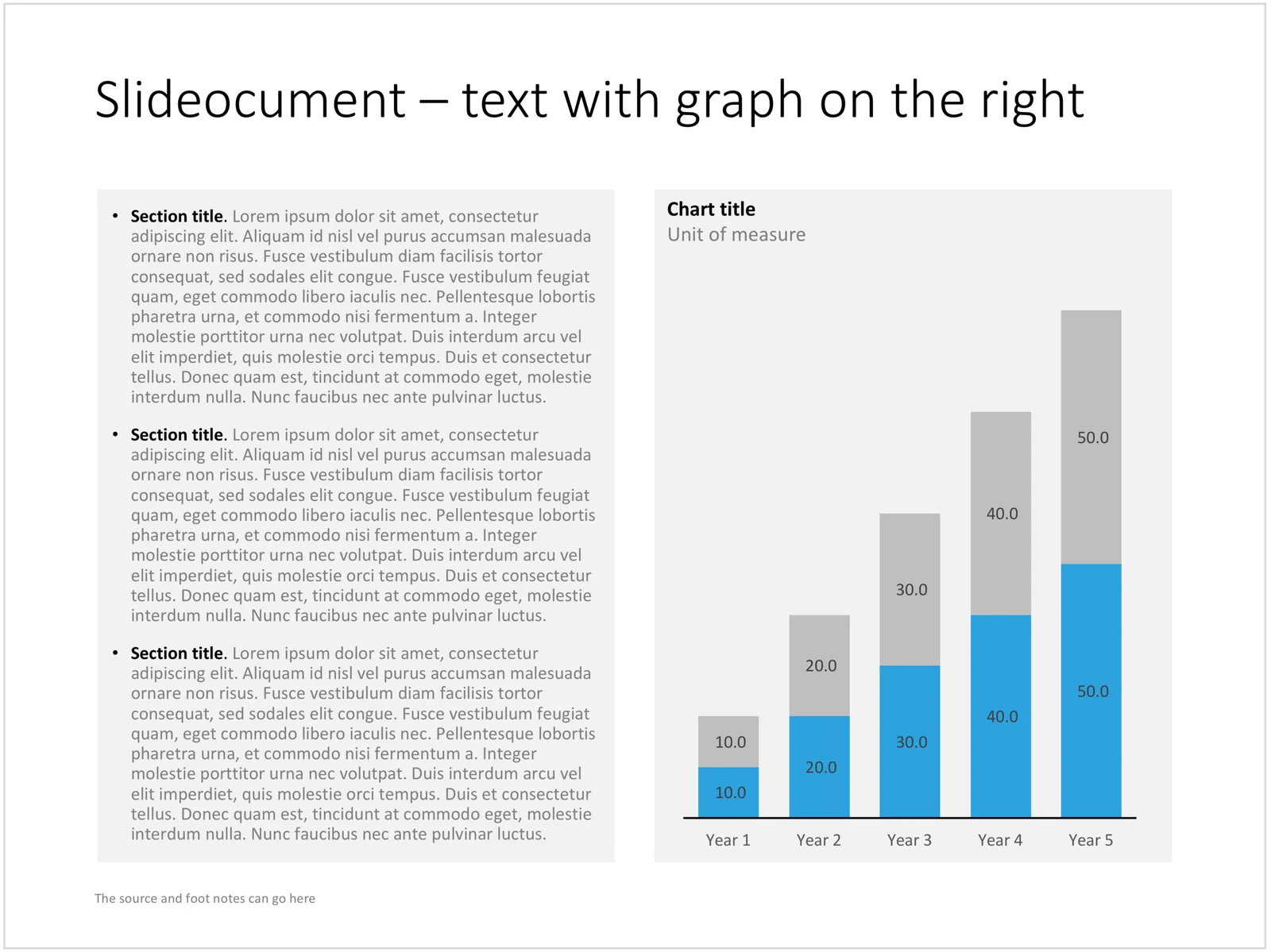
A good slideocument slide with dense text is different from a poorly designed bullet point slide (with dense text). It follows the layout principles of print design: white space, text in readable columns. Poor bullet point slides usually have a font size that is too small for a live presentation and too big for reading. Text runs from left to right across the entire screen, which makes it hard to read, especially in wide screen format. The structure of bullet points is not clear. The text of the bullet points is too long to be a headline, and too short to be a clear paragraph.

I added a few slideocuments to the SlideMagic store recently. Feel inspired to copy the design, or click on the images to purchase a ready slide. Of course, subscribers can add the slides to their collection at no cost.

Cover image by Laura Kapfer on Unsplash