SlideMagic Blog

Frequent updates about all things presentations since 2008. Subscribe to never miss a post.

RSS
all posts

Search results for “competition”

·Investor presentation

And this, and this, and this

Rattling through 25 points about why your idea is great on page 1 of your deck is not convincing.

  • You do not give the audience the ability to warm up, and first of all understand what it is you do
  • You dilute the power of the arguments by spending too little time on each: big need, no competition, great team, we all heard them before
  • You remind us of weak pitches where the lack of quality of the story is made up for by quantity: products with 25 benefits usually have no benefits

Instead, resist the temptation for detail and explain roughly what you do on page 1, plus the most important differentiator. Then follow with a presentation that is short enough for the audience to focus on your key points.

·Investor presentation

VCs can also improve their pitch!

As a startup you are used to sitting in the hot seat while the VC (venture capitalist) is grilling you on your business idea, and in the process gives you some advice on how to pitch it better. True, VCs probably know best how it is to pitch to them.

But VCs themselves can improve their pitches as well. I have designed many fund raising presentations for VCs and later-stage private equity (PE) funds pitching their next fund to institutional investors and high net worth individuals. Here are some of the common mistakes in version 1.0 that comes across my desk:

  • A lot of attention to the mechanics of the fund; how the due investment process works, and how the fund is organised.
  • Very generic descriptions of what sort of companies the fund will be looking for: great product, great management, no competition, sound business model
  • (Every fund does this) a chart emphasising that the fund (unlike all other funds) will actually be really hands-on with their portfolio companies
  • A dry summary of the investments made and financial returns, forced in the same generic framework that is applied to all the portfolio companies (with completely different stories) often lacking the real story behind the investment decisions and the portfolio’s company progress over time
  • Investment banker-style, dense, bullet point slides that are meant for printing and reading, not for presenting.

Investors in VC funds have heard the exact same story from all the other funds that are pitching for their money. VC/PE funds need to really think hard and articulate their story, and how it stands out from other funds.

Continue reading →
·PowerPoint

Start with the story

When you start to write a college text book, or you are cutting up the project work for a team, you start with a structure: market, cost, competition, etc. When you start with a presentation, you start with the meat, the substance, the story, what you want to say. Big difference, often confused.

·PowerPoint

Non-wordy-self-explanatory slides

Everyone has bought into the idea that presentation slides full of text are poor communicators of ideas. The result is that many presentations are now so minimalist, that hardly anyone can understand them without verbal explanation. This creates a problem, as more and more, slides are used as commercials of ideas that are shared without the presenter being present (yesterday’s post).

One solutions is to add an audio stream to your slides, or going a step further, turning your slide deck in a small video. This requires some technical skills though. Also, busy important people often prefer to sticking to the communication medium that they have grown up with: slides. But, they like to do so at their own pace (meaning fast), impatiently looking for a visual that catches their attention. Boring blah blah blah gets skipped.

So what to do in situations where you do not have time / resources / patience to separate slide decks for a live presentation and a cold email attachment? Some ideas.

A very clear headline. Write your message out in a human sentence, you can even change your presentation template to allow 2 lines of text at the top of your page.

Pick useful images. A big squished orange to support that your are crushing the competition does not add much. A photograph of bored people waiting and lining up to buy paper lottery tickets to argue that there is a market for mobile lottery makes the point perfectly.

Swap verbs for visual concepts. A tension can be 2 boxes of text with a rope in the middle that is about to snap. An implication can be arrows with 2 words in each pointing to another box with 2 words. Best of both worlds can be a Venn diagram. Contrasts can be 2 boxes with opposing colors.


Continue reading →
·Delivery

Timing your elevator pitch

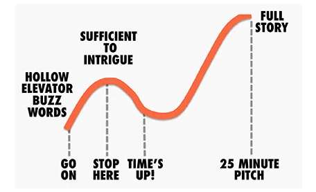
Sometimes there is little time to do your pitch. You meet an investor in the corridor, you got a slot at a pitch competition. Seth Godin said the other day that no one has ever bought anything in an elevator: in other words a very short elevator pitch consisting of 2 sentences with hollow buzz words is not going to excite an investor.

Instead, you need to add more specifics to intrigue the investor to invite you to another occasion where there is more time to discuss your idea.

But sometimes, elevator pitches become less effective when you take too much time. You start adding details, provide facts, that take the energy out of your presentation, that require time to close all all the plot lines. There is a dip between the perfect short pitch, and the full-length 25 minute story. Do not get stopped in the middle, it is better to keep it short.

·PowerPoint

Teaching slide design to teenagers

In a week from now I will be teaching 15/16 year olds about presentation design in Jerusalem.

MEET is an MIT-sponsored high-tech education initiative that aims to bring Israeli and Palestinian students closer together. Over the past years it has become a very prestigious program and only a small fraction of the applicants get in. Admitted students go through an intensive curriculum of programming and other IT-related subjects in addition to their regular high school commitments. A business idea pitch competition is part of the program, and I will be teaching, coaching, and judging the students.

I know that there are many teachers among the readers of this blog and would welcome suggestions on how I can adjust my content aimed at senior executives and startup CEOs to a younger audience.

You can find out more about MEET here.

·Design

Review of the live pitch to Mark Suster

Venture capitalist Mark Suster has a blog with a large following, and is also active in producing video about venture funding and startups. A few days ago he hosted a live startup pitch for funding on his show. As I said before, I am a big fan of making (at least part of) the fund raising process more public. The 53 minute video is embedded below, I watched it and give some of my thoughts.

I have great respect for these entrepreneurs to be vulnerable and go with their pitch on video, and they were probably a lot more nervous than when sitting a conference room without a camera. I have made the comments below a bit sharper on purpose, in the hope that other people pitching for VC money can learn from them. In part I am helped by my Dutch/Israeli cultural environment where people use a slightly more direct style than in the US.

Look how Mark is forming an opinion about the business right in the first seconds. What is it that we talking about? Many investor presentation deck hold off the answer for too long.

The opening sentence full of buzz words gets cut short. Mark starts paraphrasing “Right, so you are a sort of eBay/Etsy widget for blogs”. It is indeed a better way of saying things, but hidden in this comment, Mark is already hinting at his major concern about the business. The presenters could have come out with a snappy/high-energy “OK, that you call it like that for now, but we have something amazing under the hood that makes us stand out in the middle of all these eCommerce giants, advertisers, and affiliate programs.”

Continue reading →
·Delivery

Better webinar software?

I now did a few online webinars and I found it a great way to connect live with an audience without the need to travel, and without the requirement to get a large group of people together in one physical location.

Having said that, the experience from the presenter point of view is far from optimal. You are talking into a microphone, staring at your screen without any feedback. Here are some suggestions to make better webinar software and make the webinar experience a bit closer to that of a live presentation.

  1. Avatars. Encourage people to upload avatars when joining a webinar as an audience member, and more importantly, have these avatars show up on the presenter’s computer. In that way you get a sense of a real audience in front of you. I am sure as technology progresses it would be possible to create a virtual audience shot of live video avatars
  2. Kill presenter distractions. Applications that I use show statistics of people online, people leaving, people joining, people that are active, versus people that are checking their email in another browser window. Some applications require the presenter to let people into the session during the presentation. This information is useful, but there should be a way to switch it off, enabling the presenter to focus on her story. In real life, the presenter on stage does not need to open the back door to let someone back in to the room.
  3. Find a better way to moderate questions. At the moment, questions get punched into a small chart window. There is a constant flow of information, and chart windows are too small to be able to read the text. In a real live presentation setting, people do not shout their questions at the presenter all at the same time. There should be a 2-stage process: 1 audience members need to indicate that they want to ask a question, then the presenter need to give them the floor, and only then can the question be asked. Either through a live voice, or through a text box that has big fonts and can easily be read by everyone.
Continue reading →

Teaching public speaking to the new generation

Wanda Taliaferro contacted me to draw attention to her not-for-profit organization The New Jersey Orators that teaches children aged 7-18 to speak in public with confidence. The organization is also one of 10 global finalists in a Lenovo-sponsored competition that can land them $50,000. If you want, you can vote for them here, by selecting the Building Confidence - One Word at a Time entry.

·Delivery

Great, I do not get a lot of time!

Recently someone asked me: “How much time do you need for your presentation, 30 minutes, 45 minutes?”. While I can fill 2 hours with just talking about presentation design I chose to go for the 30 minutes. It focuses you to be to the point and interesting.

TEDTalks can discuss very complex subject matters in just 20 minutes. I have designed 6 minute presentations for startups participating in pitch competitions that managed to convey the entire company’s story. Often I find that a time constraint results in a better presentation.