

SlideMagic Blog

Frequent updates about all things presentations since 2008. Subscribe to never miss a post.

RSS
all posts

Search results for “mckinsey”

·Data visualization

Data backups

A good presentation uses very simple data charts. Often, in the last minute, changes are made to the data: it is easy to change a number in PowerPoint here and there.

In most cases the first versions of these simple data charts were extracted from very complicated Excel sheets. And here is where the trouble starts. After a few PowerPoint iterations, the presentation and the backup model is no longer consistent. This is fine if the presentation was a one-off event, but most of the time, the Excel model will live on for future iterations.

The solution is to include a worksheet in your Excel model that pulls the data exactly as it goes in your charts. Put in the correct rounding, everything. Anyone who wants to change the numbers, need to make changes in the Excel model to get the numbers to change.

And yes, sometimes that might involve a goal seek.

If these charts frequently change, you might even consider designing a presentation in Excel. Excel has the same chart and shape design tools as PowerPoint, and you can create direct links between charts and work sheets without having to copy things across. See a previous post (2009) on this technique.
·Keynote

Templates -> boredom

In big corporates, preparations for an important presentation often start with one person preparing the template for the presentation, emailing it around to all relevant business units to be filled out. The final presentation design is simply a matter of slapping the filled in templates together into one big, boring, 30MB, 200 page, 10-hour slide deck.

I am repeating my hobby horse here, this presentation is the problem solving deck that contains all the relevant data. The challenge now is to distill from all that information a compelling story. And that story might well have a different structure/flow for each business unit.

So, my suggested process:

  1. Yes, create that template, send it out
  2. Create the monster file, clean it up
  3. Have a conference call with each of the business units about the data
  4. Then, give them freedom to express their story in their own way, with their own slides, within a strict time constraint
  5. Share the monster document as backup/bed time reading

The word template can have 2 meanings. One is the standard background layout of a slide (many use banners, logos, and other graphics, I mostly use a white page), and the second one is a series of tables and data charts without numbers and/or words in them. In this post I refer to the latter.

·Keynote

Content before structure

The other day I had a potential client on the phone who was under time pressure. She asked me whether I could work on the structure/framework of the presentation (and the template) while in parallel they would start filling things in.

When you start a project and need to cut up work among multiple team members, a skeleton or presentation framework can be really helpful: someone works on the market, someone works on the competition, while someone else takes on the financials.

When you get to the stage where you have to present your conclusions to others (i.e., the analytical work is done), putting structure before content is wrong. As a presentation designer you need to know the content first, translate that into a story, and in the process you come up with a structure which is engaging and convincing, a structure that often will deviate from business school presentation templates, consulting pyramid structures and other logical frameworks.

Problem solving: structure first, then content. Convincing: content first, then structure.

·Keynote

Consolidation chart

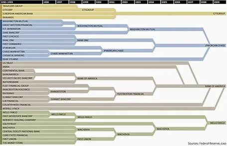
This is a nice way to show consolidation in an industry. You can digest the chart in 2 ways: on the podium you see the big picture of consolidating financial institutions, reading in close-up on the screen, you can see the details. The chart could have been better if the width of the arrows would represent the assets under management of the banks, some of these acquisitions were bigger than others.

[Off topic] There is a populist discussion going on in the comments of the original post. I did a lot of strategy work in banking mergers and there are different ways to look at the concentration in an industry. The top level player count is an easy statistic, but what is more relevant is the choice that customers (especially small businesses) have on the ground. How many different bank branches are within a 10km range at any point in the US? If there are 30 banks, but each concentrate on a specific state, then the market looks very competitive, but on the ground, customers face a monopoly. On the other, if all 4 banks are represented in most small villages, the market could be competitive.

·Data visualization

Boring frameworks

If your business has 15 sales channels, it makes sense to review their performance using the same framework: easy to compare, and you make sure that you are covering everything that needs to be covered.

If you work with management consultants, you will notice that they love this approach. You get presented with a framework, asked to fill it out and then - here is the mistake - the 15 analyses are put on the overhead projector for a nice morning-filling channel performance review session.

Analysis slides are not the same as presentation slides. Keep the boring, structured deck as reference material. But, when presenting: try to break the logical structure. Focus on what is different, remarkable, requires attention. And since each of the 15 channels are different, you will find that these stories do not fit into one framework.

·Data visualization

Place holder and data charts

I realised that most presentation slides I create fall in two categories:

  1. Data charts that have information in them that would be impossible to convey verbally (a graph, a table with financial information, a ranking of competitors)
  2. Place holders with some powerful visual (picture, typography) and is merely a placeholder for the story told by the presenter

Things go wrong if you mix them: showing hard core data with a cute picture will not work, putting up a detailed consulting framework as your place holder will not work.

·Keynote

Flattening a story

Business school books and consulting reports have a clear hierarchical structure. This is great for reading a document: you can skip what you do not need, and go right into then detail when you do need it more explanation.

In short stories, hierarchy can be boring, you sound like you are given a university lecture. I often flatten that hierarchy, making the presentation more sequential. Out go the slides with the 3-5 setup bullet points, and instead I just let the story flow. If I have to, I bring back the structure at the end of the presentation to sum things up.

This works great for 20 minute presentations, for marathon presentation days we might have to revert back to the business school rigour though. But there is a reason why marathon presentation sessions are so stimulating for the brain…

·Keynote

Focus on the decision

Most business meetings are about getting to some sort of decision or agreement on next steps. So why not focus your presentation completely on that?

Take out or put in the appendix:

  • Long-winded sections with historical backgrounds
  • A detailed description of the process your team took
  • All the dead ends you hit and excluded from the analysis
  • Vast analysis that proofs a point that everyone already agrees on
  • Market analysis for the sake of market analysis, without supporting a point you want to make
  • Explanations of management theory and frameworks you used, extensive parallels with other industries
  • Elaborate competitor profiles

Instead:

  • Frame the options that you see
  • Provide a summary why you think you need option C
  • Quickly mention the evidence that everyone agrees on
  • Boil things down to the decision about the more controversial parts of your argument
  • Provide your logic, and provide deep fact-based analysis that support the points you are making.

A business school professor would not agree to this violation of providing an academic argument, but you ensured that your meeting will be as short and to the point as possible.

·Keynote

The ponder slide

Not all PowerPoint presentations are in front of 500-seat TED audiences. Many presentations get emailed around and read on screens.

Strategic decisions are usually a careful trade-off between options. Some choices are clear, fact-based and objective. Others are qualitative, and yet others are complete leaps in the dark.

To make a decision you need to have all of the factors on some page somehow. Yes, this dense slide violates all the rules about good presentation design. But there is one big difference: the audience that will appreciate it are insiders, who suffer from the Benefit of Knowledge (the opposite of the Curse of Knowledge [what?]). They have heard the arguments before and they are ready for decision time.

How to design a good decision slide for these people?

  1. A table: options in the columns, arguments in the rows
  2. Group the options and arguments somehow, sort options by risk, how radical they are, something. Group arguments: similar arguments go together, if they are sort of the same thing, you collapse them into one. Group the factual arguments, to make the more contested ones stand out.
  3. Label your options and arguments for the audience with the Benefit of Knowledge, short labels or placeholders that are enough for them to understand the full picture. After months of discussions “Blink first” might be enough to describe a strategic scenario covering 25 pages.
  4. Frame the options so that the answers are in the same direction: I usually pick positive ones: no cannibalisation, retention of talent, limited competitive threat. Etc.
  5. Now the tricky bit: score options (1, 2, 3, low, medium, high) and use colours to distinctive good or bad. Re-group, re-sort options and arguments until you get the maximum number of continuous good and bad fields.
  6. Look at the result and tweak scores and weights until you reach your conclusion. If you had the push up the weight of the leap-of-faith type of arguments a lot to balance the factual criteria, you know what you will have to explain in your presentation
  7. Once you reach your conclusion you can make a hugely simplified version of this matrix, collapsing all similar arguments together and boiling it down to the 2 or 3 points that will tip the balance
·Keynote

A new business language?

Most PowerPoint decks are not designed for standup presentations to large audiences, rather they are documents that are used to get a smaller group of people to agree business decisions (the implementation plan, next quarter’s budget, etc.). The language used in these documents has changed over the years.

First, there was the memorandum that was dictated and written on a type writer, later replaced by a word processor. It was full of fluffy and formal language and people quickly learned how to skip most of it by jumping straight to the “Executive Summary” on the first page. All of these documents looked sort of the same.

In the 1930s, the management consulting profession was invented. Engineering mixed with business resulted in scientific charts full of frameworks with fancy names and buzzwords. Like the executive summary, managers had to acquire a method to skim through the content quickly, ignoring padding and business school speak to cut through what the document really wanted to say. All of these documents looked sort of the same.

I think it is time to create a new business language that injects good design into the management consulting-style charts and I am trying to write my upcoming presentation app around it. Yes, all of the documents it produces will look sort of the same, but it will make business decision making easier and more beautiful on the eye.