SlideMagic Blog

Frequent updates about all things presentations since 2008. Subscribe to never miss a post.

RSS
all posts

Search results for “web design”

·Keynote

90 degrees

Nature prefers curves and round shapes. Steve Jobs likes rounded edges. White board sketches are curved and fluid. People prefer rounded shapes in architecture.

But: curved shapes are a pain to design. It is hard to fit text. It is hard to align them properly. They waste space (the Japanese invented the square water melon that makes better use of fridge space).

This is the reason that I “squarify” almost all diagrams and white board scribbles when designing presentation slides. Circles/ovals become squares/rectangles. Curved connecters become elbow connectors. Business presentations need to be efficient, and as a result they might not always be artistic master pieces.

·Keynote

Slide negotiations

There are different uses for a PowerPoint deck. One is to serve visuals for a live presentation. Another is a replacement for a word processor. I currently use it as a user interface design tool for a web app (the irony: PowerPoint is designing its own successor…).

In big corporations, a PowerPoint file is often the working document that different stakeholders use to negotiate on strategy, budgets, or planning. Through a series of meetings, a document iterates towards a solution that is acceptable to all parties involved. The slides do not have to be attention-grabbing, emotion-triggering, memorable calls to action.

Instead, often the most important part of a slide is the detailed footnote that summarises the compromise that has been reached after 3 weeks and 6 meetings. Others: the order in which the boxes are placed on the slide, the relative position of the boxes, dotted lines versus straight lines, preliminary versus final decisions, etc.

Use PowerPoint for whatever you want to use it, do not mix things up though. Budgeting presentations should only be used in budgeting meetings.

·Keynote

Mentioned in Forbes

See an article on Forbes by Mark Fidelman with 20 tips to make better presentations. Due to the format of the article (an email interview with presentation design experts including me), the suggestions are slightly random, but useful nonetheless.

·Keynote

The new slides.com

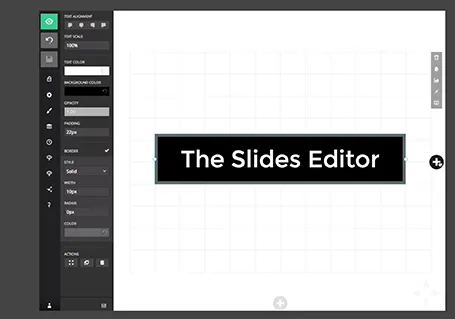
Slides has updated its slide editor. It is another example of people moving away from 1990s drop down user interfaces. The UI is simple and looks great. It has very powerful capabilities to insert HTML code in it. Still - as with all presentation design software - the average user is likely to use it to create bullet point slides… Check out the demo here

·Concepts

The easy or the hard way

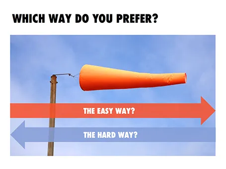
Maybe not very original, but this concept worked nicely in a client presentation (something related to lowering customer acquisition cost).

UPDATE: A variant of this slide design can now be downloaded from the SlideMagic store.

·Keynote

Bad form

Most form designs are a total disaster. Full of text (long prose) and cluttered, it is impossible to find the information you actually need. Especially if you are a non-Hebrew reader living in Israel, and need to pay a water bill online. The basics of 1) which web site to go, 2) what numbers to enter on the site, and 3) by when to pay are totally unclear.

There is a strong parallel with poorly designed presentation slides. Most forms are designed with the issuer in mind: it follows the structure of the IT infrastructure. Most forms follow a classical form template that has been used for decades, nobody is challenging whether a different layout might by more effective.  Most forms lack any form of human language.

·Keynote

SketchDeck - overnight slides

Most investment banks and management consultancies have the luxury of an overnight, low-cost slide production factory in countries such as India. Raw slides (even hand-drawns on the fax machine in the evening, the result in your inbox when you are back in the office the next morning.

SketchDeck is now opening this production capacity to everyone. Prices are very attractive, and they can ramp up capacity quickly to work under very tight timelines.

Not every presentation is an all-or-nothing investment pitch or TED talk, and most PowerPoint presentations are visual documents that are put together quickly to support decision making inside big corporates (Nancy Duarte calls them SlideDocs in her new book). It is for these types of presentations that SketchDeck is a good solution.

As it competition for me? Yes and no. For long-standing clients, I have done slide make-over work helping them in emergency situations, going at such a speed that I could probably be price competitive with an India operation on a s $-per-slide basis (I have the advantage tough of having the confidence/ability to edit/cut/change wording put in by very senior executives in a company, something they might not appreciate from everyone). But ultimately, my 1-man operation will not be able to keep up with the race to the bottom (as Seth Godin calls it). I will continue to focus on bespoke work that is in a different price category, and - in my spare time - am busy developing a web app that can hopefully automate a large part of the work that a mass volume slide production facility typically does.

Continue reading →
·Images

Getty Images - free embed

Getty Images (a huge database of both stock and news photos) is open sourcing non-commercial use of its collection if you publish an image via their embed widget. Web sites only for the moment, presentation design software will have to wait…

·Images

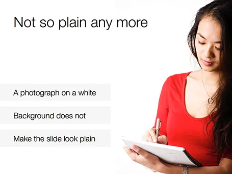
White <> plain

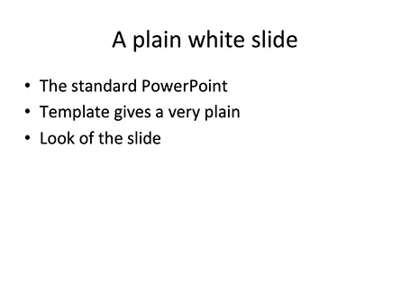
No one likes the plain, white, standard PowerPoint slide. And sometimes when I design a slide with an image on a white background and a lot of white space I get the comment that it looks very similar to a boring, plain PowerPoint slide. I beg to differ.

·Keynote

Icons in PowerPoint

With smaller screen sizes, icons are becoming an increasingly important element of user interface design. Not everyone of you is likely to be using PowerPoint to design a web app (hey I do), but icons can also be useful in regular presentation design.

I am not talking about floppy disks and other ancient icons we still use, but stylised symbols that can be an effective visual short cut to a category of (pick the appropriate) products, benefits, user problems, etc.

One option is to create your own icons in PowerPoint, set the zoom to 400% and create miniature shapes using shape booleans. Often you can use a quick Google Image search to find inspiration for your icon.

Stock photo sites sell endless amounts of icons, but there are compatibility issues when using them in PowerPoint or Keynote. Most icons are design as a vector graphic in Adobe Illustrator. It makes them infinitely scalable (like a PowerPoint shape), but PowerPoint does not read this file format. Copy-pasting Illustrator objects (if you have the software installed) is unpredictable and results in a shape that is hard to manipulate (changing colour for example).

Cropping icons out of a JPG or PNG file is not a solution either, if you forget to compress the small image file, you end up storing a huge image file with all your icons multiple times on a PowerPoint slide. Cropping also kills the vector-like scaling of icons, and background transparency.

A recent trend in web design might provide a solution: custom icon fonts. Modern successors of Zapf Dingbats (what?) provide clean icons that are scalable and can be manipulated (colours, shadows, and - do not use this - reflections).


Continue reading →