SlideMagic Blog

Frequent updates about all things presentations since 2008. Subscribe to never miss a post.

RSS
all posts

Search results for “mckinsey”

·Delivery

My presentation training in 1996

In the middle of the house and office declutter exercise, I found my credit card-sized reminder of things I should work on which I wrote after a communication training at McKinsey, back in 1996 when I just returned from INSEAD:
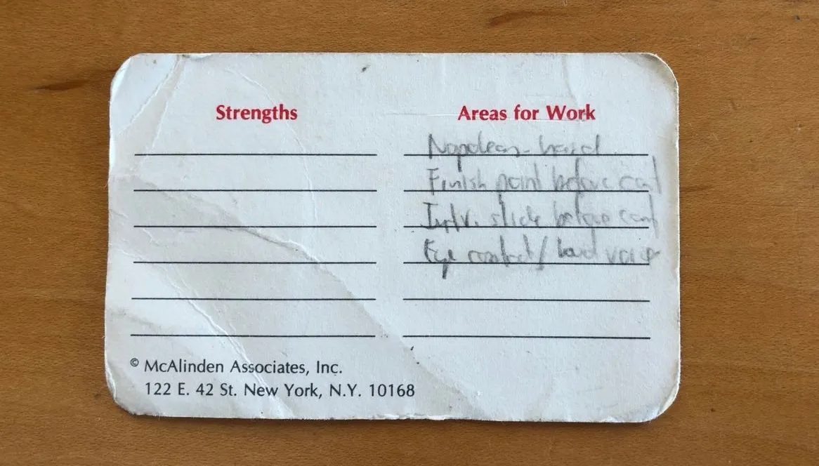
  1. Avoid the “Napoleon hand”, I seemed to have difficulty finding a natural position for my right hand
  2. Finish a point completely before jumping into the next slide / topic
  3. Introduce a slide before putting it up (McKinsey data slides can be overwhelming)
  4. Maintain eye contact with the audience
  5. Use a loud (maybe confident?) voice

I think I had a few strengths as well, but did not bother to write them down (I hope :-) ).

That little card might survive the declutter tornado.

Cover image by Margarida CSilva on Unsplash
·Data visualization

Trees!

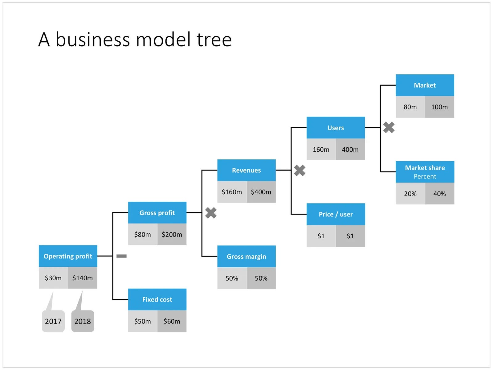
A tree visualises the composition (or decomposition) of a number into a number of factors. They are what I call ponder charts, not to be presented during a TED talk, but rather they are useful for  (complex) studying relationships between different factors.

Below are two examples of these analysis trees. The first is a summary profit and loss account for a company. I often use these a tree like this to visualise the business model of a startup by forcing a forecast year 5 P&L of a success scenario into this format. It is impossible to forecast the future accurately, and investors and founders will always disagree on the numbers, but the tree teaches you how to think about this company. What drives its economics? What would you have to believe for the year 5 scenario to be true? A tree always has to add up and multiply, this often leads to insights when it forces you to fill in boxes that you did not originally take into account (i.e., you forecast your sales, you assume market size, and right in the middle sits your implied market share).

A second example is this return on invested capital tree. It explains how (and more importantly, why) company performance is changing over the years. In this version I added miniature line diagrams to make the annual trends clearer. PowerPoint cuts the vertical axes of these graphs automatically, amplifying the trends in the line graph. Normally, I would object to this form of lying with statistics, but in this case with the very small diagrams, it is actually useful.

Continue reading →
·Investor presentation

Pitching your startup

Here is a nice post on the Stripe Atlas site about pitching your startup. It is written from the perspective of a very early-stage startup pitching for a seat in an incubator such as Y Combinator. (If the entrepreneur is not yet that experienced, an achievement like having climbed Mount Everest adds a datapoint about persistence).

Here are some quotes that struck me from the post:

  • “Explain assumptions in your pitch like you would to a smart friend in a different field.”
  • “The investor is not your user, so pitching users and pitching investors are completely different.”
  • “This pitch says nothing, in 18 words: COMPANY will help e-commerce stores sell more products using cutting-edge AI-enabled algorithms and machine learning.”
  • “Clarity is particularly important when you’re tackling recently popular ideas, like blockchains or machine learning”
  • ‘Your reviewer will read literally thousands of data points today–the average pitch includes more than 10. No one can remember that many arbitrary numbers, so reviewers compress them to “zero”, “non-zero”, and “impressive.”’
  • 'Nobody has ever written in their comments on a company “Wow, their sign-in screen blew me away. I want to invest in that sign-in screen.” ’
  • “Risk-taking is encouraged in startups; stupid risks are not. Walking into the office of a person in a position of authority without a meeting scheduled is a risk, but it suggests ambition and sales ability. Describing crimes you’ve committed generally suggests poor judgment.”

The people evaluation bit of this Y Combinator screening process seems very similar to the way we were on the lookout for new talent in McKinsey. Especially for young hires with little work experience, you had to comb for indicators of possible future success, fit. In every interview you really wanted the candidate to succeed. And the dialogue with the candidate, the way she responded and thought was very important.

Continue reading →

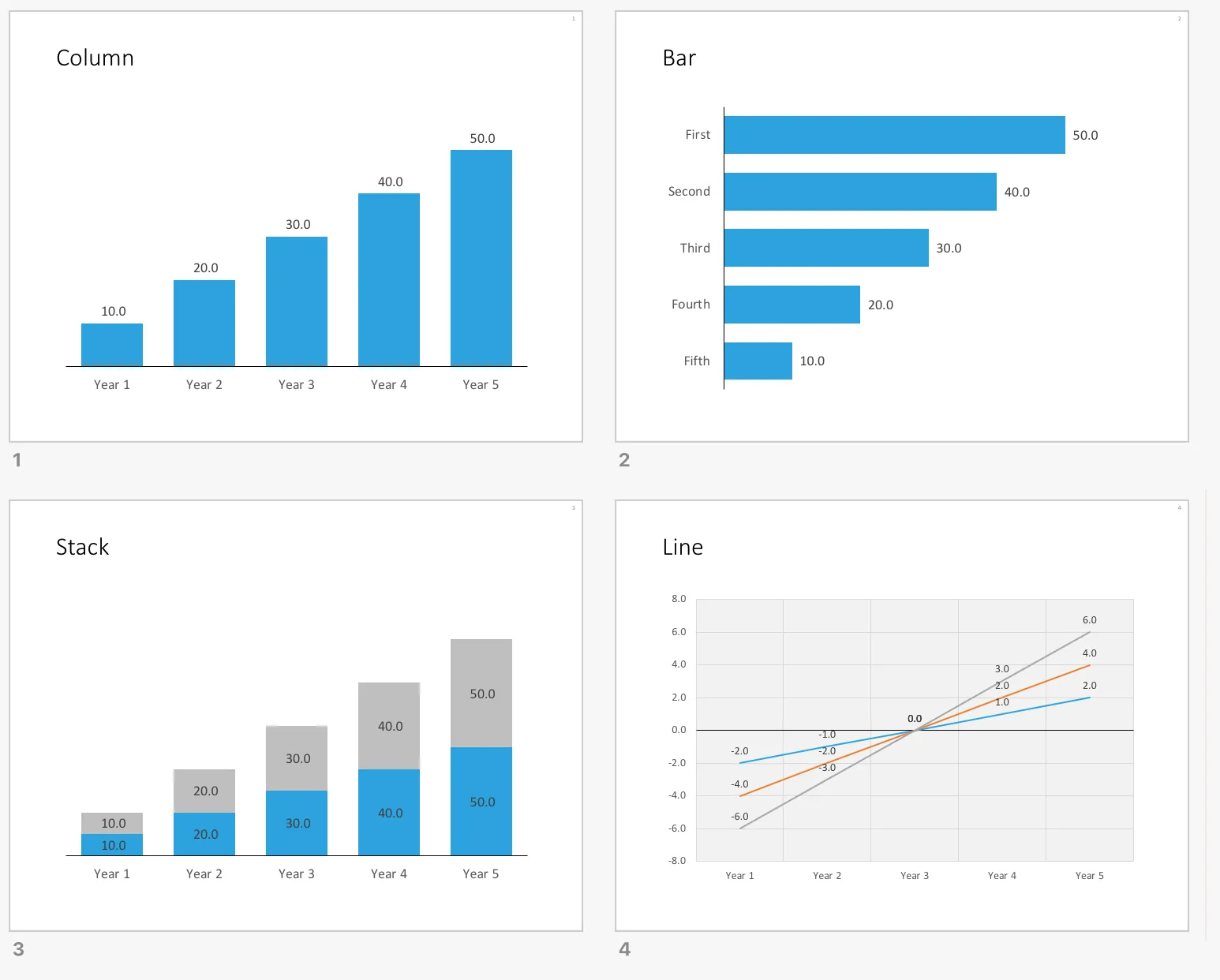
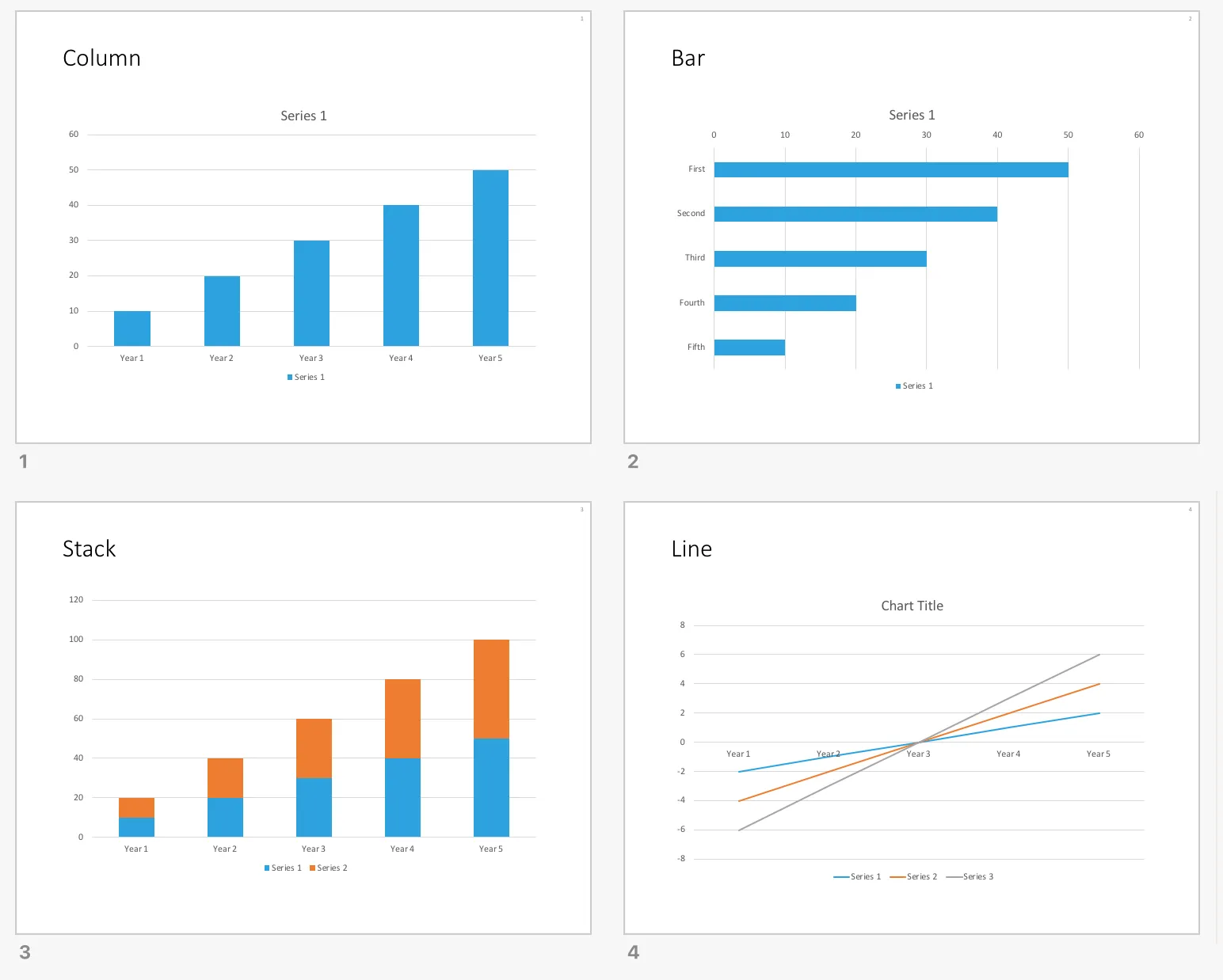
SlideMagic data charts as a default in your PowerPoint

All my data charts have the same simple look and feel, inspired by the format that I started using on my first day as a McKinsey consultant.

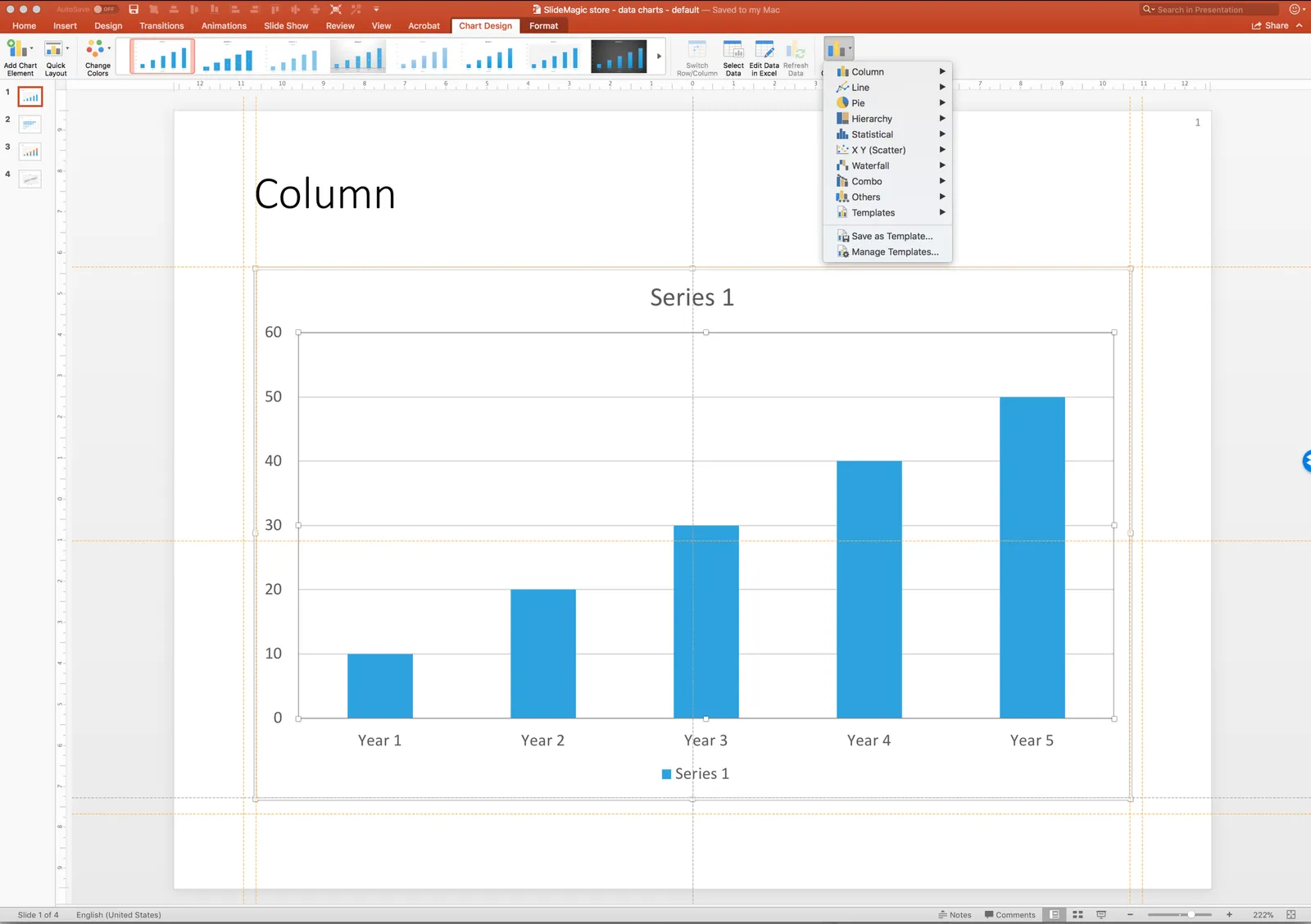
They are different from the default PowerPoint data chart templates:

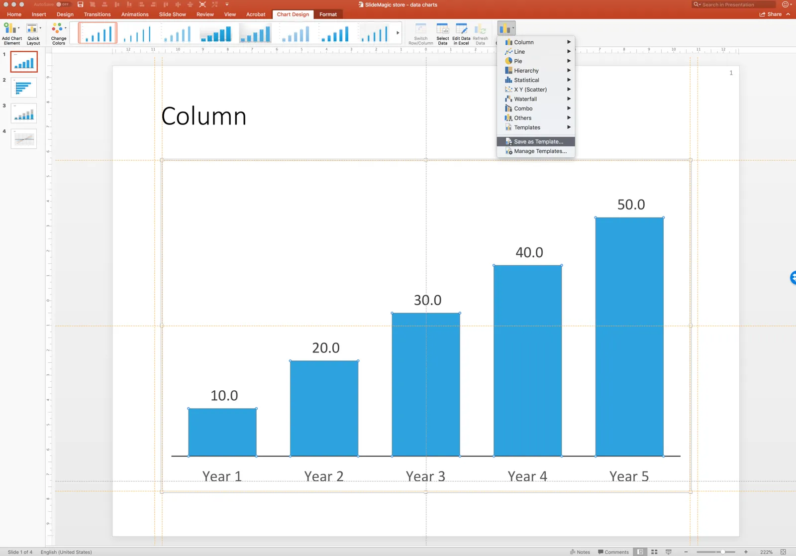
I have added the above 4 simple charts to the SlideMagic template store. You can set them as templates in your own PowerPoint applications (Mac screen shot, but I think Windows is exactly the same). Select the chart, click chart design, click *change chart design,*then go to the bottom of the menu and save the chart as a template. This methods is easier than sending you the actual template files and getting you to store them deep down in the computer’s file directories.

Repeat this process 4x for each of the slide designs in the file.

Now, the next time you insert a standard PowerPoint chart, you can instantly re-format it to look like a SlideMagic chart by selecting it, clicking slide design, then clicking change chart design again, and now you will see a new option, templates, from which you can pick the file you just saved.

You can download the default data chart templates from the store here.

·Concepts

System dynamics in PowerPoint

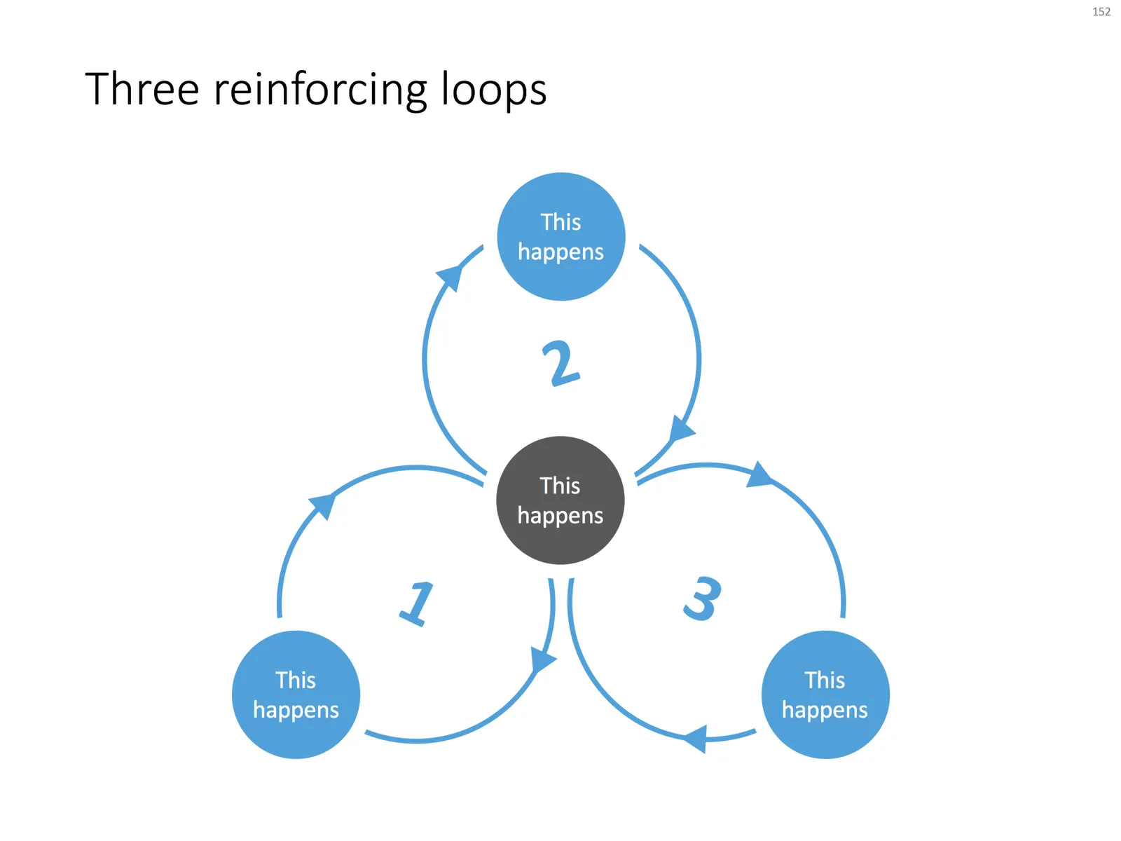
Loops are a powerful way to visualise reinforcing trends. Electrical engineers use them and refer to them as “system dynamics”. McKinsey consultants use them and call them “business dynamics”.

You can use them in a presentation to support your point, but make sure you don’t overcomplicate things like in the infamous US Army Spaghetti chart. Alternatively, you can use them as an analytical tool and add as much complexity as you want.

I often use some sort of loop diagram to scribble the basic story line of a presentation to make sure that I understand things myself.

When using a loop diagram in a presentation, go through different version on paper until you arrive at the most pleasing design, with the minimal amount of overlapping arrows in your spaghetti.

I have added a basic loop diagram to the template store. They are a bit tricky to make in PowerPoint, if you want all the circles and arrows to line up properly.

·Concepts

How to create Harvey Balls in PowerPoint

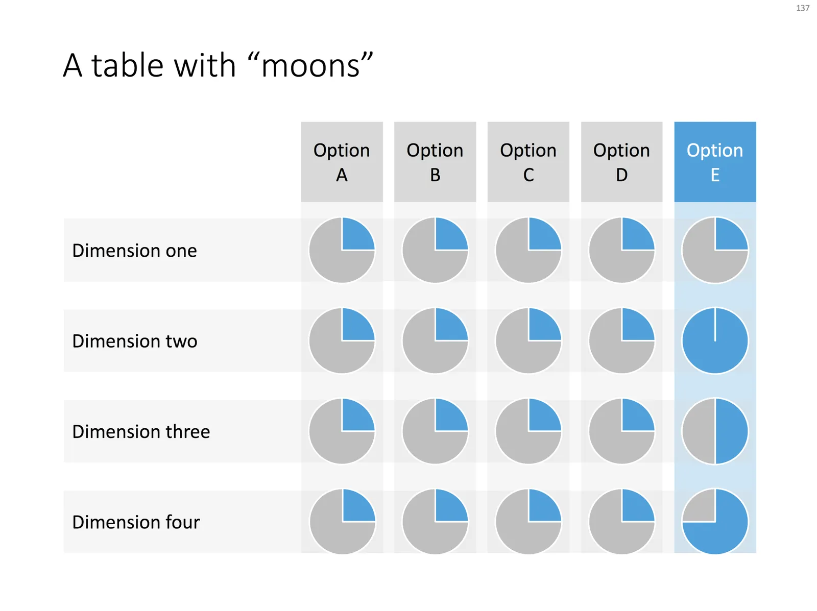
Harvey Balls are a repeating pattern of simple pie diagrams to score options among different access. Strategy consultants love them because it allows you to make qualitative assessments quickly. They work great on group discussion whiteboards as well: draw the empty circles and have the meeting participants colour them in.

Apparently they were invented at Booz Allen in the 1970s, which is probably why we at McKinsey referred to them as “moons”.

In PowerPoint they are a bit tricky to make, in the template below I tried to make an effort. To change the values, you need to open each pie diagram and change its value, make sure that you are not moving or re-scaling any of the pie diagrams in the process.

At McKinsey, I remember always keeping a “moon” diagram somewhere in my hard drive, so I could easily re-use the various shapes (these were not Excel pie diagrams, but graphic icons that came in the four stages).

Visually, I think they are not perfect. Maybe in the early 1990s, with primitive computer graphics, Harvey balls served a purpose, but now the same effect can equally be achieved by applying different colour shadings in the background colour of the cells in your table.

As always, feel free to copy the design, or download the ready-made slide from the template store.

The tree

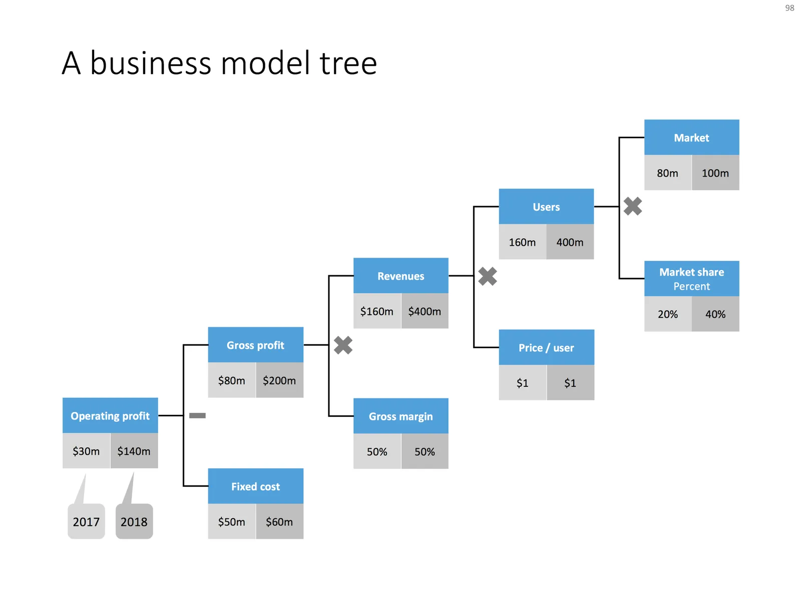
Trees like the one below are a great way to communicate a formula or a business model. It shows how factors are related. It forces you to “fill in the blanks”. For example, if you think you are going to get 200,000 customers in Luxembourg, you need to relate that to the overall population somehow. It makes assumptions very visible, and separates the ones which are relatively certain, from those which are wild guesses.

 Business model tree

Business model tree

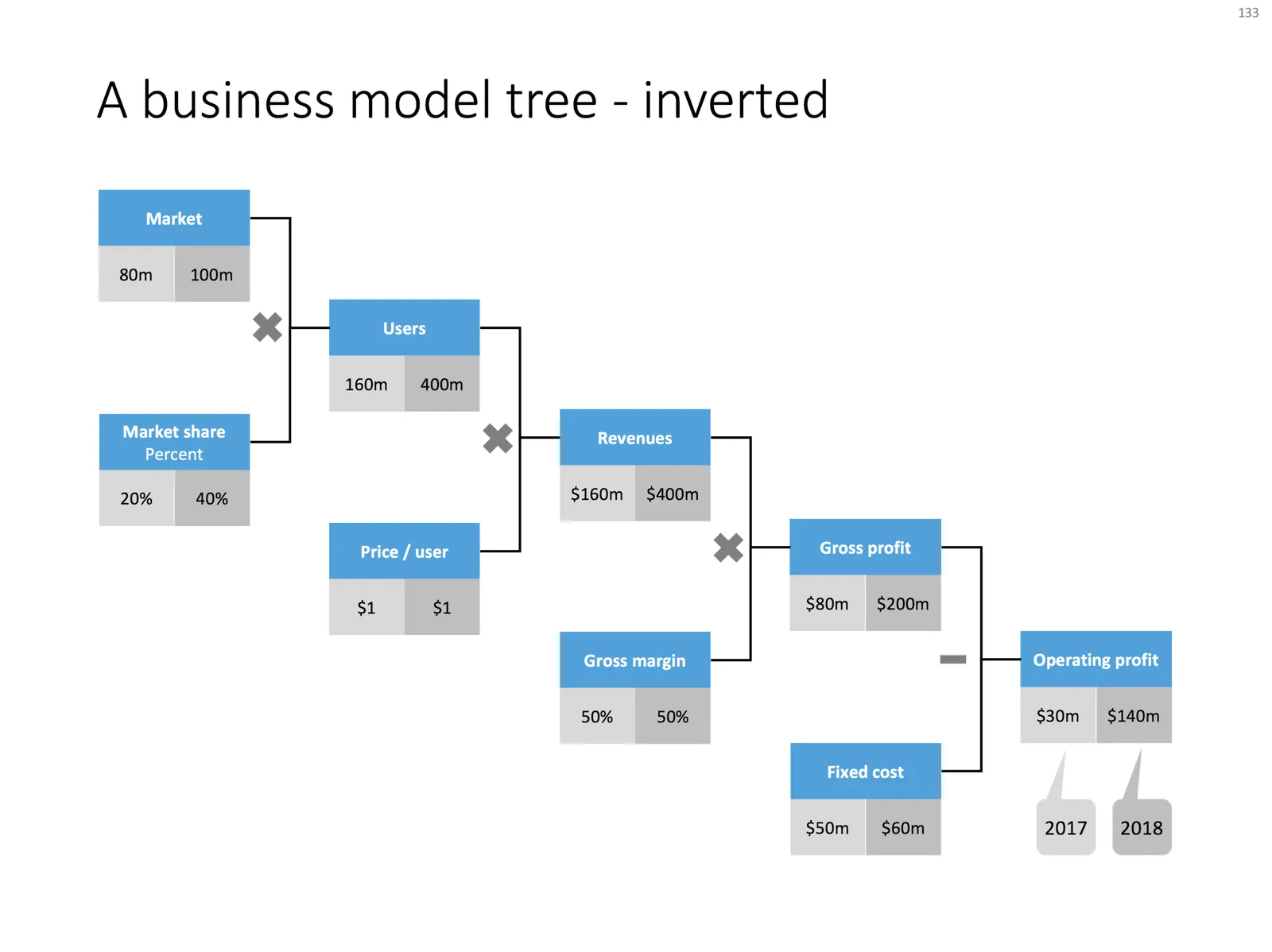
 A business model tree - inverted

A business model tree - inverted

Use the tree to triangulate your own view of a business model or forecast, then show it to your audience and convince them of the numbers.

I always make my trees left-to-right, McKinsey style, where you would take someone from the big picture to the smaller details. Some clients have a preference for doing it the other way around, going from inputs to the final result.

Feel free to borrow this design idea, or download the ready-made slide from the SlideMagic template store.

Photo by kazuend on Unsplash

·Concepts

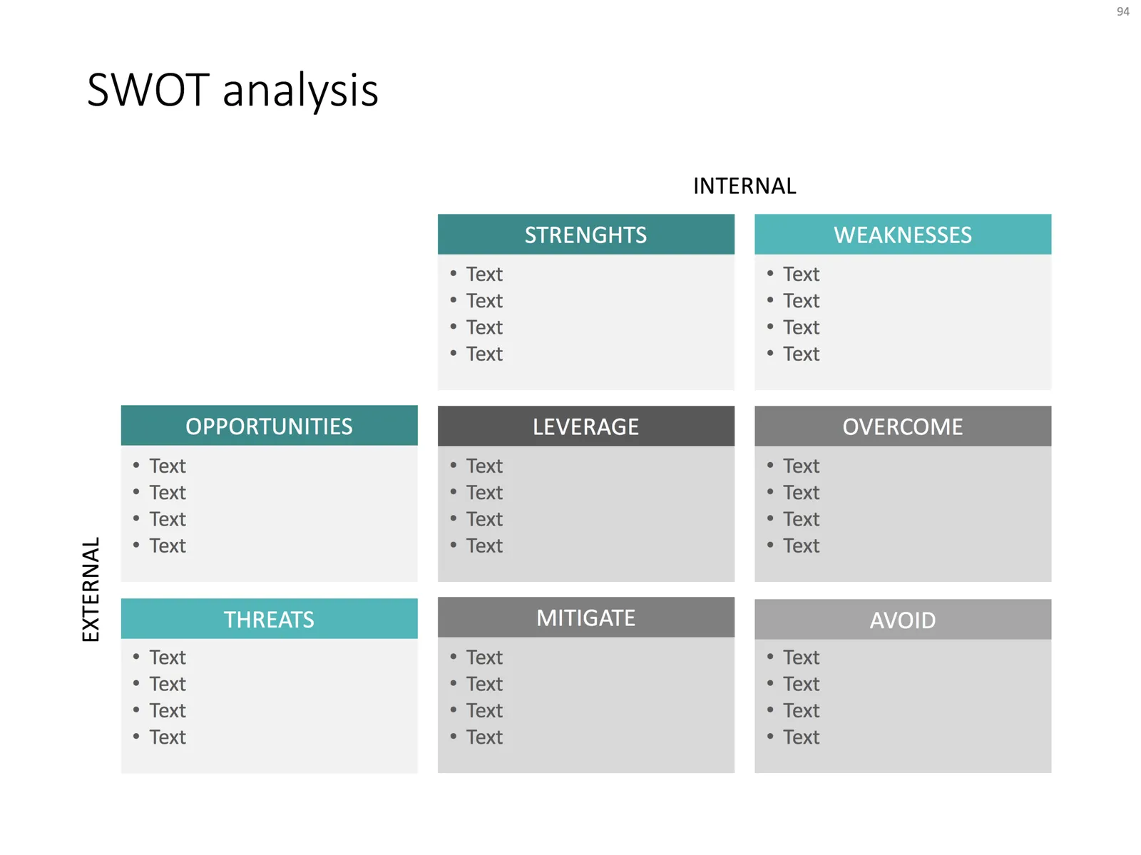
SWOT analysis

You have been searching “SWOT” a lot in my slide template store, and got blank results. So, by popular demand, I added a SWOT slide template.

The slide is a bit too dense to put up in your next TEDTalk, but that is never the purpose of a Strengths-Weaknesses-Threats-Opportunities analysis. A SWOT is an analysis rather than a presentation tool. In my life as a strategy consultant at McKinsey, a SWOT analysis rarely solved a big strategic problem start to finish, but it is usually a great tool to get people started.

It can be especially useful in big group discussions where strategic debates can go all over the place. Putting an empty SWOT framework on a flip chart immediately calms the group down and focuses the meeting.

I expanded a bit on the traditional 2x2 (4 boxes) model: the SW, and OT boxes are now put on the side of the matrix, leaving space for 4 new boxes in the center that enable you to scribble what you are actually going to do about all these internal and external factors.

(I vividly remember that 50% of the group discussions around a SWOT whiteboard were about in which box to throw a particular thought).

Feel free to copy the design, or download the SWOT analysis ready made from the template store. You can find there more examples of strategic frameworks as well.

Generic disruptive startup pitch

For my template store, I am working on a set of standard presentation story lines that can be matched up with template designs. I am going back in my client archive and see what sort of stories I end up using. Here is a very common flow that keeps on coming back in many situations:

  1. Situation: something has not changed much for a long time
  2. Inefficiency: this creates a missed opportunity: if only we could do this
  3. Change: a recent innovation opens up the possibility to do this
  4. Complication: but there is a problem why it cannot be used
  5. Solution: enter our solution which takes away this roadblock

This is a slight elaboration of the Situation, Complication, Resolution, introduction story line introduced in the Pyramid Principle that I often used in writing documents at McKinsey.

Photo by Jeremy Thomas on Unsplash

·Investor presentation

A list of presentation mistakes

Looking back at recent client work, the V1.0 briefing decks I saw, here are some of the mistakes I encountered. Not a complete list, not in the right order, just some examples that came across my desk the past few weeks.

  • Without even reading a single slide, some presentations have an incredibly dated look & feel: standard PowerPoint colors, old, low res, cliche images, even clip art. Look at a presentation you think look good, and simply copy the style elements with the colors of your logo and your presentation will dramatically improve, without changing one bit of its content. And by copying, I mean copying. Look at the positioning of titles and boxes, the amount of white space that is used. With an example design in front of you, your page should be able to look exactly the same, no excuses!
  • You have gotten used to the strategy review slides that have been in all the decks since you started out a couple of months ago. The audience sees them for the first time. Charts you used to evaluate your strategy, and not charts that can be used to pitch investors or customers. These presentations look highly professional, are loaded with content, say all the rights things, but do not change heart and minds.
  • Some presentations look too cute, minimalist infographics, icons, and cartoon characters. It is maybe nice and funny for a 1 minute product video, but people need to feel that there is a proper business behind this. If it fits your brand, it is fine to use the “cute” story as a sales presentation inside your investor deck, but the other slides should provide a bit more gravitas.
  • There are presentations which take too long to get to the point. Endless series of charts with market backgrounds, often providing statistics for trends everybody pretty much agrees with. Cut to the chase earlier, and if required, put a quick placeholder slide to remind the audience of the market context you are working in
  • Most of the time, I am not to strict with structure in a presentation (yes, I am an engineer who used to work for McKinsey). In 20 minutes, a story that flows nicely is more interesting that a highly structured presentation full of tracker pages and sections. Having said that, some companies actually need it. If you are a biotech with a significant portfolio of drugs in development, the audience need to stay on top of what we are actually talking about right now.
  • Dwelling forever about your technology, or doing a very long product demo does not help, but the other extreme is equally worse: summarizing your product in 2 sentences. The audience need to “feel” what the current pain is, how brilliant your product is, and how clever the underlying technology is put together. Each individual case has a different balance of these 3 points.
  • Certain businesses are basically apps. When the app is still in development, crafting a grand pitch deck might be overkill. Money could be better spent on some great-looking screen mock ups to explain investors or potential partners what it is you are actually doing. Graphics quality is not super important here, you can include 1-2 screens that show that your company is able to produce a good looking product. What is more important is the flow of the application demo you are showing. In these cases, designing the app experience, and designing the pitch deck can go hand in hand.
Continue reading →