

SlideMagic Blog

Frequent updates about all things presentations since 2008. Subscribe to never miss a post.

RSS
all posts

Category VC/investor pitch

·Images

No need to show that monitor

In technical pitch presentations, you often have to show the application through screen shots. While a picture of the application inside a monitor frame might look nice, it is a poor way to get your audience to see the content of the screen.
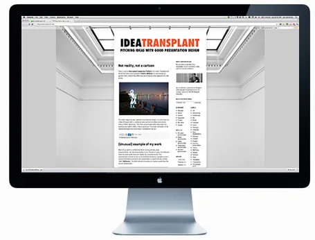
I would cut the monitor, cut the window bars above and below your application, and even zoom in to parts of the screen to highlight what is important. Cover everything that is not relevant (ads for example) with white boxes to keep things clean.

Having said that, there might be 2 uses for the monitor shot. One for a very quick 5-second slide that enables you to say “Let’s talk about the application” and move on. The second application is a slide that shows that your software is running on multiple platforms, but in that case you need a monitor image, a tablet screen shot, and a mobile phone application all on one page.
·Investor presentation

Presenting a mobile demo

Passing a device with your demo app around the audience is not enough, even for a small group of people:

  1. Screens are small and do not make a big impression
  2. People do not know what to do in order to see the best of the app

So the point of passing the device around is mainly to prove that your app exists. It should be supported by very large screen shots on the projector screen that tell the story behind the app, with the right sequence of features. Preferably with different levels of zoom: a user holding the device, the opening screen with the device around it, and then zooming even further to parts of the screen.

·Investor presentation

A shift in my design work

A few years ago, the main purpose of my presentation design work was to arm people with a powerful set of slides for a live stand up presentation. Usually, the meeting would be set up after an initial telephone or in-person conversation, and the audience would see the slides for the first time.

More and more, I see my visuals being used to get to that meeting in the first place. The “cold” email attachment. Presentation slides become a short 3 minute commercial for an idea. The distribution is not in print, not on TV, but through an emailed document or URL. The actual presentation is more about figuring out the people behind the idea, not the idea itself.

There is general presentation format, or universal PowerPoint document. PowerPoint can even be used to write text documents. The 3 minute commercial is yet another one to add to the long list.

·Investor presentation

Different investors, different pitch

You can be very efficient when pitching to a professional VC and leave the 101 stuff out of your deck. She will have read all the relevant blogs, she is likely to be a power technology user, she sees 1,000s of deals each year, no need to teach her about the market environment anymore.

One, it is a waste of your scarce pitch time, two it shows that you do not have an ability to seize up your audience, which might tell her something about your skills as a manager and sales person.

If you are pitching to a less experienced angel investor, it is a different story, These people require more background and more time. But remember, there are highly seasoned angel investors as well.

·Investor presentation

The early-stage VC pitch deck

Ryan Spoon of Polaris Ventures wrote this guest post on TechCrunch about designing a VC pitch presentation for early-stage startups. Most of his guidelines are valid. I have a few comments on some. It is interesting to take a step back and read between the lines how a VC is analyzing a presentation. Ryan does not say everything explicitly.

How to Create an Early Stage Pitch Deck

·Delivery

Timing your elevator pitch

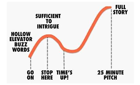
Sometimes there is little time to do your pitch. You meet an investor in the corridor, you got a slot at a pitch competition. Seth Godin said the other day that no one has ever bought anything in an elevator: in other words a very short elevator pitch consisting of 2 sentences with hollow buzz words is not going to excite an investor.

Instead, you need to add more specifics to intrigue the investor to invite you to another occasion where there is more time to discuss your idea.

But sometimes, elevator pitches become less effective when you take too much time. You start adding details, provide facts, that take the energy out of your presentation, that require time to close all all the plot lines. There is a dip between the perfect short pitch, and the full-length 25 minute story. Do not get stopped in the middle, it is better to keep it short.

·McKinsey

Strategy deck <> pitch deck

The other day a client showed me a pitch deck that a management consulting firm had prepared for them. Having been a consultant myself, I recognized it immediately: structured, organized, logical, dense. Great to solve a problem and/or convince an analytical audience with lots of facts.

Not good enough to make the sale: a good sales presentations needs to touch both the heart and the mind. Consulting presentations touch the latter, not the first.

Instead, put the consulting deck aside and start from scratch. What is the story you would like to tell? Sketch visuals without borrowing / Frankensteining / recycling charts from the consulting presentation.

·Investor presentation

The Zynga IPO presentation

The Zynga IPO presentation is in the public domain, you can watch the video here. I watched the first 15 minutes of the presentation. Some comments.

Overall it is a pretty good presentation. The slides are organized, decently formated, the speakers are clear. And I guess this is what you have to do for a video-ed delivery about an investment opportunity that is aired for everyone to see on the Internet.

But what could be improved?

I think the presentation was taped with a tele-prompter as the only audience. The pace of speaking is constant. The result could have been better to put in a small live audience in the camera room, to make the delivery more real, more emotional.

Zynga must have many highly skilled graphics designers. I would shed the red border around the slides, get rid of the clouds in the title, but ad more game props and other graphics inside the slides to get the Zynga cartoon-like graphic style in the slides. The team slide with the cartoon characters and the logos of the previous employers is a good example.

The opening slide with the bullet points is an example how bullet do not stick. The slide gets put up. We look at the speaker, try to figure him out. We look at the background, the globe, the dog, start reading the points and note that the speaker is sticking exactly to the bullets. The content of the bullets does not sink in. The bullet slide could have been shortened and instead the opening shot could be focussed on just one message: we have Amazon in shopping, Google in search, Facebook in social, and now there will be Zynga in gaming for the next decade. If you want to invest in social gaming, there is no alternative but to invest in us.

Continue reading →
·Images

Get decent team images

The other day I put a large picture of member of a management team in an investor presentation. “Hey, that one is much too large!” was the reaction of the client.

College year books and newspapers have programmed us to look for passport-sized images of people. Usually they have an inconsistent color and/or background, and people have an awkward starte into the lens of the photo booth.

You do not see images like this in well-designed magazines. Why not give your presentation that same look and feel. This is especially important if you email a presentation ahead of the actual live performance. The person opening the document might not know you and a big image might help establish a better connection.

So bigger images of management team members is one step. The next step up is to hire a good photographer and actually take a shot of the team working together. Preferably in a different pose than the ones we see in wedding family photos or football team shots.

·Investor presentation

Do you believe in your own hockey stick projection?

“Look, we have proof! Excel says that we will be a $50m company in year 5, the hockey stick revenue forecast shows it all!”

No investor will buy this story. She knows the forecast is ridiculously optimistic, but she can check 2 things:

  1. Is there more logic to the $50m than a conservative 5% of a $1bn IDC market forecast? Have you thought about how your business works, and how to think about its revenue potential? If not, the investor should invest in a company that claims the other 95% of the $1bn.
  2. Are you driven, motivated, determined enough to go after the $50m against all the odds?

In other words, do you believe it yourself (really)? That might be the sign an investor is looking for.