That's it?
I sometimes get that reaction from a client. Very few slides, very simple graphics. Sometimes the most powerful stories can be pitched really sweet and short. No need to waste more words/time/slides. Consider yourself lucky.


Frequent updates about all things presentations since 2008. Subscribe to never miss a post.
I sometimes get that reaction from a client. Very few slides, very simple graphics. Sometimes the most powerful stories can be pitched really sweet and short. No need to waste more words/time/slides. Consider yourself lucky.
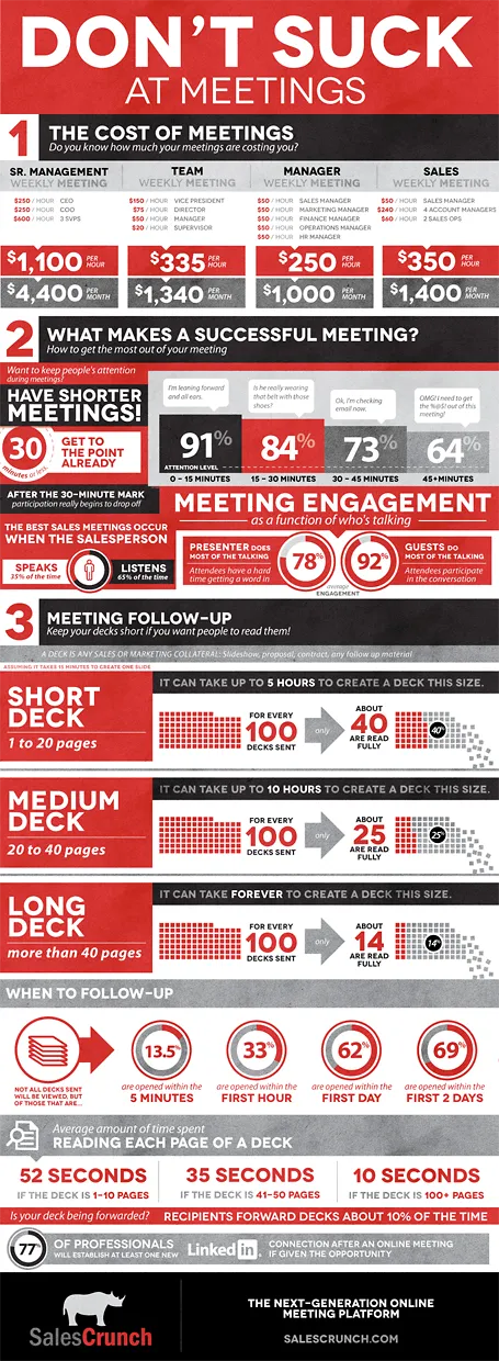
SalesCrunch (disclosure a client) is an online meeting platform that gives your real, hard statistics about how effective your meetings are: how many people pay attention, what % of your presentation is read, etc.
They analyzed the aggregate statistics of their entire client base and boiled the data down in an infographic. The key points will not surprise regular readers here: shorter meetings are better, shorter decks are better, and listening is better than doing all the talking. But for the first time, everything is backed up by hard data. Download the high-res version of the infographic here.
I am currently designing a presentation that is supposed to run on an iPad that sales people take into busy, noisy small businesses to sell something to an owner who does not have time to listen to us.
Of course it has to be short. But we are pondering whether to go with lots-of-big-pictures-slides in 4 minutes, or a few condensed slides in 4 minutes. Big images are better to catch the attention of the owner, but constantly swiping through slides on an iPad might be awkward, and standing in the way of creating a human one-on-one interaction.
On balance, I think to go with the first, what do you think? Have you had experience with this?
The other day a client showed me a pitch deck that a management consulting firm had prepared for them. Having been a consultant myself, I recognized it immediately: structured, organized, logical, dense. Great to solve a problem and/or convince an analytical audience with lots of facts.
Not good enough to make the sale: a good sales presentations needs to touch both the heart and the mind. Consulting presentations touch the latter, not the first.
Instead, put the consulting deck aside and start from scratch. What is the story you would like to tell? Sketch visuals without borrowing / Frankensteining / recycling charts from the consulting presentation.
“Let me talk you through our exciting products!” And up comes the agenda page: product 1, product 2, product 3, product 4. Uh oh. Your audience starts checking whether there is guest WiFi to check some emails on the phone…
Product catalogues are an exhaustive description of what you have on offer. They are about you, not about the customer.
How can you keep a product or sales presentation interesting and relevant? Start explaining the overall architecture of your product range (we have big ones, and small ones, we work in this segment and that segment). Then, think about the needs of the customer in front of you and narrow down the options dramatically. Spend a lot of time / slides on solutions that are relevant for your audience, and surpress the urge to be complete and cover everything.
A lecture about designing sales and investor presentations
A series of videos of a lecture Jan Schultink gave at NYU in 2011. Venture capitalist Mark Suster (author of the blog Both sides of the table) introduced Jan’s talk. The event was hosted buy SalesCrunch (a startup that was renamed Crunched, and later acquired by Clearslide). The content of my talk closely follows the topics discussed in my book about presentation design.
Let’s start with Mark’s introduction.
Mark Suster has done live pitches in front of the camera. Here is my review of one them. His feedback to the pitching investors is interesting. But what is more interesting is observing his body language. Mark has created a great library of his blog posts about pitching to VCs
Below are the videos of my presentation design seminar that followed. There were 2 sessions, one on designing investor presentations, and one on designing sales presentations. About half of the content in the talk overlaps.