SlideMagic Blog

Frequent updates about all things presentations since 2008. Subscribe to never miss a post.

RSS
all posts

Category Presentation design

·PowerPoint

Sticky Slides becomes Idea Transplant

OK, I have re-branded. One more time the first blog header that I used back in the summer of 2008. (the details: Verdana font, and the standard Microsoft “Trek” color scheme). All the best Sticky Slides…

All links and RSS feeds should continue to work: http://blog.ideatransplant.com http://www.stickyslides.com http://www.stickyslides.blogspot.com http://feeds.feedburner.com/stickyslides

·PowerPoint

Can your audience see it's PowerPoint?

If they can, maybe it is time to change the slide design and get rid of:

  • Repeating graphics
  • Titles in the same spot
  • Page numbers
  • “Confidential” on every page
·Books

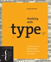
Book review - "Thinking with type"

Regular readers will have noticed that I am reading up on typography lately. Some basic understanding of typography can improve the quality of your presentation designs dramatically. The book Thinking with Type (affiliate link) by Ellen Lupton is one of the most useful ones I read so far. Clear explanations of all the basic concepts with great examples. It comes with great online resources on the Thinking with Type website, covering a lot of material of the book. (See the type crime section, and how I use the wrong quotation marks all the time on this blog).

Earlier reviews of typography books:

  • Just my type, stories about the most important fonts and their designers, useful information, entertaining reading (and great dinner party stories).
  • 20th century type, a more scientific overview of fonts and designers of the past century.
  • 1000 fonts, just what the title says
  • Design elements, a broader review of graphic design concepts
  • Bibliographic, an overview of classic graphic design books
·Books

Recommended presentation design books

What are the best books about presentation design and public speaking

Some good books about presentation design, public speaking, graphics design, and art. If you click on an image, you will be linked through to Amazon where you can buy the book. We use affiliate links and receive a small commission when you purchase a book through this site.

You can find reviews of presentation design books that I posted on the blog here.

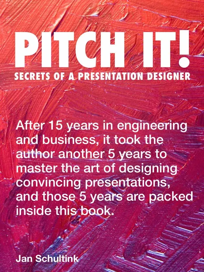
Pitch It! by Jan Schultink, my own book about all things presentation design. The book can be accessed free online here.

Presentation Zen by Garr Reynolds started the revolution in presentation design, transforming bullet point slides into visuals with images. Read my review here (2008).

Design Elements by Timothy Samara takes you through the basics of layout and typography. Read my review here (2010).

Resonate by Nancy Duarte has good instructions on how to design a captivating story that gets your audience to do something, take action after they walk out of the auditorium. The iPad version is free. Read my review here (2010).

Slide:ology by Nancy Duarte is a good general introduction to presentation design and delivery. Read my review here (2008).

Continue reading →
·PowerPoint

Cheap hotel rooms!

It sounds great, but we discount it completely because we have heard and read it so many times. The same for text in presentations.

Even this Zen minimalist slide text (with a nice picture in the background) might not convince your audience:

IN SHORT, WE HELP YOU

  • Acquire new customers
  • Sell more to existing customers
  • Prevent customers from leaving
  • Cut cost

These are the exact things big banks and mobile phone operators are worried about. But, every company pitching to them is putting these words on the summary slide. It does not stick anymore. They have heard it before.

Increase the signal to noise ratio. Instead, try reminding them on the final slide about the specifics of your company that create these benefits. Maybe a small icon-size thumbnail of an image you used before. It will make you stand out in the noise.

·Art

Going beyond the presentation screen borders

A long introduction to the post today. You can skip the plot sideline and go straight to the end if you want.

It seems that many visual artists that somehow documented the thoughts behind their work reach higher levels of fame. One example is Vincent van Gogh, who through the letters to his brother Theo gave us a lot of background on his art. Vincent van Gogh spent some time in this white house in the same street I grew up in the Dutch town of Hoogeveen, and it is striking to see how his descriptions of the place, the features and character of the people still applies today (except for that people there have moved on from living in huts). His subsequent transition from the cold/dark Netherlands to the bright Mediterranean is another interesting parallel I share with the painter.

Vincent Van Gogh, farm house in Hoogeveen

Recently, I have been reading a biography about Robert Irwin, an American artist starting off with expressionist paintings to move on to minimalist, large art installations. The book Seeing Is Forgetting the Name of the Thing One Sees (affiliate link) provides lots of his personal perspectives behind his own work, but more importantly about art in general. I have changed the way I like at art after reading it.
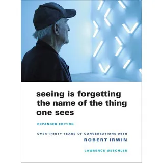
Irwin wonders why art ends with the frame of the painting. He wonders why art ends with the room the painting/installation is exhibited. Art and beauty is all around us, we just need to be able to perceive it.

“But paintings are like what you can barely make out through a keyhole compared with the richness of perception that’s just waiting there in the world to be experienced all the time. […] It’s strange. With food, for instance, people seem to understand what’s involved: you savor the taste rather than just feed the body. But people have a hard time understanding that it should be the same way with visual experience.”


Continue reading →
·Images

Poster design goodness

Some interesting visual concepts in a Core77 poster design competition. I borrowed the image by the winner Miryam Melkumyan, you can see all entries here.

·PowerPoint

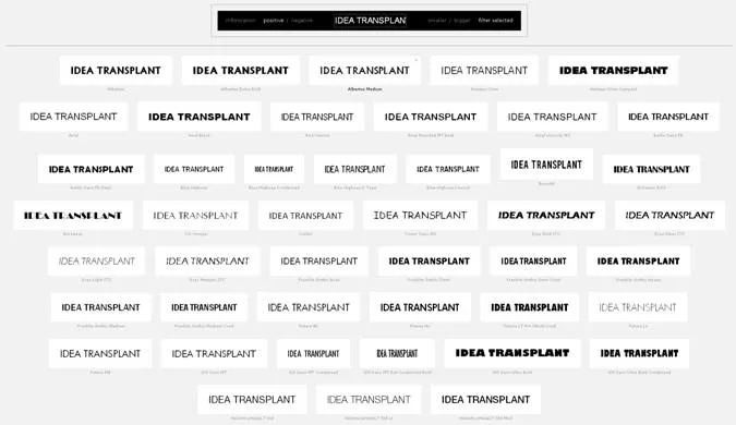
Compare all fonts installed on your computer

A nice link tip from Gee Ranasinha: the site Wordmark.it shows you a text in any font that you have installed on your computer.

·Images

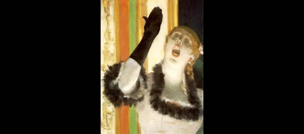
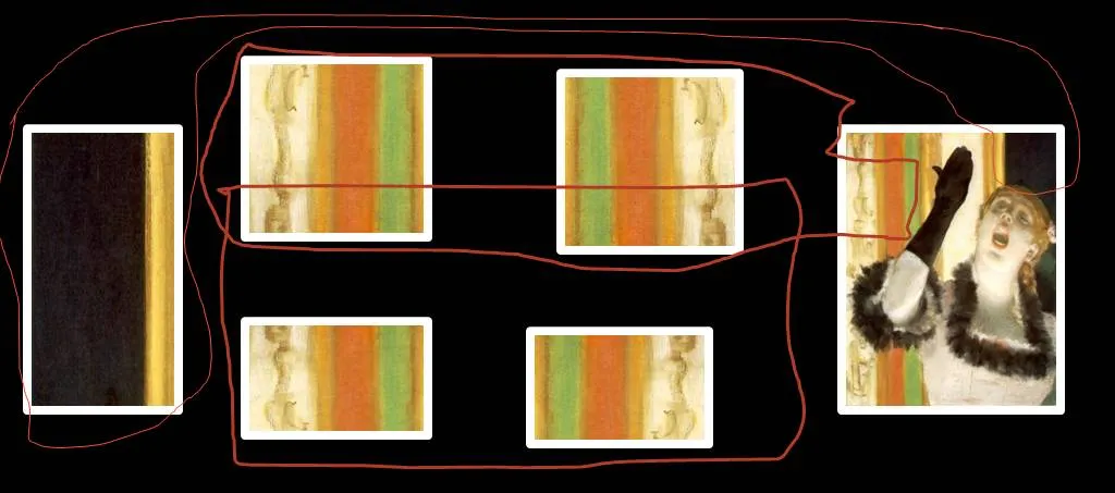
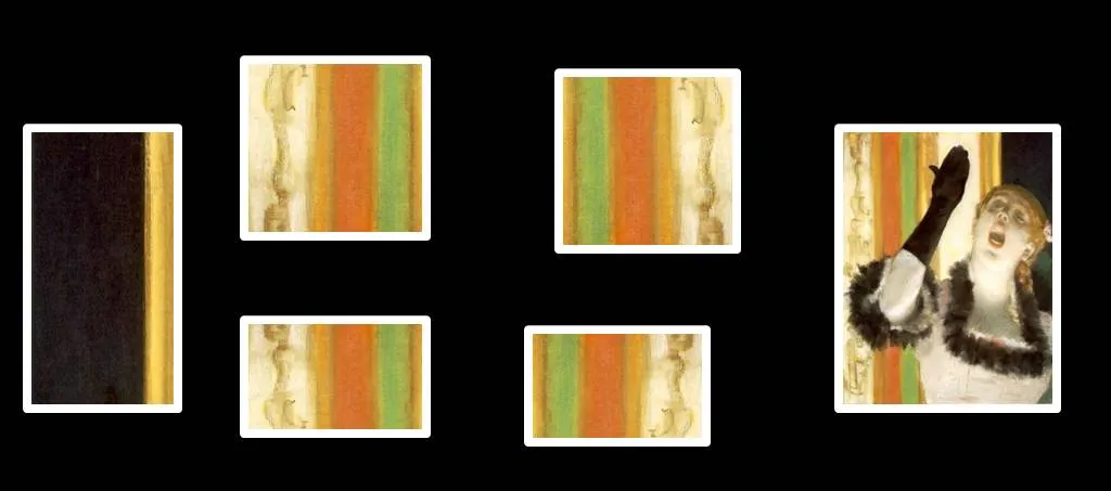
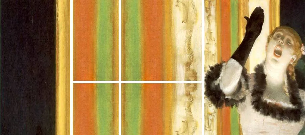
Sorry Degas...

One of the images in the slider of my Idea Transplant web site needed some extension. Here is how I re-used some components of Degas’ original painting and make it fit in today’s widescreen format. I hope he will forgive me.

·Books

Book review - "Just my type"

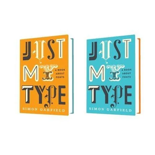
Most books about typography and graphics design are nicely illustrated reference books full of theory. Just My Type: A Book About Fonts (affiliate link) by Simon Garfield is different; through a number of stories and anecdotes you a get a wonderful introduction to the history of typography.

It is a great read: both informative and entertaining. A more extensive review of the book in the New York Times. I purchased the book for my Kindle/iPad to save delivery time and charges to Israel. If you live closer to Seattle, I would suggest you buy a paper version to get a better view of the font examples inside the book.