

SlideMagic Blog

Frequent updates about all things presentations since 2008. Subscribe to never miss a post.

RSS
all posts

Category Presentation design

·PowerPoint

The presentation design market

Last week I attended a Creative Mornings presentation by John Maeda in New York. He is the head of the Rhode Island School of Design and a well-known designer, artist, and author (more information about him here).

He made an interesting point about the graphics design industry. What caused the creation of the graphics design industry as we know it today? The fact that in the 1950s and 1960s, it became customary for publicly traded companies to have well-designed annual reports for their shareholders.

I think we are seeing something similar in presentation design. The bar is rising constantly. Presentations, and videos of presentations are being shared online and are getting wider and wider audiences. Corporations start seeing the value of good slide design. Enterprises will start allocating budget to it.

I do not think this investment will solely go to the design of PowerPoint slides. The corporate story needs to be brought out consistently in presentation slides, documents that can be shared online, videos, and the web site. A new discipline in graphics design, and a new design market is emerging.
·Delivery

Great, I do not get a lot of time!

Recently someone asked me: “How much time do you need for your presentation, 30 minutes, 45 minutes?”. While I can fill 2 hours with just talking about presentation design I chose to go for the 30 minutes. It focuses you to be to the point and interesting.

TEDTalks can discuss very complex subject matters in just 20 minutes. I have designed 6 minute presentations for startups participating in pitch competitions that managed to convey the entire company’s story. Often I find that a time constraint results in a better presentation.

·PowerPoint

80% there

The idea of visual presentations is spreading and I see more and more decks that I would call “80% there”: very limited use of bullets points, big images, one message per slide. For those experienced amateurs among you, here is how to get it to 100%:

  • Use only high res images, instead of low res ones borrowed from Google Image search
  • Scale up your images either to full page size, or stick to the same white frame on each page.
  • Think of image aesthetics: people in toilets, eating gross food, a close up of an ugly animal might be funny, but they are in a college humor kind of way. Deep down, humans do not like to look at things that are not pretty. Not every image has to be funny. Funny images can also be beautiful.
  • Resist the temptation of the image barrage. An onscreen presentation is not a SlideShare presentation that requires a click to go to the next word in a sentence. Not all points need to be supported by an image. It is scary, scary face image. We are confused - confused face image. It is difficult - child doing math image. Use images or graphs to show why you are scared, what is confusing you, and how come it is so hard to solve. Much better than pictures of scared and confused people.
·PowerPoint

Photoshop for presentation designers

Photoshop is growing on me, after having confused me for many years. Photoshop is catering to multiple audiences. Professional photographers need the sophisticated tools for correcting camera images. Advertising designers need the engine for creating complex layer compositions.

What is useful for presentation designers? (search help in Photoshop for exact instructions how to find them):

  • The magic wand to remove image backgrounds (the Microsoft PowerPoint option is really poor)
  • Image size and canvas adjustments to get to the exact right size of an image at 300DPI
  • Content-aware fill to extent backgrounds
  • Content-aware extend to extend backgrounds
  • The spot healing tool to fix extended backgrounds
  • The color-replace function to change colors that are slightly off (i.e., make orange red)
  • And (a bit advanced) the vanishing point filter to put text on 3D objects

Whenever a new version of Photoshop is released, I am not so much looking forward to more features, but better implementation of existing ones.

What features have I missed?

·PowerPoint

In defense of the maligned PowerPoint

Tim Harford is defending PowerPoint in the light of the recently formed Anti PowerPoint Party. I agree. He argues that PowerPoint is a tool used poorly. The link to the article.

·PowerPoint

Presentations on tablets

I am increasingly interested in designing documents for tablets. They could work great in one-on-one meetings (or even stand alone). I have not found the right platform to develop them yet though.

PDFs do not always work (especially when converted using the Microsoft Office plug in) and show up within the frame of the iPad PDF reader (menu bars, chart thumbnails).

HTML5 looks promising. Onswipe aims to be an HTML5 publishing platform for magazines that also could be useful for presentations. If you visit the Marie Claire web site on an iPad for example you see what it can do (it looks like an app, but it is a regular HTML page). But you also see the limitations. A browser-based environment makes page switching slow, and again, you still have the navigation frameworks of the browser application.

Custom apps. Over the past weeks, I taught myself Adobe InDesign, and loaded up software that can turn Adobe InDesign files into custom iPad apps. My computer science background is trying to convince me actually download the entire IOS 4.3 SDK to have a look inside to see what it takes to program an iPad app from scratch. It is a heavy-handed approach though.

Do you have experience with this? Let us know in the comments.

·PowerPoint

Posters in Amsterdam

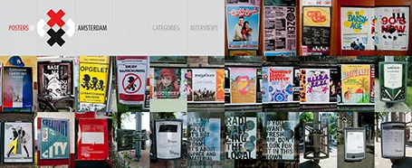
The summer is here: time to slow down a bit and look around for design inspiration. The site Posters in Amsterdam by Jarr Geerlings enables you to walk around the city without physically going there.

·McKinsey

Presenting the slide

A decade ago when I just started my career at McKinsey, I always was very excited when I was asked to “present the slide” to the CEO of a client. Presenting the slide: the slide was primary, the presenter was secondary. There is nothing wrong with that. When designing your slide deck, just realize that this is the audience setting you are designing for.

·Investor presentation

Boring structure = boring presentation

Going systematically through the branches of your organization diagram is not the best way to get visitors from abroad excited about your company.

When you make a biographical movie, it is recommended to spend a bit more time on the period in the life of the artist where she delivered those stunning pieces of sculpture.

Following the sections of that business plan template you found online literally will not encourage investors to write you the check you want.

·PowerPoint

Making good diagrams in PowerPoint

This presentation contains some useful guidelines for making diagrams. Thank you Alessandra for pointing it out to me.

How to make Awesome Diagrams for your slides