SlideMagic Blog

Frequent updates about all things presentations since 2008. Subscribe to never miss a post.

RSS
all posts

Category Presentation design

·McKinsey

Rubber stamping a business plan?

I had a phone call with a potential client yesterday. He needed an investor presentation but also was interested in a full business plan.

There are different documents that both are called business plan. One is a stack of files (spreadsheets, gantt charts, PowerPoint slides) that contains the company financials/budget, competitive analysis, and development mile stones. In short: real content. It does not have to look pretty.

The second one is a long document created in Microsoft Word in which market research data is copy pasted (IDC says our market is $1bn), the company opportunity is described with lots of buzz words, and so forth.

You need the first one, you can forget about the second type of business plan. They take forever to write, they take forever to iterate, and as a result they are always out of date. No one reads long written text. Brad Feld and others have called them obsolete.

My client admitted that the business plan job was simply a matter of writing up material that was already there. He was willing to invest lots of money and 2.5 months of work with a consulting firm to have the document rubber stamped, paying for the logo on the front page.

I think it is a waste of money, time, and effort. If the only thing the consulting firm does is write down stuff that already exists, investors will look right though it and judge the investment opportunity based on your content, not the way in which it is written. If it is market data you are after, pay for the market data directly, rather than by hiring a consulting firm in the middle.
Continue reading →
·Delivery

Preaching to the converted

A story from the early 90s. Back then I had recently joined McKinsey as a Business Analyst and got involved in recruiting presentations at Dutch universities to try to convince more engineers to apply for a  position. The slide deck covered it all: our offices, our expertise, our clients, our selection process.

Until one day we did a survey asking the audience to rank how useful this presentation was. The outcome: people already knew that we were probably very smart, worked with prestigious clients, were unlikely to starve because of lack of financial resources, and were very professional.

The questions the students had were: are you guys human or nerds, do you really have to work 80 hours a week, how on earth can a physics engineer be useful there? These questions you cannot really address on a slide, so we cut the introduction presentation to the minimum (to re-confirm what people already knew), and then switched off the projector and started talking about us as a person, and opening up the discussion for questions.

Preaching to the converted is a waste of time. Instead, use your presentation to address the issues the audience has.

·Delivery

Brutal honesty and a 5 second test

I am linking to 2 posts related to venture capitalist Vinod Koshla today.

The first is about brutal honesty in investor presentations by Michael Arrington. He argues that indirect polite language because people are afraid to turn down a startup is not helping anyone (including the pitching startup).

The second is a blog post by speech coach Jerry Weisman: the 5 second test. If your (test) audience fails to produce the point of a slide when you hide at after 5 seconds, the slide is too complex. An audience trying to figure out what a slide means is not listening to the audio track.

(Thank you Wouter Deelman for pointing this out to me)

·Investor presentation

Mixing slide styles

In many of my investor presentations I mix slide design styles.

  • In the beginning, big images to catch the attention of the investor and make her feel the pain that you are trying to solve. These slides are good enough to put up in a big keynote address.
  • Later on, more dense slides follow with details of the technical architecture, the financials and the team experience. These work in a small conference room, but definitely not on a large stage.

The slide design is not completely consistent, but I find it works well for me.

·Delivery

Getting your boss to rehearse a presentation

How do you convince an overly confident, highly senior executive that it makes sense to rehearse tomorrow’s presentation? “Me, hey, I have given thousands of presentations in my career, I will wing this one!”

Winging does not work, you need to know your substance in-and-out in order to be spontaneous. A presentation without rehearsing produces of one of two possible results: a poor performance, or a replay of the presentation you gave last time without emphasizing the new content in the deck.

I do not have the ultimate answer. You can say that Steve Jobs took days to rehearse a keynote. You can scare her and say that the analysts in the audience tomorrow see hundreds of presenters each year, and you better stand out. Or sometimes, people agree to go through the presentation with an outsider like me, the presentation designer, in a closed room where non of their subordinates have to hear the corrections we discuss.

What does work for you?

·PowerPoint

Just to be sure

When your boss is editing your slides, there is a risk that she will add the same key message on every slide. She has not fully immersed herself in your story. She does not see the full context of the presentation. Time is short, too short in fact to study the presentation in detail.

Better make sure that the point “our architecture is flexible” gets mentioned a few times in the deck. Extra bullet on page 3, a nice bubble on the side on slide 7, foot note on page 15, and bold the flexibility point on the last page.

Have the courage to stand up and stop her.

·PowerPoint

The Groupon IPO roadshow

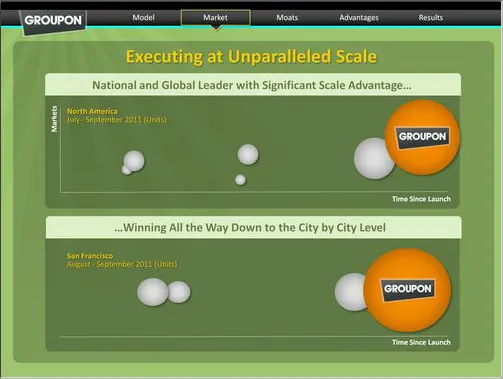
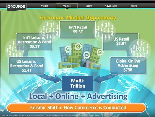
The investor presentation (both slides and video) of the upcoming Groupon IPO are online (link). Robin Wouters of TechCrunch has made a few screen shots of some of the slides. Usually these presentations are held in private meetings with potential investors, and I think it is great that they are now available for everyone to see.

Overall this is not a bad presentation, the presenters rehearsed, the slides are organized. There is still room for improvement though.

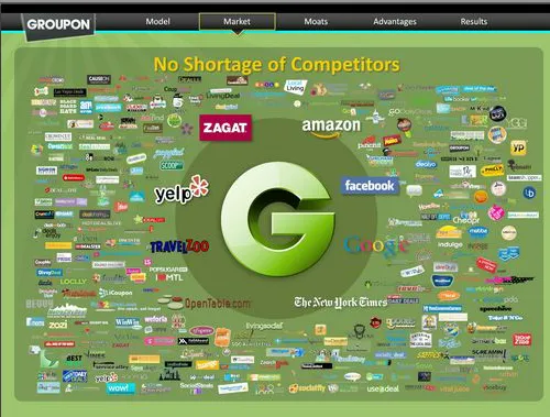
Slide design. The slides look like a beautification of a standard business presentation. The beautification is done professionally: sophisticated graphics and custom-made illustrations. Some of them look great (I love the slide with all the competitor logos). Still, Groupon could have gone further by designing the slides from scratch, making them simpler. For example, the slide right after the competitors on Wouter’s page is not clear. Also, the template could have done without all the trackers that are repeated on every page page.

Examples. Groupon is a business that happens all the way down in the street, at a small merchant. Like retailing, detail is what matters. The case examples could have been featured more prominently. Bigger images of the restaurant, more specifics of the deal. When the VP Product goes through a long list of the detailed information that Groupon has available, it sounds abstract. Why not take one very specific example and show how shoppers for flowers have different habits in 2 streets of San Francisco. The specifics of the detail make the big point.

Continue reading →
·Gadgets

MacBook with 2 external screens

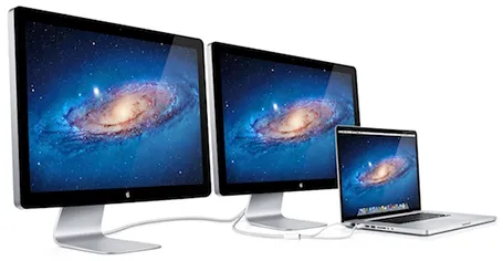
The new Apple 27" Thunderbolt display enables you to connect 2 giant external displays to a laptop, something that has not been possible until now without additional hardware.

Large screen real estate has its advantages. It is easier to design presentation slides when you have a large workspace in front of you. Extra space also enables you to open multiple windows, for example a PDF file with comments on the previous version of your presentation, or an Excel file with the data that need to go into your pie chart.

Now, 27" is a lot of space (2550x1440 pixels) and for most ordinary people, one screen will do. A presentation designer might actually need two (putting her in the same category as financial traders, air traffic controllers and social media addicts). I like to design on a clean and calm canvas. All the small windows with bits of information distract me. So I use that second screen as my messy desktop, literally pushing bits, pieces, and windows aside when I do not need them, preserving my pristine and uncluttered design environment in front of me.

Now some technical details. An Apple Thunderbolt screen can only be connected to a recent MacBook laptop that actually has a Thunderbolt port. But more importantly, the dual screen configuration only works on the most recent 15" and 17" MacBook pros, not on the 13" MacBook Pro, and not on the MacBook Air. (This might actually be an argument for getting a MacBook Pro over a MacBook Air) at the time of writing, October 2011).

Continue reading →
·Gadgets

First sketches with the Wacom Inkling

The Wacom Inkling Digital Sketch Pen (affiliate link) is a tool that lets you draw with a regular pen after which a sketch can be transferred to Photoshop or Illustrator for further editing. No, it does more than a regular scanner. First of all, it allows you to draw in layers and preserve them in the editing software. Secondly, the hardware is so small that you can take it any where you want.

My box arrived yesterday in the mail and the experience confirms what I have seen so far in the promotion video (my sketching skills have some way to go though). The product comes in a box the size of a regular pencil case. The pen and the receiver fit in nicely. Clip the receiver at the top of the page, and start sketching. It is as simple as that. One button opens a new file/page, another button adds another layer. The software is easy to install and works great.

The only drawback for me is that sketching has to happen with a ball point. I prefer a soft tip pen, or best of all a thick pencil to draw. There might be technical reasons why Wacom stuck to a ballpoint for sketching, but hopefully they will release a pencil-based scanner in the near future.

·PowerPoint

5% presentation, 95% Q&A

These are often the best meetings. The audience has prepared, read the material, and is ready for a discussion. What presentation slides can help you run a meeting that is mostly free discussion?

Bring your entire deck, but select from it those slides that create a mental framework around the things you want to discuss. Often, they are very simple slides, but relatively dense with content. Examples:

  • A 2x2 matrix with all the competitors listed
  • A matrix of market segments (growth, and size on the axes)
  • A simple ranking of sales and profits by brand
  • A product development timeline
  • Two market share pies: last year and this year
  • A software architecture diagram

All these can be projected onto a whiteboard (use a white slide brackground), on top of which participants in the meeting can scribble. After the meeting is over, snap a picture of the remaining group art.

Changes are that if you look at that picture 3 weeks later, you can pretty much replicate the entire discussion. Not because the scribbles are so clear, but because your mind has allocated a physical space on the white board to store the entire debate in your memory. Similar to stories, a physical location makes it much easier for people to remember things.