SlideMagic Blog

Frequent updates about all things presentations since 2008. Subscribe to never miss a post.

RSS
all posts

Category Presentation design

·3D

More 3D in PowerPoint - obstacle course!

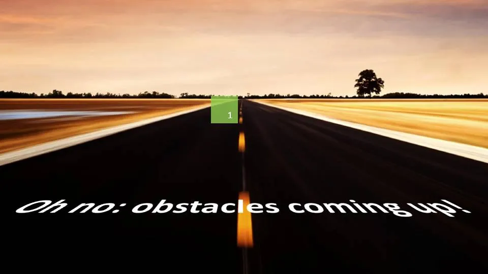
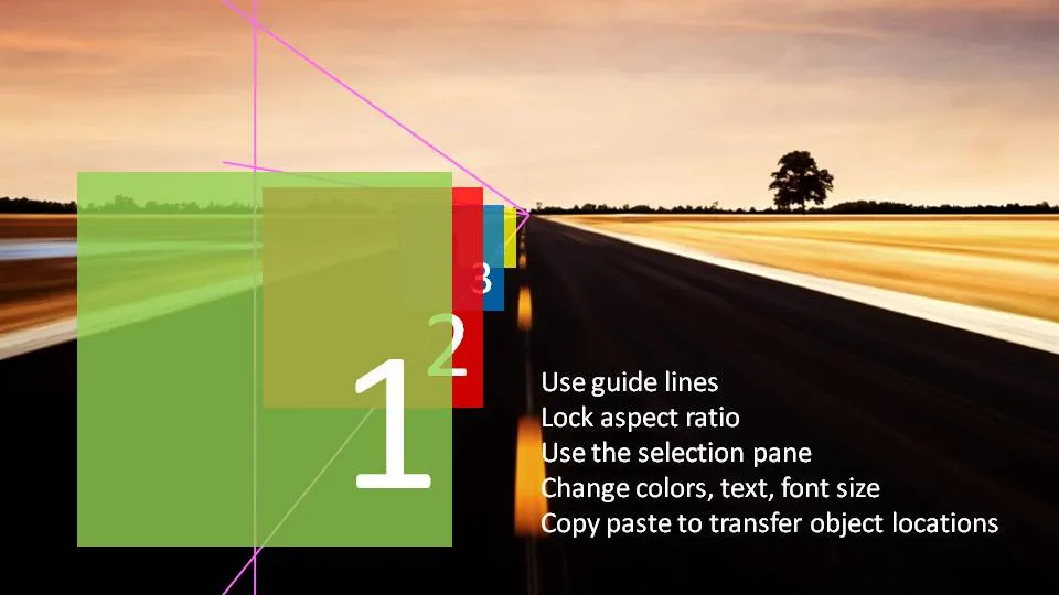
I am continuing to experiment with 3D effects. Here is an alternative idea to visualize a number of obstacles on the road ahead. The last image (click it for a larger picture) contains some explanations on how I did it. If things are not clear feel free to as in the comments.

Does anyone know how to add a smooth moving animation to this, motion paths and re-sizing of objects do not go together?

(Apologies for the image quality as I converted to JPG instead of PNG to improve load times)

·Design

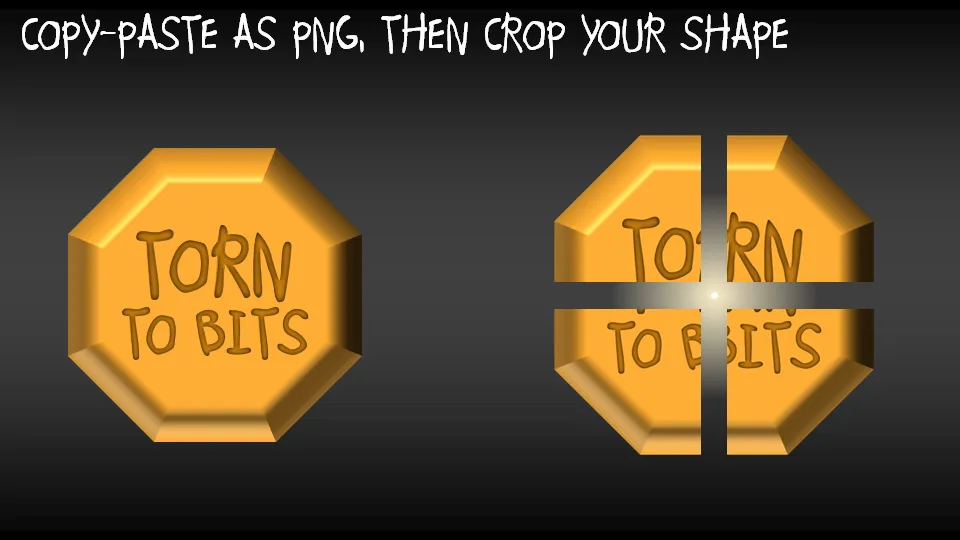
Chart concept - rip those PowerPoint shapes apart

A concept I often use to visualize things that are torn apart by opposing forces in PowerPoint presentations.

  • Copy a shape (with text)
  • Paste special as PNG (4 times, or even more)
  • Start cropping the copies

·Design

How to strip web text of its formating

Especially for sources in footers I often want to avoid re-typing a complicated title of a document that I found on the web. Copy-paste of the text also copies some of the text formating. Solution: copy the text, paste it into “Note pad” (the standard text editing utility that comes with Windows), select the text again and paste it into a PPT text box. I would be interested if other people have faster solutions for this.

UPDATE: Remy got the solution in the comments: copy any text, then select Edit and “Paste Special” and select unformatted text. Thank you!

UPDATE 2: Glen Turpin recommends PureText (see the comments).Thank you!

·Design

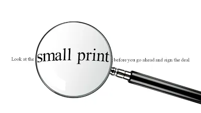
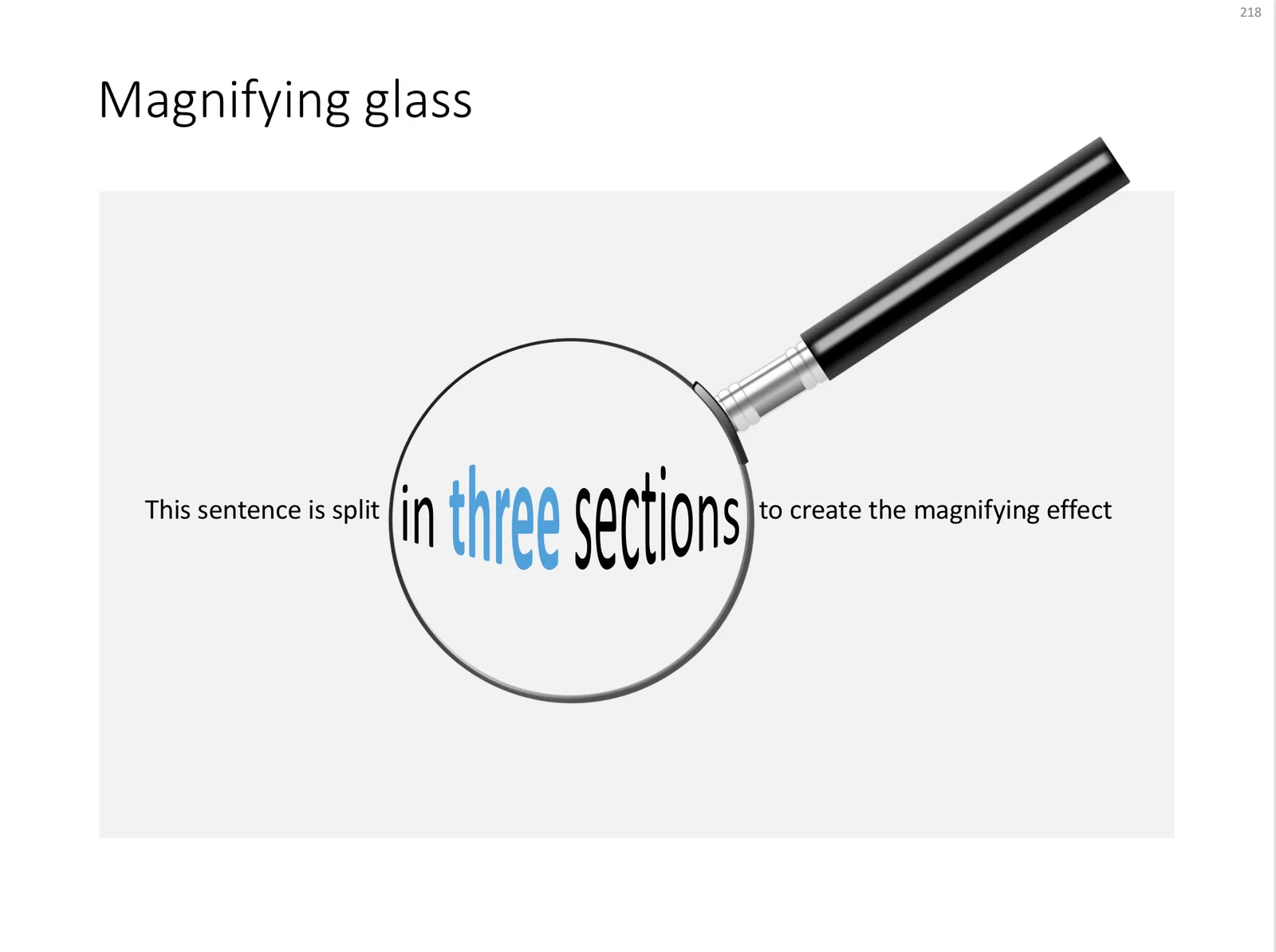
Chart concept - distorting text under a magnifying glass in PowerPoint

For when you want to make the point that it is important to pay attention to the small print, or make sure that you did not skip over important hidden information, you can use this concept.

In PowerPoint 2007:

  • Get a picture of a magnifying glass from any stock photography site
  • Set the font to a Times Roman-like serif font that looks like a book/newspaper
  • Cut the sentence in 3
  • Increase the size and apply a “can up” distortion to the text inside the magnifying glass (select the text, go into format, text effects, transform, in “warp”, 3rd from the left, 4th from the top.

UPDATE: I have added a slide with this concept in the SlideMagic template store, you can download it here.

 A magnifying glass in PowerPoint

A magnifying glass in PowerPoint

Photo by mari lezhava on Unsplash

·Design

Creating more white space in a picture

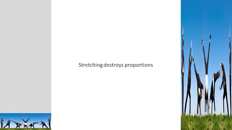
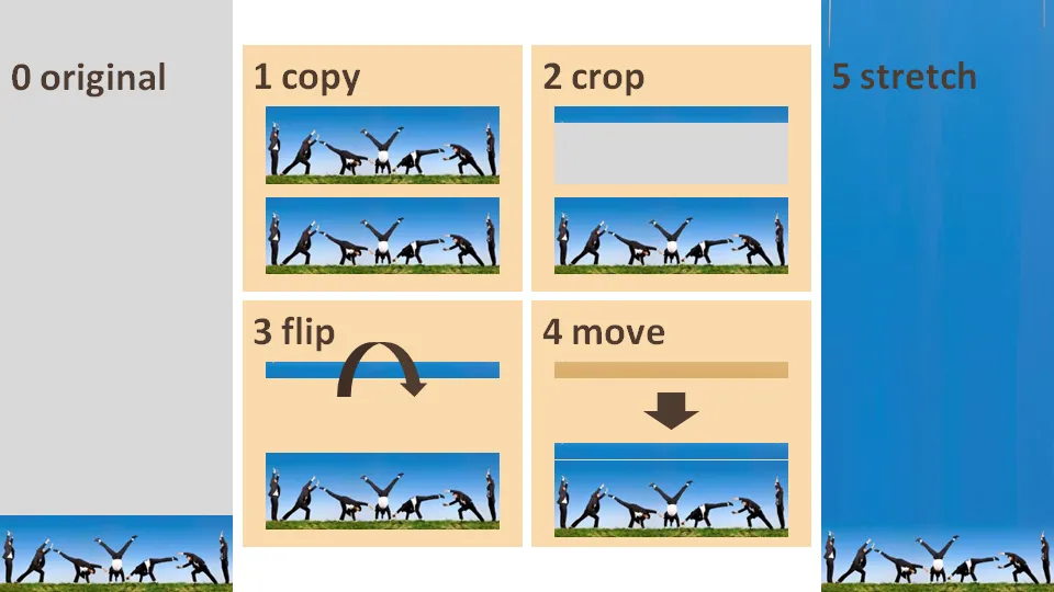
Many stock images lack sufficient white space for text. Stretching an image distorts the proportions.

A trick to get around this problem:

  1. Copy the image
  2. Crop a small strip at the top of the image
  3. Flip the strip
  4. Stretch the strip only

·Design

Experimenting more with typography

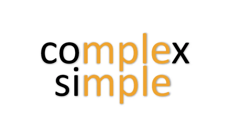
I am creating a presentation for a client today that provides a very simple solution for a very complex problem. While moving around the letters in the words I saw an usual pattern:

  • completely different meanings
  • very similar words…

I need to find more of these.

·Design

Humor in your presentation - Add Letters

Add Letters is a site full with image generators. I noticed that they’ve added a few new images. My personal favorites are those related to The Simpsons.

·Advertising

(Snow) white space to the extreme

Don’t fill up your slides to the last square inch. Instead: leave white space (or negative space). Have the courage to write nothing, take a visual break. This ad for a ski resort takes it to the extreme, but makes its point brilliantly (large image here).

Via Ads of the World.

·3D

I am starting to understand when to use 3D in PowerPoint

A user of PowerPoint 2007 has an enormous amount of 3D tools at his/her disposal. It is only after a year or so of working with this software that I start to understand how 3D could help get your message across.

Many 3D effects are NOT useful. Three dimensional graphs make it harder to match the data to the value axes. Adding “random” bevels, reflections and shadows to a PowerPoint object does not make it an elegant graphical element. The fact that PowerPoint can do it, does not mean you have to use it.

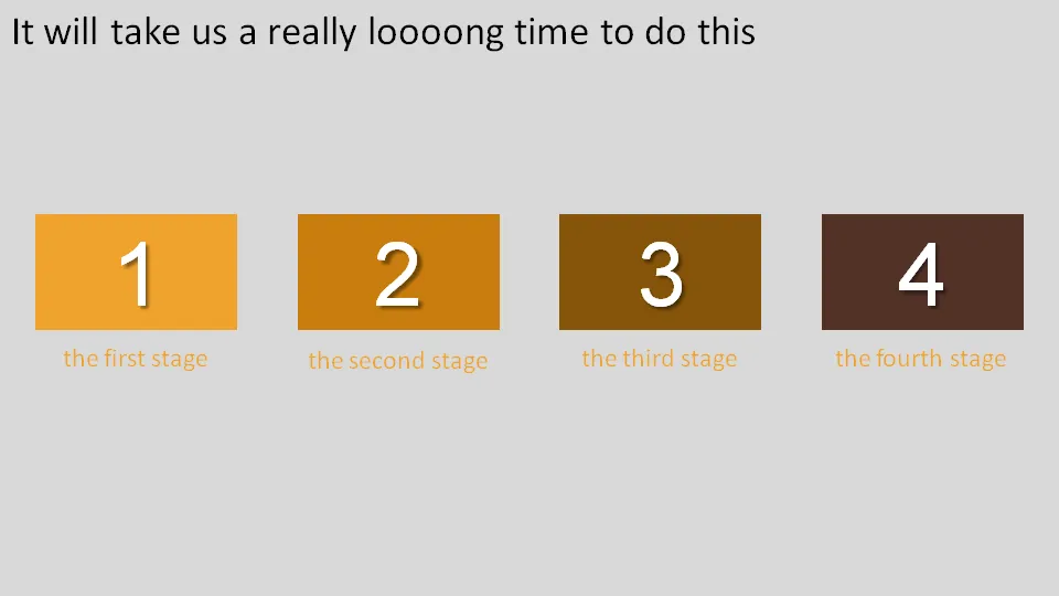
Why don’t we use 3D for what it can do best: show distance? The example below shows a time line that we expect to last forever.
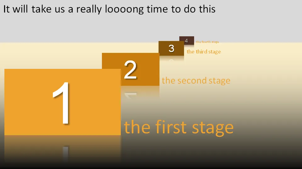
Adding some 3D effects will make it much more powerful:
Other examples could be a landscape scattered with competitors battling for market share. Or a quadruple layer of defenses that can protect the intellectual property of a startup.

Notice that you actually do not need any of the PowerPoint 2007 effects to create a 3D effect. It is all about positioning shapes, and reducing the size of objects and fonts as you come closer to the imaginary horizon.

Use 3D when you think two dimensions are not enough to tell your story.

·Colors

PowerPoint template colors and color blindness

My Vincent van Gogh color set from a few days ago is not very good for people suffering from red-green color blindness.

Use Vischeck to test your own templates. To do so, you need to “save as” a PowerPoint page as “PNG”.

A side-benefit of this test is that you get sense of what happens if someone prints your presentation on a black & white printer. (But hey, the B&W white test is the easiest of all: print preview)

Somewhat related: an earlier post about designing presentations with people suffering from dyslexia in mind.

Via Richard Garber. A more elaborate post on Vischeck and PowerPoint in this post on the Indezine blog.