SlideMagic Blog

Frequent updates about all things presentations since 2008. Subscribe to never miss a post.

RSS
all posts

Category PowerPoint

·Books

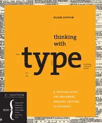
Book review - "Thinking with type"

Regular readers will have noticed that I am reading up on typography lately. Some basic understanding of typography can improve the quality of your presentation designs dramatically. The book Thinking with Type (affiliate link) by Ellen Lupton is one of the most useful ones I read so far. Clear explanations of all the basic concepts with great examples. It comes with great online resources on the Thinking with Type website, covering a lot of material of the book. (See the type crime section, and how I use the wrong quotation marks all the time on this blog).
Earlier reviews of typography books:

  • Just my type, stories about the most important fonts and their designers, useful information, entertaining reading (and great dinner party stories).
  • 20th century type, a more scientific overview of fonts and designers of the past century.
  • 1000 fonts, just what the title says
  • Design elements, a broader review of graphic design concepts
  • Bibliographic, an overview of classic graphic design books
·PowerPoint

Cheap hotel rooms!

It sounds great, but we discount it completely because we have heard and read it so many times. The same for text in presentations.

Even this Zen minimalist slide text (with a nice picture in the background) might not convince your audience:

IN SHORT, WE HELP YOU

  • Acquire new customers
  • Sell more to existing customers
  • Prevent customers from leaving
  • Cut cost

These are the exact things big banks and mobile phone operators are worried about. But, every company pitching to them is putting these words on the summary slide. It does not stick anymore. They have heard it before.

Increase the signal to noise ratio. Instead, try reminding them on the final slide about the specifics of your company that create these benefits. Maybe a small icon-size thumbnail of an image you used before. It will make you stand out in the noise.

·Art

Going beyond the presentation screen borders

A long introduction to the post today. You can skip the plot sideline and go straight to the end if you want.

It seems that many visual artists that somehow documented the thoughts behind their work reach higher levels of fame. One example is Vincent van Gogh, who through the letters to his brother Theo gave us a lot of background on his art. Vincent van Gogh spent some time in this white house in the same street I grew up in the Dutch town of Hoogeveen, and it is striking to see how his descriptions of the place, the features and character of the people still applies today (except for that people there have moved on from living in huts). His subsequent transition from the cold/dark Netherlands to the bright Mediterranean is another interesting parallel I share with the painter.

Vincent Van Gogh, farm house in Hoogeveen

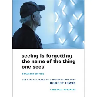
Recently, I have been reading a biography about Robert Irwin, an American artist starting off with expressionist paintings to move on to minimalist, large art installations. The book Seeing Is Forgetting the Name of the Thing One Sees (affiliate link) provides lots of his personal perspectives behind his own work, but more importantly about art in general. I have changed the way I like at art after reading it.

Irwin wonders why art ends with the frame of the painting. He wonders why art ends with the room the painting/installation is exhibited. Art and beauty is all around us, we just need to be able to perceive it.

“But paintings are like what you can barely make out through a keyhole compared with the richness of perception that’s just waiting there in the world to be experienced all the time. […] It’s strange. With food, for instance, people seem to understand what’s involved: you savor the taste rather than just feed the body. But people have a hard time understanding that it should be the same way with visual experience.”

Continue reading →
·Images

Poster design goodness

Some interesting visual concepts in a Core77 poster design competition. I borrowed the image by the winner Miryam Melkumyan, you can see all entries here.

·PowerPoint

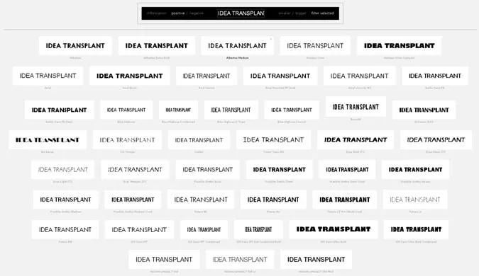
Compare all fonts installed on your computer

A nice link tip from Gee Ranasinha: the site Wordmark.it shows you a text in any font that you have installed on your computer.

·Images

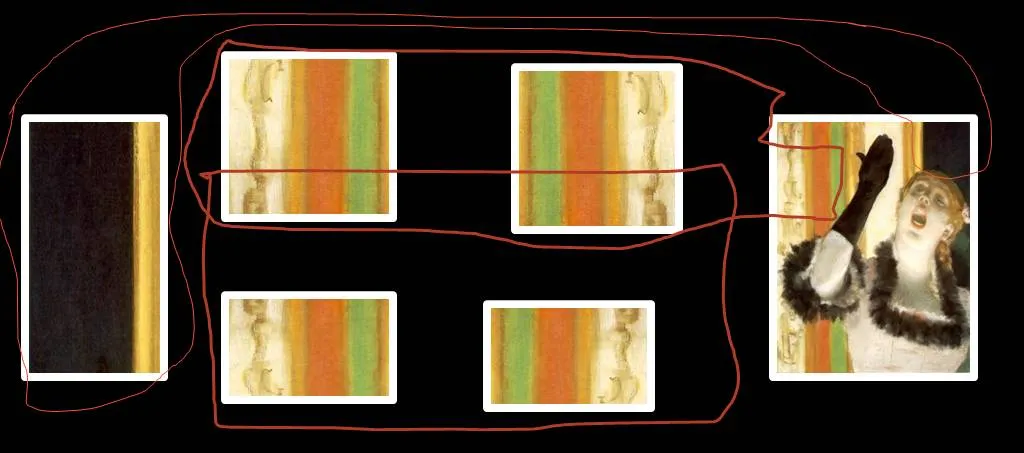
Sorry Degas...

One of the images in the slider of my Idea Transplant web site needed some extension. Here is how I re-used some components of Degas’ original painting and make it fit in today’s widescreen format. I hope he will forgive me.

·Books

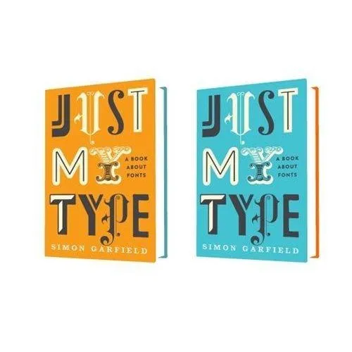
Book review - "Just my type"

Most books about typography and graphics design are nicely illustrated reference books full of theory. Just My Type: A Book About Fonts (affiliate link) by Simon Garfield is different; through a number of stories and anecdotes you a get a wonderful introduction to the history of typography.

It is a great read: both informative and entertaining. A more extensive review of the book in the New York Times. I purchased the book for my Kindle/iPad to save delivery time and charges to Israel. If you live closer to Seattle, I would suggest you buy a paper version to get a better view of the font examples inside the book.

·PowerPoint

Juggling personal brands

No presentation insight today, but some musings about my personal branding. Skip if you are not interested.

The URL www.stickyslides.com might be down today as a result of scary shifting and moving of my online properties. Things should propagate over the next 24 hours back to normal. It is all the result of a personal branding project. I am a strategy consultant, so here are the recommendations:

  • Jan Schultink, used as my Twitter handle. I do not have a name like Steve Jobs, so chances are that if you do not happen to be a native Dutch speaker you will find it hard to remember, spell, and pronounce my name.
  • Axiom One, the name of my company. This name was picked without much thought from a dictionary (I was still in the “A” section). Axiom was trade marked in Israel I think, so we added the “One”. There are thousands of companies called Axiom in the world (even a few are called “Axiom One”, and the connection with what I actually try to achieve in the world is zero.
  • Sticky Slides, the name of this blog (renamed already once from “Slides that Stick”). I like the name, it covers what I do, still it comes across more as the title of a high school newspaper rather than a serious presentation design firm in discussions with CFOs of publicly traded companies. BUT I have built a lot of equity with the 1,000 or so blog posts in the archive
  • Idea Transplant, the name of my shiny new company web site. It covers what I do (better than Sticky Slides), unique, serious, and fun at the same time. No brand equity what so ever.
Continue reading →
·PowerPoint

Designing analyst presentations

Some random thoughts about designing good investor presentations. Investor presentation in this context is a presentation by a larger publicly traded company to equity analysts and institutional investors, for example a quarterly results announcement or an investor conference.

My blog contains a lot of ideas that visible for only one day, I plan to start writing some longer articles about certain topics that deserve a more permanent presence, and update them with new ideas or input from my readers.

Begin working on the presentation early The worst presentations are finished at 3AM the night before the investor call. It is possible to create 75% of the content of the investor presentation with preliminary data, or even the data from last quarter. Usually changes in data are not that dramatic that completely new visualization approaches are needed. Use existing data to decide on what type of graphs you need and replace the dummy data with the real thing as the information comes in. And: not all sections in an investor presentation are about data. The section with the update on the company strategy can be completed independently of the availability of the latest financial results.

Get the basic formating right Use the correct corporate template, set the colors and the fonts to the correct values. Avoid clip art. Use professional, high resolution images. Use one template throughout all the presentations at the event. Pay special attention to the way data charts are formated. There is nothing worse than a straight copy-paste from Excel. Look the way newspaper or magazines such as The Economist pay attention to the layout of graphs: clean and focussed on one message. A PowerPoint presentation to investors differs from an annual report: it is OK to round up numbers to make the chart more readable. People who want the full detail can always refer back to the accounts. In a 20 minute call those last 3 digits behind the dot do not matter.

Continue reading →
·PowerPoint

This blog inside your facebook feed - no spam pledge

I have created a facebook page for Idea Transplant. Many company facebook pages are an excuse to spam subscribers with useless messages. I promise not to do that, sticking mainly to posting my blog updates about presentation design. You can like the page here.