SlideMagic Blog

Frequent updates about all things presentations since 2008. Subscribe to never miss a post.

RSS
all posts

Category PowerPoint

·Concepts

How to make organization charts in PowerPoint

I added the first organization chart to the template store. It is hard to design a generic template for organizations, there are so many different permutations possible. This is the reason they are still hard to create in my presentation design app, and this is probably also the reason that it is tricky to create beautiful organization diagrams from simply copying pasting a pre-fab template. Let’s give it a try.

Here is the process I usually go through when designing an org chart:

  1. Make a sketch on paper, and reshuffle, re-juggle existing PowerPoint organigrams. These are made by HR people, not by designers. Often you can rearrange objects in such a way that you get a much nicer composition without changing hierarchies and relationships between people and departments
  2. Find out the horizontal layer that has most boxes in it, this will determine the size of the horizontal grid. Find the person with the longest name / role title, which will give you a clue about the maximum font size you can use.
  3. Put this layer in, and add all organization elements relevant to this layer.
  4. Make sure every object is perfectly aligned, and start putting in the PowerPoint connectors. (You will immediately see when you made a small alignment glitch, the connectors will not fit nicely)
  5. Now that the whole structure is in in place it is time to put in names and roles, and if required the FTE count of the various units (the small black bubbles in my example).
  6. Take a step back and look at the whole structure to see whether there are opportunities to use color to make things clearer.
  7. You got your reference slide was all the info about all the people in the right places, the final step is to think what your specific slide actually really needs to say: our organization is big, or organization is flat, our organization mirrors our customer segmentation, everyone in the organization is over-stretched, our organization is basically 3 silos. Start deleting, adding, coloring things just to make that point.

Continue reading →
·Images

How to cut out shapes out of images in PowerPoint

PowerPoint can do Photoshop-like tricks. One of them: cutting shapes out of images. Here is how to do it:

  1. Drag your image on the slide
  2. Draw a shape on top of it (the freehand shape allows you to create a very precise shape)
  3. First select the image, then select the shape (shift click)
  4. Now select the Shape Format menu
  5. Click Merge Shapes
  6. Click Subtract

That’s it. Below is a slide from the template store that uses this technique (you can download the ready-made slide if you want)

 The final template slide

The final template slide

 The making of

The making of

Photo by Joanna Kosinska on Unsplash

·PowerPoint

The snapping chain

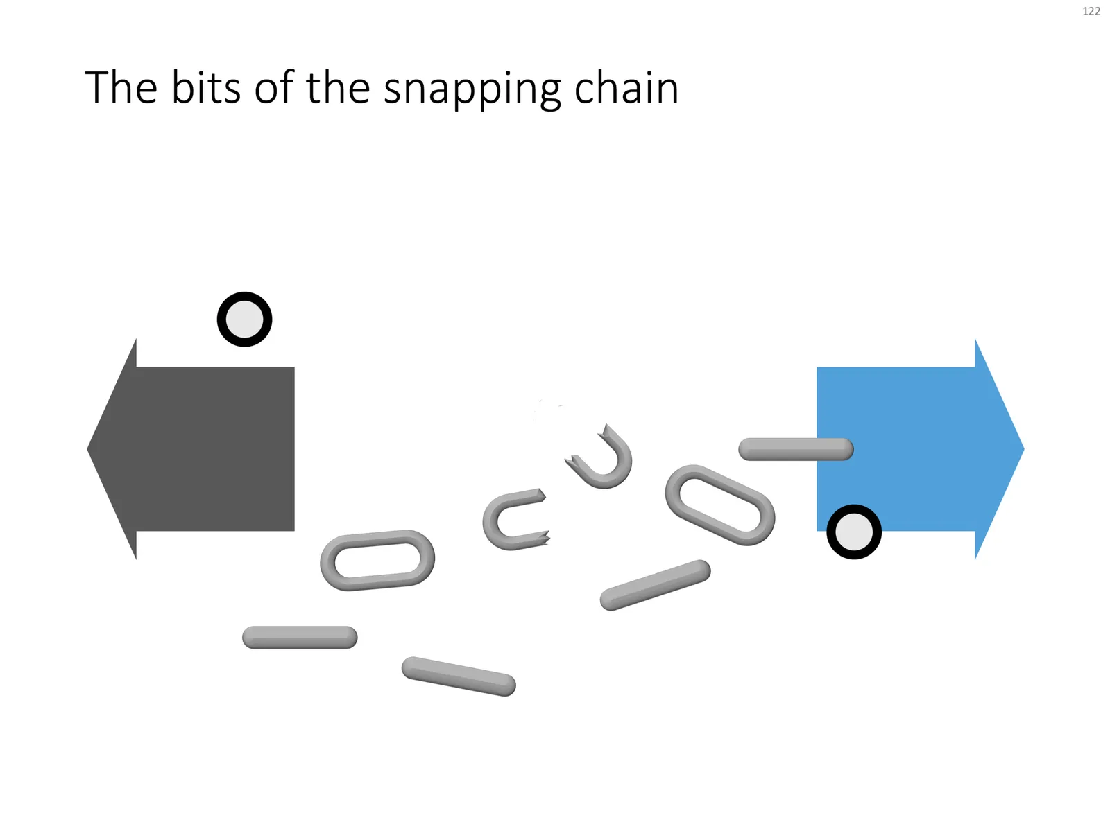
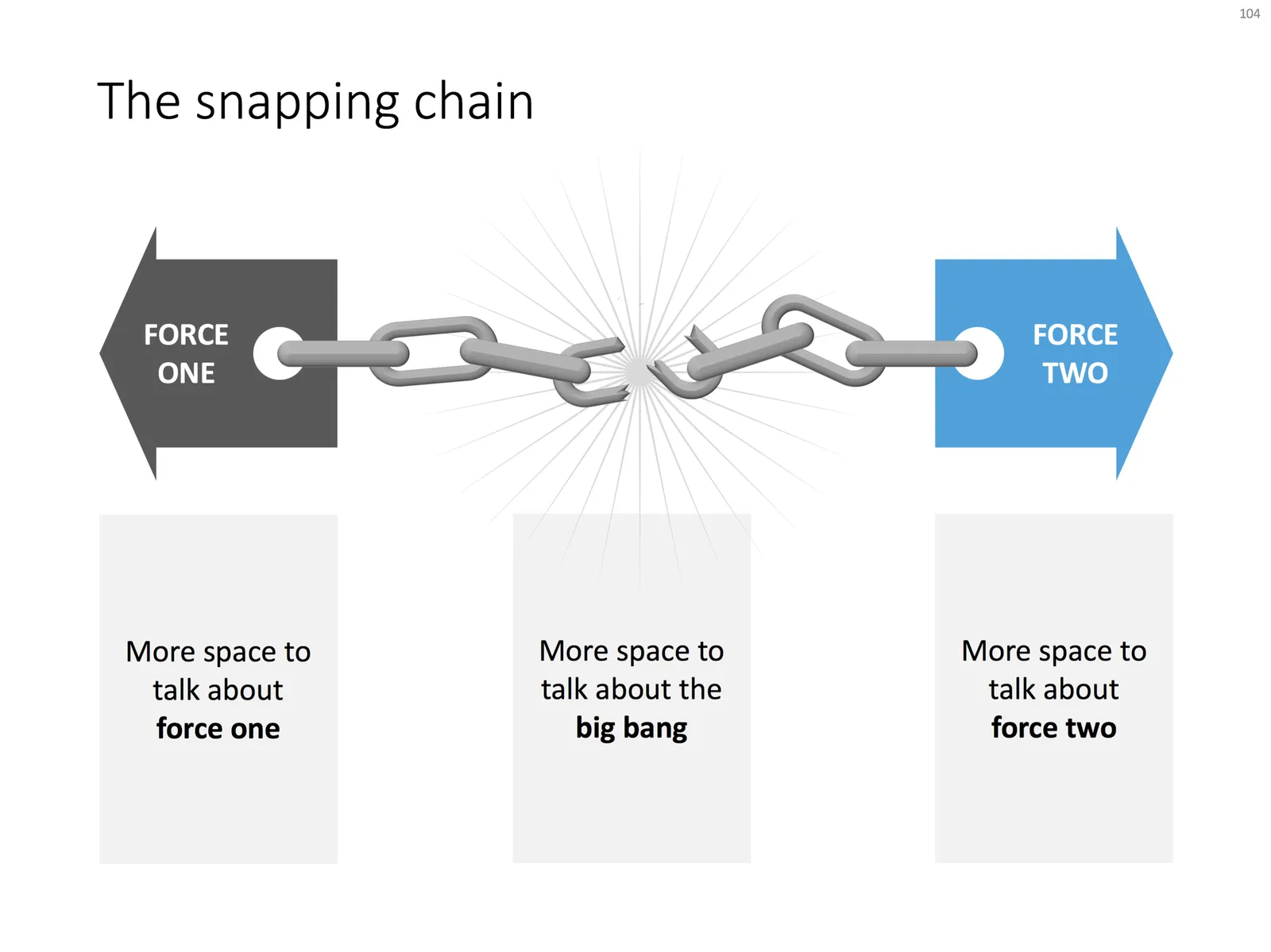
Business presentations usually rely on a few basic concepts. One of them is the snapping chain or rope, where 2 forces pulls something apart. One way to create this is with a stock image of a snapping rope or chain, but it can be hard to find one without an unhelpful 3D rotation, another approach is to create a chain from basic PowerPoint shapes.

Here is what I did

  • Take a rectangle with rounded corners
  • Increase the rounded corners until they become half circles (the small yellow dot in the shape)
  • Copy the shape, make it smaller
  • Centre the 2 shapes, subtract the smaller from the bigger
  • Apply some 3D bevel to to get the basic chain ring
  • The other chain ring is simply a rectangle with rounded corners.
  • Now, scribble a “saw” freehand shape.
  • Copy a chain ring, subtract the saw shape to get the broken ring
  • Copy this broken ring, and subtract it from another ring (to get the exact complement of the break lines)
  • Line everything up for the final composition.

You can follow these steps, or download the finished product from the template store.

Once you have your chain, “store it in a safe place”, there are endless ways you could use it in future slides: multiple chains, longer chains, chains that go all around the slide :-) Here is another possible composition from the SlideMagic archive

The resulting chart is not a master piece illustration, but its unpretentious simplicity can do a decent job in an everyday business presentation. People spent too much time dealing with presentation software, and the objective of SlideMagic (the app, the store) is to help you get business concepts on a decent slide quickly and move on with more important things in life (and business).

·PowerPoint

Turning a bar chart into a Gantt diagram

Project Gantt charts are a pain to create in PowerPoint. Screen dumps from professional project management software are too detailed and don’t have the right look & feel. Manually resizing blocks is tedious, and oh boy, what if you have to add or change an activity…

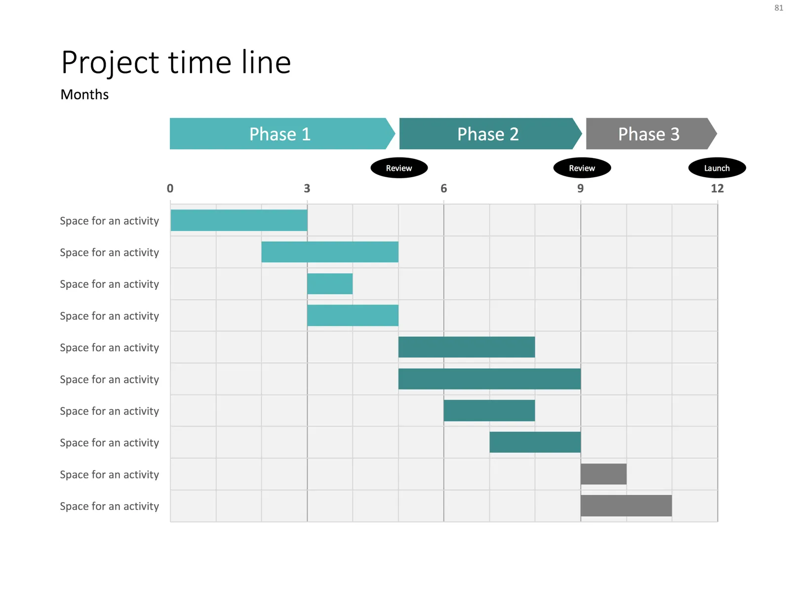
I often use a disguised stacked bar chart to create project flow charts in PowerPoint.

First, you need to look at the content. Like my approach with all data charts, project plans should not be copy pasted directly into PowerPoint. Project planning, data analysis, is not the same as presenting the result to an audience, you need to disconnect the two activities. This means in most cases starting with a blank sheet of paper.

Purely from the stand point of communication (not planning): which activities should be grouped together, which separated? What is a logical phasing? Sometimes, nitty gritty activity details are crucial for planning purposes (exact roll outs for each city), but can get pretty boring in a presentation. Sometimes the opposite is true, a small pilot might be worth highlighting in the presentation.

Once you have this sketch, you can transfer it to PowerPoint. PowerPoint does not have pre-configured Gantt chart templates, but the stacked bar chart can provide a solution. See the chart below as an example:

It takes a bit of thinking to set up, but once in place, it is easy to make small changes to the length of the bars and/or add and subtract activities without having to go through the hassle of lining up everything again.

Continue reading →
·PowerPoint

Using perspective in PowerPoint

Today, there are many tools to create 3D visuals: images, videos, evening 360 degree virtual reality simulations. Most of the time, these perfect 3D compositions are overkill for business presentations. But sometimes, 3D compositions can help communicate your message. I am thinking of “road ahead”, “obstacles” and other concepts that are common in business presentations.

PowerPoint which is aimed at non-professional designers, does not have very powerful 3D object manipulation features. If you try to use the few that are there (3D object rotation, adding depth to shapes, putting drop shadows), the result often don’t look realistic.

My PowerPoint 3D abilities more or less followed the 3D development of a child who learns to draw. First, no perspective, then adding the side view without making things vanish into an imaginary horizon, then acknowledging the horizon, but not being consistent about, until finally you get what is actually happening and being able to tell why what you draw somehow does not match reality.

Most of the time, I ignore the built-in PowerPoint 3D features. Instead, I use regular shapes which I put on the slide canvas with some help of temporary lines. You can have a look at the example below. Objects should more or less fit within the boundaries of the lines, and text should be resized accordingly.

So, two principles:

  1. Only use 3D in PowerPoint when you actually need it to express a point. 3D for the sake of 3D does not make your charts look more fancy or clear
  2. When using 3D, keep it simple, and pay more attention to the proportion and positioning of the objects than “sophisticated” 3D effects
Continue reading →
·PowerPoint

How to export PowerPoint slides as high res images on a Mac

I am working with PowerPoint 2016 for Mac

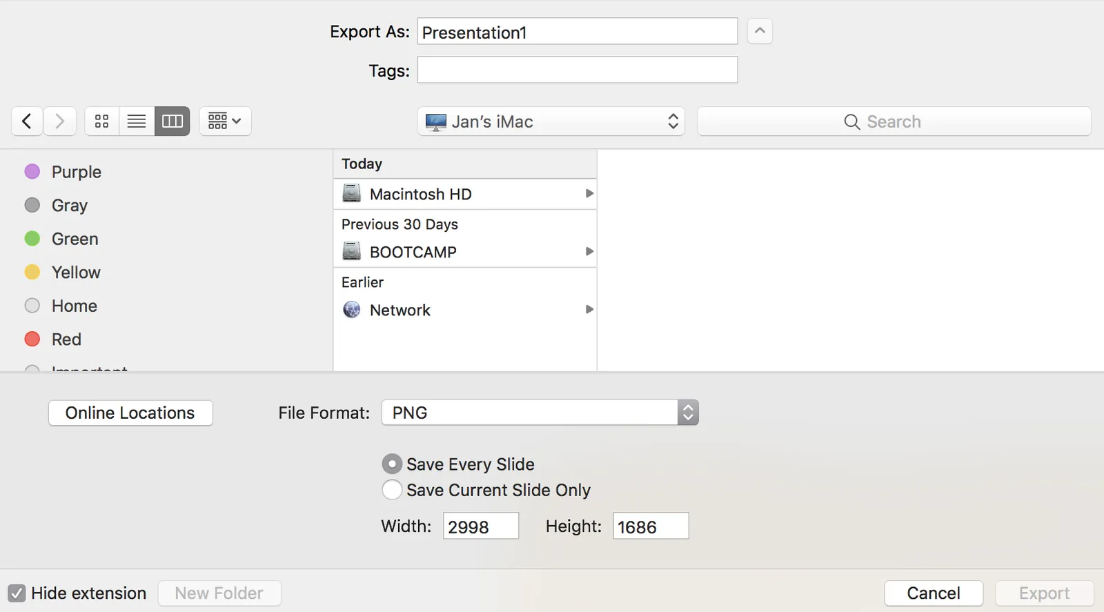
PowerPoint can export your presentation as a series of images. Go to file, export, select PNG, and you can select just one slide, or the entire presentation to be exported. In the latter scenario, images will be saved in a newly created directory.

Probably a left over from earlier PowerPoint versions, the resolution of these images has always been poor when using the standard settings. In previous versions of PowerPoint, you could somehow change DPI (dots per inch), but it did not affect the output. There are also ways to hack registry system variables (on a Windows machine, not a mac). The results have always been unpredictable.

In the most recent version of PowerPoint on mac, you are presentation with a menu in which you can enter the desired slide dimensions. This dialog behaves strangely when entering extreme values has height or width, flipping the orientation of the slides.

For some reason, I get decent pictures both in 4:3 and wide screen aspect ratios when setting the width to 2998, and the height is calculated to 1686. I have tried to understand why, but failed to do so far. It is probably not worth breaking your head over it, just use these numbers.

·PowerPoint

The origins of PowerPoint

This article The improbable origins of PowerPoint is probably the most detailed story of how PowerPoint became what it is today I have read.

·PowerPoint

My own clean PowerPoint template

PowerPoint templates get corrupted over time. It usually starts with a template that was designed by a print graphics designer as an after thought after designing the logo and the business cards: creating slide layouts without paying much attention to the technical issues of programming a template that can be (ab)used by thousands of employees. Then over, slowly but gradually, “foreign” templates infect the original until nothing is left of the original.

I go back to zero every time I design a new presentation. The file that I put up in the SlideMagic template store is pretty much the one I start every new presentation design project with. It is really simple. You can customise it with your own colours and you are good to go.

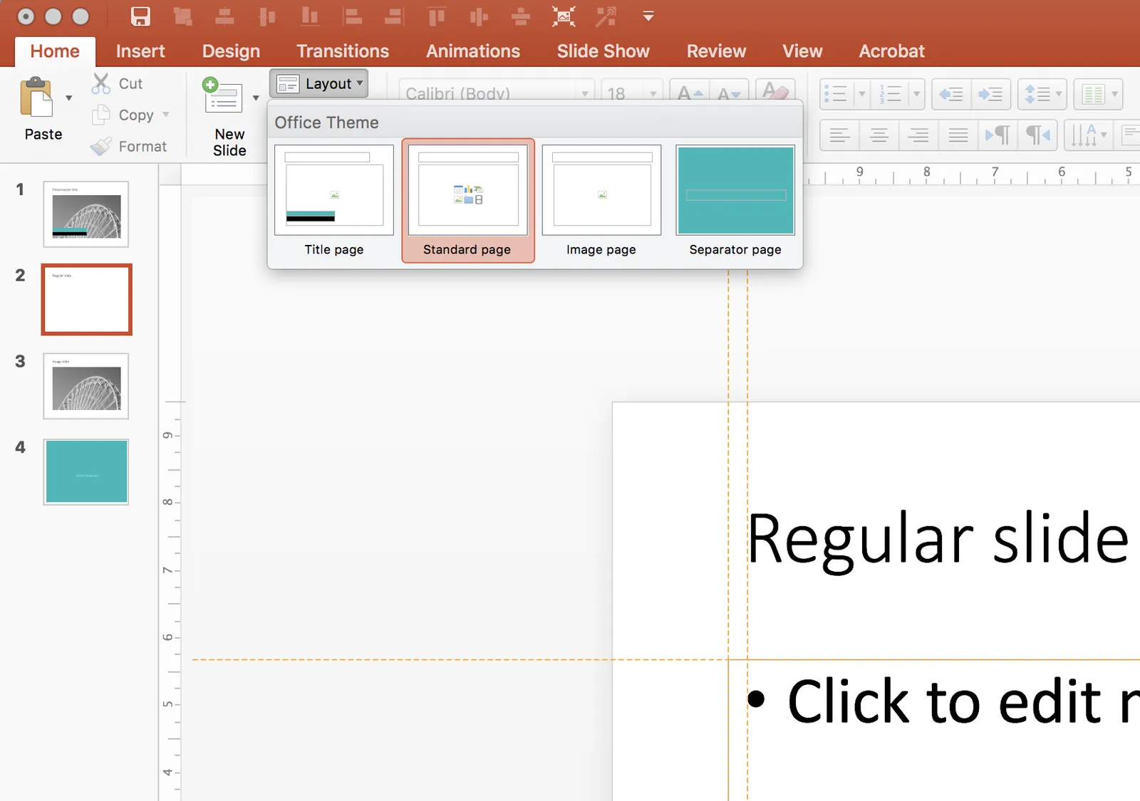
When creating a new slide, go to the “Layout” button in the top left of the menu to create a select a new slide layout.

·Layout

Slideuments and graphics designers

Many designers with excellent skills in web and/or print design somehow cannot deploy their talent very well in PowerPoint/business presentations. I have been thinking hard about why this could be.

The key challenge I think is the tight relationship with content and design. In print/web the design of a page does not really change that much if the content changes (it is still a block of text, an image, and an icon that fit in the same overall grid). In a business presentation, everything goes upside down when your competitor analysis needs to include 3 instead of 2 dimensions.

The second reason is - I think - that both people who write presentations and designers who polish them, stick to the conventional slide format: title across the top, list of bullets.

Now here is an interesting experiment for a 100% graphics designer who is not allowed or does not have the knowledge to touch any of the content (the classical print graphics designer situation). Assuming the presentation is a slideument (meant for reading rather than presenting).

Hand over the material in a word processor, as a long text file rather than a partly finished PowerPoint presentation. Now give the designer total freedom to present this material in any form she wants, even in any software she wants, using any page layout she wants.

Changes are you might get a pretty good lucking slideument by taking “PowerPoint” and its familiar layout out of the equation.

Image via WikiPedia

·PowerPoint

Making a transparent cube in PowerPoint

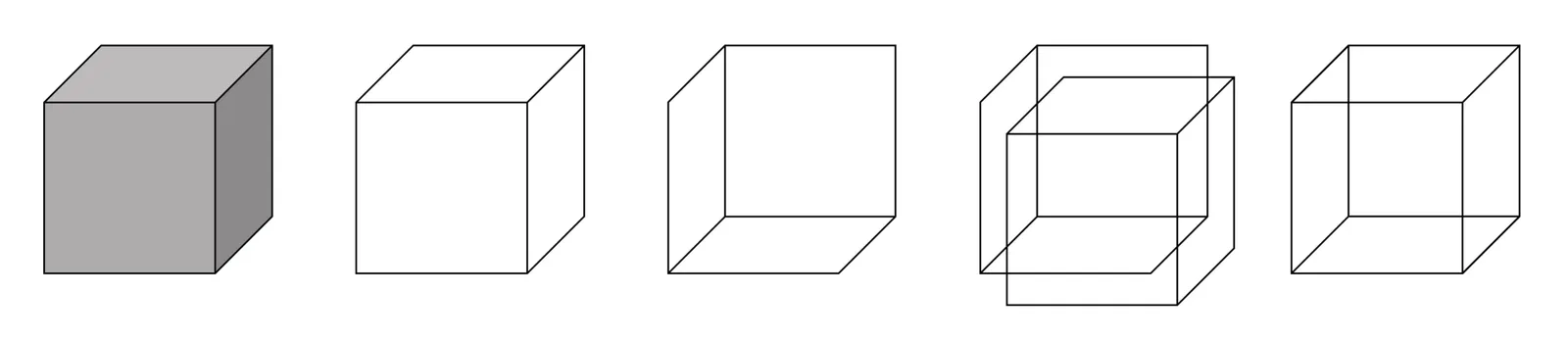
There is a 3D cube shape in PowerPoint, here is how you can make it transparent. The secret: rotate a copy of itself and paste them over each other.

Image via WikiPedia