SlideMagic Blog

Frequent updates about all things presentations since 2008. Subscribe to never miss a post.

RSS
all posts

Category Keynote

·Data visualization

Middle East friendships

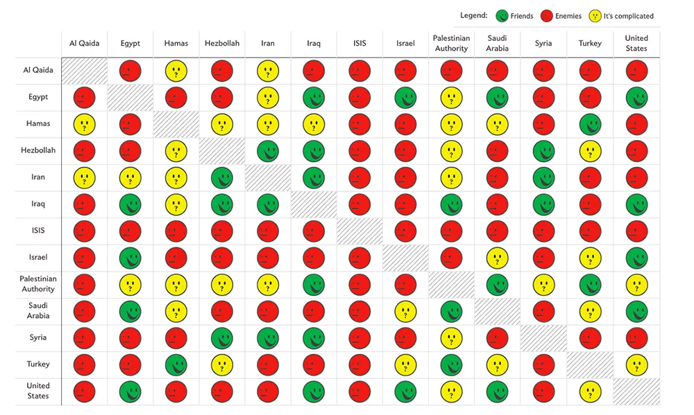
Slate created a beautiful map showing the complexities of the friendships in the Middle East:

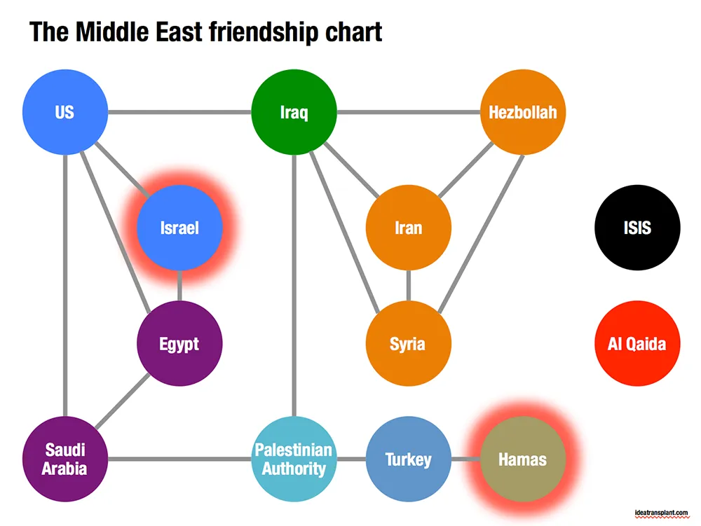
Go to the original here and click on each of the smileys for additional information. The message of this chart is clear: it is complicated. The same information can be displayed simpler by focusing on the just the green relationships. The following pattern emerges, highlighting among other things why it is so difficult to get Israel and Hamas to communicate.

·Images

Overwhelming images

Images are much better than words to amplify a message, but sometimes they can be too distracting. If people are staring in awe at this stunning photograph you found, they might just forget for a second about the message you are showing/talking about.

Image source

·Images

Twitter goes PPT

Twitter is keen to find ways to become more accessible to a broader audience, beyond the tech-savvy early adopters. The answer so far: images. Images grab the attention better than obscure hashtags and @ reply’s, and - sneakily - provides a way around the 140 character limit on a Tweet.

The results, lots of poor visuals. This large headshot is an attention grabber, but I am not sure whether Twitter users will take the time to read through the dense bullet points.

·Keynote

Problem - solution

Most presentation design projects can be split up in components, you can even have different people work on the individual bits. Two components go hand in hand though: convincing/reminding the audience of the problem, and presenting your solution. The way you portray the problem should guide the way you show the solution. In fact, the best way to show the solution is the highlight the problem.

·Keynote

Do you have it all?

Business presentation design requirers a combination of skills:

  1. Content story: the strategy consultant. Somehow all the raw material, content need to be in place. All in a logical order, no holes, no overlaps, all the items of check list need to be ticked off: need/problem, solution, market, competitors, business model, financials, etc. etc.
  2. Slide layout: the designer. Colours, fonts, look and feel, white space, layout, image cropping/scaling/positioning, diagramming.
  3. Data visualisation: the strategy consultant. Challenge one: pick the right message you want to emphasise from the thousands of options that a data set gives you. Challenge two: actually emphasise it with the right chart, the right colours, the right rounding.
  4. Pitch story: the movie director. Now take all the structured, analytical, and boring base material, and turn it into an exciting, emotional, convincing 20 minute pitch. (Note the difference between content story and pitch story)
  5. Outside reality check: seasoned business executive. What are the weaknesses in the story, what are the difficult (and/or obvious) questions the audience will ask, what elements of the story are totally obvious?

I was trained in 1 and 3, got 5 through the years, taught myself 2 (clean, good enough, but not at the level of a master illustrator), and trying my best at 4.

Many professional designers in the market will lack 1, 3, and 5: but they will still do fabulous work on presentations that have less hard core business content.

Many corporate executives lack 2, 3, and 4. They also will have trouble with number 5: being able to look at their story from a true outside perspective.


Continue reading →
·Keynote

I cannot read the footnote!

It is in tiny font, it has a light grey font, nobody can read it!

Perfect.

If the legal department insists on using footnotes, then they should be designed in such a way that someone who stands with her nose against the screen can read them. If you want to read them, you can, if you do not want to, you do not have to.

·Keynote

Quick starter guide

Most appliances comes with a user manual and a quick starter guide. The manual resembles most business presentations today, the quick starter guide is what you should aim to design.

Manual:

  • Long
  • Lots of words, long paragraphs, clumsy translations into multiple languages
  • Regulatory disclaimers
  • Logical structure

Quick starter guide:

  • Short
  • Visuals only (no need for languages)
  • Only info that matters (regulatory statements are out)
  • Story structure (the order of what needs to happen when you take the thing out of the box)
·Keynote

Speeching vs presenting

Many bullet point heavy presentations are in fact speeches. You read and correct every paragraph over and over again and after hours and hours of work you see that you got it exactly right this is what you want to say!

Congratulations, you have arrived at the starting point of your presentation design project, not its end.

·Keynote

Sending with a fresh head

Whenever I need to send out a version of a presentation, I tend to do it in the morning after I had a chance to glance over things one more time, making small corrections here and there. Sending a deck straight after a big design push leaves errors that can easily be fixed by a well-rested mind. Story flow design in particular gets a bit hazy when you are in the trenches to turn out one slide after another.

·Keynote

Interpreting feedback: Q&A

Continuing my post from yesterday about interpreting feedback and deciding who to ignore, and who to believe.

In very short presentations (15 minutes) you can get away with a small glitch in your story flow. Your audience will get the whole picture fairly quickly, even if there was a slide bump in the way you told the story. You like to tell the story this way, the test audience liked it the other way, so be it.

A big red flag though will come from the sort of (content, substance) questions people ask.

  • Do you find yourself answering a question by giving a completely new mini presentation on a white board to explain something fundamental to your idea? Time to incorporate this into the main presentation.
  • Does the test audience ask questions that are totally trivial to you? Example: the reasons why current solutions do not work. Maybe you are going to fast in the opening of your presentation. Time to back up and take it slower at the beginning.
  • Do people try to compare you to specific other players, competitors? It is rarely a good idea to overly emphasise your competitors in a presentation, but if an issue comes up all the time in Q&A, it is better to take it head on in your main story.

Questions are important indicators of whether the audience got your message, or not.