SlideMagic Blog

Frequent updates about all things presentations since 2008. Subscribe to never miss a post.

RSS
all posts

Category Keynote

·Keynote

All the same

I have a number of clients in the IT security sector. My main challenge with them is to make them sound less similar to all other IT security companies in the world. IT security presentations or brochures usually follow this pattern:

  1. Scary, scary, scary reminder of awful security risks. The audience knows this already. The visual images are unpleasant to look at.
  2. A relentless stream of marketing abbreviations and buzzwords that sound exactly the same as the ones the competition is using.

I try to keep a positive mood in the presentation without using images of hackers wearing a balaclava. The marketing buzzwords can be replaced by a deep dive of one particular aspect of your technology that takes a completely different approach to IT security than your competitors use.

·Data visualization

Focus on the differences

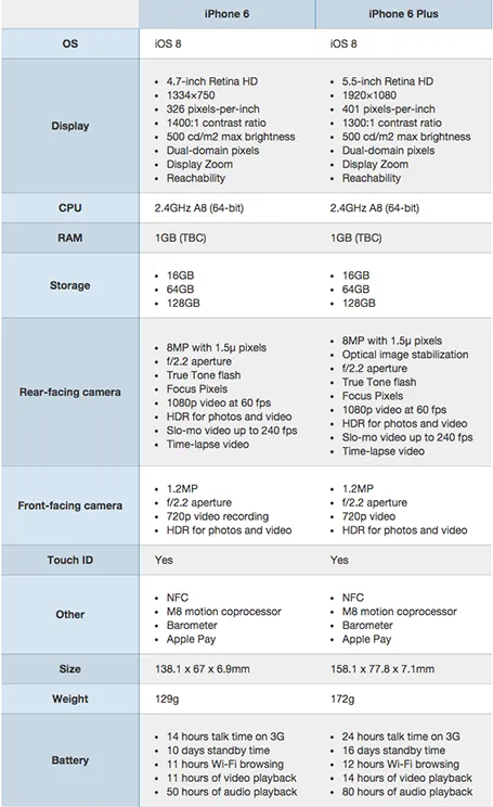
A nice side by side comparison of the new iPhone 6 and 6 Plus on the Cult of Mac. I see many of these tables in business presentations: columns with almost identical content. Why not focus on the differences instead and leave all the other clutter out?

·Investor presentation

Help the VC pitch for you

Startups invest a lot of energy in getting into the door of well-known VCs (step 0 of the process). Strangely enough, some of them drop the ball later on wasting that earlier effort.

After you have convinced a VC partner, she has to take the idea to her other partners, often in some internal meeting without the startup being present. When a startup presents to a VC, mistakes are often forgiven,  and gaps in data can always be filled with a follow up email. Usually the VC partner wants you to succeed.

Internal VC presentations are a bit more brutal. There is less time, people do not need to be polite to guests (people say what they think), and everyone expects the perfect pitch with all information available, there is no second chance. Missing facts often lead to a turn down.

Talking to some of my VC friends, they complain about how startups further on in the investment process are slow with providing information/answer simple questions that can save them in these internal VC grilling sessions. Startups take note of this easy win.

·Investor presentation

Harvesting the Board presentation

The last Board presentation is usually the only document in the company that more or less talks about everything what the organisation is about: strategy, financials, people, product pipeline. It is tempting to harvest the Board slide deck for sales and/or investor presentations. Here is why should not:

  • Board presentations talk about you, not about your (potential) customer, not very useful in sales meetings
  • Board presentations reveal your weaknesses, give a too transparent comparison to competitors.
  • Board presentations are all about trade offs and choices, not a clear articulation of a way forward
  • Board presentations have a boring agenda-like structure, not a captivating story
  • Board presentations are usually stitched together last minute with input from multiple people, not the most creative story writing process
  • Board presentations are designed for long meetings, not 20 minute pitches
  • Board presentations are usually Boaring…
·Delivery

PowerPoint on iPad

I have now stopped dragging along a laptop to client meetings. The thing is (relatively) heavy, requires a bag, and being the guy with the lap top in a meeting always put you in an inferior social position somehow. The PowerPoint for iPad app has improved a lot. You no longer have to go through the tedious process of downloading a file from Dropbox, remembering your 365 password, uploading the file to the 365 cloud drive, and downloading the file again. Still potential font rendering issues (even with standard fonts that might drop to the next line), still makes me use the combination of PDF files and iBooks. It renders nicely and the iBooks folder/collection solution is good enough to keep things organised. A lighting-to-ancient-VGA-projector convertor enables you to present on a big screen.

·Keynote

90 degrees

Nature prefers curves and round shapes. Steve Jobs likes rounded edges. White board sketches are curved and fluid. People prefer rounded shapes in architecture.

But: curved shapes are a pain to design. It is hard to fit text. It is hard to align them properly. They waste space (the Japanese invented the square water melon that makes better use of fridge space).

This is the reason that I “squarify” almost all diagrams and white board scribbles when designing presentation slides. Circles/ovals become squares/rectangles. Curved connecters become elbow connectors. Business presentations need to be efficient, and as a result they might not always be artistic master pieces.

·Creativity

Levels of understanding

As a presentation designer, you need to understand the substance of your slides better than what is reflected in your final work. Here are the levels of understanding:

  • Level 5: the expert, your boss, your client
  • Level 4: the level you need to get to as a designer
  • Level 3: what is reflected in your slides
  • Level 2: the audience right at the end of the presentation
  • Level 1: what the audience remembers in 3 weeks
  • Level 0: where the audience and you start out on

The key lesson for the presentation designers: you need to shoot beyond level 3, if you cannot stand above your substance, you cannot make the right design trade-offs. So ignore the strange looks you get when asking probing questions during the briefing.

·Investor presentation

In the Valley early October

I will be mentoring at a startup event in San Francisco early October. If you are interested to catch up, contact me. The Bay area is a big place, but maybe we find a time to be in the same place. My main presentation might be open to the public, more details to follow.

Image via WikiPedia
·Keynote

Freelancing and Uber

Here is a comment I posted on Fred Wilson’s blog about the inevitable rise of market places for professional services, just like Uber did for taxi drivers and passengers.

Perspective from a freelancer.

Platforms/algorithms will do an “Uber” to many professions including probably my own field: presentation design. Competition/bidding to find effective market clearance. In quiet months, prices go down, you want something done tomorrow: pay for it.

For a freelancer, I think this is ultimately a race to the bottom (Godin speak). The only profitable way to build a freelance career is to work on a distinctive personal micro brand in a super niche segment, with an ever growing base of happy clients.

Maybe you use a platform to get started, but the winners will be able to wrestle themselves loose from the platform. Like the best freelancers today are often the ones that freed themselves from high paying consulting, advertising, or investment banking hierarchies.

·Data visualization

Readability

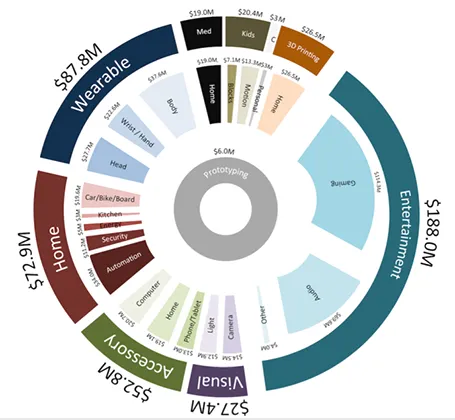
Here is a data chart that was published in TechCrunch, it shows a breakdown of crowdfunding-sourced investments in hardware.

The scattered pie chart looks nice, but is not easy to read:

  • A lot of data and many label are positioned upside down
  • The $ and M signs clutter up space
  • A lot of text is too small

Also, PowerPoint is not very well equipped to make charts like this. You see how the exploded pie points do not line up perfectly, and how the text is not curved right.

To make it readable, I would go for 2 stacked columns, one for the total categories, one for the sub categories. Put horizontal labels to the left of the totals, and to the right of the subcategory column. Use colours to link totals and subcategories together (like it is done in the above pie).

If you wanted to go fro an exploding pie as indicated above, do not explode the pieces in PowerPoint, but rather use extremely fat white lines around the elements of a regular pie to get a more organised diagram.