SlideMagic Blog

Frequent updates about all things presentations since 2008. Subscribe to never miss a post.

RSS
all posts

Category Keynote

·Keynote

The big picture first

Doing the product spec slides of your sales presentation is relatively easy. The big picture, how you position yourself versus the competition is harder. It is tempting to start with the easy bits and worry about the difficult things later. Still, I suggest to take on the positioning first since all other slides will depend on it. Moreover, it is the overall product concept that you are selling, not the features of individual products.

·Keynote

Flattening a story

Business school books and consulting reports have a clear hierarchical structure. This is great for reading a document: you can skip what you do not need, and go right into then detail when you do need it more explanation.

In short stories, hierarchy can be boring, you sound like you are given a university lecture. I often flatten that hierarchy, making the presentation more sequential. Out go the slides with the 3-5 setup bullet points, and instead I just let the story flow. If I have to, I bring back the structure at the end of the presentation to sum things up.

This works great for 20 minute presentations, for marathon presentation days we might have to revert back to the business school rigour though. But there is a reason why marathon presentation sessions are so stimulating for the brain…

·Colors

Too much colour (2)

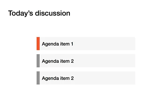
Following frequent requests after my previous post, I have included a picture here that shows the concept of the narrow coloured bar replacing a fully coloured slide object.

·Colors

Too much color

Colours brighten up your slides and are a great way to group related items together: USA is green, Europe is blue, Asia is purple for example.

But applying bold colours to big text boxes makes your slides too busy and nervous. Instead, keep those text boxes light grey and add a very narrow colour box attached to it at the left side, almost like a fat line.

·Keynote

Mess illustrates mess

“Hey, that chart looks very messy?” “Yes, but that is what we want to show, right?” “True.”

·Animations

Uncovering

When you need a complex animation, it is often easier to uncover objects by removing a white box than build up a shape step by step, especially if the shape includes a data graph (columns, lines, bars).

·Keynote

Design for reading

The other day, a client needed a presentation meant for reading, something that would be sent out to the employees by email. So, we designed it for reading and used the fact that for an internal audience we could be a bit more radical with the format.

Here is the concept: a dark 16:9 background. Each chart has a big visual on the left side while the message of the chart is spelled out in full sentences in a relatively small font in a column on the right. Full sentences, because nobody will be around to explain what the abstract graph means. A narrow column in a small font because it is easier to read than a very wide sentence spanning an entire 16:9 screen.

·Keynote

Use that style guide

If your company logo was designed by a professional designer chances are that somewhere in the bottom drawer of the marketing department you can find a complete graphical style guide that goes with it. Usually, it gets only used for commissioning other design work (brochures, web sites, etc.), and hardly any PowerPoint user knows of its existence.

Ask for a copy and use it to inspire your presentation design. See what colours the designer recommends, there might be more than present in the logo. See how pages are laid out. See what fonts and font colours are used. Lots of inspiration.

And yes, the section for the PowerPoint presentations in these style guides is usually pretty bad. Professional designers are not used to working in PowerPoint (an inferior product in their minds). Beautiful design work gets reduced to Arial, heavy top banners and watermarks. So, use the design inspiration of the first pages of the style guide to create your own PowerPoint template that fits it. Hopefully the marketing communications department lets you get away with it.


·Keynote

Every word counts

Often, presentation slides are filled with verbal padding: words that take up lots of space but do not add any additional meaning. Every sentence you write in a slide is like thinking of a newspaper/blog article headline: it should be as short as possible without diluting the content to an overly generic statement. Unlike a text document, in a presentation, every sentence needs careful consideration and scrutiny.

·Keynote

The audience expects it

Some presentation slides live for years, and that might be the reason that we are hesitant to change them, we think: well, the audience will expect this slide.

If nothing about your story has changed, then this is a valid point. If not, it is the wrong approach. The same slide signals no change at all, business as usual. Also, even if you did change its content, the audience will think it is the same slide as last year, and will not notice the different content.

Sometimes, change is good.