SlideMagic Blog

Frequent updates about all things presentations since 2008. Subscribe to never miss a post.

RSS
all posts

Category Investor presentation

·Investor presentation

Mark Suster on pitching to VCs

The great people of SalesCrunch are beginning to put the videos from my New York presentations online. First up is Mark Suster, a well-known venture capitalist from LA who introduces my presentation on pitching VCs

Mark is one of the best VC bloggers around, and I was honored when he offered to introduce my presentation in New York in person. We found out the night before that we happened to be in the same city (it is a statistically low probability that 2 people from Tel Aviv and Los Angeles are at the same time in New York).

More videos to come. Thank you Ann Lupo for the video recording and editing.

Bullet points and abs

I always preach that the look and feel of an investor presentation should match the brand identity of the company.

Abercombie & Fitch sticks to this principle. See the investor presentation here.  The Footnote website comments:

We counted no fewer than 13 slides that featured shirtless dudes baring their pecs. That’s nearly 20% of the slides in the 67-slide deck. The PowerPoint was part of the company’s Investors Day earlier this week. The presentation seems to have gone well, judging by this brief WSJ article that notes that Abercrombie stock climbed over 8% on Tuesday, in part, it seems, based on the bullish projections made during the presentation. So there was some substance in between the eye-candy slides.

On a more serious note, this investor presentation has some good and bad practices. The good:

  • Muted formatting
  • The use of maps to highlight global expansion
  • The real images of the customer excitement in the stories

Things that could have been done better:

  • Too many bullet points, the numbers would have looked even more impressive if they were put into data charts
  • I like the big bold “$1.0bn” type text across the maps, just don’t put financial data in red.

Thank you Robert Lakin. Image by Abercombie & Fitch.

·Investor presentation

I don't know

When pitching VCs it is better to say “I don’t know” if you do not know the answer to a question than making something up that turns out to be wrong later. Management integrity is a more important investment criterion than having all facts readily accessible in your head.

·Investor presentation

No red in financial data

Red is a great accent color to make text stand out from other elements on the slide. Do not use it for financial data though, people are associating red with negative performance and losses.

·Investor presentation

How to present your team to investors

The founding team is a one of the most important inputs in a venture capitalist’s mind when she decides to invest in your startup or not. For a large part, an investor will size you up during the pitch by judging how you present and how you answer questions, information that is not written down anywhere on a slide.

Still, the team slide is a crucial part of any VC presentation. It is difficult to put CV information in a slide. There is lots of information, and CV entries require lots of text (long university, company, and position names). So I usually end up designing 2 versions: one to go in the front and one with full details to go in the appendix (the latter is meant for reading, not presenting).

You should adopt the design of your high level team slide, depending on what you want to say:

  • We have many of years of experience, a very long time line
  • We have worked together before, multiple time lines circling the overlap in your careers
  • We worked for big name companies: company logos
  • We have complementary skills, some sort of (slightly cliche) puzzle that shows what skill set the individual team members bring to the table.

And if you can:

  • Put in high-quality head shots of the team members
  • Or even better: an energetic group picture.
·Investor presentation

Send me an executive summary

When an investor is running out of time, conversations often end with “why don’t you email me an executive summary”.

Upon hearing that, startups wil scramble to produce the well-known executive summary format, compressing the entire pitch deck in just a few paragraphs:

  • Has to fit 2 pages, so no space for visuals, use a small font or narrow margins if required
  • Stuff the text with buzzwords and big numbers
  • Include all the features of your product
  • Spend a lot of paragraphs on CV details of the founding team

Think of this from the investor perspective: this document is boring and so dense that it would take the same amount of time to read it start to finish than to page-down through a slide deck. Here is an alternative: “I am sending you a 5 minute pitch”

  • A short and visual document, but it could be longer than 2 pages
  • Explaining the investment opportunity in human language
  • Focus more on the problem, less on financial,  product details, and team details (that can come later)
  • The objective is not to get the investment (yet), but to get invited to the next stage in the investment process, possibly a full pitch meeting
·Data visualization

Reuters issues a 1-page online annual report

Slowly, large publicly traded companies are starting to experiment with Internet and social media as alternatives to the dry and boring annual report. Reuters just issued a 1-page version (see it here), with a promise that over the next few days, this will be followed up with more detailed blog posts about the company and its financial results.

Early online annual reports were a pain. They basically were print documents put online and you had to keep on clicking on “next” links to get to the following page. Rendering of tables and data in basic HTML also did not provide good results. Combine that with slow page loads and you get a pretty useless experience.
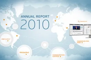
New display protocols (and certainly HTML5) will give PowerPoint-like fast navigation controls to online documents. I think a hybrid of a traditional slide presentation, advanced (and fast) web navigation, video and other multi-media, plus social aspects will give a powerful distribution platform for financial data. You get the best of both worlds: PowerPoint-style visualization of data and key strategic messes, and nicely-formated text for those who want more details. Certainly for public investor presentations such as this one, but also for confidential documents. You can distribute login details to (potential) investors you want to share your data with and exclude them from the online data room as soon as the deal process has stopped.

There are also great opportunities in sales. I rarely use a PowerPoint presentation anymore to introduce my own services for example. Rather, I just take people through a few sections of my web site, either in person or via a remote presentation tool. SalesCrunch, the company that is organizing my upcoming New York presentations, is trying to create a platform for these remote sales presentations.


Continue reading →
·Investor presentation

Getting into the investor's mind

The Internet is full with layouts of investor pitches, they all go something like this:

  • What’s the pain
  • What’s the solution
  • What’s the revenue model
  • What’s the edge over the competition
  • Who’s the team
  • What’s the traction of the company

Your pitch should address all these issues, but think about your potential investor’s mind when deciding about the structure. You might have to deviate from the text book approach.

Investors are constantly evaluating critical questions. And when they (think they) have answered them, they move on to the next one. Questions are not always in the order of your pitch deck.

  • “That guy looks 12!” “Oh, he is 28 and already climbed Mount Everest”
  • “They are doing what exactly?” “Ah, something to do with mobile payments”
  • “Isn’t that a Groupon me-too?”
  • “That would take 5 years to develop!”
  • “Great idea, but where are the dollars?”

If there is an obvious elephant in the room, you might as well address it early on in the pitch. Your audience will be calmer and more open to digest the other important points you want to make.

Far more important than sticking to the text book pitch structure.

Far more important than spending time repeating the obvious (i.e., stats on how big Facebook has become).

·Investor presentation

In New York early April

A heads up. It looks like I will be in New York April 4-7. I will be giving one or two presentations about making better presentations (VC pitching, sales). More details to follow.

·Investor presentation

Can I mention competitors in a VC pitch?

A post inspired by a question on Quora: how to talk about competitors in a VC pitch?

  • There is no business that does not have competitors. If you say so, you just lost a lot of maturity and credibility points. Maybe there is no company that does the exact thing you do, but people have alternatives. (Before the advent of the car, people used horses to get around). Discuss them.
  • There is not much point in hiding the truth. Smart investors will find out in subsequent phases of the due diligence, and when they find a big competitor at this stage, you will have lost significant integrity points.
  • Find a good visualization to show your distinctiveness. Put the competitors in some sort of 2x2, or a heat map that shows on what aspects you are similar and what aspects you are different.
  • Sometimes competitive differentiation is not just about product features. Maybe your competitors are not focussed enough (they are part of a larger organization), maybe you move faster than your competitors (“look at their roll outs over the past year”), maybe you focus on a different geography.

In short be honest, but have a good story at the same time.