SlideMagic Blog

Frequent updates about all things presentations since 2008. Subscribe to never miss a post.

RSS
all posts

Category Images

·Images

Godin on Tribes - a PowerPoint documentary

Seth Godin will be presenting about his latest book Tribes this morning in New York. The slides of the presentation are available on slideshare:

Seth Godin on Tribes

Why a PowerPoint documentary? This presentation uses a huge amount of slides (more than 200), mostly full-page images that are clicked through at a very high speed: the presenter only speaks a few sentences to each of them. The effect you get is similar to documentaries on for example the History Channel: the camera zooming slowly over still images with a voice over in the background. (Ken Burns is the master of the slow zoom, see a post on Presentation Zen) Not suited for slideshare. The notes are an integral part of this presentation. Because they are not very visible, this presentation is actually not that suited for publication on the Internet. The images are nice, but you do not get the message by clicking rapidly to the slideshare document. I would have included a black “subtitle” bar to provide background to the documentary. About Tribes. Seth is making the case that marketing is all about enabling a group of followers to interact with each other. More here.

UPDATE: a video of Seth’s presentation can be watched on Mixergy.com.
·Images

"Made to stick" authors on avoiding presentation mistakes

Chip and Dean Heath, authors of the best selling book “Made to Stick” devoted this month’s column in Fast Company magazine to How to avoid making a bad presentation.

It is an interesting read. Two key messages for me:

  • Firstly: “before your audience will value the information you’re giving, they’ve got to want it. Most presenters take that desire for granted. Great presentations are mysteries, not encyclopedia entries.”

  • Secondly: puting the use of stock images into perspective. They are definitely better than clip art, but spending hours to find that perfect image to support let’s say “innovation” (“which one, the bunny coming out of the magician’s hat or the smiley-face guy with a light bulb over his head”) will not help you communicate the concept better.

Apologies for the many apostrophe an quotation mark errors in this post, too many HTML codes to put in.

Via Andy Nulman

·Images

After "beyond bullet points", now "beyond stock images"?

I found this presentation today. Playing around with simple text and fonts on an almost empty screen can sometimes be incredibly powerful, to the extent that you can do without that “stunning” stock image. Watch those fancy fonts though that are not installed on everyone’s computer. (I disagree with Seth Godin on this one).

Presenting with text

·Images

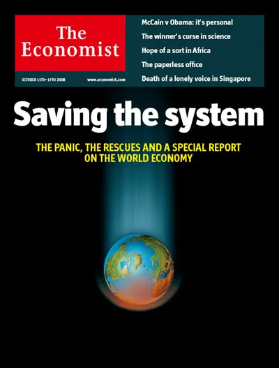
Images that stick - this week's Economist cover

Update, a slight show with many Economist covers of the past years warning about the upcoming crisis:

The Economist Covers - The Financial Crisis Evolution

·Images

Showing off your customers - building a logo page in PowerPoint (or something different)

Many of the startup clients I serve are keen to show off their customer list. Almost all of them do it using a page full of company logos scraped of web pages. Why do most of them look so bad?

  • Different sizes
  • Different colors
  • Not evenly distributed over the page
  • Not all images are of high quality

Some guide lines on how to let them look better, some of which are easy, some of which take more time:

  1. Build a grid. Count the number of logos you need to put up. Build a nicely distributed x by y matrix of rectangular boxes that fits them all. Now all logos will look evenly spread.
  2. Use a white background, or make at least the boxes (described above in 1.) white, most logos come on white
  3. Use the “press toolkit” of a company to download the official logo
  4. If not available, use Google Image search to find clean logos (not the ones with background graphics at the top loft corner of web pages), the bigger the size, the better (they look sharper when you shrink them)
  5. If the logo is only available with a colored background, find the RGB color of it (in Paint, or another graphics program) and make the color of the box (described in 1.) exactly the same
  6. Crop out any marketing slogans (“we try harder”) etc. from the logo
  7. To make the slide a bit more calm, you can take the color out of all the logos and replace them with a monochrome overlay consistent with your slide color scheme. The point is to show lots of logos, not neccesarily introduce a lot of colors to your slide.
Continue reading →
·Images

Google images now with "photo-only" option

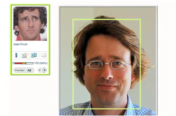
In the advanced search tab of Google Images you can now specify: all content, news content, faces, and photo content. Photo content is the new addition. You can strip put illustratations, logos etc. from your image search. (Thank you Lifehacker.) Although I purchase all my PowerPoint images from stock photography sites, I often use Google images to “brainstorm” a concept for an image. Off topic. The “faces” option might be the most interesting. We are heading for a world where images of people are getting automatically tagged, that means: all images available on the web. For fun, see MyHeritage that has developed technology to match your face with that of a celebrity. My face was matched to that of Formula I racer Alain Prost. I guess their technology will be put to more serious use soon.

·Images

Using real faces in PPT (+ Microsoft AutoCollage)

I like using images of people in my PowerPoint presentations.

  • Faces create an emotional connection (especially on a title page that is open for a long time on the screen while the audience sits down)
  • Faces allow the visualization of a consumer segment, an image says more than a 1,000 words (college education, mid-income, Hispanic, woman, suburbia, etc.)

Things to think about when picking images:

  • Select images of “real people”, not “artificial” models, cliche images, or cheesy compositions of which there 1,000s on stock image sites (hand shakes, applause, “business person in suit”, call centre rep, etc.)
  • Images isolated on a white (or black) background often blend in most easily into your template
  • Often, I use a color overlay to take the natural image colors out and replace it with a color from my client’s color scheme.

I used a free trial of Microsoft Research AutoCollage 2008 to show some examples of images of “real people” I used (click on the image for a larger picture). All images were purchased from iStockPhoto.

(B.t.w., why is Microsoft trying to sell this product with many free collage utilities available on the web?)

·Images

How to crop portrait pictures

Portrait pictures always come in different sizes, different background colors, different poses. Ideally, you would make one consistent photo shot. The next best alternative is fixing things using the crop function.

If it not possible to resize/crop the pictures in such a way that faces have the exact same proportion, hold on to these guide lines:

  • Eye lines at the same hight
  • Eye lines close to the “golden proportion” of 62%
·Images

Chart concept - a new beginning

This image from iStockPhoto is great to illustratie “make-overs”. Add minimalist text either in the white or the yellow (depending on whether you want to highlight the old or the new).

Skilled Photoshoppers can change the color into something different than yellow.

To create more yellow space. Make a copy of the image. Crop only the yellow wall, align it to the right of the main image and stretch until the right margin. Again, in PhotoShop this can be done more professionally.

Disclosure: no commercial interest

·Images

Managing big PowerPoint files

Increasing use of images creates very large PowerPoint files. Many web hosters cap the size of e-mail attachments at around 10MB, a limit that is now very easy to exceed. Some suboptimal solutions:

  • Upgrade to PowerPoint 2007, files are a lot smaller, but many of my (corporate) clients do not have this software yet, so you end up saving in the 2003 format anyway
  • Compress pictures: select the picture, in the format menu pick “compress” and select the appropriate DPI rate. I personally don’t use it a lot: it does not save that much space if you use larger images, and the quality of your source file deteriorates forever. A big issue, especially when putting your presentation on a big overhead screen.
  • Zipping files does not have a big impact when using images

What I end up doing is

  • Keep file sizes (and image quality) to the maximum
  • Use PDF files to exchange drafts with my clients
  • Finally, send the master file across using a file transfer utility such as YouSendIt.com (note that YouSendIt is not secure in its basic version, anyone “guessing” the URL can download the file).