SlideMagic Blog

Frequent updates about all things presentations since 2008. Subscribe to never miss a post.

RSS
all posts

Category Images

·Concepts

Trees!

Photographs with a strong perspective are always the most interesting ones to use in a presentation. See the example below. Strong lines leading to a bright spot that almost makes you squint. When adding PowerPoint objects make sure to align them properly with the flow of the image.

·Images

Everyone is a photographer

The wide-spread use of smartphones has given almost anyone a camera in their pocket, all the time. So it has become really easy to collect some great pictures for your company presentation, even at the last minute. You could take them yourself, or email a colleague in a remote office to go out on a photo shoot. The images you are likely to get are going to be far better than the shot of the corporate logo behind the reception desk.

  • A group shot of the team replacing high school year book mug shots of the management team
  • Your products on display in a store
  • People having coffee at the annual sales rep gathering
  • One of your (branded) trucks driving off full of product in the early morning
  • The 1 liter bottle filling line in full swing
  • A store front of your New Delhi shop
  • A downtown billboard with an ad for your company on it (not the ad itself)
  • A hazy shot of the rock concert you sponsored last year

Even if you cannot use all these images as slides in your deck,  these photos can make great backgrounds for separator pages that divide up the sections of your deck.

·Concepts

Endless permutations

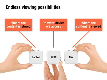
Here is a nice way to visualize an unlimited amount of possible combinations. The sanitized example below was designed for a client with a new digital media technology. You could create a similar concept with a suitcase combination lock, or maybe a slot machine.

·Images

Extreme perspective

Images get more interesting with a dramatic perspective. How to find them? Look for unusual camera angles, and put an object on the foreground to amplify the effect of depth. As it is done in this ad found on Ads of the World.

·Images

Filter Forge

I said before that it is a shame that PowerPoint (or Keynote) do not have these powerful replicators that you can find in motion graphics software. Filter Forge is a nice piece of software that plugs into PhotoShop and extends the range of filters you have available for your images.

Here is an example image I created for a client that has software that works across all possible versions of the highly fragmented Android mobile operating system.

Filter Forge is a platform on which users can contribute their own filters, the result is an endless library of filters, including the perspective distortion above, instagram-style retro filters, and filters that turn your images into cartoons or impressionist paintings.

It is not cheap, I bought the professional edition which is priced at $399.

·Images

Take lots of pictures

Related to yesterday’s post, here is a piece of advice: make it a habit to take cellphone images of workshops, site visits, conference, foreign visitors, a strategic deal signing, moving day to the new office, etc. throughout the year. I always find that when the moment comes for a new corporate presentation, the only office visual a client can produce is one of the entrance corridor with the receptionist in front of the company logo.

·Images

Making a good team introduction

This video by Before & After Magazine shows a great way how to visualize the team behind your company. I always think it is a shame that people do not invest in better photography for their presentations. How hard is it to get someone to hold a camera and take a group picture of your management team? It looks so much better than the inconsistently cropped, high school year book-like, images you usually see in a presentation.

I actually make the team description slide a bit more dense than other charts in a presentation. During the presentation the presenter will talk around the photo and introduce the team, the text in the boxes is for reading after the presentation.

 The Before & After Magazine has some nice graphics design instruction material on their site (some is free, some is not). Their YouTube channel is also worth checking out.

·Images

Video summary in stills

Embedding video in presentations has its drawbacks. It adds another technical risk factor when setting up the presentation outside your office environment. File sizes become so big that it is hard to email a document. And a PDF version of the presentation does not show the video.

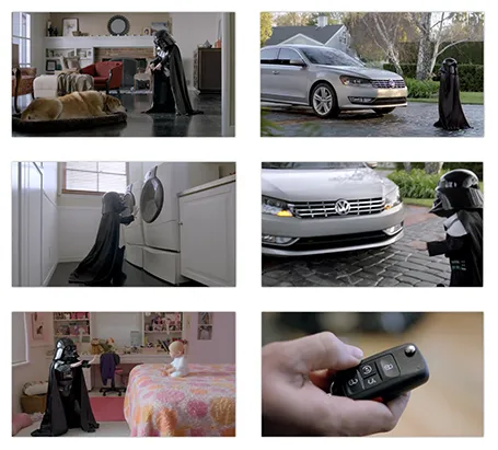
As a solution, you can put in a video summary in your presentation consisting of a few key still images taken from the video. Our brain is powerful enough to make up most of what happens in between, and might even imagine the Star Wars sound track in the background when looking at last year’s Volkswagen Super Bowl ad (which I think was better than the one shown this year).

Look how showing the video, or showing a consecutive series of page-filling images keeps up the suspense of the audience. Showing all images on one page gets the point across as fast as possible. The first approach might be the most fun, the second one is what works best when trying to communicate an idea to busy people.

·Images

No need to show that monitor

In technical pitch presentations, you often have to show the application through screen shots. While a picture of the application inside a monitor frame might look nice, it is a poor way to get your audience to see the content of the screen.
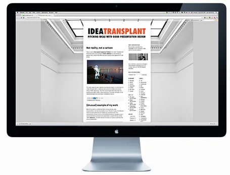
I would cut the monitor, cut the window bars above and below your application, and even zoom in to parts of the screen to highlight what is important. Cover everything that is not relevant (ads for example) with white boxes to keep things clean.

Having said that, there might be 2 uses for the monitor shot. One for a very quick 5-second slide that enables you to say “Let’s talk about the application” and move on. The second application is a slide that shows that your software is running on multiple platforms, but in that case you need a monitor image, a tablet screen shot, and a mobile phone application all on one page.


·Cartoons

Not reality, not a cartoon

Have a look at these great images (on Fubiz) in the series “Enlightened Souls” by French photographer Fabrice Wittner. He uses images of people with a stencil-like effect and puts them on a background of a real photo.

This effect might be very useful in presentation design. It is very hard to a series of images with a consistent look and feel on either stock photo sites, or Flickr. Moreover, I find that using images with real people not working very well in slides. It is too personal. This slight distortion of the characters might just solve these 2 problems in one go.