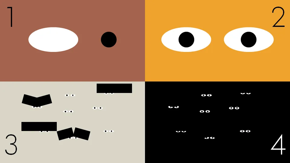
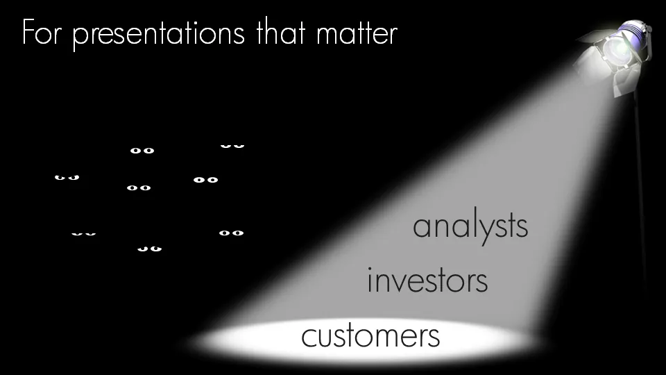
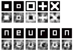
Putting your audience in the patient seat can be a powerful presentation technique. While upgrading my own introduction presentation, I started playing around with “eyeballs” that create an audience staring back at you.
Add Letters is a site full with image generators. I noticed that they’ve added a few new images. My personal favorites are those related to The Simpsons.
A Peugeot ad finally got me to the source of these brilliant cartoons of incredibly complex machines that perform very simple tasks through a sequence of carefully timed actions. No, they were not pioneered by Road Runner and The Coyote that’s chasing him. Cartoonist such as Rube Goldberg and Heath Robinson are one of the most famous creators of these systems. Today, there still are many annual Rube Goldberg contests that challenge high school students to invent one of their own.
This Honda commercial from a few years ago is a beautiful example of how you can use Rube Goldberg-type effects in visual communication.
How to use it in PowerPoint? Animating one of these machines is a challenge… Two suggestions.
Build up audience anticipation. Use a simple cartoon to create a tension about something that is about to happen. The same way that a novelist leaves room for the reader to fill in the blank spaces. See an example on Nancy Duarte’s blog: the hanging piano that is about to fall is a more powerful visual than that of a broken piano on the floor.
“There must be a better way to do this”. This is a concept I often need to get across in fund raising presentations for technology startups. Showing a very complex Rube Goldberg machine does the trick for me. (Another technique making the same point is using vintage images, here an “auto wash bowl” long before the automated car wash was invented).
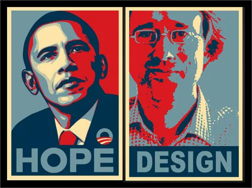
The Obama poster by Shepard Fairey is the icon of 2008.
Here is a tool to make your own. You see, there is still some work to do before I can make it as a presidential candidate.
Jokes aside. Icons can be powerful visual tools to use in presentations. Famous historical moments, famous historical pictures, famous historical posters.
Go back to the pencil when designing presentations. Sketch, erase, sketch, sketch again. A much better creative tool than opening the PowerPoint standard template. Design your slide offline, PowerPoint is a production tool to get your original idea in digital form. Nothing more.
A bit of self-relativation: it is amusing to see how professional presentation designers (ME INCLUDED) increasingly resort to using “back to analogue” techqniques to make their point. We’ve come full circle when we start pasting 10MB high-res scans of a piece of paper, a sticky note, etc. into PowerPoint. Why not bring the physical flip chart page to the presentation event and leave the laptop in the office?
This reminds me a little bit of the joke of the investment banker who worked 100 hour work weeks to retire at 45 and settle in a Mediterranean village to spend the day fishing. His fellow local fisher man has been doing this since he was 15 without going through the trouble. (A better, longer version of the joke here).
There are some ambitious objectives for future research:
Read someone’s dreams
Read someone’s thoughts
And: “read [someone’s] feelings and complicated emotional states”
Until now, it has been very difficult to transfer feelings and complicated emotional states in a PowerPoint presentation. You had to resort to writing a novel for that…
Peter Norvig is Director of Research at Google. Back in 2000, being fed up with boring PowerPoint, he decided to use a famous speech by President Lincoln to demonstrate how a poorly designed PowerPoint translation could destroy its communication power completely. He put the creative “master piece” on his web site and more or less forgot about it.
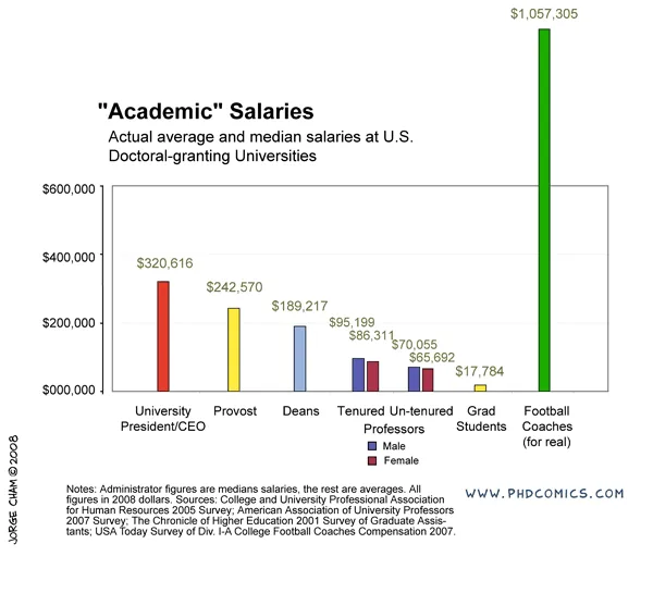
UPDATE: this chart does violate some other basic design rules that are better corrected, see an earlier post about cleaning up Excel/PowerPoint data charts.