SlideMagic Blog

Frequent updates about all things presentations since 2008. Subscribe to never miss a post.

RSS
all posts

Category Cartoons

·Cartoons

Adding value to the value

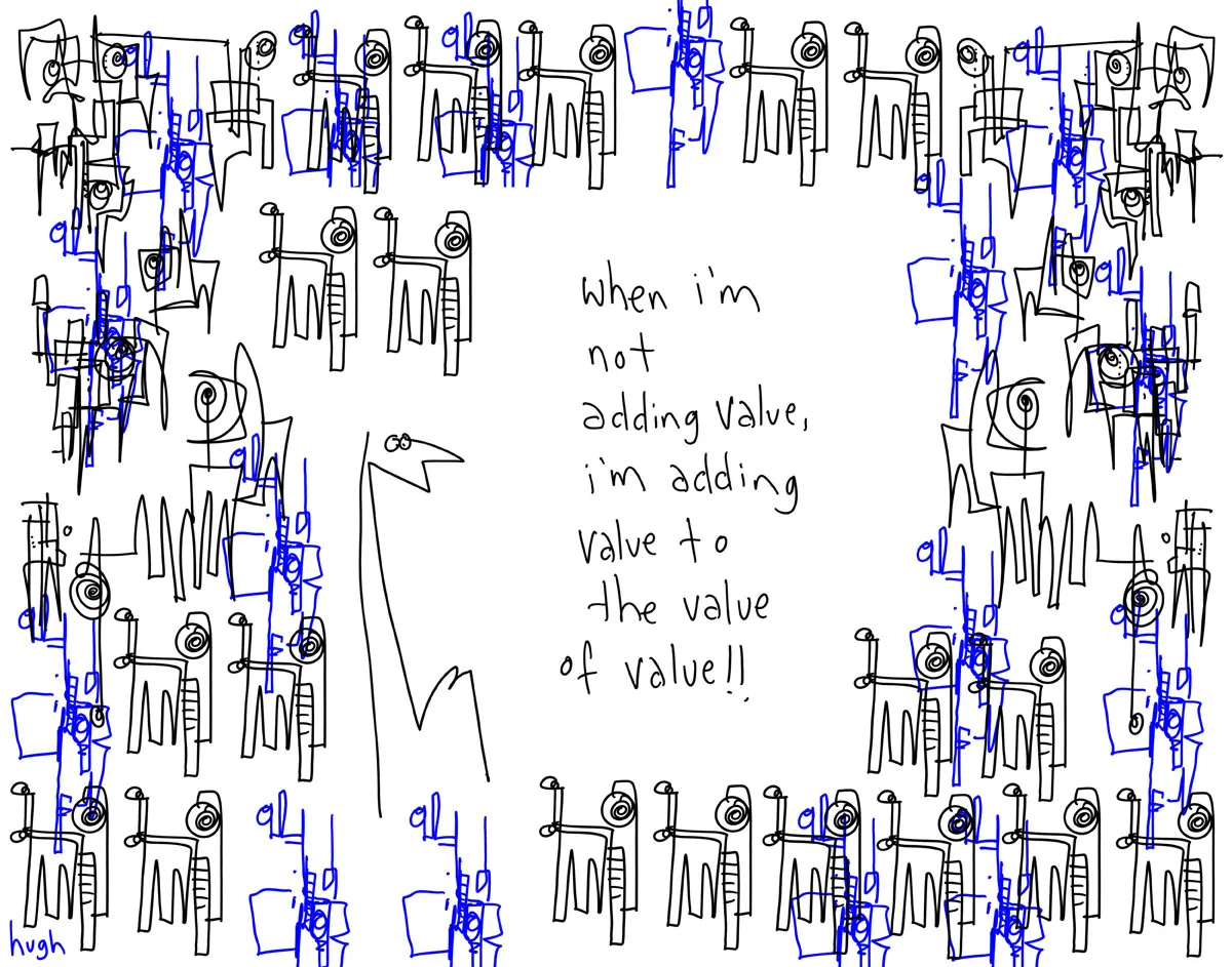
Presentations use too many buzz words and empty phrases. Hugh MacLeod (gaping void) made a great cartoon about the abuse of “adding value”, you can buy a print here (no commercial interest) or subscribe to his daily cartoons by email here.

·Cartoons

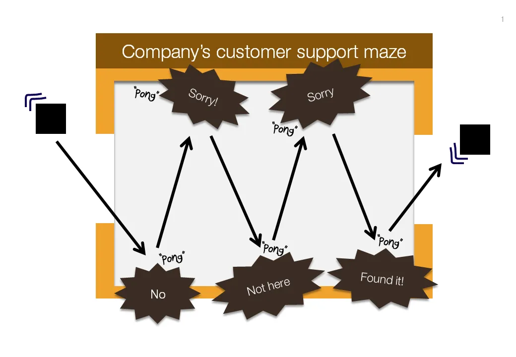
Chart concept: "Pong", "Pong", Pong"

Cartoons have a great way of adding movement to an image. Images can be static and without animations (easier to share online). All you need to do is use an informal font such as Boopee and add some arrows and loosely drawn lines.

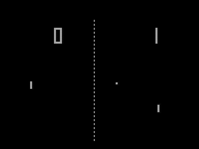
The following chart example was inspired by the first “pong” video games that came out in the 80s.

While the style of the slide is informal, the content is serious enough that I would not hesitate to include it in presentation to the Board. I took out the specific customer example to maintain client confidentiality.

I am a big supporter of the global “ban comic sans movement”, try not to use that font.

·Cartoons

Screen bean nostalgia...

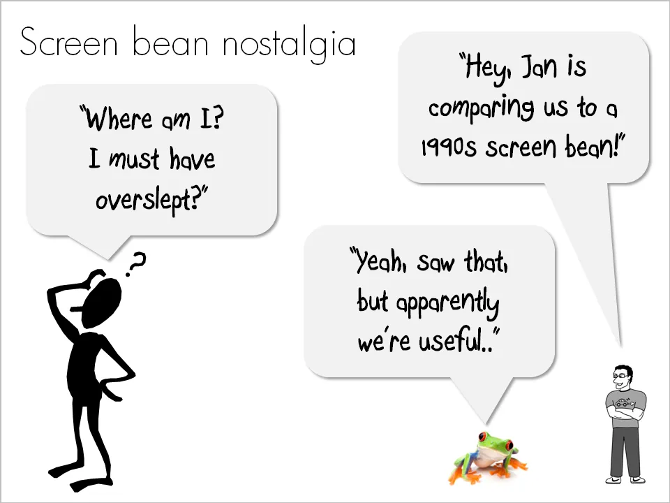
A number of good things have happened in presentation design over the past few years. Yesterday, I came across one of these screen beans that used to feature prominently in many corporate presentations in the 1990s. I am very glad people are not using them anymore. (But I must admit that deep in my heart there is a bit of screen bean nostalgia…).

There is a modern reincarnation of the screen bean character though. A small cartoon with a text balloon placed on the border of a slide. He/she often makes a side comment that adds to the overall message. Garr Reynolds uses them very successfully, Google explains the technology behind the Chrome browser using comic characters, just to name a few.

Farewell my friend Mr. Screen Bean…

·Cartoons

Chart concept: the mini-dialogue with text balloons

The text balloon is commonly used in cartoons. It is now making its way in PowerPoint presentations as well. There are 2 fundamental ways in which you can use them.

  1. A full-length comic story. For presentations that are designed for online viewing (without the explanations of a live presenter) you could create an entire presentation that is in fact a comic book. Create characters, put them in different scenes and write a dialogue that tells the story. Here is an example. They are beautiful, but take a lot of design work to make, need to be very consistent from page to page, and are basically useless as supporting slides for a live presentation.
  2. An example of a familiar situation. How to visualize this familiar situation: “We all know the feeling when you show up at the reception desk and it turns out that there was a miscommunication about the time and place of your meeting because you did not get/read an email”. A mini dialogue can do a wonderful job.

If you use mini-dialogues:

  • Make sure that text is readable (short, big)
  • The point of the dialogue is very easy to understand
  • Use a non-cheesy portait image or cartoon character. (Debby would not be good for this type of chart)
  • Give the audience a few seconds to digest the slide
·Cartoons

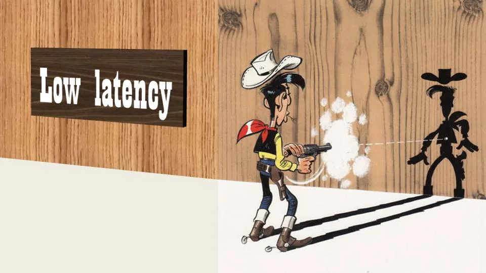
Chart concept - Lucky Luke and low latency

Cartoons can enhance a presentation. You need to strike a fine balance though with inviting a laugh from the audience, and trying to get your point across. People do not have time to read through a cartoon plot. The idea behind a slide should be instantly recognizable. Using classical cartoons can help. People have seen them before. Here is one that can be used to describe the low latency of a technology product. Lucky Luke, the man who can shoot faster than his own shadow. That’s pretty low latency.

The extension of the cartoon with PowerPoint shapes is not perfect. I used the “oak” standard texture, and the “Playbill” font to give that nice Wild West feel.

·Cartoons

Using Rube Goldberg machines in your presenation

A Peugeot ad finally got me to the source of these brilliant cartoons of incredibly complex machines that perform very simple tasks through a sequence of carefully timed actions. No, they were not pioneered by Road Runner and The Coyote that’s chasing him. Cartoonist such as Rube Goldberg and Heath Robinson are one of the most famous creators of these systems. Today, there still are many annual Rube Goldberg contests that challenge high school students to invent one of their own.

This Honda commercial from a few years ago is a beautiful example of how you can use Rube Goldberg-type effects in visual communication.

How to use it in PowerPoint? Animating one of these machines is a challenge… Two suggestions.

  1. Build up audience anticipation. Use a simple cartoon to create a tension about something that is about to happen. The same way that a novelist leaves room for the reader to fill in the blank spaces. See an example on Nancy Duarte’s blog: the hanging piano that is about to fall is a more powerful visual than that of a broken piano on the floor.
  2. “There must be a better way to do this”. This is a concept I often need to get across in fund raising presentations for technology startups. Showing a very complex Rube Goldberg machine does the trick for me. (Another technique making the same point is using vintage images, here an “auto wash bowl” long before the automated car wash was invented).
Continue reading →
·Cartoons

Scott McCloud (comics, Google Chrome) on TED

An interesting and entertaining way to spend 17 minutes. Comics evangelist (and author of the comic book that explains the technology behind Google Chrome) Scott McCloud on comics and visual presentation in general. More details on the TED talk page, and the TED Scott McCloud profile.

·Cartoons

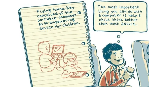
A "Google Chrome-style" comic novel about the pioneer behind the laptop

Steve Hamm is a writer for Business Week who is about to publish a new book: The Race for Perfect: Inside the Quest to Design the Ultimate Portable Computer

Joe Lambert produced a graphic/comic version of chapter 4 of the book, about the development of the laptop and the contributions of Alan Kay, one of the main visionaries of mobile computing. Alan worked on a number of very important innovations: the graphical user interface and the mouse, the portable PCs, and the PDA just to name a few.

I think that the illustrations are beautiful, and the story is really interesting. However unlike the case of Google Chrome, I do not think that the comic format does a lot to add to delivering the message of this book. Neither Joseph Lambert nor Steve Hamm are to blame (on the contrary the art work and the story are great). The Google Chrome book confirms that comic graphics can do a great job of explaining complex technology. A historical time line simply leaves less room for creative expression. For more about Alan Kay and his ideas see this video at TED, the source of my inspiration for this blog post.

·Cartoons

Animated ad - cartoons should be used more in PowerPoint

This is an ad for the Detroit Institute of Arts. It has an example of how animated cartoons can support presentations.

I should look more into their use, especially for situations that are actually hard to explain in traditional slides: for example the benefits of the product of a new technology startup that is so early-stage that it does not yet have a product demo. More on cartoons in presentations in a post about Google Chrome. Via AdFreak.

·Cartoons

Financial crisis explained in PowerPoint

A post on The Big Picture in February 2008 points to a “cartoonesk” PowerPoint presentation explaining the current crisis in the financial markets. We all should have listened to it…  There is no credit though for who created this file, also some explicit 4-letter words inside. (UPDATE, in slideshare an author is mentioned, not sure whether the person who uploaded it also created it)

Subprime Primer

For those who want to know it all in detail in a classic presentation packed with dense facts, I embed another presentation. It is not written in Presentation Zen-style, but most of the data charts are designed correctly. Viewing in full-screen mode is essential.

Making Sense of the Mortgage Meltdown

Update: Presentation Zen adds another explanation video here.