SlideMagic Blog

Frequent updates about all things presentations since 2008. Subscribe to never miss a post.

RSS
all posts

Category Art

·Art

Unstretch that screen

More and more presentations are given on plasma/LCD screens with a wide aspect ratio. Most PowerPoint presentations are designed for a narrow 4:3 ratio (a traditional computer monitor). Most of the time, the screen will automatically stretch you image to create a bigger picture. I never understand this habit: the distorted proportions look horrible. (Judging by my own experience, this is how most people watch TV nowadays as well).
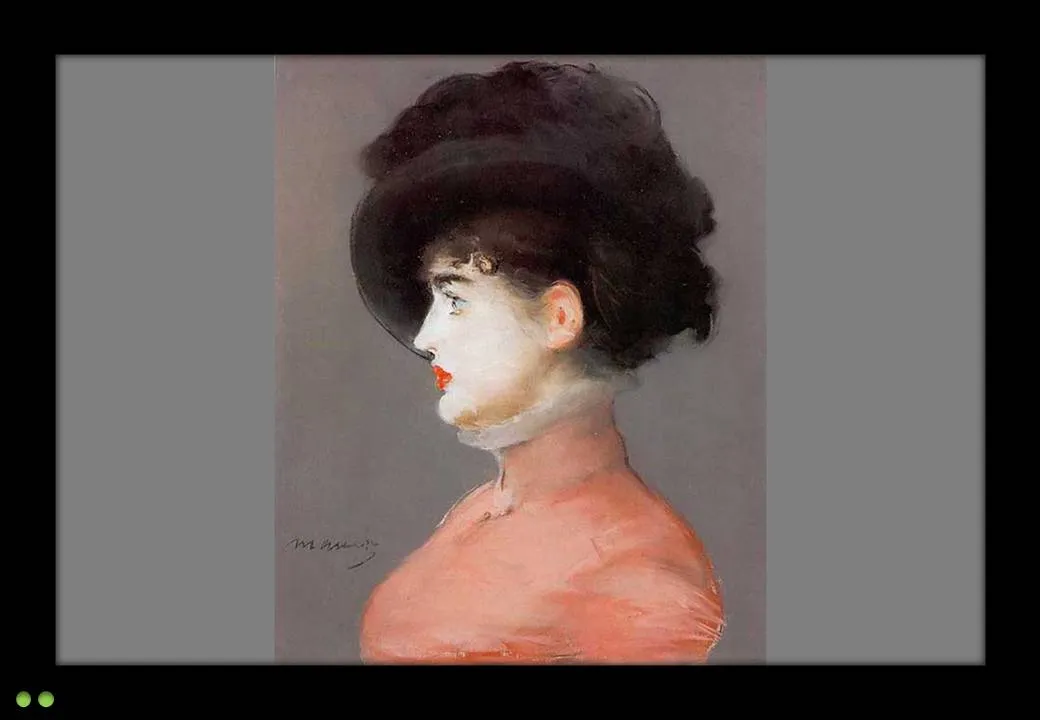
My advise: set the screen back to the narrow aspect ratio. Doing this on your computer is often tricky, the best way is to take the remote control of the screen and fix it there. A smaller picture is much better than a distorted picture.

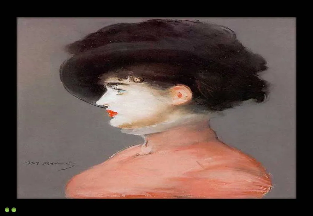
The painting is Manet’s Portrait of Irma Brunner.
·Art

Depth in images

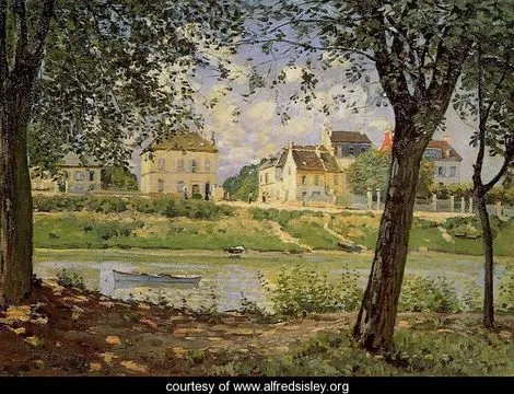
It is very hard to capture the sensation of a wide panoramic view in a photograph. Making a picture of that stunning view will look boring when you view it later. Not when you capture an object nearby as well.

Impressionist painters use this technique in the composition of their works. See this painting by Alfred Sisley (Village On The Banks Of The Seine at Villeneuve La Garenne). Unusually, the background of the scene is actually lighter than the foreground.

I used this lone tree in one of my own photographs of a recent visit to the ruins of the Masada fortress near the Dead Sea here in Israel.

Think about this when your pick your next stock image in your presentation.

·Art

Christoph Niemann and LEGO presentations

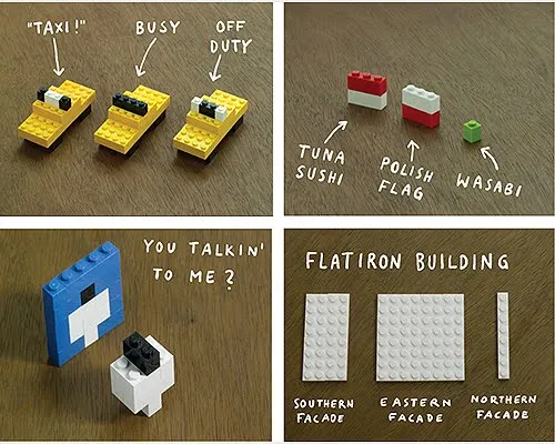
Christoph Niemann (web site) is a highly talented artist whose illustrations have appeared on magazine covers ranging from the New Yorker to Wired. He posts on a regular basis on his blog in the New York Times, where this set of cartoons based on Google maps caught my attention.

He recently published a new (board) book with snap shots of New York modeled in Lego bricks: I LEGO N.Y. (affiliate link). A sample image below.

Now here is a presentation challenge: construct your entire presentation in tiny Lego scenes, photograph them and paste them into PowerPoint. Not as crazy as it might sound.

UPDATE. One of my readers, Daniel Cabrera, used LEGO images to construct a presentation for a university project. In this case, the images were sourced from the web.

391 city workforce

·Art

Extreme close-up

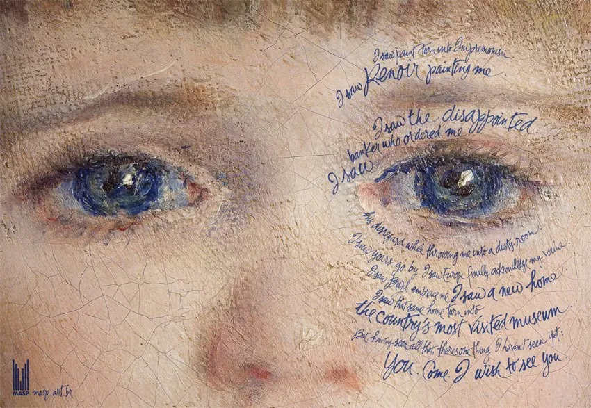
An extreme close-up of a face can have a dramatic effect in a presentation. I used photographs of animals and people before (Miles Davis for example), but never a painting. What a great ad based on a painting by Renoir.

The ad encourages people to come visit an art museum (MASP in Sao Paolo). In case you have difficulty reading the text:

I saw paint turn into Impressionism. I saw Renoir painting me. I saw the disappointed banker who ordered me. I saw his disregard while throwing me into a dusty room. I saw years go by. I saw Europe finally acknowledge my value. I saw Brazil embrace me. I saw a new home. I saw that same home turn into the country’s most visited museum. But, having seen all that, there’s one thing I haven’t seen yet: you. Come. I wish to see you.

Two more examples on Ads of the World. If you are interested in art, try this book.

·Art

I am jealous of this artist

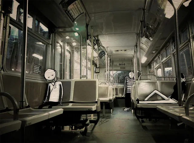
Images are hardly ever exactly right. Changing reality, even with the most powerful software, is very hard (previous post). Artists and/or cartoonists can use their skill to their advantage. Adding contrasting characters to images. One example is Johan Thornqvist (more images on his site). I am jealous not to have these drawing abilities.

Found via unstage.

·Art

Develping confident PowerPoint "brush strokes"

OK, this concept is somewhat hard to explain. I will give it a try, but I am not sure I can get it across in a blog post. Here we go:

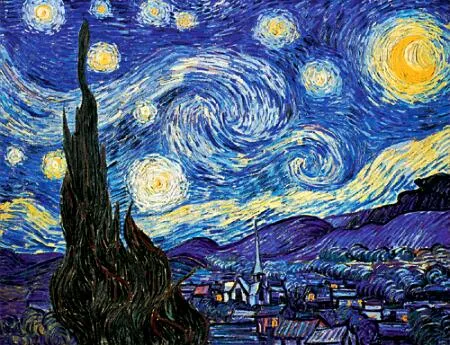
Paint is irreversible: therefore a painter must get it right a first time, or otherwise face extensive fix up work. The more experience the painter gets, the more confident a painter becomes. It is better to make a (small) mistake than restrict yourself to making timid and boring paintings.

The starry night, Vincent van Gogh, 1889, oil on canvas, 74x92cm, MoMa, New York

I notice something similar in presentation design. Be confident as your design your slide in “analogue mode”, scribbling on a piece of paper. Be confident to open the PowerPoint screen, delete all Microsoft bullets and start adding elements from your design: box, box box, align, arrow, etc. Make them big, bold, confident, but minimalist.

In this way you work faster, and slides come out more natural. It is all about confidence.

Maybe this post does a better job in explaining.

·Art

Finding font inspiration in Bauhaus architecture

More presentation design and art today. I had a very clear policy on the use of fonts and typography:

Until now. I just finished a presentation:

  • Set in ALLCAPS
  • Using the Futura Bk font
  • 90% of the slides are set in bold (yes, ALLCAPS bold)

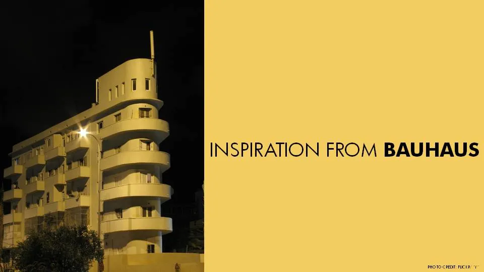
The Futura font family is to blame. The history of the font go back to the 1930s and its design is heavily influenced by the Bauhaus movement. Clean geometrical shapes, look at these o’s, almost perfectly round.

Maybe being located in Tel Aviv, a city that has one of the world’s most extensive collection of Bauhaus architecture, had something to do with it. The picture below is an example of a Bauhaus-style building in Tel Aviv, the “Bait ha’Onia” or “Ship house” on 56 Levandah Street, designed by architect Arieh Cohen and built in 1934-1935. To make the side track complete, if you are interested in Tel Aviv Bauhaus architecture, make sure to get your hands on this book (text both in French and in English).

Back to presentation design. In particular I like two font variations of Futura. The Light version (Futura Lt) for thin, elegant, sentences in sentence case, and the Book version (Futura Bk) for all caps. The allcaps look especially impressive in fat bold (look at the font in the image). Obviously, some of my old font design principles still hold. Allcaps bold fonts should only be used in presentation that contain a few words per slide.

Continue reading →
·Art

Finding inspiration in CD cover images

More and more, I am trying to make each presentation in a unique style that is consistent on each slide. Paintings are a good source of inspiration, but so is cover art of CDs/LPs. Today I used this one from Remastered: The Best of Steely Dan - Then and Now

Steely Dan used an image of “Carhenge”, an art installation by Jim Reinders, somewhere in Nebraska, a modern-day version of Stone Henge in England.

It provides all I need for a presentation with a consistent accent:

  • A slightly apocalyptic theme (this presentation was for a client in the asset management industry talking about changes since the economic meltdown of 2008)
  • Cars, especially vintage cars, a rich hunting ground for images expressing all kinds of concepts
  • The large bold font with a blank fill
  • Blues and yellow/oranges as colors.

Disclosure: I earn a small commission if you purchase products on Amazon through links on this site.

·Art

Book review - 1001 paintings you must see before you die

Paintings are excellent inspiration for presentation design:

  • Color schemes designed to provoke an emotion, often going against the rules of color theory
  • Lessons in composition and page layout
  • Ideas to give your presentation a distinct style or personality

The Dutch educational system plus graduate degrees in computer science and business administration have not contributed much to my knowledge of art history. I want to catch up quickly, but it turned out to be more difficult than I thought:

  • There are many web sites devoted to a painter or a museum, I have yet to discover one that cuts across artists, locations, styles and periods in time
  • The same issue is true for many art history books: one style, one painter, one museum.
  • More-over art history books (surprisingly) have usually more text than images in them. Text full of elaborate interpretations by the author, that is clearly written with student education in mind.

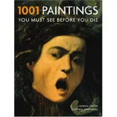
How happy I was to find this book: 1001 Paintings You Must See Before You Die.

Thousand pages of one painting per page, designed as a guide for museums to visit before your time on the planet is up (but then, there is no clear museum index, and many paintings are taken from private collections).

Leaving this small criticism aside, I found this book truly useful to digest a vast amount of images of paintings in a short time. Color picture, a bit of background on the artist, a bit of background on the painter. It contains both the block busters such as the Mona Lisa as well as lesser known works of art. Great.

Continue reading →
·Art

Da, da, da, it's OK to let go of the rules of design (sometimes)

Color theory provides us with a clear set of rules of colors that go well together. Kuler has them even built in: complementary colors, triad, monochromatic, etc. But hey the world would be boring if everyone would follow the rules.

Look at the world of music for example. Jazz drummers only really start to swing when they go slightly off-beat. Many R&B songs have their drum computers programmed with delayed beats, providing a punch a fraction of a second too late.

If not, the music would sound like a 1980s Casio keyboard.

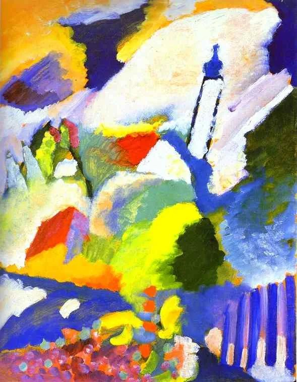
In my presentation work I recently stopped using these color composition rules. Instead I often look at a beautiful image or a powerful painting to design the color scheme of my presentation. Find a painting that provokes an emotion, load it up in kuler, and use it as the basis for the colors of your next presentation, even if it does not exactly follow the rules of color composition…

Wassily Kandinsky. Church in Murnau. 1910. Oil on cardboard. 64.7 x 50.2 cm. Städtische Galerie im Lenbachhaus, Munich, Germany