Visuals - 30 Christmas ads from around the world
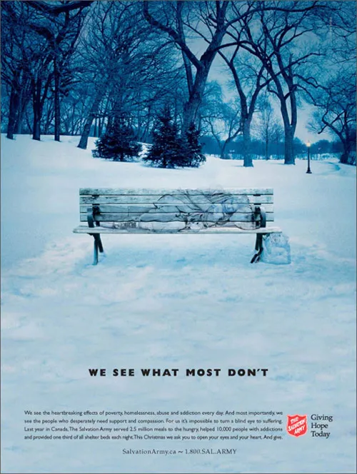
Not much time to write elaborate blog posts over the holidays. Some interesting visuals on Digg Design - 30 unforgettable Christmas ads today (here is one to them):


Frequent updates about all things presentations since 2008. Subscribe to never miss a post.
Not much time to write elaborate blog posts over the holidays. Some interesting visuals on Digg Design - 30 unforgettable Christmas ads today (here is one to them):
I am more and more fascinated by design lessons from consumer advertising billboards. Take this ad for Tango (a UK soft drink):
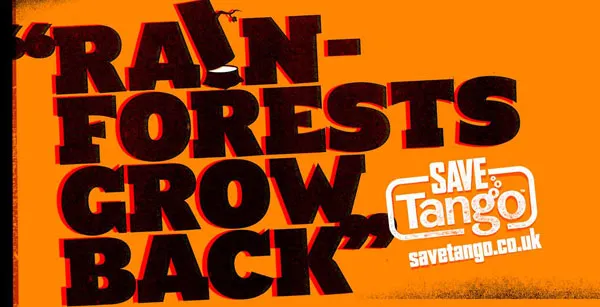
First of all the message. Confident, huge font, but the reader will discount the message completely “yeah right”. But it makes you think.
Then the typography. It almost hurts. Like watching a broken television screen. The onset of a migraine aura. Looking through the corner of your glasses and see how the lenses distort colors because of light refraction.
I argued before that slightly irritating the senses of your audience can help get your message across.
How did the typographer (Chris Chapman) do it? Clashing colors. Full orange background. Bright red shading. Colors that are very close on the color spectrum, but not similar. Like hitting 2 adjacent keys on a piano (harmonic dissonance). Grunch letter fill (hard to imitate in PowerPoint).
More on working with color wheels in a later post.
Via Ads of the world.
UPDATE after a comment. People should not misunderstand me. Any dissonance effect should serve a purpose. Simply screaming out a message does not make it stick. However, certain “painful” situations can be supported by a (one) “painful” chart.
I found this great Lego ad yesterday on SlipperyBrick:
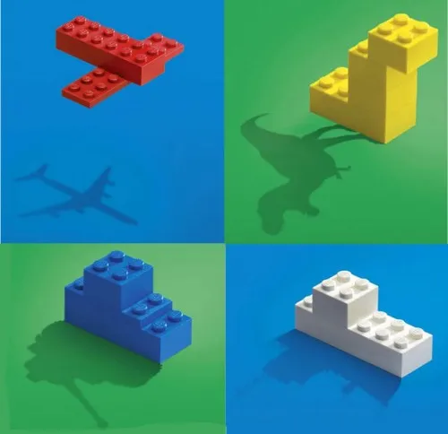
Sometimes relying on audience imagination can work, sometimes it does not.
Weekend reading (1 day earlier than the rest of the world in Israel). I stumbled on this great ad for Adobe Photoshop CS4.
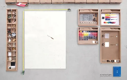
It shows what graphics and presentation design is all about, a creative process working with shapes and colors and a blank piece of paper. Computers make it easier to work, but in our mind we should go “back to basics” now and then. Go to this Flickr stream for more detailed/hi-res images. Agency Bates141. Via Zurb.
I am adding adgoodness to my blog roll. This is another great find.
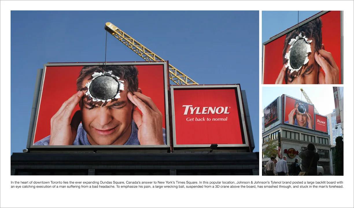
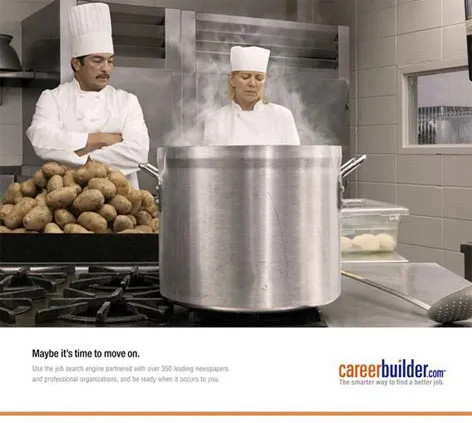
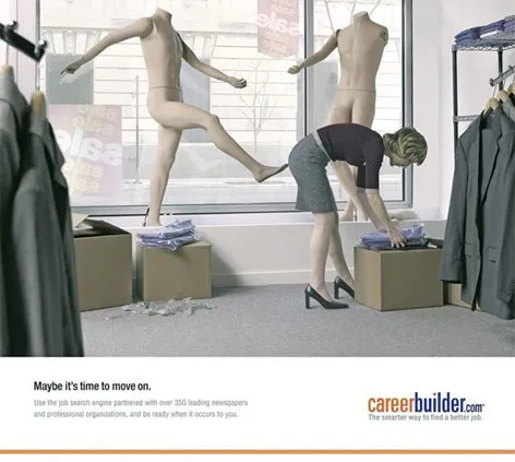
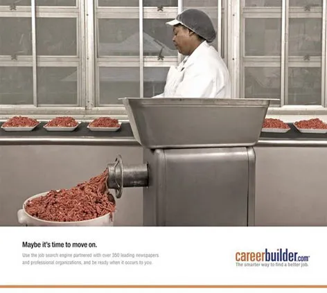
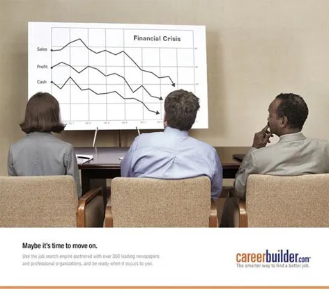
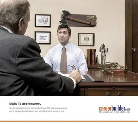
These ads do a great job in visualizing a state of mind (maybe in the current situation, people have less of these thoughts though). These type of images are good ice breakers in a presentation, but because they attract so much attention, I would follow with a black/white empty screen afterwards to get the attention back on you, the presentator.
The site careerbuilder.com seems to be down though… Via Fubiz.
I stumbled across this ad for a Mini. It contains useful lessons for designing a PowerPoint template.
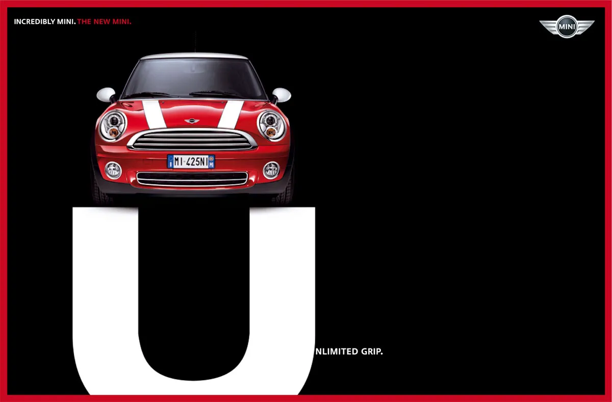
We can always learn from outdoor billboards. This one’s great. Huge but still elegant.
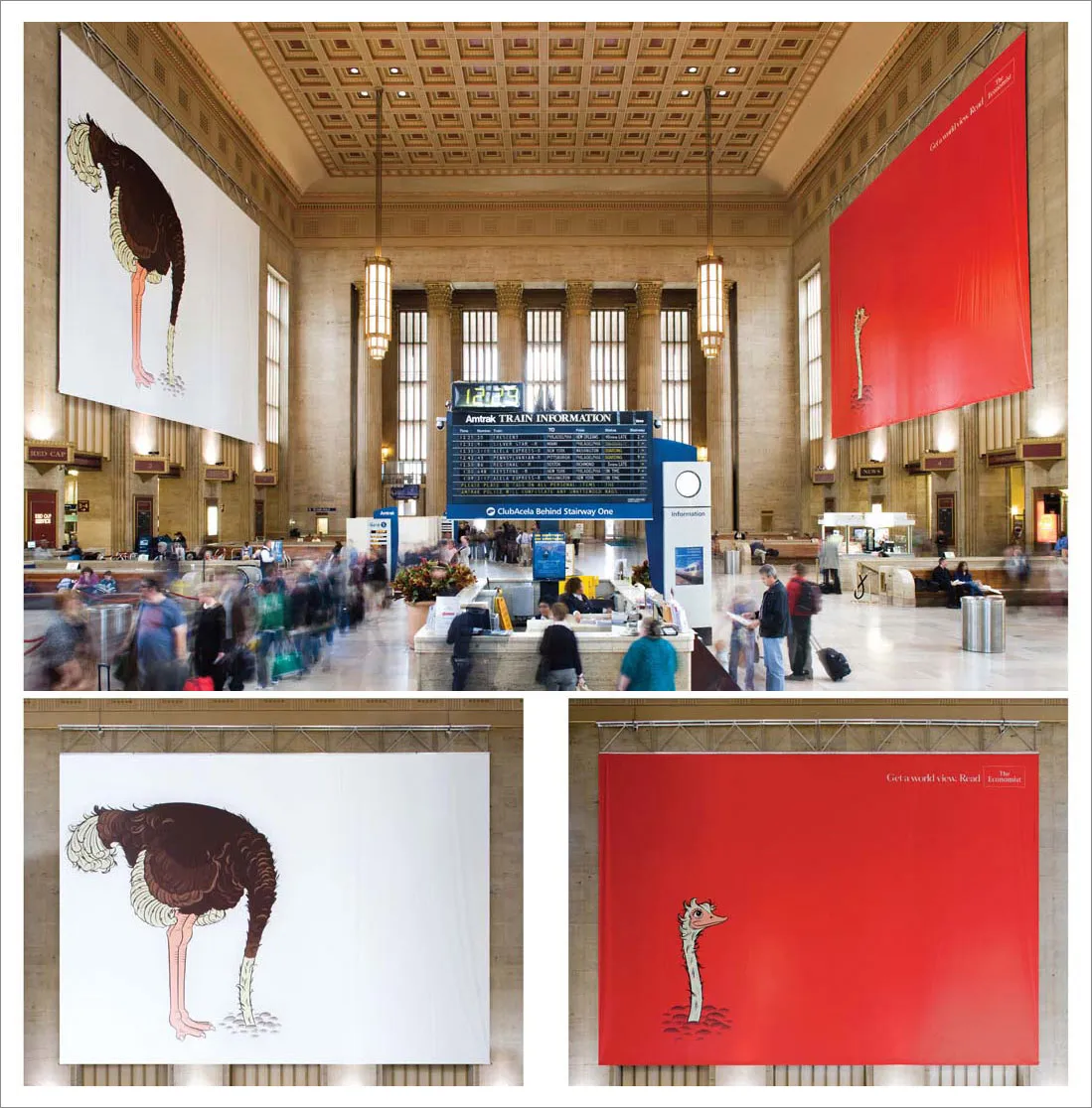
Via adgoodness