SlideMagic Blog

Frequent updates about all things presentations since 2008. Subscribe to never miss a post.

RSS
all posts

Category Advertising

·Advertising

Photo compositions that hurt the eye

Photo editing software can do a lot, and it is getting increasingly used in advertising. This ad however shows its limitation. When you try to be photo-realistic and it is not 100% right, it just hurts the eyes. The concept behind the ad is good, the execution not.

Via Ads of the World.

·Advertising

Portraits that do not really look you in the eye

Stock images libraries are full of pictures of models that look towards the lens, but are not really look at you. The man in these ads does better than the woman (maybe the squinting, or his age), but it is hard to beat a painter’s ability to get those penetrating eyes.

The ads were taken from Ads of the World. The painting is “Girl resting on her arms” by Eugene Vidal (1847-1907), Oil on canvas, 47 x 59 cm.

·Advertising

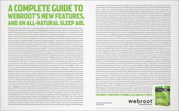
Oh no, you left some features out of the deck!

This ad by Webroot Internet Security reminded my of many discussions with clients in the technology sector. The VP Product is meticulously scanning the slides to make sure ALL the product features have made it in the deck.The result: a bored audience that will not understand the value your product brings.

Still, there is a way to include them though, but with a different headline: cram them all in page using a neat table in 7pt font with a title: “Powerful specifications”. The audience will believe you without reading all the text.

Via Ads of the World.

·Advertising

Watch out with charged images

Our collective memory has some very powerful images. Photo editing software enables us to manipulate them and use them to communicate a message. “Learn to anticipate” says the ad below with a set of shortened WTC towers and planes happily flying over it. Maybe the ad was meant to be funny. Maybe its intention was to shock people and trigger a discussion of a controversial subject (What Benetton tried to do in the 1990s). A “fail” on both accounts. Be careful with charged visual concepts.

Via Ads of the World.

·Advertising

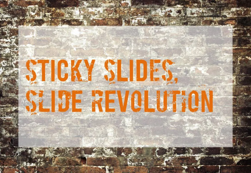
Chart concept - painted billboard

This vintage-style ad found on Ads of the World can easily be replicated in PowerPoint. A white box, semi-transparent with a bit of soft edges and a nice font against an image of a brick wall and you’re done.

·Advertising

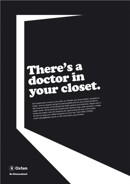
Chart concept - mystery door

This ad reminds us how easy it is to create a visual concept with elementary shapes and nothing more than basic drawing skills.

Via Ads of the World.

·Advertising

Buzz word abuse

Wonderful, a top 100 of the most over-used buzz words in press releases compiled by Adam Sherk:

Leader, leading, leading, best, top, unique, great, solution, largest, innovative, innovator, award winning, exclusive, premier, extensive, leading provider, innovation, real-time, fastest, easy to use, dynamic, state of the art, smart, flexible, cutting edge, biggest, world class, amazing, next generation, revolutionary, sustainable, best practices, leverage, thrilled, robust, delighted, cloud, user friendly, extraordinary, breakthrough, savvy, ROI, transform, seamless, groundbreaking, empower, scalable, one of a kind, proactive, best in class, return on investment, market leading, turnkey, mission critical, strategic partnership, ground breaking, dashboard, iconic, industry standard, never before, re-purpose, ecosytem, win-win, best of breed, enterprise class, empowerment, magical, synergy, out of the box, feature-rich, stack, cross-platform, value proposition, well positioned, disruptive, hit the ground running, disruption, mindshare, space-age, bleeding edge, exit strategy, customer-centric, sea change, sticky, silo, synergistic, client-centric, outside the box, paradigm shift, peak performance, perfect storm, organic growth, top-down, next-gen, never been done, bottom-up, solution-driven, secret sauce, low hanging fruit.

People hear/see/read them so often that nobody pays attention anymore. Think about that in your next presentation or white paper. (Hmm, not sure what to think about “sticky” featuring prominently in there.)


Via Advertising is Good for You.

·Advertising

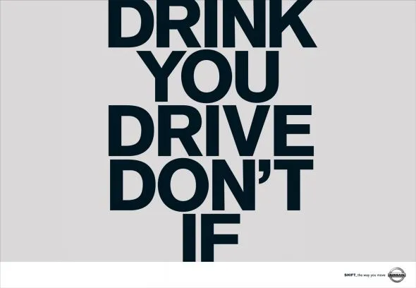
Teflon headlines

This ad is a good example of how your brain adjusts reality to what it thinks it should look like. I read this sentence the first time as “Don’t drink if you drive”, a familiar slogan.

I find myself doing the same thing when reading headlines full of buzz words and jargon in PowerPoint slides. Skim over it, and see whether there is something more interesting to be seen on the rest of the slide. A teflon headline, it definitely did not stick.

Try this book “Brain Rules” if you are interested in finding out more about how the brain processes information. Ad via Ads of the World.

·Advertising

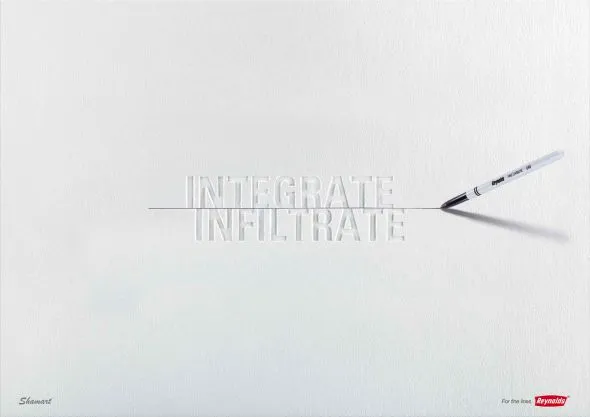
Subtle light effects in fonts

Inspired by this ad, here is how to create the effect of fonts that seem sunk below the surface in PowerPoint 2007 (as shown in the last 2 images).

  1. Choose a background color
  2. Enter text, preferably in a fat font (I used Helvetica Neue Heavy in this example)
  3. Select the text, go to format, text effects, shadows, and pick inner shadow with light from the top
  4. In text effects, pick a text fill that is just slightly darker than the background

Via Ads of the World

·Advertising

Iconic images

What a wonderful advertising campaign: if 4 pixels can tell a story, imagine what millions can. Here is one example, but there are lots more on Ads of the World (click the previous and/or next buttons).

I like using iconic images in presentations, an endless repertoire of visual shortcuts stored in the brain of almost any person on the planet.