SlideMagic Blog

Frequent updates about all things presentations since 2008. Subscribe to never miss a post.

RSS
all posts

Category Advertising

·Video

Hillary's stock campaign video

The video in which Hillary Clinton announced her intention to run for President is too well executed. The messages are incredibly clear, you can almost reverse engineer the PowerPoint slide that contained the briefing bullet points for the script.

But the execution is also staged and lacking raw emotion that it is unlikely to resonate with voters. I don’t think it will leave a negative impression, just a neutral one. It sounds and looks like almost all advertising we see around us. This review on the Huffington Post captures it correctly.

In a similar way, Apple product videos, once admired, now almost look funny after the many parodies.

A better way to do this? Interview “real people” on camera. It is a lot harder to do though.

It is a warning sign for those who think that big budget productions (videos, presentations) automatically translate into audience impact. The more people have been disappointed by slick presentations, photoshopped ads, spectacular videos, the harder it is to convince them that in your case they should believe you.

P.S. What do I think about the campaign logo? I don’t think it is very pretty, but it will be very recognisable as an avatar on social media sites. Functional.

Art: The Peacemakers (1868) painting by George P.A. Healy.

·Advertising

Building signage

I drove by a big office tower the other day that featured a new signage:

  • The biggest font size possible, covering the entire width of the building, no (white) space left what so ever.
  • As close as possible to the top, no white space here either
  • The characters’ rhythm and spacing seemed to clash with the repeating patterns of the window.

Typical corporate executive thinking: big and high. What should they have discussed with the architect and the signage supplier instead?

  • Give the logo space, more white (stone, concrete) space around the graphics creates a much stronger presence
  • Adjust the size of the logo based on the characteristics of the building: time the spacing of the characters in such a way that disturbing repeating window patterns are neutralised.
  • Avoid the logo being an after thought, instead explicitly reserve space for building signage when designing the exterior of the building
·Advertising

Overdoing special effects

Image manipulation software can do a lot, but most of the time it is used over the top. All that technology causes most ads to look worse than those elegant compositions from the 1960s.

First of all there are the clear Photoshop disasters such as this nice composition below (via the PSD blog).

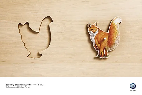
One step up, designers get the technical execution right, but the chosen concept just hurts the eye (via Ads of the World).

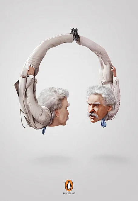
Finally, it possible to get it right, but in most cases these compositions are beautiful illustrations rather than image manipulations. The only difference with the 1960s is that the analogue pencil has been replaced with an electronic one (via Ads of the World).

·Advertising

Cover those ads

Screen shots of news articles are useful to give your audience a sense of the sign of the times. To make them look more interesting, I reduce the zoom of the screen to get a nice long, vertical shot of the article with the headline and the newspaper logo still readable. On a page with a non-white background, I title it a bit and cover and distracting ads or facebook and Twitter buttons with a white box.

·Advertising

Anticipation

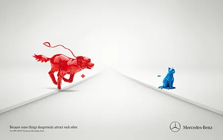
Most of the time, it is more powerful to show events that are about to happen rather than the event itself. It is very well done in the ad below for an automatic braking system that anticipates the movement of objects on the road. It brings great tension to the visual, almost making the still image move.

Commenters on Ads of the World were less enthusiastic though. Maybe the plusses and minuses should have been made a bit bigger. And well, if there is something wrong with the chart, it is in its 3D composition. The dog is too close and actually not running towards the cat. But I am probably the only one who bothers about that…

·Advertising

Everyone can design

Advertising agency RPA made a bunch of Apple-style ads for common products, probably intending to show that the world would be boring of all ads looked like this. I actually disagree, and would welcome to see the clutter in advertising go.

You see how easy it is to create professional looking slides by just applying a bit of white space and picking the right crop for your images. You do not need to be an advertising professional to do this, you do not need sophisticated software to do this.

Via AdFreak.

·Advertising

Star burst

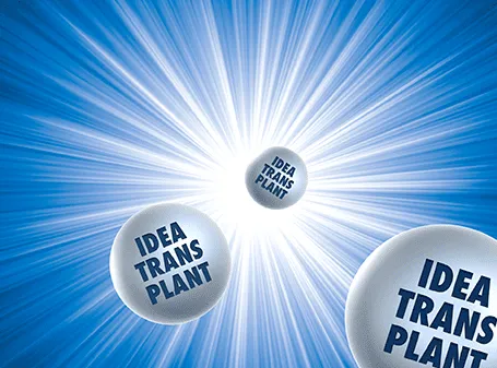
The star burst is often used in retro advertising. You can pick one up from any stock image site to create a background for a composition with a lot of depth.

·Advertising

Lego Simpsons

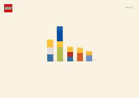
I love Lego. The ad below looks like a PowerPoint column chart, but also like the Simpsons family. It shows the power of imagination that many of us forget about when we grow up. (More ads here on Ads of the World).

·Advertising

Should you conform?

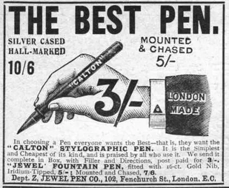
Early last century, there was a common practice in advertising: “This is what an ad should look like.”. Think about this when your boss tells you: “This is what a presentation should look like.” in response to your effort to do it in a different way.

For more of these wonderful vintage ads, visit vintageadbrowser.com

·Advertising

Presentation first

Presentation design often comes at the back of other marketing communication (advertising, scripts for brochures, white papers, and web sites). In many cases, marketing can benefit from the opposite approach. Visuals are much better to lay the foundation of a marketing story than text. And it is far easier to involve a CEO or other senior executive in a visual presentation design process, then force her to go through revisions of text. So a good presentation design project does not only give you a nice slide deck, it might well provide the inspiration for an entire marketing campaign.