SlideMagic Blog

Frequent updates about all things presentations since 2008. Subscribe to never miss a post.

RSS
·Concepts

Blue ocean strategy in a presentation

Most investor or sales presentation have some sort of slide about the competitive environment. (Here are earlier blog posts about how to present the competition). Usually, people use tables, or 2x2 / 3x3 matrices to show how they are different.

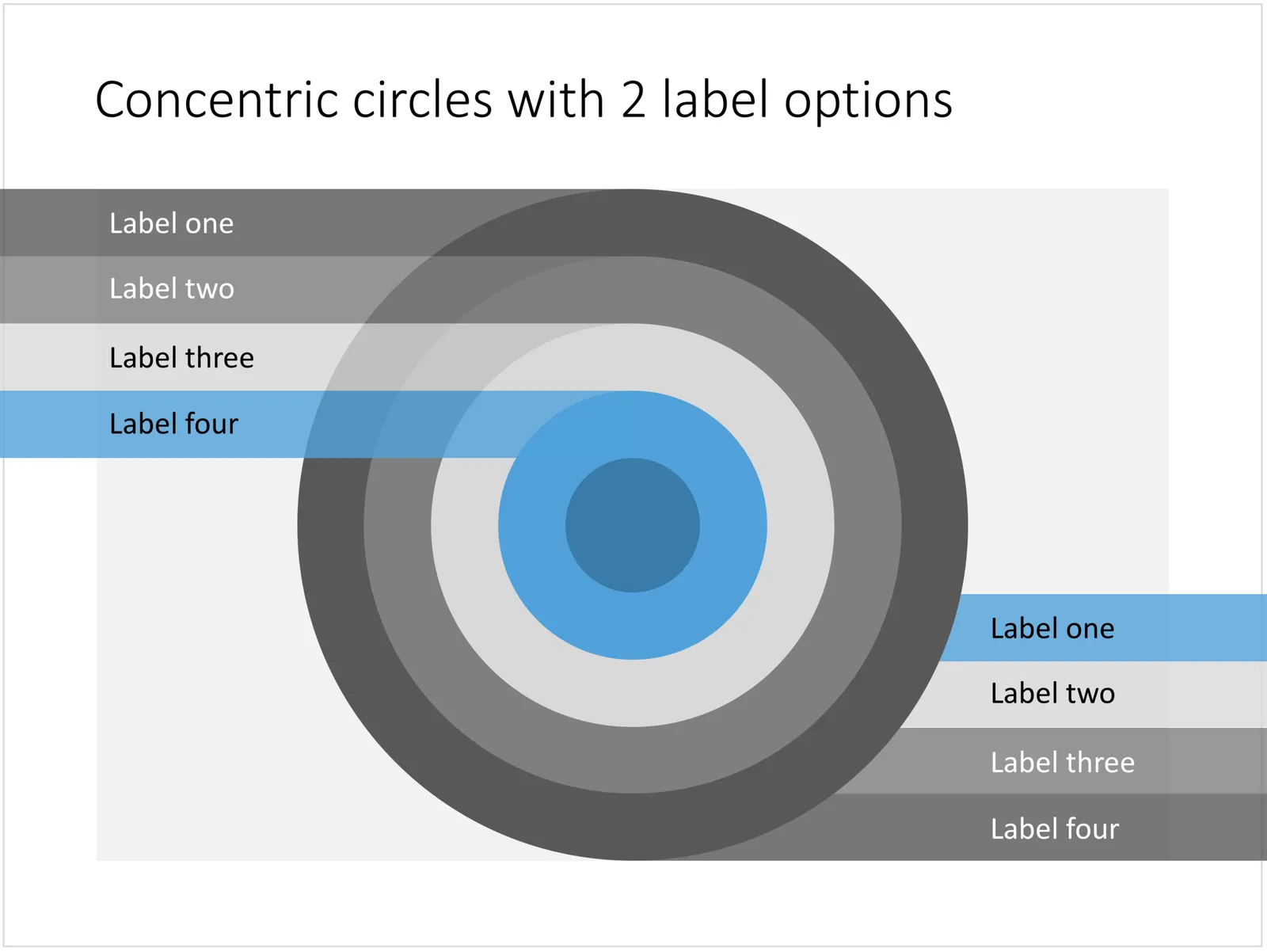
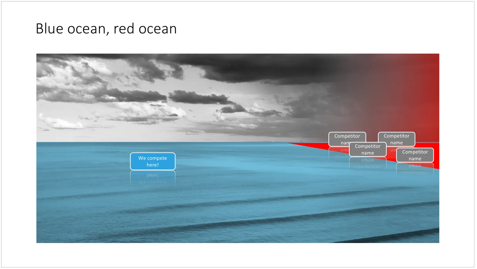
The chart below might a completely different take on the subject. The Blue Ocean strategy concept developed by INSEAD argues that is often better to define an entirely new market rather than battling with all the existing companies that go after well-established market segments. You can download the slide here.

 Visualise the competition using

Visualise the competition using “Blue Ocean Strategy” in a presentation

Cover image by Ishan @seefromthesky on Unsplash

·Concepts

Presentation layout for when you are stuck...

Sometimes the simplest slides can be the most effective ones. This slide layout shows a big arrow crashing into a wall to visualise your obstacle or roadblock. The wall image is framed, while the arrow is bleeding of the page, adding an extra movement effect.Edit to text in the arrow and/or on the wall to show your audience what it stuck. The text in the arrow will automatically tilt in the right 3D angle, and both the wall and arrow will colour in your primary accent colour. Please copy this slide into a presentation that uses your own corporate presentation colour theme.

I am gaining a lot of experience now in translating PowerPoint designs into Keynote. This chart is only available in PowerPoint and not in Keynote, because the latter cannot tilt objects in a 3D space. The same problem arises with charts that rely heavily on bevels or other 3D lighting effects, which is not obvious to do in Keynote.

Here you can find this wall layout in the SlideMagic store. Cover image by Chris Benson on Unsplash

·Concepts

Bubble charts in PowerPoint and Keynote

Bubble charts are useful to present and analyse very large datasets. The standard template in PowerPoint and Keynote still needs some adjustment to make the chart useful. In thisbubble chart on the SlideMagic template store, I have tried to do the hard work for you.

This a reformatted version of the standard bubble chart that you will find in PowerPoint and Keynote, on top it has the layout of a 2x2 matrix. The bubble chart is useful when you want to compare a data series with 3 elements, across a large number of data points. Examples are countries, business units, regions, products, etc.

The first two elements will be plotted on a regular XY chart, the 3rd element is the size of the bubble. PowerPoint or Keynote do not support labelling of the bubble very well, which are put in manually.

A 2x2 matrix structure is put on top of the regular bubble chart, giving you 4 distinct quadrants to segment your bubbles in. In the current example, the quadrants have the same size, by putting the 2 axes right in the middle. To do so, you need to manage the ranges of the axes carefully. If this is not important to you, you can put the X and Y axes where they are relevant without worrying about this. Quadrants of unequal size will still look good.

I am working hard to make the store more useable. This layout is an example. There are 4 variants of the chart: PowerPoint, Keynote, both in 4:3 or 16:9. I tried to add all the right instructions about how to use the layout, and show many links to other relevant slides in the store. While working on your presentation, you can go back and forth between designs and get ideas on how to visualise the key messages of your presentation. Some layout suggestions, you might be able to create yourself, others you might already have bought and can re-use, or you can download a layout right away to add it to your library. SlideMagic will be a place that saves you time making your business presentations.

Continue reading →
·Concepts

Most templates now available for Apple Keynote

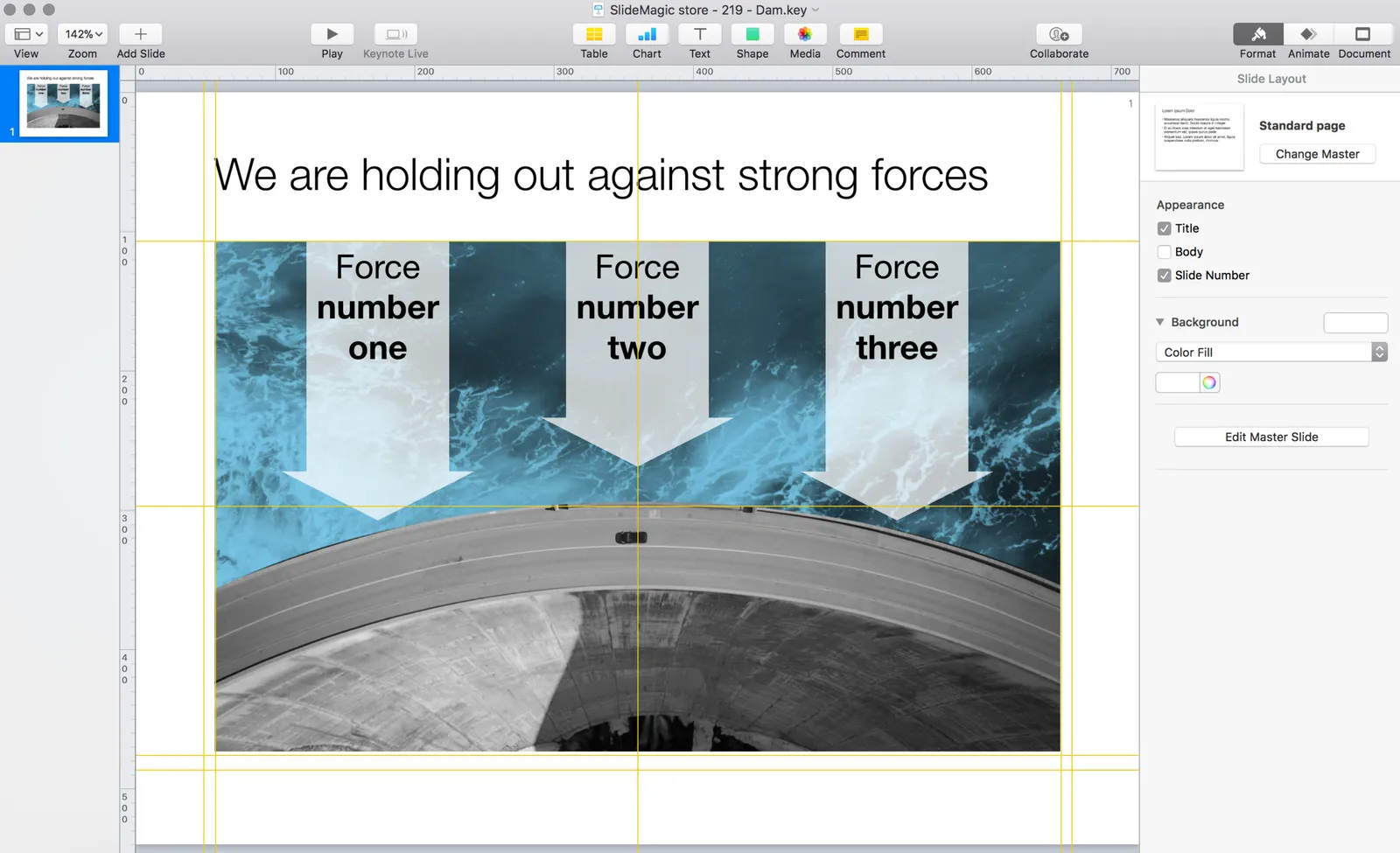
The template store now supports Apple Keynote, a drop down menu let’s you make a selection between your preferred presentation software. Not all templates could be converted, Keynote is missing the 3D shape rotation feature of PowerPoint that I used in some of the slides.

 The store now gives you the option to download templates either as a PowerPoint or Keynote file

The store now gives you the option to download templates either as a PowerPoint or Keynote file

 Slides in Keynote look the same except for the font

Slides in Keynote look the same except for the font

The only adjustment I made was the font: switching it from PowerPoint’s default Calibri to Helvetica Neue for  Keynote. I am keen to keep the look and feel of the charts as “standard” as possible to make it easy to integrate the design in the corporate presentation templates that people are using.

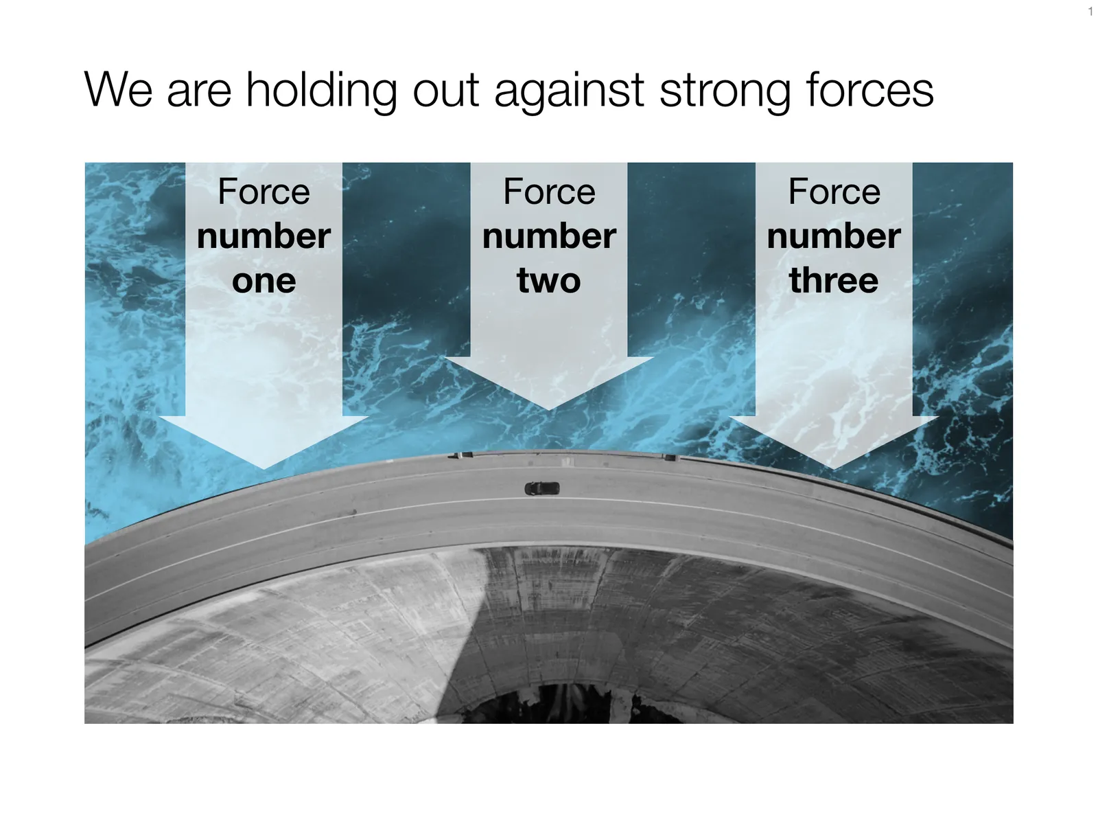
 Under pressure!

Under pressure!

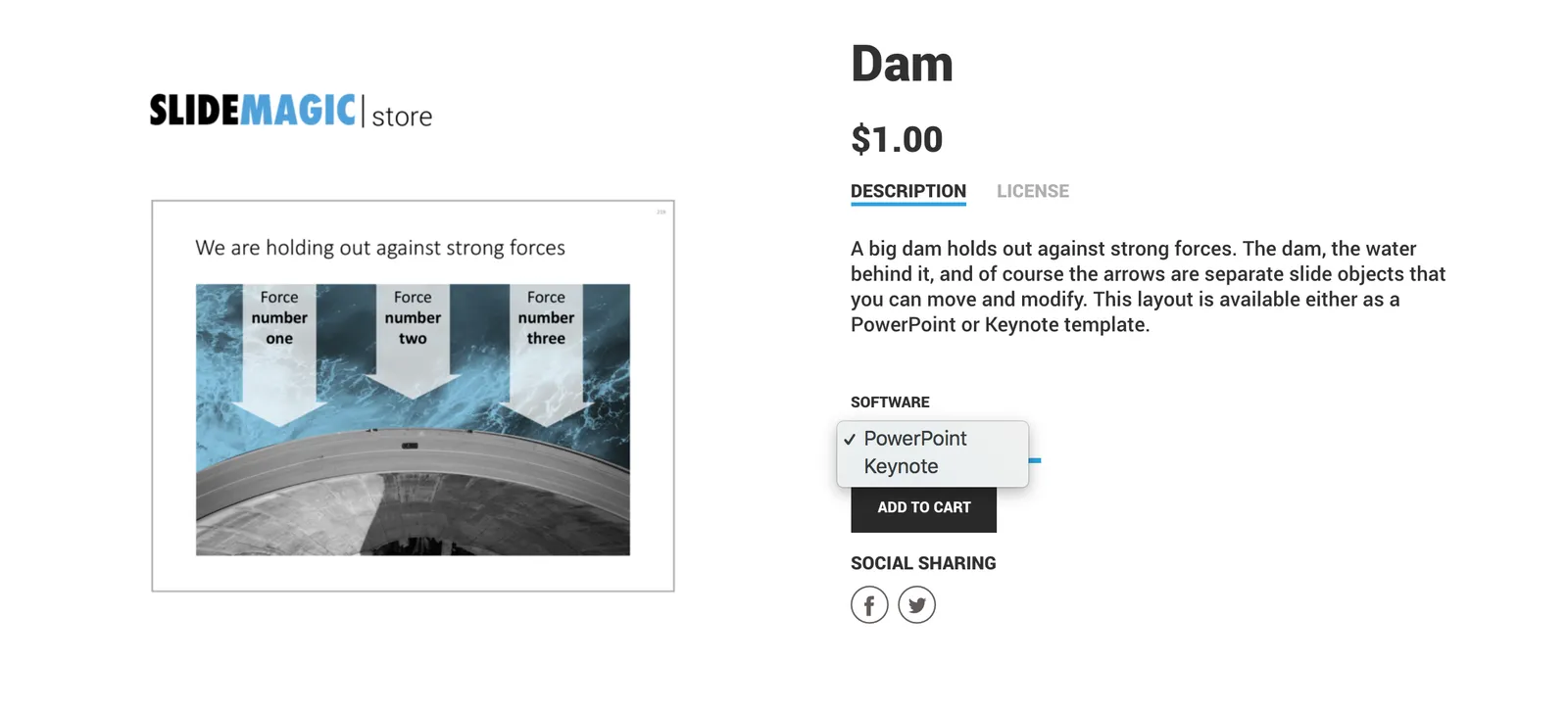
The slide above is a layering of 2 images that visualizes a big dam that is under pressure from something. You can use it either to show that something is about to burst, or the opposite, that defenses are strong and holding out well. I love the massive architectural scale of these hydro power installations, especially when you can highlight it with this tiny car driving across it. You can download this dam template here.

Looking for other visual concepts that are similar? You can try and search the store for “forces”, “down”, or this search “downward” and see what slides come up. That is my longer-term vision: no more boring bullet point charts, and no more searching for “where is that slide that I made 2 years ago”, but rather have all the relevant designs ready at your finger tips. The search engine with design ideas is almost as important as the actual design itself.

Continue reading →
·Concepts

Layering PowerPoint shapes

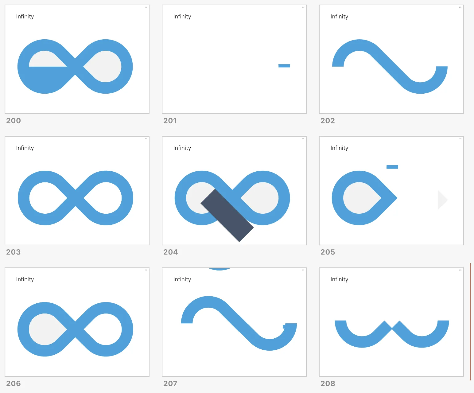
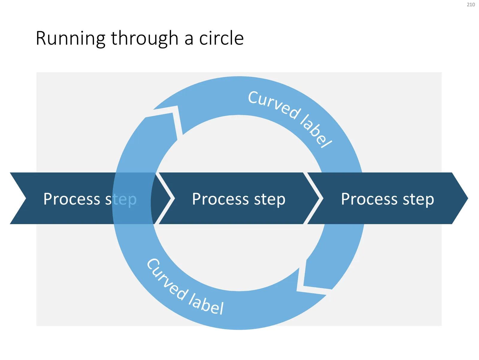
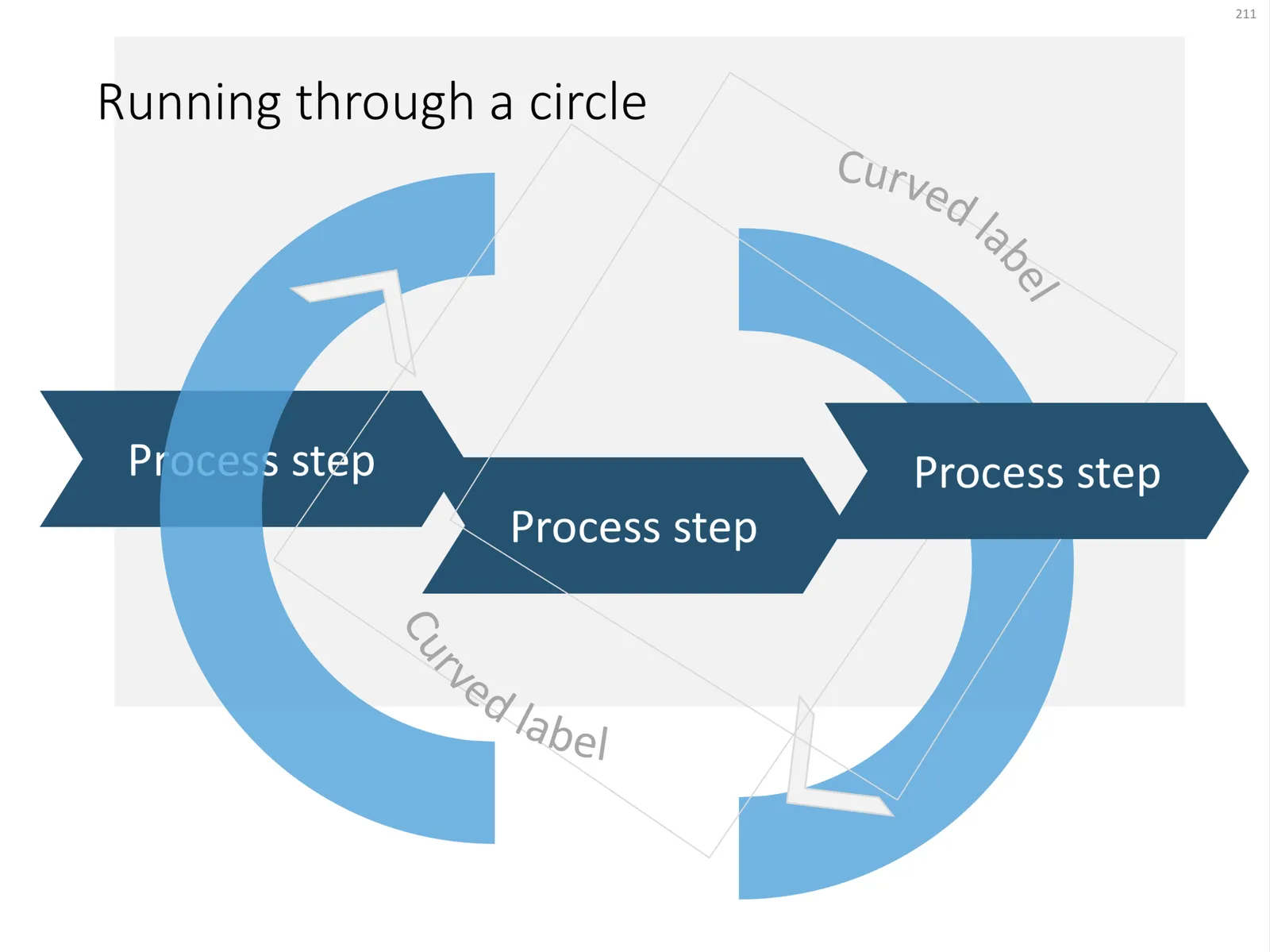
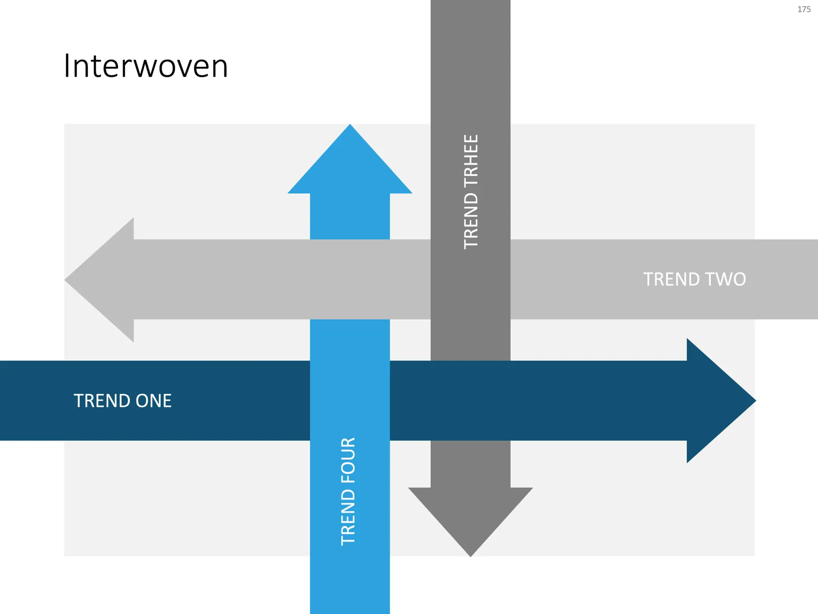
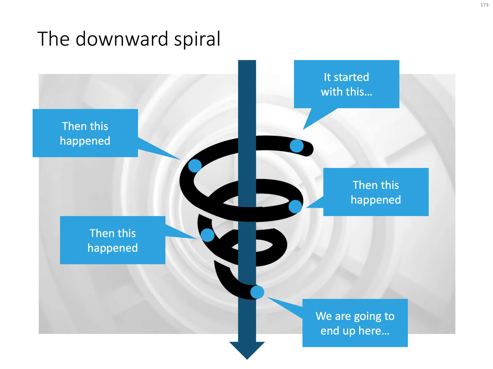
Here are some examples of PowerPoint slides that cleverly use layering to create a “woven fabric” effect. Why clever? Take the circle for example with the arrow flying through. Part of the circle needs to below the arrow, part on top. The solution? Cut the circle in half… The interwoven arrows have small square blocks in the right colours pasted in the relevant junctions, and the spiral was a bit tricky, placing small black cut outs on the junction with the blue arrow.

Click the image if you want to download the relevant slide. Alternatively, search the template store for keywords like “arrow”, “downward”, “circle”, “process” etc. to get to charts like these.

 A regular process, with a circular process around it

A regular process, with a circular process around it

“The making of”

 Layered PowerPoint arrows give a fabric or knot type slide layout

Layered PowerPoint arrows give a fabric or knot type slide layout

 A downward spiral in PowerPoint

A downward spiral in PowerPoint

Photo by Christian Perner on Unsplash

·Investor presentation

Should you send a short "teaser" deck to a VC?

Here is an interesting reply on Quora:

The answer seems like common sense. “Short” and “long”, “tease” and “bore”

  • Don’t send a “short” 3 page slide deck crammed with font size 8 text
  • Don’t send a 3 page deck that is so vague and mysterious that the VC does not understand what it is about (“do you want to share our journey that will revolutionise personal finance?”)
  • Don’t send a super looooong slide deck does not get to the point even on slide 15 because you are still setting the market context and ticking of the hottest buzzwords
  • Don’t send a long slide deck full of (confidential) details about your finances, product pipeline and roadmap, competitive strengths and weaknesses and the last Board decisions

“Short” and “long”, “tease” and “bore”, the smart approach sits somewhere in the middle. VCs are usually reasonably intelligent, and have likely seen many, many pitches from companies that operate in the same field as you do.

You could almost compare this to you checking out a web site of a new competitor to your business in your industry. After a few seconds, you either utter a sigh of relief, or get that feeling, “hmm, this could actually be pretty good”. The VC will look at your deck in pretty much the same way.

Photo by Paul Dufour on Unsplash

The SlideMagic "insert" templates

When you hit “insert slide” in my SlideMagic presentation design app, you get presented with a number of basic grid layouts for the slides.

 Here is the menu you are presented with when you select

Here is the menu you are presented with when you select “insert slide” in the SlideMagic presentation design app

Many people have asked me for these layouts in PowerPoint, so I added them to the SlideMagic template store, you can download the template bundle here.

 Thumbnails of the slide layouts available in the PowerPoint template

Thumbnails of the slide layouts available in the PowerPoint template

I based the template mostly on slides that were already present in the store, so there are some deviations here and there. But, overall, these are the layouts I think should enable you to build almost any business presentation, that’s why I selected them for the app.

The file with PowerPoint templates comes with a health warning though: the reason I created the presentation design app is that it is very hard to customise template slide layouts in PowerPoint. Adding or deleting rows/columns to a grid requires some clean up and realign work that not very layman designer can do. In the template you can find more variants on the layouts of some of the slides presented here, but they probably never match your exact needs.

The app is easy to work with but integrates less well with PowerPoint, the PowerPoint templates fit right into your corporate PowerPoint template and/or colleague’s presentations, but are harder to customise. I am working hard to get rid of both these limitations.

·Concepts

Native waterfall charts in PowerPoint for Mac

Waterfall charts have emerged in PowerPoint for Mac after a recent software update. This would be a major addition, since these types of charts are highly useful to summarise changes in data. I have shown in previous blog posts how it is possible to construct a waterfall chart starting from a regular stacked column chart, but it involves manual calculations and PowerPoint fiddling.

The new waterfall templates for PowerPoint for Mac are a step in the right direction, but things are not perfect (yet) though. For some reason, you cannot edit the data of the waterfall that gets inserted in PowerPoint, nor can you change the design of the chart. I figured out a work around:

 1. Data in the standard PowerPoint for Mac waterfall chart cannot be edited (

1. Data in the standard PowerPoint for Mac waterfall chart cannot be edited (“edit data in Excel” is grey out)

 2. The only adjustment you can make is selecting a cell, and then designating it to be a total column (or not)

2. The only adjustment you can make is selecting a cell, and then designating it to be a total column (or not)

 3. Work around: add a regular column chart

3. Work around: add a regular column chart

 4. Make it a stacked column

4. Make it a stacked column

 5. Delete data all but one data series

5. Delete data all but one data series

 6. Add the data you need

Continue reading →
·Templates

100+ new PowerPoint layouts

I am adding designs to the template store at a healthy pace now, so it is not possible to feature every new design as a blog post. Head over to the store and check them out, this link will bring you to the latest additions. This view is chronological, and does not represent the breadth and variety of templates that are available. I encourage you to use the search box and see what comes up, it works really well now.

My objective is to get to such a variety in the store that I can move to a subscription revenue model: you can find a starter slide for every business concept you possibly would want to present. I need to find the “sweet spot”: most PowerPoint template sites offer a huge amount of slides, but very few actual concepts, mostly permutations of images and text box layouts. Stock image sites have gone the the other way: millions and millions of similar compositions, but in the process they have diluted the quality and usability of the site. And of course, an image is in most cases not a finished presentation slide. The ideal is somewhere in the middle.

Photo by Alicia Steels on Unsplash

·Concepts

The iceberg in PowerPoint, presentation cliches

I think people are spending way too much time on creating corporate presentation documents for internal company  meetings where the objective is to get your colleagues to agree on something that needs to happen next. Not every meeting is your all company annual sales kick off.

Presentation cliches can be effective visual shortcuts to get your point across. People have seen them before, instantly connect to the concept, and you can move on. The challenge is to make your slide look decent, maybe even referring to the cliche in a tongue-in-cheek way.

Below is what I tried to do to the infamous tip of the iceberg slide.

 The tip of the iceberg presentation

The tip of the iceberg presentation “classic” (or cliche?)

  • Don’t try to make it look too photo realistic, but rather use an abstract simple geometrical shape, and use the presentation accent color (instead of white against a dark background)
  • Keep the slide very simple, but the depth effect is actually created with clever layering of (partly semitransparent) shapes and image crops, it took me some head scratching to figure out
  • Shift the whole composition to the side to leave some more space for text, if you need it.

All in all, this chart looks better than a boring list of bullet points that describe some looming threat you want to warn your colleagues about. Just resist the temptation to fill that empty piece of arctic ocean on the right or the crisp polar sky with text.

Continue reading →