SlideMagic Blog

Frequent updates about all things presentations since 2008. Subscribe to never miss a post.

RSS

"We just need a quick fix up"

I get these type of requests to improve a presentation a lot, first when there are budget issues, and now more recently when I say that coding my app consumes 100% of my time. Unfortunately, there are no quick fixes in good freelance design work:

  • Doing quick fixes will turn you into well, a quick fixer, you join anonymous army of freelance designers that do patch work and compete on price. If not you, we will find 1,000 alternatives exactly like you. The race to the bottom as Seth Godin would call it.
  • Fixing slides is the last step in the process, first comes understanding someone’s story. That is a big fixed cost investment that you need to put into every project, even if the draft slides look decent.
  • Presentation design work can only be really effective when you have the creative freedom (and budget) to tear up the entire draft design and pick your own consistent approach.
  • Quick fixes always need to be completed quickly, doing a lot of these projects means you always will be extinguishing emergency fires and never get around to doing your real work. It is more productive to be able to plan your work over a longer period of time. Quick fixes actually impacts the quality of your overall work.
  • Substandard work creates a self reinforcing loop: you will attract similar types of clients, and you are no longer proud of the work you show when someone asks you for recent design work that you did.
Continue reading →

Investor pitching: more and more like movie/dance auditioning

I recently watched the documentary “This is it!” about Michael Jackson again and remember the scene in the middle where the director is picking the handful of lead dancers for the MJ show from a line up of hundreds and hundreds of highly talented people that made it through the first selection filters and made the journey to the stage.

The parallels with pitching for an investment to experienced investor are striking:

  • He does not need to see an entire performance start to finish, he has seen it before
  • He compares every dancer to every other dancer who is on stage, but also subconsciously against all the other candidate-dancers he has seen and picked before.
  • His mind and eyes wanders all over the place without a clear structure or script
  • He uses a heavy dose of gut feel
  • He is looking for someone who has that bit of “something special”, both in terms of objective capability, but also drive and ambition
  • He know he probably makes mistakes (picking the wrong dancer and not picking the right dancer who standing in the back row)
  • He probably forgives a newbie who makes a rookie mistake in auditioning and actually enjoys discovering a new talent (or the opposite discounts the talent of the “auditioning pros”)

This does not mean to throw all the rules about presentation design out of the window: the context is just different when you for example pitch a crypto startup to a crypto fund who has been funding crypto companies for the past 2 years.

Pens!

I love investing in good writing instruments. Here is the current line up (with a new addition):

  • Apple pencil for notes I need to keep (meeting notes, important concepts for my app development, ideas for new blog posts)
  • Mechanical pencil for sketching disposable charts, diagrams, concepts that either need partial creative erasing and/or a ruler (read the review of my trusted Lamy 2000 mechanical pencil here)
  • And now: a nice roller pen for other “disposable” notes.

Since I started my career at McKinsey back in the 1990s I have been using pencils for everything. Back in the day, all charts and slides were sketched by hand before being produced by a graphics designer who understands PowerPoint (or Solo before that). But, pencils leads break easily when writing enthusiastically and have low contrast, hence the addition of the pen.

The Lamy 2000 roller pairs nicely with my pencil. The design is almost identical to the classic fountain pain, but with less staining (I am left handed), and the need to get that writing angle perfectly right. I think a roller is better for short notes than a proper fountain pen. The Lamy has a perfect balance (wit the cap placed on the back), and somehow the plastic that is used in the pen gives it a really nice brushed feel, and a perfect weight. Only drawback, those two tiny grips that were part of the original design and produce that satisfying click when the cap is closed.

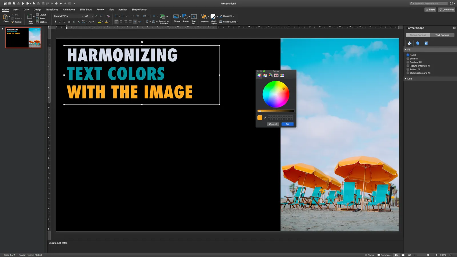
Matching text and image colours

Full colour images can clash with the colour palette of your presentation colour scheme. Three options:

  • Pick a different image (search for “orange” in Unsplash for example)
  • Use grayscale images
  • Or… adjust the text colour to the image (see example)

Photo by Annie Spratt on Unsplash

Personal story

While battling the rendering of images in PowerPoint via JavaScript I remembered that my ver first piece of software was actually a “presentation design tool”. Back in 1985, in the final years of high school, I submitted a program as an entry to a programming contest.

Screen drawing was in its infancy then, and I noted that all programs were “destructive”, you drew something on bitmap canvas and could store the end result, but there was no way to edit / undo your master piece at a later stage. My program stored individual actions which had 2 benefits: you could edit your drawing, and it took far less tape space to save the file (a line just takes 2 points to store).

The program was written in Basic on a TI-99/4A (which had a screen resolution of 256 pixels I think). Unfortunately, I did not win the contest. I think the winner was a shopwindow advertising application written by the son of the local butcher that enabled horizontal scrolling of the latest entrecote prices in big characters on the screen. (The butcher himself seemed to know more about the intricacies of the program than his son though). I think the jury thought this had more practical application than a presentation design program.

Image via WikiPedia

Rewriting the headlines

A memory from my life as a consultant in the 1990s. Creating a document with dozens of people giving input and changing things is hard: analysts correcting mistakes in numbers, graphic designers insisting on following the house style, partners reshuffling the entire deck, fax machines breaking down, cleaners dropping the entire deck (without a staple and no page numbers) on the floor, copy machine operator shifts ending, etc, and all of this under intense time pressure.

I remember one introvert project manager who had his own survival strategy in this overflow of stimuli: towards the end, simply take all the charts, retreat in his office, and start reordering and rewriting every single headline completely. The headlines would be long sentences and in the right sequence would tell the whole story of the project’s conclusions. Sometimes the link between the headline and the chart beneath it was not 100% on every page, but as a whole the deck made sense.

That’s one approach, which would have worked even better if he had done this 24 hours before the deadline instead of 2.

Photo by Francisco Arnela on Unsplash

Changing the use of images

I use images very differently now in presentations then 10 years ago:

  • Zero stock images that look like stock images (fake models, staged compositions, cliche compositions)
  • I no longer feel the urge to find an image for every slide I produce to avoid forced visual analogies, and get left with a set of images in a presentation that are completely unrelated and inconsistent

Instead:

  • Most of the time, my images reflect something real: the actual leadership team, the product, a factory, a city, a screen shot, the cover of a scientific publication, etc.
  • I am still using commercial stock images if I need isolated objects (a bucket, a hammer, etc.)
  • Sometimes I might go for a visual theme and try to find images that fit with the concept on virtually every slide (flowers, 50s, record covers, etc.)
  • Most of the images I use come from the free site Unsplash. As a result, I don’t even bother saving images to disk anymore, if I need another one, I will search for it again.
  • I often make all the images in a presentation black and white, to make the look and feel of slides more consistent, and let the accent colour of the slides (often just one) pop out more.

Photo by Math on Unsplash

Finding a flow for your presentation

Your text book story flow might not always be the one to use in tomorrow’s meeting.

  • A 60-minute/75-page final Board presentation of a 3-month consulting project

    • Sequencing is important to take resistant members of the audience from common ground, via cold logic and facts to the conclusion that option 1 is preferred over option 2 and 3 that equal to “fall of the cliff”
    • In some business cultures it is important to establish the credibility of your work (assumptions, models, importance of people in the organisation you spoke to), before getting into the actual crunch
    • Meeting timing, having the whole meeting explode with a debate on page 3, while that highly insightful analysis is on page 7 is not helpful
  • A 5-10 minute investment pitch:

    • The order in which questions pop up in the head of an investor might deviate from the business school investment pitch flow template. First, the investor needs to understand what it is you actually want to do, then it might make sense to take out “elephants in the room” before moving on to more important issues, but which are less controversial.
    • Experience differs vastly across investors, some might need the proper 101, others dive straight into the detail, derailing your carefully laid out story

No, I am not saying to throw that perfect storyline out of the window, and in 90% of the cases it is the right thing to do, but think whether your meeting might be part of the other 10%.

Continue reading →

Tried and trusted

Sometimes, the good old way is still the best.

One of the main “side effects” of my new giant iPad is that I start reading magazines again that cannot afford/did not invest in good iPad apps, the screen is big enough to flick through PDF-copies of the paper format. It is great to broaden my news sources again (French, German, Dutch) beyond Anglo publications focused on a small number of issues.

I must say, the simple user interface of just swiping between pages without zooming, multi-directional navigation, pinching, multi-finger swipes, actually works pretty well, and is exactly the mindset I am in when developing my presentation app: 99% of business presentations do not require a fully immersive interactive experience.

Photo by Charisse Kenion on Unsplash

Update on the development efforts

The past few weeks have been very interesting for me in my new role as a developer! I have switched platforms 3x now: first starting to explore plugins for PowerPoint (Windows Forms), then moving on to coding an application straight onto windows (Windows WPF), but now I am back in the world of Javascript that in combination with the Electron platform can produce software that runs natively on Windows, Mac, and even Linux with just one code base to maintain. The first intermediate end product will be a local presentation “presenter view” tool that does not require internet connections to deliver/show SlideMagic presentations (it is all a bit clunky still in the web app), and a 100% accurate PowerPoint conversion tool for SlideMagic presentations that runs on both Mac/Windows, and is totally independent of PowerPoint itself, my software is generating the converted files directly without the help of the rendering engines of PowerPoint (plugins).

This whole process is absolutely fascinating. Now that I go through things myself I have come to realise how important it is to master (at least part of) the actual core technology yourself as a founder.

To be continued.

Photo by Pankaj Patel on Unsplash