

SlideMagic Blog

Frequent updates about all things presentations since 2008. Subscribe to never miss a post.

RSS
·PowerPoint

Back from New York

No major insights regarding presentation design today as I am getting myself organized after returning from a fantastic week in New York. I really enjoyed the 2 speaking events at NYU, and want to thank Sean Black from SalesCrunch for inviting me. Sean will publish the content of the 2 evenings in chunks on his site.

I also would like to thank venture capitalist Mark Suster (author of Both Sides of the Table and one of the “3 musketeers” of VC bloggers together with Fred Wilson and Brad Feld) for spontaneously agreeing to introduce the first event (on VC pitching) in person.

I enjoyed my week tremendously, met great people, and am really impressed by the buzzing startup scene around Union Square in New York. If you were in the audience and would like to connect and/or have additional questions, do not hesitate to contact me.
·Investor presentation

No red in financial data

Red is a great accent color to make text stand out from other elements on the slide. Do not use it for financial data though, people are associating red with negative performance and losses.

·PowerPoint

A new ergonomic chair

One of the easiest ways to become better at presentation design is to have a calm and relaxing work environment and an ergonomic chair and computer setup. I have not found the idea chair solution yet. Simple kneeling chairs put too much pressure on your knees after long use, complicated ergonomic chairs are so huge that they seem to come straight out of  a science fiction movie. Maybe this simple elegant solution, the Tip Ton by Vitra might be a good solution to put next to my regular office chair (nice commercial by the way), it will be launched later this month.

·VC/investor pitch

Presentation design seminar

A lecture about designing sales and investor presentations

A series of videos of a lecture Jan Schultink gave at NYU in 2011. Venture capitalist Mark Suster (author of the blog Both sides of the table) introduced Jan’s talk. The event was hosted buy SalesCrunch (a startup that was renamed Crunched, and later acquired by Clearslide). The content of my talk closely follows the topics discussed in my book about presentation design.

Let’s start with Mark’s introduction.

Mark Suster has done live pitches in front of the camera. Here is my review of one them. His feedback to the pitching investors is interesting. But what is more interesting is observing his body language. Mark has created a great library of his blog posts about pitching to VCs

Below are the videos of my presentation design seminar that followed. There were 2 sessions, one on designing investor presentations, and one on designing sales presentations. About half of the content in the talk overlaps.

·PowerPoint

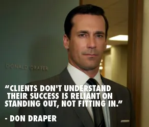
"Clients don't understand their success is reliant on standing out, not fitting in"

I came across this quote by the fictional character Don Draper (Mad Men) on the Advertising is good for you blog. It does apply to some of my presentation design projects, especially when there is some resistance to let go of the common bullet point approach.

Image via Wikipedia

·Investor presentation

How to present your team to investors

The founding team is a one of the most important inputs in a venture capitalist’s mind when she decides to invest in your startup or not. For a large part, an investor will size you up during the pitch by judging how you present and how you answer questions, information that is not written down anywhere on a slide.

Still, the team slide is a crucial part of any VC presentation. It is difficult to put CV information in a slide. There is lots of information, and CV entries require lots of text (long university, company, and position names). So I usually end up designing 2 versions: one to go in the front and one with full details to go in the appendix (the latter is meant for reading, not presenting).

You should adopt the design of your high level team slide, depending on what you want to say:

  • We have many of years of experience, a very long time line
  • We have worked together before, multiple time lines circling the overlap in your careers
  • We worked for big name companies: company logos
  • We have complementary skills, some sort of (slightly cliche) puzzle that shows what skill set the individual team members bring to the table.

And if you can:

  • Put in high-quality head shots of the team members
  • Or even better: an energetic group picture.
·PowerPoint

Spring cleaning: de-personalizing your laptop

If you use your laptop to present slides in presentations, it is time to let go of all that personal screen real estate such as cute family pictures. Screen savers kicking in with images of you in the pool with your 2 year old son, instant message popups, wallpapers showing off your new motor bike are all very interesting to you, but not to your audience. Spring cleaning time.

·PowerPoint

A few tickets left for my NY seminars next week

I am very happy with the signup rate for my NY seminars next week. There are still a few seats left, you can sign up here using the “ideatransplant” promotion code. I am preparing for my flight and hope to get to see some of my New York readers in person next week.

·PowerPoint

Memory and stories

Joshua Foer, the author of Moonwalking with Einstein (affiliate link), shows an interesting technique to memorize a string of unrelated object: imagine them one by one positioned on a familiar path. Boiled egg on the driveway, duck at the front door, 17" MacBook pro at the bottom of the stairs, etc.

Speaking of ducks, the Hebrew word for duck is ברווז, or barvaz. Imagine that duck sitting in a cafe, having a coffee, while in the distance you can see that huge red vase sitting on top of the bar. Barvas.

It shows that our spatial memory is much stronger than our ability to remember a list of bullet points. It might have something to do with our ancestors whose key to survival was to remember the location of that apple tree, and even more importantly, the way back home.

Stories are a great framework to store and memorize facts and ideas. It comes naturally. This might also be an explanation of why you can remember an entire 2 hour discussion by just looking at a messy, incomprehensible white board full of scribbles.

·Investor presentation

Send me an executive summary

When an investor is running out of time, conversations often end with “why don’t you email me an executive summary”.

Upon hearing that, startups wil scramble to produce the well-known executive summary format, compressing the entire pitch deck in just a few paragraphs:

  • Has to fit 2 pages, so no space for visuals, use a small font or narrow margins if required
  • Stuff the text with buzzwords and big numbers
  • Include all the features of your product
  • Spend a lot of paragraphs on CV details of the founding team

Think of this from the investor perspective: this document is boring and so dense that it would take the same amount of time to read it start to finish than to page-down through a slide deck. Here is an alternative: “I am sending you a 5 minute pitch”

  • A short and visual document, but it could be longer than 2 pages
  • Explaining the investment opportunity in human language
  • Focus more on the problem, less on financial,  product details, and team details (that can come later)
  • The objective is not to get the investment (yet), but to get invited to the next stage in the investment process, possibly a full pitch meeting