SlideMagic Blog

Frequent updates about all things presentations since 2008. Subscribe to never miss a post.

RSS
·Investor presentation

Words and number consistency

It is impossible to make a correct 5 year business forecast in an investor pitch. But your financial projection is not really a forecast, a prediction of the future, it is a picture made out of numbers. “If our company will be successful, this is what it could look like”.

Mistake number one is to make the projection ultra precise with 5 digits after the comma. It is just a guess, so a year 5 revenue number of $99,234,318 is not more credible than ~$100m.

But oversimplifying is not right either. The fact that you are for sure going to be wrong does not mean that you simply take 1% of a big market number to get to the year 5 scenario.

The trick is to make the words/visuals in your presentation consistent with your financial model. You are going to sell to millions of individual customers, drive the model that way. You rely on 5 big telco operators, put it in. SAAS company with recurring revenues? Model it. One-off perpetual licenses, use it as the basis of your model.

Teaching investors how the business works is more important than getting the point estimate right.


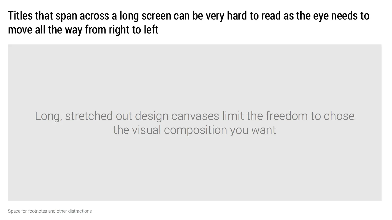
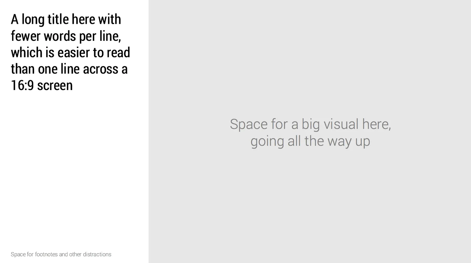
A different slide layout for 16:9

Wide 16:9 aspect ratios are great for movies as we can follow the car chase across the full width of the screen. For slide design however, they cause problem.

  • Looooong titles across the screen are hard to read as the eye needs to move over a long distance
  • A stretched rectangular design canvas limits the amount of compositions you can create.

Maybe it is time to experiment with an unconventional slide layout, where we put the slide title on the side of the design canvas.

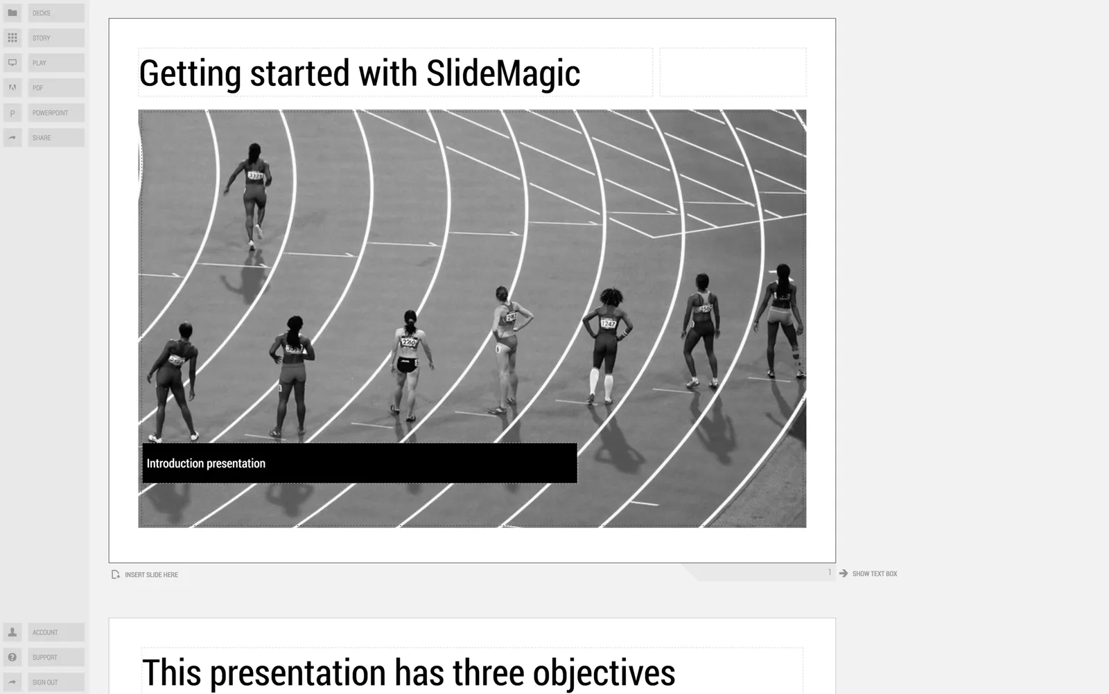
In my presentation design app SlideMagic, I took a different approach. The app sticks to 4:3 slide aspect ratios, with a title in the traditional top position, but the user has the option to add a slide out panel on the right with a verbal explanation of the slide for those cases where the presenter cannot be there to explain an abstract visual.

Image from WikiPedia

·Story

Make it personal

It can be hard to figure what to talk about when you are invited to speak at a professional event as an entrepreneur, an investor, a designer, a CEO.

One option is to prepare a business school-grade lecture about your profession. Organised, structured, all the key points laid out, with informative slides that will be photographed by hungry aspiring entrepreneurs, investors, designers, and CEOs. But in the world of Google and Amazon, there are probably hundreds of “how to’s” for these professions available at the click of a mouse.

The other option is to make it more personal:

  • Case examples
  • Anecdotes
  • Stories

Yes, you might not hit all the points of investing 101, but the audience will learn something they cannot learn anywhere else, will remember more, and have a better time.

Being too defensive

On stage, you do not present slides that layout your weaknesses in the best possible visual way. On the other hand, when preparing for your presentation, (or briefing your presentation designer), it does not make sense to brush every weakness away.

I have clients who respond to every possible probe with: “of course not”,  “and this”, “and that”, “and then there is this data”, “look at this customer quote”. And still, there must be a reason why the company hardly has any revenue.

A better approach is to recognise the weaknesses, lay them out openly on the table, and try to figure out a way to address them.

Image from WikiPedia

·Delivery

The annual school performance

It is that time of the year. Here are some things kids do, and you will recognise them in grown-up presentations as well:

  • “Press play”, rattle down the lines to show that you can memorise things. You speak slower, softer when your memory needs to work harder. Eyes up to locate that next phrase.
  • Blank stare. You can’t see the audience because of the stage lights, so you are not really looking at them.
  • No connection to the substance. You simply say the words without feeling their meaning.
  • “Bye”. The moment you spoke the last word, you turn around and walk off stage

Art: The Country School, Winslow Homer, 1871

·Story

Cutting the obvious out (or not)?

Doctors know what causes a certain disease. Investors know that hardware margins are small. Social media experts are aware of the huge install base of Pokemon Go. Cable operators know that an onsite visit to a customer costs a fortune. Even this presentation designer has argued many times not to preach to the converted, it is better to spend time and slides on issues that are less clear cut or controversial.

I still believe this is true, but I would not go as far as completely eliminating the obvious point from your presentation. This will break the flow of your story. Also you miss out on the opportunity of using the same visual concept for both presenting the (obvious) problem and your (not so obvious) solution.

A place holder slide with a simple image or statistic is enough to remind the audience of the obvious in 20 seconds.

Image from WikiPedia

Simple visualisations of complex things

More and more I am trying to self-analyse the process I go through when designing tricky charts for my clients, all with the hope of one day putting all that skill in my presentation design app SlideMagic.

Here is a process I went through yesterday:

  1. Write all the key things that need to come out on a piece of paper (the most important objective of this exercise: the things that are NOT written down).
  2. Cut down the messages to the bare essential:
    1. Re-write them as short as possible, no filler words
    2. Group similar points, eliminate duplications
  3. Underline verbs/action words: “is at the centre”, “nobody can do these 3 things at the same time”, “integration is possible because of IT”, “across all channels”
  4. Map cause and effect/result
  5. Select the most important action (something being at the centre, the IT that integrates everything, a Venn of 3 overlapping things?) and sketch a basic visual concept ignoring any conventional way to depict things in the specific industry
  6. Now fit in the other bits
  7. Re-shuffle, re-position to make sure lines, arrows don’t cross and related things are close together
  8. Add colour (selectively)
  9. Make sure everything lines up with a grid
  10. Fix typography, odd line breaks, orphan lines, etc.

I still have some work to do in SlideMagic…

Image from WikiPedia

·SlideMagic

Using templates in SlideMagic

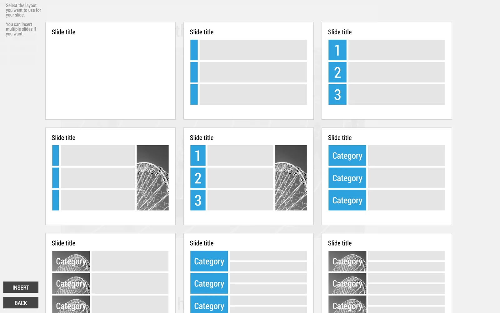
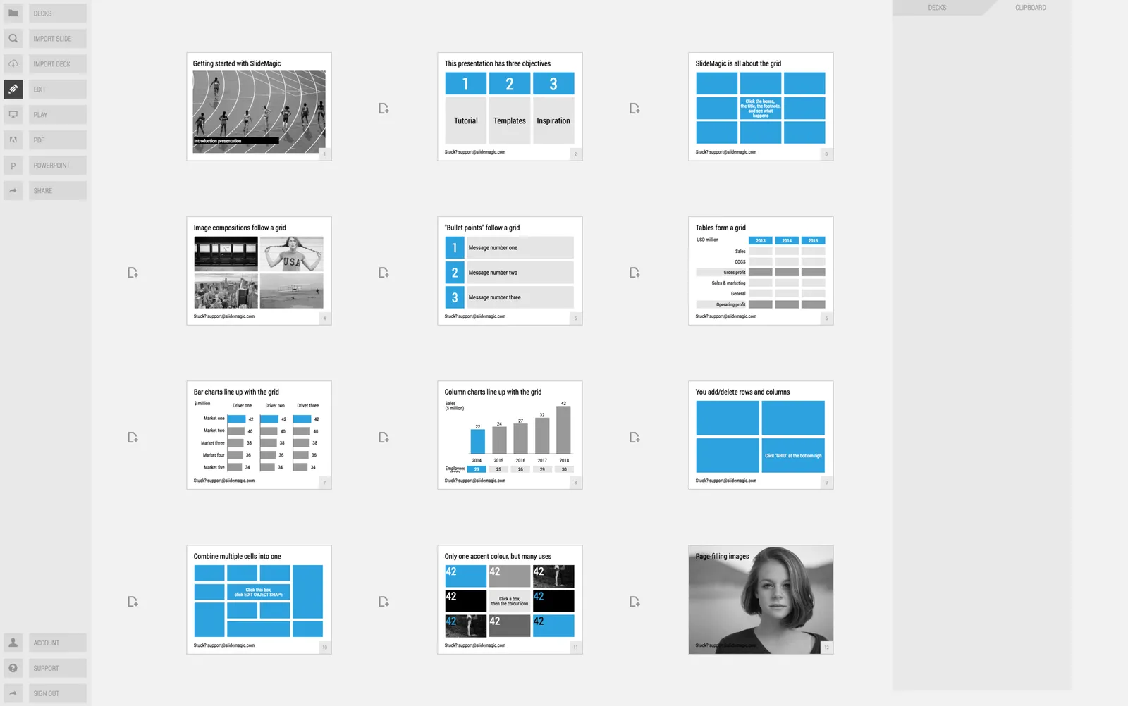
In little bursts of work I will be updating my presentation app SlideMagic over the coming weeks. I noticed that many users stick to the 9 box grid that is the default blank layout of a new slide. Yesterday we released a new insert routine. You now get presented with a number of slide layouts to choose from when inserting a new slide, without having to import and/or clone template slides.

Try it out and let me know what you think.

Humorous conference presentations

When people get invited to speak at a conference about their specific expertise and/or profession, they usually have no problem creating an industry story. It is easy to understand why: they are their home turf, feel very confident, have lots of interesting things to say and are in a relatively risk-free environment (there is no business proposal that could be rejected).

The draft presentations I receive from these type of clients usually need very little work. Here is what I usually end up doing:

  • Switch to a big conference white on dark template, without any logos, banners
  • Replace the standard Calibri or Arial font to something safe (i.e., no custom fonts that can cause trouble on foreign computers). Usual choices: Arial Black in all caps, or Century Gothic
  • Replace cheesy stock images
  • Replace low resolution images
  • Replace images with copyright issues (Google image search, search tools, “labelled for re-use”
  • Restore original image aspect ratios and stretch/crop images to full screen
  • Spread out slides with multiple messages across multiple slides
  • Cut text and reposition text boxes in the context of the underlying image

Art:  Johannes Moreelse, Democritus, 1630

Presenting to later-stage investors

Early stage investors make a risky bet: 1 or 0, either the company will work, or it doesn’t. Later stage investors don’t take that make or break risk, they invest in companies that have gotten some traction but need capital to finance growth and expansion. Which markets are you going after, how are you going to sell to them, what new products can you launch.

Valuation of early-stage startup is usually a mysterious process in the absence of sales and profits. For growth-stage companies it usually boils down to some sort of discounted cash flow analysis.

This is important to remember when presenting to these type of investors. In the end, a junior analyst will sit down, take your presentation and try to come up with some sort of financial business forecast for your company.

One way to deal with this is to email your own business forecast ready in Excel. But by definition, the buy side will never believe the assumptions of the sell side in a transaction, and worse, the potential buyer might just use your own spreadsheet to salami slice every single assumption down in order to end up with a value of $5.

The best approach is to feed the buyer the assumptions (market growth, market share growth, pricing, number of sales people you need) without doing the adding up of all the numbers. And feed those assumptions in the form of stories about your business plan, rather than a dry set of numbers.

Prioritise your sources of growth according to likelihood of success, first existing customers, existing products, then maybe new geographies, new verticals, and finally completely new products.

Continue reading →